- The best Google Font combinations to try
The best Google Font combinations to try
When it comes to choosing fonts, you have to think big picture. Not only is it important to choose fonts that feel like a good fit for your brand or your project—it’s also important to choose fonts that are going to work together from a design perspective.
Choosing the right font combinations (also known as font pairing(opens in a new tab or window)) is an important element of great design. And a great place to find font pairing inspiration? Google Fonts.
Let’s take a look at some of the best Google font combinations to try in your next design (and the Canva templates you can use to get started!)
Raleway and Open Sans

Sometimes, simple font pairings are the ones that make the most impact—as is the case with Raleway and Open Sans.
Raleway is a sans serif font designed specifically for larger text (like headings). When paired with Open Sans, another sans serif with a friendly, approachable design that’s optimized for a variety of uses and sizes (including web, print, and body text), the final look is simple, straightforward, and elegant—making it a solid choice for everything from corporate marketing materials to more creative designs (like flyers or posters).
Download from Google fonts:Raleway(opens in a new tab or window) and Open Sans(opens in a new tab or window)
Raleway pairs exceptionally well with Open Sans—but it’s also a strong enough font to stand on its own. If you want to let Raleway take center stage, Canva has a number of templates that feature this font—including the Blue Yellow Orange Burger Promo Flyer(opens in a new tab or window).

Montserrat and Oswald

Inspired by the Montserrat neighborhood of Buenos Aires, the Montserrat font was designed as a nod to early twentieth-century urban typography. One of the most striking characteristics of this sans serif font is the generous spacing between letters—and, when paired with Oswald (a sans serif with a more narrow appearance, both in spacing and letter design), creates an attractive dichotomy that adds visual interest to a design.
Download from Google Fonts:Montserrat(opens in a new tab or window) and Oswald(opens in a new tab or window)
Love this one-two sans serif punch? You can find this font combination in a number of Canva’s templates, including the Literature Comparison Infographic(opens in a new tab or window).

Sniglet and Cabin

Sometimes, all it takes is the right font combination to create a sense of fun and whimsy in your designs—and the Sniglet/Cabin font pairing is definitely one of those combinations. The rounded appearance of each letter of the Sniglet font makes for a fun (and visually impactful) headline—while the more subtle roundness of Cabin complements as a secondary font choice. If you’re creating a more whimsical design (for example, a design targeted towards children), this is definitely one of the best Google font combinations to play with.
Download from Google Fonts:Sniglet(opens in a new tab or window) and Cabin(opens in a new tab or window)
The rounded look of both the Sniglet and Cabin fonts make this a great pairing for designs targeted towards kids. Get the look with one of Canva’s templates, like the Orange Boxes Parent Report Card(opens in a new tab or window).

Abril Fatface and Lato

One of the most effective ways to pair fonts is by combining a traditional serif with a more modern sans serif—like this Google font combination, Abril Fatface and Lato. With its bold lettering and elegant curves, Abril Fatface is a serif inspired by the tilting fonts popularized in British and French ads and posters from the 19th century. Abril Fatface is a great font for headlines and larger text—and when paired with Lato, a more modern sans serif, it will create an attractive sense of balance in any design, from posters to social media graphics.
Download from Google Fonts:Abril Fatface(opens in a new tab or window) and Lato(opens in a new tab or window)
Abril Fatface is an eye-grabbing font. Use it to grab your audience’s attention with one of Canva’s templates, like the White Minimalist Photo Father/Dad Appreciation Pinterest Graphic(opens in a new tab or window) (this template pairs Abril Fatface with Montserrat, but you can easily switch it out with Lato to replicate this font pairing).

Merriweather and Special Elite

One of the most interesting things you can do when combining fonts? Switch things up—and use a font traditionally used for headlines as the secondary text. In this Google font combination, Merriweather, a classic serif, is used as the headline text—while Special Elite, a typewriter-inspired font, adds visual interest as the body text. Moral of the story? A graphic font doesn’t always have the be the focal point—and can add just as much visual impact to design as an accent.
Download from Google Fonts:Merriweather(opens in a new tab or window) and Special Elite(opens in a new tab or window)
Love the typewriter-inspired look of Special Elite? Canva has plenty of templates that feature this cool, vintage font—like the Vintage Monochrome Typewriter Photo Quotation Poster(opens in a new tab or window). (Want to recreate this font pairing? Just switch the footer text to the Merriweather font.)

Six Caps and Josefin Slab

Font pairing is all about balance; bold and subtle, narrow and spacious, upper and lowercase. And one pairing that perfectly illustrates that balance? Six Caps and Josefin Slab.
The headline font, Six Caps, is categorized by its condensed, narrow lettering and fully capitalized typeface—while the secondary font, Josefin Slab, is more spacious and elegant (which, according to the designer, was inspired by Scandinavian style).
Download from Google Fonts:Six Caps(opens in a new tab or window) and Josefin Slab(opens in a new tab or window)
When paired with a more subtle font (like Josefin Slab or Libre Baskerville), Six Caps makes for a visually impactful headline font. Get the look (and make an impact!) with Canva’s White and Light Gray Graphic Design Book Cover(opens in a new tab or window) template.

Mrs. Sheppard and Montserrat

Montserrat is an extremely versatile font. It’s powerful enough to act as the focal point of a design, but when paired with something more bold and graphic, it’s also subtle enough to take a backseat and act as a secondary font—like it does when paired with Mrs. Sheppard, a calligraphy-inspired script font. The artistic feel of this Google font combination makes it a solid choice for more creative or editorial designs, like magazine or book covers.
Download from Google Fonts:Mrs. Sheppard(opens in a new tab or window) and Montserrat(opens in a new tab or window)
Love the boldness of this script/sans serif font pairing? Capture the look with one of Canva’s templates, like the Tastebuds Breakfast Issue Food Magazine Cover(opens in a new tab or window).

Homemade Apple and Raleway

There’s something extremely charming about handwritten fonts—but only when used sparingly. handwritten font used too often can make a design feel visually overwhelming (not to mention hard to read!). This is why pairing Homemade Apple with Raleway, is so impactful, especially for text-heavy designs. When used as a headline, the handwritten Homemade Apple draws people in—but the more straightforward sans serif Raleway makes key information much easier to read.
Download from Google Fonts:Homemade Apple(opens in a new tab or window) and Raleway(opens in a new tab or window)
This font pairing is so effective because it lets the elegant, handwriting style of Homemade Apple take center stage, balancing things out with a more simple sans serif. Capture that same balance (and effectiveness!) with one of Canva’s templates, like the Teal Spring Photo Illustrated Flowers Your Story(opens in a new tab or window).

Playfair Display and Raleway

Corporate design, especially in more conservative industries like finance or law, typically requires more traditional font pairings—but that doesn’t mean they have to be boring. This Google font combination brings together Playfair Display and Raleway, two elegant sans serif that feels professional enough for even the most traditional designs—but interesting enough to keep the design from veering into “boring” territory.
Download from Google Fonts:Playfair Display(opens in a new tab or window) and Raleway(opens in a new tab or window)
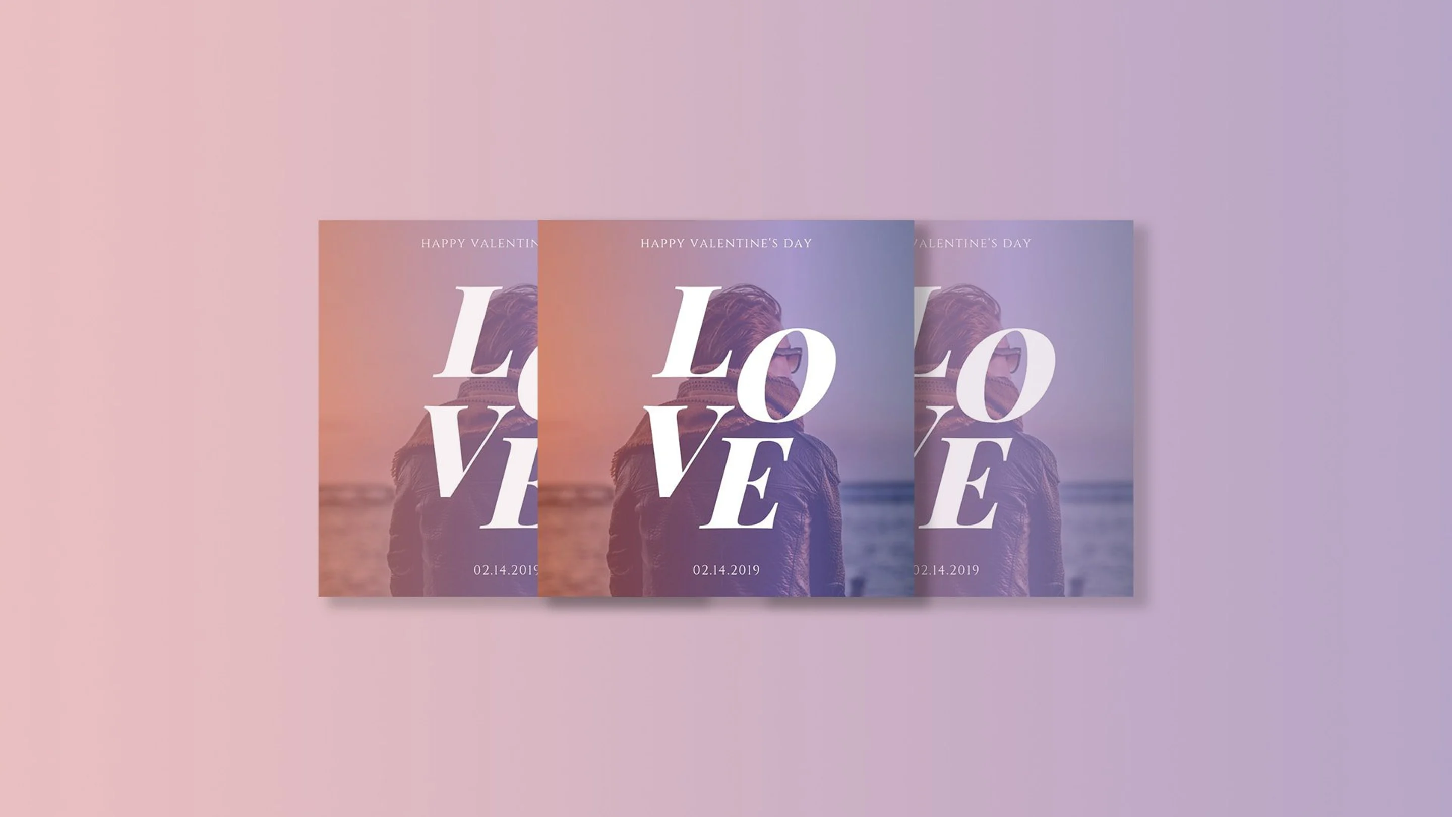
Playfair Display can work as a more subtle headline or secondary font. But with the right layout and style, it can also act as a bold focal point—like in Canva’s Love Typography Valentine’s Social Media Post(opens in a new tab or window) template.

Permanent Marker and Open Sans

When you need to pack a visual punch with your font pairing, look no further than Permanent Marker and Open Sans. This Google font combination lets Permanent Marker, a bold, marker-inspired graphic font, take center stage—and compliments it with the more subdued (but still modern, sophisticated, and visually interesting) Open Sans. Font combinations like this one, which pair a bold graphic font for the headline with a more laid-back secondary font, are a great fit for designs that need to stand out (like posters or magazine covers).
Download from Google Fonts:Permanent Marker(opens in a new tab or window) and Open Sans(opens in a new tab or window)
The graphic style of Permanent Marker makes it a great choice for when you need a bold headline that’s going to grab people’s attention—like a book cover. Get the look with one of Canva’s templates, like the Pink and Black Grunge Creative Wattpad Book Cover(opens in a new tab or window).

Roboto and Roboto Condensed
[SCREENSHOT:https://fonts.google.com/specimen/Roboto+Condensed]
Sometimes, two versions of the same font make for the best font combinations. Roboto Condensed is a more (you guessed it) narrow and condensed version of Roboto—and when you put the two together, they look similar enough to lend a cohesive feel to designs, but different enough for each to stand out on its own.
Download from Google Fonts:Roboto(opens in a new tab or window) and Roboto Condensed(opens in a new tab or window)
Roboto Condensed pairs well with Roboto—but that’s not the only pairing that works for this font! If you want to make a statement in your design, try pairing it with a bolder headline font, like in Canva’s Mountain Landscape Church Flyer(opens in a new tab or window) template, with pairs Roboto Condensed with League Gothic.

In this article, we’ve highlighted some of the best Google font combinations—but we’ve barely scratched the surface. No matter who you are as a brand, what industry you’re in, and what kind of designs you’re creating, Google Fonts has the perfect font pairing for you. So what are you waiting for? Get out there and find the best Google font combination for your designs!

Written by
Deanna deBara

")


