- 50 blog headers guaranteed to draw readers into any post
50 blog headers guaranteed to draw readers into any post
Working in a large organisation with over 100+ employees? Learn how to communicate visually, boost productivity, and stay on brand, at scale. Get in touch(opens in a new tab or window).
It has been said that designing a blog is easy, a-no brainer. Pick a template from the myriads out there all readily available on any platform and you'll be good to go, right?
But popping images and text into an existing template will likely translate into another generic looking blog. And in today's growing blogging industry, being just another sheep in the herd won't do much for your traffic. Differentiating your blog from others in the same niche by creating a blog designed with a bit more character will turn you into the sheep they'll remember.
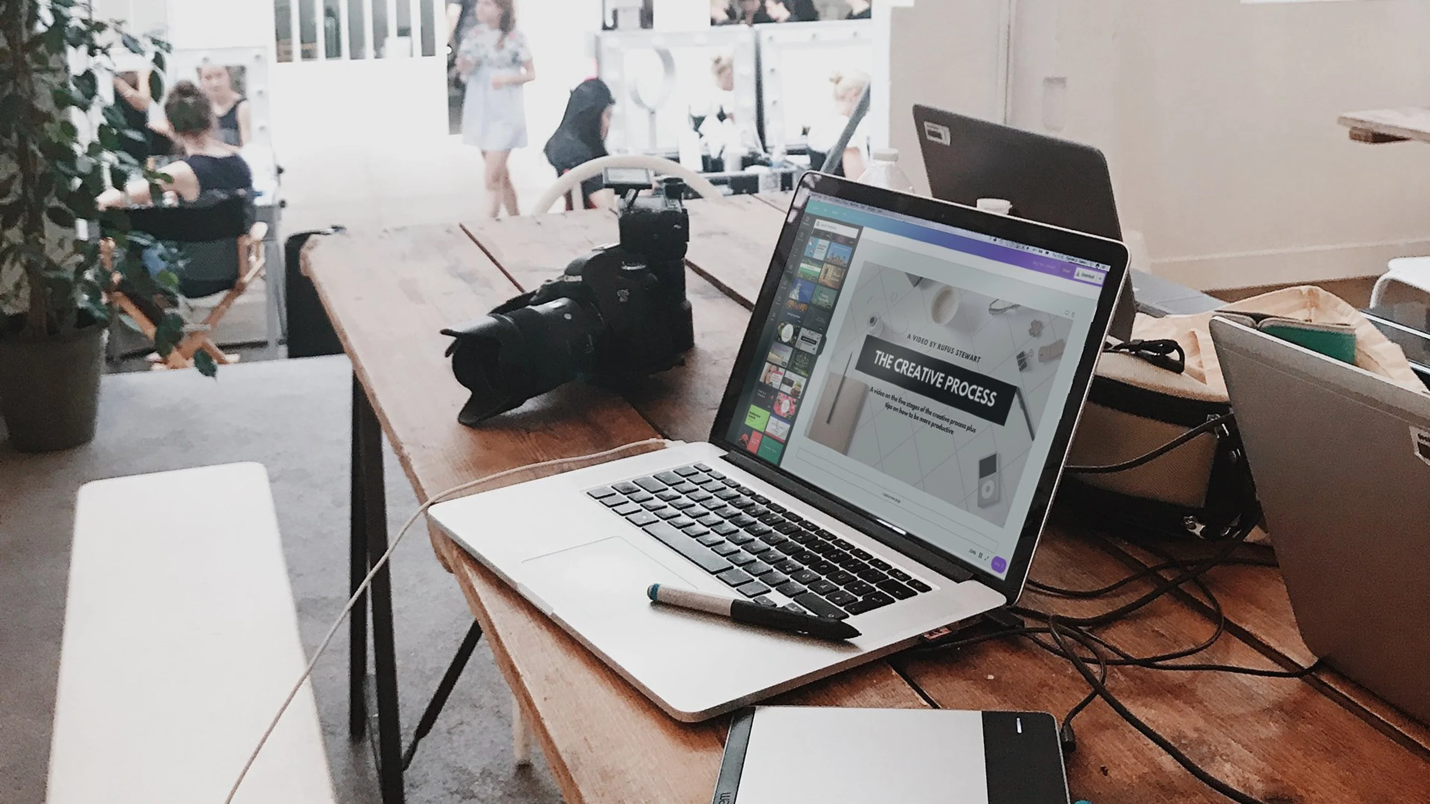
Creating a stunning blog does not necessarily mean building your own layout from scratch. You can take advantage of Canva's blog website builder(opens in a new tab or window), let it do most of the heavy lifting, and pair it with a thoughtfully designed header to start engaging your target audience. Use them to set the mood and visually communicate what your blog is all about. They don't have to be terribly complex, just tailored to fit your blog beautifully. If you're still deciding on what to call your site, try using our blog name generator(opens in a new tab or window) to come up with a memorable and fitting name, and our domain name generator(opens in a new tab or window) to secure the perfect web address. Or if you're struggling with what to write about, our blog topic generator(opens in a new tab or window) can help spark new ideas. Below, we showcase 50 awesome blogs with headers that make great first impressions and feature great content.
01. Feature illustrations

The Everywhereist
The Everywhereist(opens in a new tab or window) is a hysterical travel blog written by Geraldine, who travels often with her husband. It uses beautiful illustrations on its header and throughout the entire blog. The passport, globe, and film roll leave little room in your mind to doubt that you’ll be reading about adventures in other countries.
02. Turn your title into a mark

52 Weeks of UX
52 Weeks of UX(opens in a new tab or window) is exactly that: a blog that writes about UX for 52 weeks. Its header is stark and simple but lets you know right away you’ll be reading about everything UX.
03. Use a type-centric approach

Trent Walton
Trent Walton(opens in a new tab or window)uses a type-centric header to lure you in. Tough not to read and enjoy big, beautiful type. Every post on his site is awesomely designed and different from each other. Checkthis(opens in a new tab or window) one out.
04. Give animation a shot

VOTD
Easily one of my favorite headers. As you load, VOTD(opens in a new tab or window) serves up a simple, sweet animation of its electric blue logo sitting smugly on white. If you are up for it, consider animating elements in your header, always fun.
05. Use expressive typefaces

The Wanderlust Project
Opt for expressive type on white, like The Wanderlust Project(opens in a new tab or window). The blog also uses the typeface to keep itself cohesive, using it on headers and images that introduce new posts.
06. Black text on white, always a win

The Socialite Family
Another great example of type used to set the mood. The Socialite Family(opens in a new tab or window) features families across the world who lead contemporary lifestyles. Their stories are presented using beautiful photography and content on a stark layout. Lovely, have a read.
07. Give your logo center stage
Premium Pixels
Premium Pixels(opens in a new tab or window) shares awesome design resources and tutorials. Its header features a cool pixel logo that changes on hover. Take a look, you might find useful mockups, UI element sets, or other resources for your next project as well.
08. Pair typography and illustrations

One Hungry Mama
One Hungry Mama(opens in a new tab or window) uses both type and illustrations in its header to tell its readers they’ll be reading about cooking with and for kids. Its packed with some yummy recipes likethis(opens in a new tab or window) one. Makes parenting a little less intimidating.
09. Reduce the size of the header

The New Minimum
The New Minimum is a digital magazine with a header featuring a thin, very minimal bar with just its name and current feature number.
10. Use bold colors

Joy the Baker
Joy the Baker(opens in a new tab or window) uses a colorful watercolor texture on her header, set on white with black type. It’s attractive and while it might not feature cupcakes or cake, the word “Baker” lets you know you’ll be reading about puffy nom noms.
11. Use big imagery

I Am a Food Blog
I Am a Food Blog(opens in a new tab or window) is obviously a food blog. It does something super cool not common among blogs. It uses a very thin nav bar and full screen images in a slider for a header. It’s a beautiful visual to land on and let’s be honest, the name is a total win.
12. Texture your title

Lark and Linen
Lark and Linen(opens in a new tab or window) is an interior design blog using a textured script in its header. The entire blog is delicately beautiful, filled with great photography and awesome type pairings. Totally worth browsing through.
13. Use only your title

Keiko Lynn
Keiko Lynn,(opens in a new tab or window) another solid example of type and illustration used to create a great header.
14. Use exaggerated typography sizes

Good Moods
Hello big and bold. Good Moods(opens in a new tab or window) uses extra large type to open up. It’s refreshing and not overly common in the blog world.
15. Use a creative pattern

The Five O’Clock Cocktail Blog
The Five O’Clock Cocktail Blog uses a pattern in its header made up of the quintessential elements used for the recipes it shares: cocktail glasses. Try using a pattern like it and adding color. Try making a cocktail too.
16. Create the illusion of depth

Friend of Type
Friend of Type(opens in a new tab or window) crops its expressive title within its header, giving the page a little depth. The images it features are huge, great eye candy.
17. Keep it minimal

Freude Von Freude Blog
Hard to miss with big masterful imagery and a tasteful logo. Freude Von Freude features super cool people from around the world of different creative disciplines. It showcases gorgeous design and is packed with great content. Worth a read or two.
18. Use a great logo

Good Design
Good Design(opens in a new tab or window) puts its logo front and center. Not a bad way to go if you have created an interesting mark for yourself or blog.
19. Use a beautiful script

Floret Flowers
Floret Flowers(opens in a new tab or window) collapses its header to leave just its navigation links visible once you scroll. A great way to let users focus on content after they dive in.
20. Create a mark for your blog

Defringe
Give using an abstract mark instead of words or a logo in your header a shot. You might arrive at a modern, fresh solution like Defringe(opens in a new tab or window).
21. Aim for great typography pairings

Homey Oh My!
Homey Oh My!(opens in a new tab or window) tells us what the blog is all about with a little play on words set in two great typefaces. Using a type combination instead of just one adds visual emphasis and fun to the header.
22. Present information via beautiful sliders

Harper and Haley
Harper and Haley(opens in a new tab or window) combines its navigation bar with informative sliders featuring great images and tidy type. A great way to use your header to highlight new or interesting content.
23. Steer away from centered titles

Lust For Life
Steer away from the common centered blog titles and try something like Lust For Life(opens in a new tab or window). The blog keeps its title at the top but flush left and sets it in dynamic type, FTW.
24. Go minimal

Lined and Unlined
Lined and Unlined(opens in a new tab or window) is Rob Giampietrlo’s personal archive, styled minimally, with plain text and an accent color at its header. It’s loaded with great content, super interesting to any designer out there.
25. Place your logo front and center

Lauren Liess
Lauren Liess(opens in a new tab or window) another classic and elegant design blog, features amazing content and stunning photography. It also offers you the ability to snag a thing or two. The blog uses a clean header on white, with its logo centered and nav links distributed on its sides.
26. Strive for an elegant, stark look

La Dolce Vita
Clean, simple and type oriented. A great header by design blogLa Dolce Vita.(opens in a new tab or window)
27. Use only one typeface

Mine is Yours
Mine is Yours is extremely minimal, making no typographical distinctions between navigational items or even its title. In this case, less is definitely more.
28. Create a minimal color palette

Maiedae
Maiedae(opens in a new tab or window) features a lovely piece of lettering on their header. It’s co-written by two best friends who host a great event, The Maiedae Mixer, in Atlanta.
29. Short and Sweet

Nice
Nice is hosted on Tumblr and uses a minimal header with navigation links at its footer. Short and sweet.
30. Use your title alone

Panic Blog
Panic Blog(opens in a new tab or window) lets title sit alone in its header, straight to the point.
31. Integrate your title to photography

Little Green Notebook
Little Green Notebook uses photorealistic imagery, placing its title on a little green notebook. Definitely feels like DIY and gives it a warm touch.
32. Create imagery that relates to your content

Design Tripper
Super interesting header, eye catching and definitely original. Design Tripper(opens in a new tab or window) is totally worth a read.
33. Utilize a grid

Storyboard
Storyboard is also hosted on Tumblr and integrates its header into its content. It makes heavy use of a grid to generate a layout and help users navigate.
34. Use no header at all

Between Red and Toe
My absolute favorite layout while building this showcase. Hands down the most interesting layout. How about no header for a header? Between Red and Toe(opens in a new tab or window) is an awesome example of a blog that was carefully designed from the ground up. It also has sweet images and content featured on it. Have a look.
35. Overlay title and content

This Is Glamorous
Simple and to the point. A beautiful minimalist header with the blog’s title set in an elegant script over its content. This Is Glamorous(opens in a new tab or window) presents content from fashion to design to interiors. Worth eyeing over if you are into any of those things.
36. Combine your logo with images

Vintage Revivals
Vintage Revivals(opens in a new tab or window) overlays its logo and blog title set in black on curated imagery. Using imagery in your header provides readers with an interesting alternative to the usual “title and links” blog header.
37. Try a comic book inspired look

The Thirsty Wench
The Thirsty Wench(opens in a new tab or window) uses an awesome piece that looks like it’s straight out of a comic book. The illustration is designed to work around the blog’s content: alcohol. Spend some time poking around it, you might find your next weekend masterpiece.
38. Aim for sophistication

The Rivet Press
Check out The Rivet Press(opens in a new tab or window), featuring a super elegant header and sleek design throughout the entire blog. It uses a grid in its header to present pieces of content. Super interesting alternative and gorgeous design.
39. Make your title the largest element

The Local Palate
The Local Palate(opens in a new tab or window) overlays a huge title on sliding images in its header to deliver an attractive, engaging, interesting layout. It has some great recipes just waiting to be tested and devoured.
40. Use contrast

Deaf Pigeon
Deaf Pigeon(opens in a new tab or window) places its logo in black, centered and surrounded by navigational items in a light type weight and muted colors. An interesting way to create visual hierarchy through the use of contrast.
41. Create a beautiful logo for your blog

Decor8
Decor8(opens in a new tab or window) uses its big, beautiful logo, dead center in its header. A great, simple and classic solution for blog headers.
42. Style your title to align with the content you will feature

The Chronicles of Her
The Chronicles of Her uses a script that seems to have been created with lipstick. Setting your title with text styled to align with your content is always a plus.
43. Create hierarchy with just space

Ceeesk’s
Another great example of a site with a header that avoids using different typefaces and uses space to create hierarchy instead. Ceeesk’s header is a great example of a contemporary header.
44. Select typefaces that visually represent your content

Car Crush
Car Crush(opens in a new tab or window) lays its title on an expressive script, right above its opening post. It’s appropriately retro considering it presents mostly beautiful classic and collector cars.
45. Use a logo alone

Book Cover Archive’s
If you have a mark that translates what you are all about as successfully as the Book Cover Archive’s(opens in a new tab or window), using it as the only element in the header is not a bad way to go.
46. Try a contemporary look

70 Percent Pure
70 Percent Pure is an awesome example of what you can achieve if you are going for a modern, clean, minimalist feel. Check it out.
47. Texture your typefaces

My Baking Addiction
My Baking Addiction(opens in a new tab or window) uses a mark that combines textures and typefaces, set next to nav links. Simple and to the point.
48. Big, bold and beautiful

Beauty Is Boring
Beauty Is Boring(opens in a new tab or window) uses big, bold, black type in its header, set over its nav links. Clean and minimal. Give it a shot.
49. Share a line or two about your content

24 Ways
Using your header to share a bit of info about what kind of content your blog features can be a great idea, especially if it’s beautifully executed. 24 Ways(opens in a new tab or window), an “advent calendar for web geeks,” does just that over a rich purple color slightly textured.
50. Use solid color blocks

I Love Typography
A classic among type nerds, I Love Typography(opens in a new tab or window) sets its title over a beautiful blue color block, here to close our list. Definitely worth following if you have a heart that yearns for awesome typography.
Your turn
There you have it: 50 awesome blog headers from a myriad of industries and countries around the world. Hopefully the sample, made up of blogs that use different styles and techniques, will fuel your creative appetite and inspire you to create the next stunning header.
Ready to put all of this inspiration to the test? Click here(opens in a new tab or window) to start designing blog headers in Canva guaranteed to set your blog apart from the rest.
And if you're brand new to Canva, enjoy this free introduction to how to use Canva(opens in a new tab or window) and get the best out of your designs
Happy designing!

Written by
Maria Jose

")


