- Designing the perfect ecommerce website: 45 stunning examples to inspire you
Designing the perfect ecommerce website: 45 stunning examples to inspire you
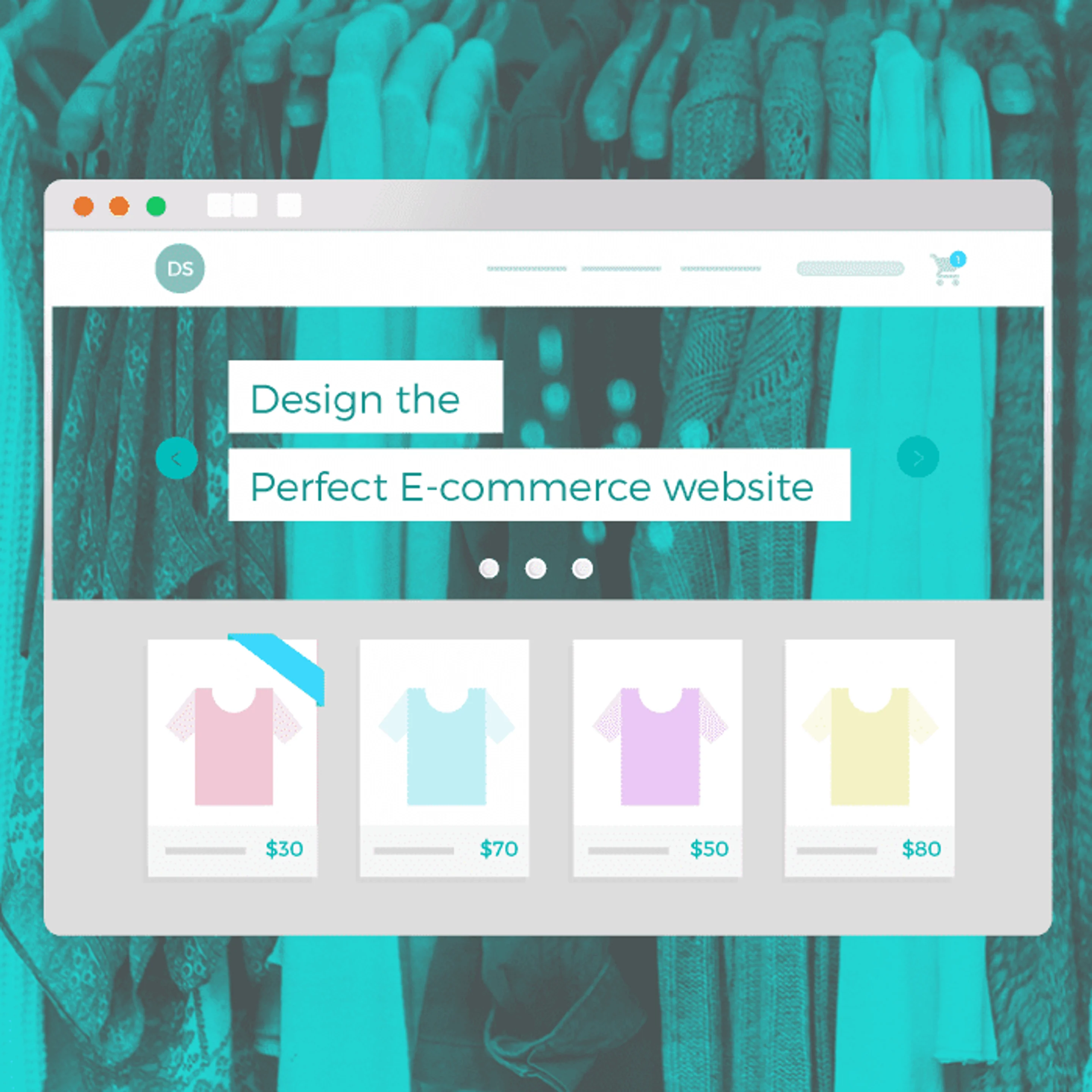
If you can’t blow them away, you won’t get them to stay.
With 2015 expected to blast past last year’srecord setting mark of $1.4 trillion(opens in a new tab or window) in global online sales, the pressure is on for businesses to create visually appealing ecommerce websites that deliver exciting visual solutions and quick and easy shopping experiences for their consumers.
Gorgeous websites draw in customers and increase the perceived value of the goods or services being offered. The task of designing an ecommerce website, however, need not be intimidating. Check out our list of 45 beautifully designed ecommerce websites from a variety of industries showcasing different layouts to serve as inspiration for your next project.
01. Use Bold Colors and Big Product Shots

Bose

Bose
New From Bose(opens in a new tab or window) serves up a horizontal layout featuring 5 of the company’s newest headset pieces. Bold, flat color backgrounds paired with a curated selection of imagery play up the products being offered, allowing them to take center stage.
02. Less is More

ETQ Amsterdam

ETQ Amsterdam
ETQ Amsterdam(opens in a new tab or window) specializes in footwear that is “generated under three standard rules: elegant, timeless, and quality.” The company certainly followed the same 3 rules when designing its online shop. Its modern aesthetic is achieved through the use of clean typography, a muted color palette, large imagery and subtle animation. Ultimately uncluttered, it contains only the bare content needed for a customer looking to acquire a pair of new kicks.
03. Use Large, Beautiful Typography

Brdr. Krüger

Brdr. Krüger
Woodturning companyBrdr. Krüger(opens in a new tab or window) sets product names and important headlines in Gotham in a large point size over full screen images. The large type also translates beautifully into mobile.
04. Design with Grids For Structure

Chris Niedenthal

Chris Niedenthal
Chris Niedenthal(opens in a new tab or window) uses a grid system to display his many years of work. It provides the website with structure, scalability, and a variety of display options in harmony with each other throughout the website.
05. Experiment With Form And Function

Chickenbot

Chickenbot
Who said menu options have to be dull?Chickenbot,(opens in a new tab or window) an Italian chicken delivery service, uses a hamburger menu that expands into a gorgeous, full screen, vibrant orange list of options. An excellent alternative to the sometimes dull drop down and sub-menu option.
06. Minimize Navigation

My Deejo
My Deejo(opens in a new tab or window) designed a website that allows customers to fully customize their product without ever having to leave the page they land on. Customers are presented with a variety of options that work with drop downs and radio buttons. Once they are satisfied, they place their order.
07. Build Interaction

Emporium Pies

Emporium Pies
Emporium Pies(opens in a new tab or window) is a sweet online bakery. It reveals information about each of its pies as customers hover over them, transforming the content of each pie into an information section.
08. Introduce Your Products

JM & Sons

JM & Sons
Canadian furniture makers,JM & Sons(opens in a new tab or window) designed a product section loaded with images of the items they are selling. Customers can look at products from many different angles, satisfying any curiosity they might have. This helps alleviate the difference felt between holding the product in your hands and purchasing it online.
09. Use Heaps of White Space

Best Made Co

Best Made Co
Best Made Co(opens in a new tab or window), an outdoor apparel store, created a layout that surrounds its products with white space, making the website feel clean and uncluttered even when it has a vast inventory.
10. Implement Custom Lettering

Leather Head Sports

Leather Head Sports
Leather Head Sports(opens in a new tab or window) creates beautiful leather sports goods. They also have a sweet header on their ecommerce website featuring custom lettering. The piece sits centered above a delicate row of navigation links. A classic and tasteful way to personalize your ecommerce website.
11. Use Color Accents To Highlight Important Information

Longboard Living

Longboard Living
Color accents are an excellent way to highlight calls to action, actionable pieces of UI and to add attractive visual elements to a website.Longboard Living(opens in a new tab or window) does all 3, using a bright teal on all calls to action, its side menu and as part of its design elements.
12. Make Your Site Easy To Navigate

LEIF

LEIF
The design of the LEIF(opens in a new tab or window) website makes it really easy for customers to find what they’re looking for, by providing a regular search option that allows them to type in what they are looking for and an option to browse through items using filters.
13. Use Informative Headers

Graze

Graze
Snacking company Graze(opens in a new tab or window) does a great job of letting you quickly recognize the variety of products they carry. By creating a header that showcases a number of the products they offer, customers are able to quickly glean the site and head straight to their favorite nom noms. The typography is appropriate, as it feels laid back and friendly, like Graze’s snacks.
14. Give Prominence To Customer Support

Farmdrop

Farmdrop
There is nothing more frustrating than endlessly searching an ecommerce website for contact information.Farmdrop(opens in a new tab or window) makes it easy for customers to get in touch with them, by making sure a chat bubble displays on the bottom right hand side and further contact info at the top are on display always.
15. Have Fun With Product Illustrations

Vertty

Vertty
Towel maker Vertty decked out its landing page with illustrations of all the variations of the product it offers. The illustrations are of course representative of the towel and add a playful and laid back look to the website.
16. Use Tiled Layouts

Oliver Bonas

Oliver Bonas
Oliver Bonas(opens in a new tab or window) uses large tiles on a grid to present diverse pieces of information, in one place. Because each tile is part of a grid, all the pieces feel like part of a whole, yet hold different pieces of information revolving around the brand.
17. Complement Product Photography With Video

Bellroy

Bellroy
Bellroy(opens in a new tab or window) added small clips of the products they sell into their product descriptions. This affords customers the opportunity to see the product they might purchase being handled, satisfying any curiosity they might have about the item.
18. Use Textured Backgrounds

Dollar Shave Club

Dollar Shave Club
Dollar Shave Club(opens in a new tab or window) uses textured backgrounds as branding element as a way to separate sections. It gives the website a slightly brash and masculine look, spot on with its target market.
19. Use Accordions for Heavy Text

Hard Graft

Hard Graft
Hard Graft(opens in a new tab or window) does a great job of filling in customers with all the important details about their products. To tackle heavy text without sacrificing aesthetics, Hard Graft uses accordions, allowing them to provide extensive details on their products while keeping a slick UI.
20. Use Video Instead of a Hero Image

Cook Mellow

Cook Mellow
Videos(opens in a new tab or window) are a great way of sharing vast amounts of information on an ecommerce website without making the infinite scroll infinite, or adding tons of pages. Cook Mellow displays a video instead of a hero image, beautifully designed and informative. It can also turn any kitchen putz into a Gordon Ramsey.
21. Offer Multiple Sidebar Menus

Carolina Herrera

Carolina Herrera
Spice up complex menus that require drop downs and sub menus. Carolina Herrera(opens in a new tab or window) provides a fantastic alternative to the typical drop down by utilizing a sidebar with a secondary menu. The difference in color is a great way to signal a sub menu and create a visual difference that makes the site easier to navigate.
22. Offer Cart Management Without Leaving the Page

Everlane

Everlane
Customers returning to your website to make a purchase may not want to have to go through all the clicks again.Everlane(opens in a new tab or window) does a fantastic job of providing a way around this by allowing customers to hover over an item, selecting a size, and adding it to their bag, all without ever leaving the page they are currently browsing.
23. Use A Stark Layout

Helmut Lang

Helmut Lang
Helmut Lang(opens in a new tab or window) is an Austrian fashion designer who initially set up a made-to-measure studio in Vienna. With a very stripped down look, the designer’s online retail draws its elegance from its brutal simplicity, including only what is most import to those landing on his website: his collection.
24. Use Sliders as a Header

Groovemade

Groovemade
Groovemade(opens in a new tab or window) makes sweet accessories for the every day and maximizes use of page real estate by turning its header into an informative slider. This affords the site a dynamic space that is ever changing, and allows the user to quickly browse through information and products without even having to scroll.
25. Play With Top View Photography

Munchery

Munchery
Munchery(opens in a new tab or window) uses top-view photography throughout its entire website. The style, trending throughout the year, provides a fresh view of the products Munchery offers. Being food based, it is a beautiful way to depict the entire dish while creating astounding photographic compositions.
26. Complement Product Colors with the Website Palette

Harry’s

Harry’s
Stylish razor companyHarry’s(opens in a new tab or window) created a website utilizing a palette that perfectly matches the products it is offering. The colors used as backgrounds, in calls to action, and throughout the entire site go hand in hand with the orange, brown and deep blue that characterize the Harry’s products.
27. Give Informative Product Summaries

Beo Play

Beo Play
Beo Play's online retail shop offers product summaries that are beautifully tiled and hold relevant information. While most summaries display a name and price tag, Beo Play offers up information on stock, special editions, and new collections.
28. Offer Interactive Scrolling

Pencil by 53

Pencil by 53
Pencil by 53(opens in a new tab or window) is 53’s revolutionary stylus. Their slick online store offers an infinite scroll with interactive pieces that break down all the components and revenant information about Pencil. Customers are told a story about their product through large, beautiful typography and excellent photography.
29. Create Patterns with Products

Aark Collective

Aark Collective
Aark Collective(opens in a new tab or window) presents a thoughtful website packed with patterns and images made with their own products. Instead of using traditional product photography featuring the product in use or solo, Aark Collective created patterns and compositions using their watches. Pair it with clean type and a serene color palette and you have a slick, unique website.
30. Provide A 360 Overview

Bagigia

Bagigia
Bagigia(opens in a new tab or window) is a high end bag made in Italy. Its website uses a 360 degree view feature to showcase the product. Color is used strategically and only to show variations of the product.
31. Use A Classic Grid with a Twist

Diesel

Diesel
Diesel(opens in a new tab or window) uses a symmetrical, traditional grid to showcase its items. To change it up a bit, the website overlays white tiles on a textured background. A great example of how a classic solution can be made to feel modern with one simple detail.
32. Integrate Social Media and Sharing

Vanmoof

Vanmoof
Vanmoof(opens in a new tab or window)makes it easy for customers landing on their site to share their excitement about the brand. The beautifully designed ecommerce website is fully integrated with social media channels, and lets customers seamlessly share as they shop.
33. Rethink Drop Downs

The Horse

The Horse
The Horse(opens in a new tab or window) provides a great example of how drop downs do not have to be purely typographical. By including product photography, the website’s menu becomes instantly informative, interesting and beautiful. The row of watches is a nice surprise and a great departure from rows and rows of text.
34. Use Editorial Inspired Design

Mr Porter

Mr Porter
The Mr Porter(opens in a new tab or window) ecommerce website is reminiscent of the old publications’ grids. The bold black stroke under its main navigation marks a clear division between navigational items and content. Although its serif face tends to get lost on some images, the pairing between serif and san serif faces throughout the site is superb.
35. Implement Stackable Interfaces

Travel Alberta

Travel Alberta
Travel Alberta(opens in a new tab or window) “stacks” web pages as you click through. You can return to the previous page by clicking an “x” on the right hand corner. It lets you see your progression through the site and serves as breadcrumbs.
36. Use Dynamic Product Photography

Nike Jordan

Nike Jordan
Nike Jordan(opens in a new tab or window), part of Nike’s line, makes use of dynamic product photography, characteristic of the brand. The photographs tell customers stories. Paired with bold typographical choices, the Nike Jordan site feels strong, masculine and, of course, sporty.
37. Feature Oversized Product Photography

Warby and Parker

Warby and Parker
Warby and Parker(opens in a new tab or window) uses extra large photographs of its products. It’s refreshing and playful and leaves no doubt about what a product might look at. It displays beautifully on mobile.
38. Integrate a Seamless Check Out

Coin

Coin
Coin gives its customers one of the greatest ecommerce gifts of all time: a painless checkout process. ‘Nough said.
39. Contrast With Stark Colors

Capellos

Capellos
Capellos uses black and white consistently across many of its delicious pasta products. Its website follows the tune, reserving color for calls to action and other actionable sections, maintaining harmony with the products it features.
40. Implement a Type-centric Design

ECC Lightning & Furniture

ECC Lightning & Furniture
With the use of large photographs trending, it is easy to forget how beautiful a website can be when it is type-based.ECC Lightning & Furniture(opens in a new tab or window) presents a site with large black typography, delicate linework, and minimalist product photography. Almost like walking into a gallery.
41. Design with Templates

Deliveroo

Deliveroo
Nom nom specialistDeliveroo(opens in a new tab or window) has a number of vendors across a few cities globally. The food delivery start-up uses templates to present each vendor and its menu. In doing so, it achieves consistency and familiarity across the entire site.
42. Introduce Storytelling

Maple
Revolutionary NYC restaurant Maple uses video on its website to tell its story. Coupled with big, bold, beautiful type, the videos give customers a direct view into the restaurant’s fast paced kitchen and story.
43. Use Iconography to Represent Products

Visual Supply Co

Visual Supply Co
Visual Supply Co(opens in a new tab or window) represents its products using color blocks and numbers. While it may not always be the right solution for every ecommerce website, some stores may lend themselves to the use of iconography to represent products, categories or features.
44. Make it Easy to Customize a Product

Le Coq Sportif

Le Coq Sportif
Le Coq Sportif(opens in a new tab or window), a sports apparel company, makes it terribly easy for users to select color, size and quantity on their site. Options are clearly labeled and large enough to be clickable.
45. Deliver All in One Interactions

Hunters Wine Shop
The Hunters Wine Shop lets you browse through items, decide on quantity and add it to your cart all on the page you land. The site is easily navigable and refreshingly concise.
Start Designing!
There you have it, folks— 45 of the most visually appealing and effective ecommerce websites currently online. If you think we missed some, let us know in the comments section, below.
Otherwise, happy designing!

Written by
Maria Jose

")


