- Big and bold: 10 ways to create amazing maximalist design
Big and bold: 10 ways to create amazing maximalist design
Throw “less is more” out the window and subscribe to a “more is more” approach.
Go big or go home, so the saying goes, and that’s certainly the maxim that applies to maximalist design. So forget what you know about modernism and minimalism. Ignore functionality and rationality. Leave white space at the door, and kiss Helvetica goodbye.
When it comes to maximalist design, it’s all about decadence, excess, and extravagance, so be courageous with color, play with pattern, and create mesmerizing motifs. Here’s how to make amazing maximalist design.
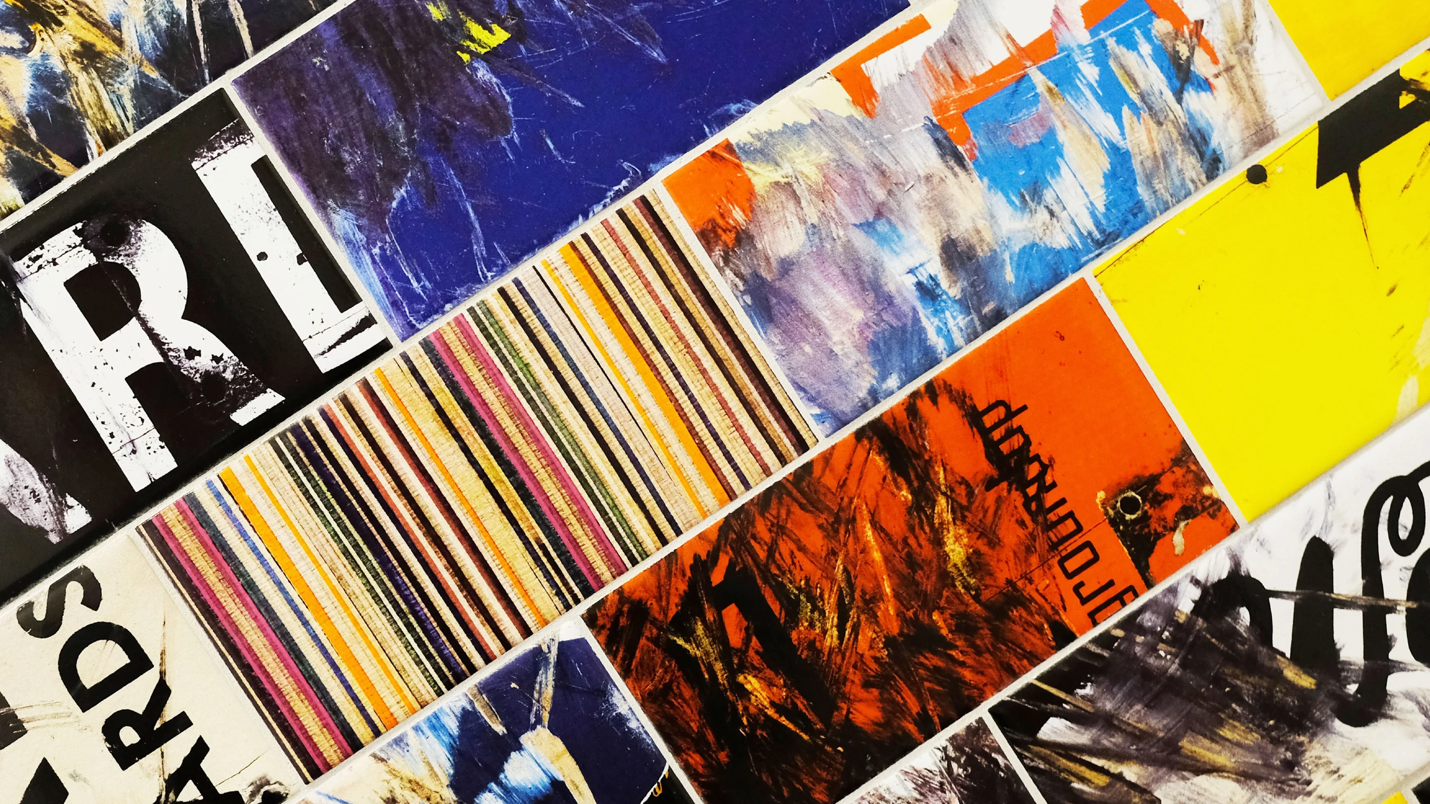
01. Be Brave With Color
Maximalist design has no fear of color combinations; in fact, the more outrageous the better. Use bold, bright, and saturated hues and experiment with clashing color palettes. Hot reds, pinks, and oranges prove to be maximalist faves.

Hattie Stewart
‘Professional doodler’ Hattie Stewart(opens in a new tab or window) is famed for her colorful creations and vibrant adulterations of glossy magazine covers. Here, she uses a rainbow of saturated color that includes purple, blue, red and green on the cover of i-D magazine.

Gosia Stalinski
This CD cover by Gosia Stalinksi(opens in a new tab or window) has a definite 80s vibe – and name for that matter. The rich red stroke is balanced out by the contrast of cool blue (perhaps signaling the ‘hot’ and the ‘wave’) and a touch of yellow to round out the primary colors.

Milk Magazine
The cover of Milk Magazine(opens in a new tab or window) is definitely taking its style cues from 1980s sitcom character Punky Brewster(opens in a new tab or window). It’s tenth anniversary issue features two female models wearing an array of playfully clashing colors posed on a paint-splashed background. To great effect the masthead is styled as white space atop the densely colored image.
02. Play With Patterns and Motifs
Patterns and motifs can be just as bold and contradictory as color when it comes to maximalist design. However, as much as they may clash, aim for consistency across the pattern palette or color scheme to ensure harmony and integrated design.

Atelier Bingo
French design studio Atelier Bingo(opens in a new tab or window) uses a variety of patterns that look hand-drawn or hand-cut, creating a series of images with Caribbean connotations. While each image is different, the color palette is as consistent as the seemingly erratic layouts.

Futura
Hennessy teamed up with New York graffiti artist Futura for a new – and limited edition – take on the iconic Hennessy V.S. label. A grape vine forms the border while the edition’s circular emblem appear scribbled across the red label.

Steve “ESPO” Powers
Of course, not every pattern has to be regular and repeated. Irregular patterns lack formal arrangement, balance, and harmony, just like artist Steve “ESPO” Powers(opens in a new tab or window)’ remix of Kanye’s minimalist Yeezus CD cover. A consistent color palette keeps the individual images in harmony, as does the playful style of illustration.
03. Repeat, Repeat, and Repeat Some More
Nothing like a little repetition to get the point across, especially when used for aesthetic effect as it is in maximalist design.

Julie Verhoeven
Artist and designer Julie Verhoeven(opens in a new tab or window) created these stunning labels for the Royal College of Art Wine by rearranging vividly-colored facial features into different compositions repeated on each bottle.

Broll and Prascida
A skateboarding rooster certainly seems like an absurd idea (although it’(opens in a new tab or window)s been done(opens in a new tab or window)), but transformed into a well-executed and repeated motif you have one sure-footed bird. Broll and Prascida(opens in a new tab or window)’s packaging design has vibrant red, blue, and pink accents that pop on a black-and-white illustration.

Asketic
A range of clashing and repeated patterns characterizes this line of packaging. Asketic(opens in a new tab or window) created a “library of illustrated patterns derived from unique places around the world” and each box combines and contrasts two patterns. They all celebrate color and have a hand-drawn feel.
04. Create Optical Illusions
Optical illusions are where the visual perception of images differs from objective reality. When used in maximalist design, optical illusions bamboozle the eye and force the brain to take its time processing the image.
The result? Viewers will need to soak in the glory of the imagery just that much longer to understand the message and meaning.

Homa Delvaray
Homa Delvaray(opens in a new tab or window) designs unique 3D typography to great optical effect. Her script typography not only transitions between appearing to lay flat versus standing upright, they also twist and turn across the page.

The Royal Studio
Almost anything goes on this piece by The Royal Studio(opens in a new tab or window). It has vivid color, erratic scribbles, and a black-and-white pattern of optical illusions.

Pichet Rujivararat
Pichet Rujivararat(opens in a new tab or window)’s design for the cover of kult magazine’s ‘Film’ issue certainly requires a second, if not a third glance, to better understand the image.
Steve Lawler, editor of kult, encourages maximalist design explaining(opens in a new tab or window), “we do embrace the sort of chaotic, mad, maximalist type of artists because I think it’s hard to mimic.”
05. Fill the Page
While white space and breathing room is a rigid rule of modernist and minimalist design, there’s certainly no desire for it here. Maximalist design fills nearly every inch of the page – if not all of it – leaving barely a space uncovered.
However, remember it’s not about filling the page for the sake of it. Rather it’s about creating a fully integrated piece of design.

Evergrunge
Evergrunge(opens in a new tab or window)’s cover may not have the bright colors we’ve seen so far but it certainly has the excess and exuberance associated with maximalist style. The almost three-dimensional imagery covers every ounce of the page with a complex and elaborate illustration.

Marie Denise Leighton
Likewise, Marie Denise Leighton(opens in a new tab or window) has got it covered. Aptly named ‘Anything Goes,’ her design is an homage to postmodern design. It includes quotes from grunge-master David Carson, splattered acrylic paint, scanned and manipulated images, and deconstructed typography.

Will Miller
While there is white space on Will Miller’s(opens in a new tab or window) postcard, it dedicates most of its legroom for typography in a multitude of fonts and font sizes.
06. Layer Those Images
Layered graphics help produce the dense look and feel of maximalist design. They not only add depth to the design, but also decadence. As Charlotte Rivers describes in her book, Maximalism: The Graphic Design of Decadence and Excess(opens in a new tab or window), “maximalism celebrates richness and excess in graphic design.”

IdN Magazine
This cover of IdN Magazine(opens in a new tab or window) is appropriately for an issue dedicated to maximalist design. The graphics are layered and manipulated in such a way they appear to represent a cityscape — the conclusive interpretation is up to the viewer, however.

Kitkat Pecson
This is Kitkat Pecson(opens in a new tab or window)’s portrayal of her move to New York City. It features many of the city’s great landmarks as well as pop culture associations and vernacular architecture, while shadowed lines reinforce the sense of dense layering.

We Are Grown Up
Thomas Burden of We Are Grown Up(opens in a new tab or window) executed this incredibly clever cover for Norwegian Airline’s inflight magazine N, turning it into a Budapest-themed pinball machine.
The masthead ‘n’ is fully integrated into the design and the various elements represent symbolic pieces: the Danube river, thermal baths, tram, House of Terror, and even some bullet holes from the war.
07. Collage It Up
On a similar note, creative collage will have you cutting and pasting to your heart’s content. Collage could also mean layering graphics while blending different images to create a consistent image, meaning, and message.

Ayla Meridian
This maximalist collage by Ayla Meridian(opens in a new tab or window) is for jewelry brand Von Mazur. It is inspired by the favelas of Brazil in which the housing, much like the collage, is layered on top of each other. However the actual images are much more tropical, evoking Brazil’s vibrant beach culture.

Leva Luka
Hereford College of Arts(opens in a new tab or window) runs a workshop on maximalist graphic art in which students look at the methods behind maximalist design and produce their own experimental piece. Leva Luka designed these great collages that combine black-and-white fashion imagery layered with other cut images to reinterpret their meaning.

Jade Stickle
Even though this is produced with layered 3D graphics, the layered images positioned on a variety of angles and planes create a collage effect. Jade Stickle(opens in a new tab or window) designed it for her holiday card and says it is “inspired by Japanese maximalist fashion and idols such as Kyary Pamyu Pamyu(opens in a new tab or window) and Sebastian Masuda(opens in a new tab or window).”
08. Create Fantasy
Maximalist is as much about fantasy and as it is about excess, and helping create that fantasy are vivid colors, showy patterns, decadent imagery, and rich design. So whether you’re creating another world or a fashioning a brand image, let your fanciful imagination rule.

Daryl Feril
Alexander McQueen was certainly a designer who knew how to fashion a fantasy world, and Daryl Feril(opens in a new tab or window) has created a maximalist design that pays tribute to that sense of fantasy. The red and black color palette is dramatic, the fine illustration intriguing, and the overall design exquisite.

Laprisamata
This music poster by Laprisamata is equally detailed, elaborate, and fantastical. Illustrations recall nature as well as historic beings, with an array of Islamic and medieval motifs layered over top. Check out the rest of Laprisimata’s portfolio(opens in a new tab or window) for more fantastical maximalist design.

Stranger & Stranger
As specialists in packaging design for alcoholic beverages Stranger & Stranger(opens in a new tab or window) know how to do great labels. This one is inspired by VML’s approach to wine production, which seeks to be harmony with the local environment. The intricate and dynamic illustration captures their respect for nature and nurture.
09. Take a Postmodern Approach
Postmodernism design(opens in a new tab or window) was a reaction against modernism and its rigid rules. A postmodern approach – much like maximalist design – ignores traditional conventions in favor of expressive and playful graphic design that often references historic design and/or combines high culture with pop culture.

Mojoko
Steve Lawler(opens in a new tab or window)’s poster for exhibition House of Mojoko is a cut-and-paste parade of pop-culture and traditional culture. Divided into four sections, each area is layered with images that represent “B-movie trash culture, smashed together with traditional Asian Culture.”

Chris Chang
MAC make-up is a brand at the forefront of popular and fashionable make-up. Shanghai-based fashion designer Chris Chang collaborated with MAC to create a fantastical, maximalist design that takes a postmodern approach.
He combines vibrant color with inspiration derived from the “traditional aesthetics of ethnic tribes and costumes from various countries, as well as the transformative world of art,” says Chang(opens in a new tab or window), to create packaging for modern women.

UnderConsideration
Graphic Design, Referenced is a visual and informational guide to graphic design terms, historical moments, projects, and influential designers. The colorful patterns filling the typography on the cover, designed by UnderConsideration(opens in a new tab or window), reference the projects, moments, and designers inside the book.
10. Create Organized Chaos
A great way to think of maximalist design is as ‘organized chaos.’ Indeed, color, pattern, repetition, imagery, and collage can all be used to capture attention, appeal to the senses, and convey a message.

Paula Scher
Award-winning designer Paula Scher(opens in a new tab or window) is queen of typographic design with her complex works that never sacrifice ‘good design.’ In her side project, Paula Scher: Maps(opens in a new tab or window), the designer creates hand-painted maps that transform the boring into the beautiful. Organized chaos indeed.

Jacob Barrick
There is meaning to the madness with Jacob Barrick(opens in a new tab or window)’s vibrant First 2015 catalogue. “The inspiration came from the publication itself,” says Jacob. “In the previous year, each spread contained four images for various artists.
“I wanted my design to reflect the theme of having all this work mashed together. Using competing styles, colors, and design elements, I built a cover as energetic as the work inside it.”

Resn
Resn(opens in a new tab or window)’s website is a firm fave when it comes to organized chaos. It has vibrant and layered imagery, patterns and optical illusions, random graphic references, and content that sets it apart from the rest.
Your turn
Feel like you need to break the chains of modernism? Then max out your creative potential by experimenting with maximalist design. While you need to be sure you apply it to an appropriate brand so it resonates with the audience, in a world of graphic design ruled by minimalism, a maximalist approach will be sure to capture attention.

Written by
Rebecca Gross

")


