- 25 free wedding font combinations to give your special day a touch of elegance
25 free wedding font combinations to give your special day a touch of elegance
Between save-the-date cards(opens in a new tab or window), wedding invitations(opens in a new tab or window), place cards and more, there’s a lot of text involved in tying the knot.
We know it can be overwhelming to plan all the tiny details of a wedding, and we want to help you avoid stress when it comes to all things font-related. There are tons of free fonts out there, but sifting and sorting through them can be extremely time-consuming.
Whether you’re going for a sophisticated script, a clean, modern look, or a handwritten style, you’ll definitely find a perfect match with your wedding day. And if you read this together with our ultimate font pairing(opens in a new tab or window) article, you’ll master the art of combining fonts in no time.
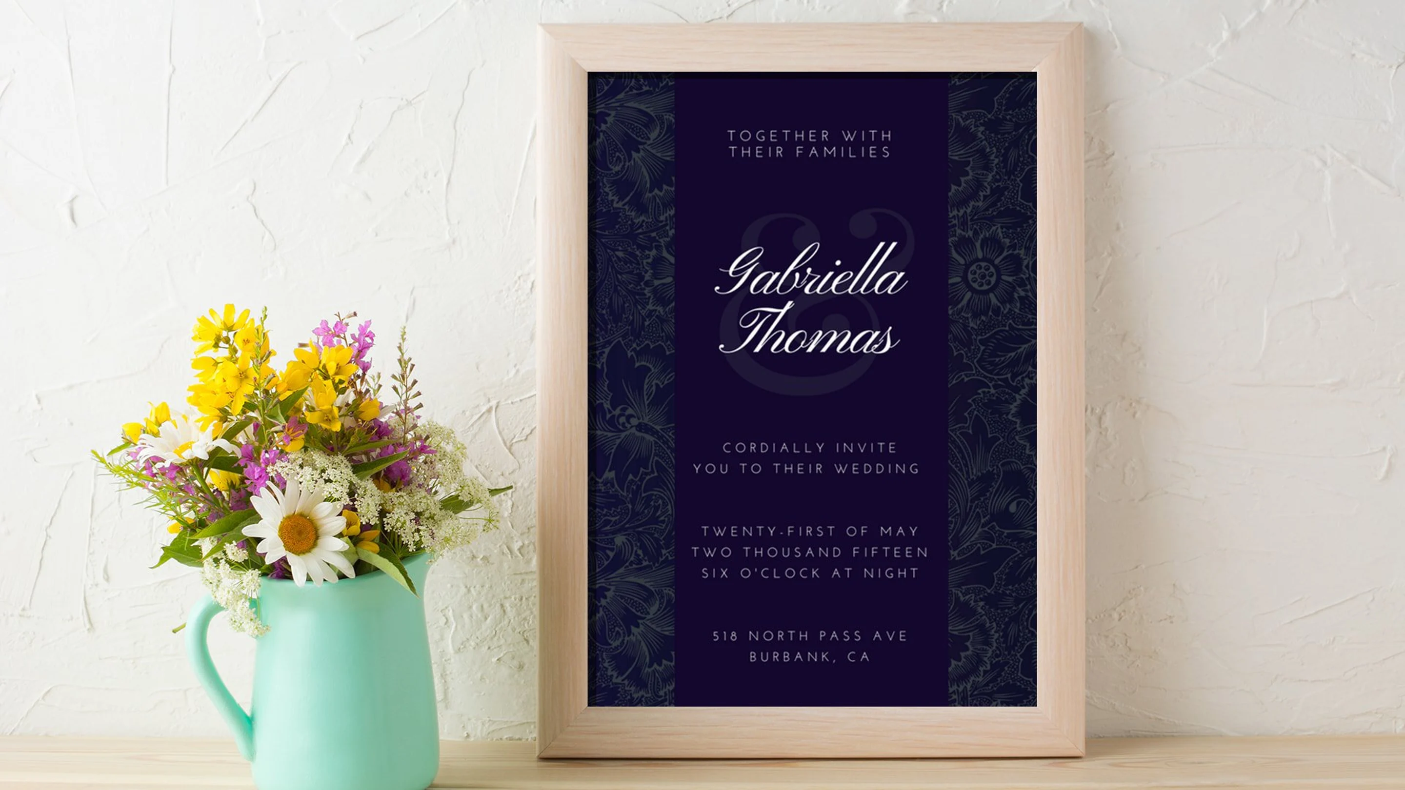
01. Great Vibes + Montserrat

This is a classic wedding invite combination: a cursive font paired with a sans serif. For a cursive font, Great Vibes is one of the most easy to read. Its subtle slant, medium weight, and even x-height make for great accessibility in the form of elegant letterforms. Montserrat balances the header’s round features with its uniform, straight lines.
With slanted letterforms, you can tip the angle a little bit — this adds interest to your design without compromising the readability of your text.
Related: Generate your own poem(opens in a new tab or window) for your loved ones and use all these beautiful fonts.
02. Playfair Display + Montserrat Light

Serif fonts have a timeless appeal, and so will your wedding invite if you choose this font pairing. Playfair Display is an classic-type serif font, with subtle transitions between its thick and thin lines. Accentuating it in this design is Montserrat Light, its even linearity playing off nicely with the upright structure of Playfair without overpowering it.
The italicized lines nuance the main font pairs and serves as a subheading without resorting to a third font.
03. Josefina + Times New Roman

This font pair is a bit like a flip of our previous combination. Josefina, a sans serif font, serves as the main headline while the serif font gets a supporting role. This works because Josefina’s line weight doesn’t lose out to Times New Roman’s and makes for a harmonious hierarchy.
The sleek font also works well with the design — the sharp edges of the multiple borders reflect the Josefina’s sharply angled form. On the other hand, its basic geometric look contrasts nicely with the free-flowing illustrations in the border.
04. Montserrat + Hammersmith One

We’ve seen Montserrat win at supporting roles, but it does just as well in the lead. In this combination, Montserrat takes on a bold physique — but so does its partner font, Hammersmith One. Any other font would have either been overpowered or competed in the hierarchy, but Hammersmith One has just the right weight to pull off the pairing. Together, the strong fonts stand out from its photographic background.
05. Bodoni + Josefin Sans

Bodoni is a modern font — meaning there’s a high contrast between the thick and thin strokes, and the serifs are completely flat. Josefin Sans, on the other hand, is a geometric vintage-inspired font. Together they’re a vintage-contemporary pair that works perfectly with simple designs.
06. Playfair Display + Montserrat

This is another take on the Playfair Display and Montserrat combo. Unlike its all caps rendition in the first one (font pair #2), Playfair is in sentence case here. The letterforms are in a bold format to emphasize Playfair Display’s beautiful letterforms, which acts as the core adornment of this minimalist design. Montserrat supplies the details of the wedding in its usual stylish and functional subheadline form.
07. Josefin Sans + Josefin Slab

This pairing proves that you don’t have to look far for the perfect pair — they might just be right next to each other in the font menu. Josefin Sans and Josefin Slab are similar, but with the right ratio of sizes, spacing, and formattign of text, the two types can nuance each other as if they’re not from the same font family.
08. Pinyon Script + Forum

If you’re looking for a classic look for your wedding invite, look no further. Pinyon Script is the just the font you’d find at royal weddings. Pair it off with a serif type like Forum and a bit of gold, you’ll get a classic wedding invite perfect for traditional weddings.
09. Vidaloka + Lato

Vidaloka is also a modern-type serif font like Bodoni, only a bit thicker and wider set than the latter. Designs with bold illustrative elements — like the two women in the above example — must be complemented with a strong headline font, lest it be lost in the invite. The lightness and simplicity of its complementary font, Lato, softens the color blocks created by the main elements.
10. Playfair Display + Arialle

Playfair Display is best for simple or minimalist designs. It’s decorative quality must be balanced off with light and simple fonts — in this case: Arialle. Notice too how the round tips of Playfair play off the polka-dot design, while the combined visual weight of the two fonts balances the weight of the invite’s top half. (Good design is deliberate!)
11. Pacifico + Open Sans

This is an unusual choice for a wedding invitation, but it works well for non-traditional weddings. In this design, the connecting letterforms and overall playfulness of Pacifico require the tough, basic look of a font like Open Sans.
12. Aleo Light

This is one example of a design that cleverly uses just one font to an effect that’s anything but monotonous. A slab serif font like Aleo Light offers a lot of structure, but the text boxes enhance the hierarchy and play up the geometric look of the whole design.
13. League Gothic + Kollektif

The alternate placement of a heavy font with a light one creates rhythm in a design. Add that to the motion created by the lines and you’ve got one modern, dynamic wedding invite.
14. Anonymous Pro + League Gothic

This design cleverly uses typography as a background design element. League Gothic was used to pull off this trick — it partially disappears into the background because of the colors but at the same time its amplified bold form. The slab serif font Anonymous Pro was used as the foreground type to add nuance to the design.
15. Montserrat

This minimalist design banks on color and subtle differences in scale to create emphasis. The selective color application on symbols serves to create divisions between relevant pieces of text. It’s an excellent example on how to create variation with just one font.
16. Sifonn + Forum

This wedding invitation is a perfect example of balance and contrast. First off, the geometric font, Sifonn, is juxtaposed with a foliage element maximizing curves and s-shapes. It was also blown up to balance the visual weight of the foliage. Forum adds a nice touch by offsetting the geometric structure of Sifonn.
17. Norwester + Roboto

Norwester is an attention-grabbing font, used to stand out from the bright orange background. This geometric font stacks up nicely with Roboto, especially because of the keyline aiding the text. The color block at the bottom works double to emphasize the RSVP date and to balance the headline.
18. Mr. Dafoe + Anonymous Pro

It’s best to use distinct calligraphic font like Mr. Dafoe on short lines, that way it doesn’t clutter the design. In this wedding invite, it was used as the central design element by blowing up the headline size and coloring it white against a dark background. The secondary font, Anonymous Pro is a contrasting font — that way it complements the main font and still grabs attention while sitting in the background.
19. Pinyon Script + Josefin Sans

Using a script-type font on a wedding invitation is a classic choice. In this design the script in question — Pinyon Script — is offset and given a contemporary touch by its partner font, Josefin Sans.
20. Vast Shadow + Roboto Condensed

In the tradition of the slab-justified design trend, here’s a wedding invitation that combines two geometric fonts to get the look: Vast Shadow and Roboto Condensed. To get the look, they were stack with the help of keylines.
Free Downloadable Fonts
You can find more fonts for your wedding invite all over the web—and they’re free! If you have Canva Pro(opens in a new tab or window), you can upload fonts in the system and use them for any of your designs.
We’ve put together five fonts that can be used for traditional or modern wedding themes. Happy designing!
01. Champagne and Limousines + Libre Baskerville

Download Champagne & Limousines
This delicate and flexible sans serif font designed by Lauren Thompson(opens in a new tab or window) is one of the best balanced fonts out there. It comes in a variety of weights (regular, italic, bold, and bold italic) and is free for personal use.
02. Minna Drop + Kollektif

Download Minna Drop
This charismatic font, created by Vanessa Bisky(opens in a new tab or window) and Romy Fey(opens in a new tab or window), is a classy serif with a unique twist. Teardrop letter endings add a bit of pizazz while maintaining an overall sophisticated look.
03. Nickainley + Quicksand

Download Nickainley
Created by Seniors Studio(opens in a new tab or window), Nickainley is a great cursive or “joined-up” style font. Slim lines and rounded edges keep the design clean, which lends itself to multiple uses in various wedding projects.
04. Simplifica

Download Simplifica
This beautiful sans serif font by KAIWA(opens in a new tab or window) is easy to read, simple and polished, making it the perfect choice for the text in a wedding program or the small print on an invitation.
Related: You can also find programs for wedding templates here!
05. Sophia

Download Sophia
Although heavier than Mightype, this super-sweet handwritten brush script by Mats-Peter Forss(opens in a new tab or window) and Emily Spadoni(opens in a new tab or window) is charming on its own, but the cherry on top is that it comes with extra swirly decorations to take your design to the next level.
Need to find the perfect fonts for your big day? Design wedding invitations(opens in a new tab or window) online with lovely typography and elements that you can personalize and print from Canva.


")


