- 10 color inspiration secrets only designers know about
10 color inspiration secrets only designers know about
Color is an integral element of good design. With so much psychology and emotions attached to the hues you choose, it can be tricky to curate your color palette when designing. Below, we list 10 color inspiration secrets so that you can get the perfect color combination every time.
We know that specific hues can provoke different emotions, associations, and responses that affect how your brand is perceived. Put simply, color choices can make or break a design. In fact, research has shown that color can increase brand recognition by up to 80%, memory, engagement with a design piece and text comprehension, so when choosing a color combination(opens in a new tab or window) for your design (especially your logo(opens in a new tab or window)!), you want to make sure that you are saying something with the colors you choose.
Fortunately, we are far from the times when our color choices were limited to a small batch of natural pigments. Our options are no longer whatever colors minerals, animals, and plants had to offer. With such an overwhelming amount of color options, selecting a palette for a design project has become excruciating, to say the least. The Colourlovers community has indexed nearly 8 million user-named colors(opens in a new tab or window), while there are over 16 million possible hexadecimal color combinations.
While there are endless color choices, it's recommended that when designing, it's best to stick to three or four colors. This will create the color palette you work with.
Overwhelmed yet? No need to worry. We asked top designers from the Creative Market(opens in a new tab or window) community to share their advice for creating stunning color combinations(opens in a new tab or window).
01. Capture inspiration on-the-go.
When looking for inspiration for a color combination, Callie Hegstrom, the talented designer behind Make Media(opens in a new tab or window), suggests taking photos of beautiful colors:“I snap photos of gorgeous color schemes (like flowers, or sunsets), and later sample those colors directly in Photoshop or Illustrator. It’s also a great way to match text or graphics with any photo you’re working with to make sure your work is cohesive.”
So, if you have a photograph with a color scheme that you love, sample colors directly from it to make a quick, easy and effective palette. Tools like Photocopa(opens in a new tab or window) make this technique even easier. Simply upload your image, explore the different hues that make it up, and build a stunning color palette in no time at all.


Manhattan Darling Typeface
Callie Hegstrom (@MakeMediaCo) gets her inspiration from real-life color palettes.
Get the look with these templates:Pink Flower Social Media Graphic(opens in a new tab or window) and Pink Cherry Blossom Flower Instagram Post(opens in a new tab or window)


02. Use a color wheel
Artist Marc Chagall came up with a pretty amazing quote to remember what works in terms of color combinations:“All colors are the friends of their neighbors and the lovers of their opposites”. In this case, “Friends” stands for analogous colors:Those that are side by side on a 12-part color wheel(opens in a new tab or window). On the other hand, Chagall refers to complementary colors as “Lovers”; tones that are directly opposite each other on the wheel.

Cindy Kinash, the Vancouver-based designer behind Cultivated Mind(opens in a new tab or window), explains that “when painting watercolor flowers, a good way to show shadows is to add an analogous color.”

Mulberry Script
In this piece by Cindy Kinash, light blue is paired with darker blue and purple to create a sense of depth.
Get the look with these templates:Blue Gold Fancy Floral Sympathy Card(opens in a new tab or window) and Blue Cream Flower Girl Wedding Card(opens in a new tab or window)


This tip works for almost everything else you can think of. Play with analogous color schemes(opens in a new tab or window) to add shadows to your titles or borders to your backgrounds. These colors usually blend well because they are closely related. Find unique combinations by simply matching colors to their neighbors on the wheel!
But if you’re not keen to sort out these schemes manually, fear not, because there is an abundance of online tools at your disposal to help you figure out your favorite colors’ friends and lovers.
03. Borrow inspiration from interior design
Different design fields share common challenges when dealing with color. Interior designers, for example, have to harmonize spaces using textures, objects and color schemes that blend well together.
In this respect, British designer Elena Genova (from MyCreativeLand(opens in a new tab or window)) offers some key advice. “I do like the interior design rule that is pretty much applicable to graphic design too:60% – dominant color, 30% – secondary color, 10% – accent color. If you’d like to introduce a fourth (and so on) color, split the secondary color (or perhaps the dominant but never the accent).”

VeryBerry Pro Cyrillic
Try to delve into other creative fields and discover their rules of thumb when it comes to color use – every artistic discipline is bound to have a few! If you keep your eyes peeled for rooms and buildings that use color well, you’ll tap into a whole new world of awesome color techniques.
04. Create color mood boards
Nicky Laatz, the owner of a typography and design shop(opens in a new tab or window), shares how she stores stunning color palettes for later use:
“Whenever I see a picture or photo with colors that I love, or that really seem to go well, I screenshot it or pin it for later. Then, when its time to find a good color palette, I go to all my saved images for inspiration and I always find something appropriate.”

Vanilla Frosting Typeface
Vanilla Frosting(opens in a new tab or window), one of Nicky’s top fonts, features this colorful image inspired by bakeries.
Allow yourself to search for palette inspiration anywhere—in contemporary designs, or historical art; in online sources, or print sources.
You probably know about the usefulness of sites like Pinterest that can allow you to save and catalog all kinds of digital palettes. But, what about physical pieces of inspiration?
Designer and author of the book ‘Steal Like An Artist’, Austin Kleon, is a big advocate for the ‘swipe file’—a notebook or folder where you can stick inspiring examples of design and color that you love. So, if you’re ever reading a magazine, pick up a cool pamphlet, or just like the way a piece of junk mail has used color in its design, stick it in the file. Then, when you’re trying to develop a beautiful palette, dig out your swipe folder and have a flip through. Instant color inspiration!
If you're envisioning your dream home's color scheme, explore Canva's house plans(opens in a new tab or window) with free templates and easy-to-use tools for crafting the perfect interior design.
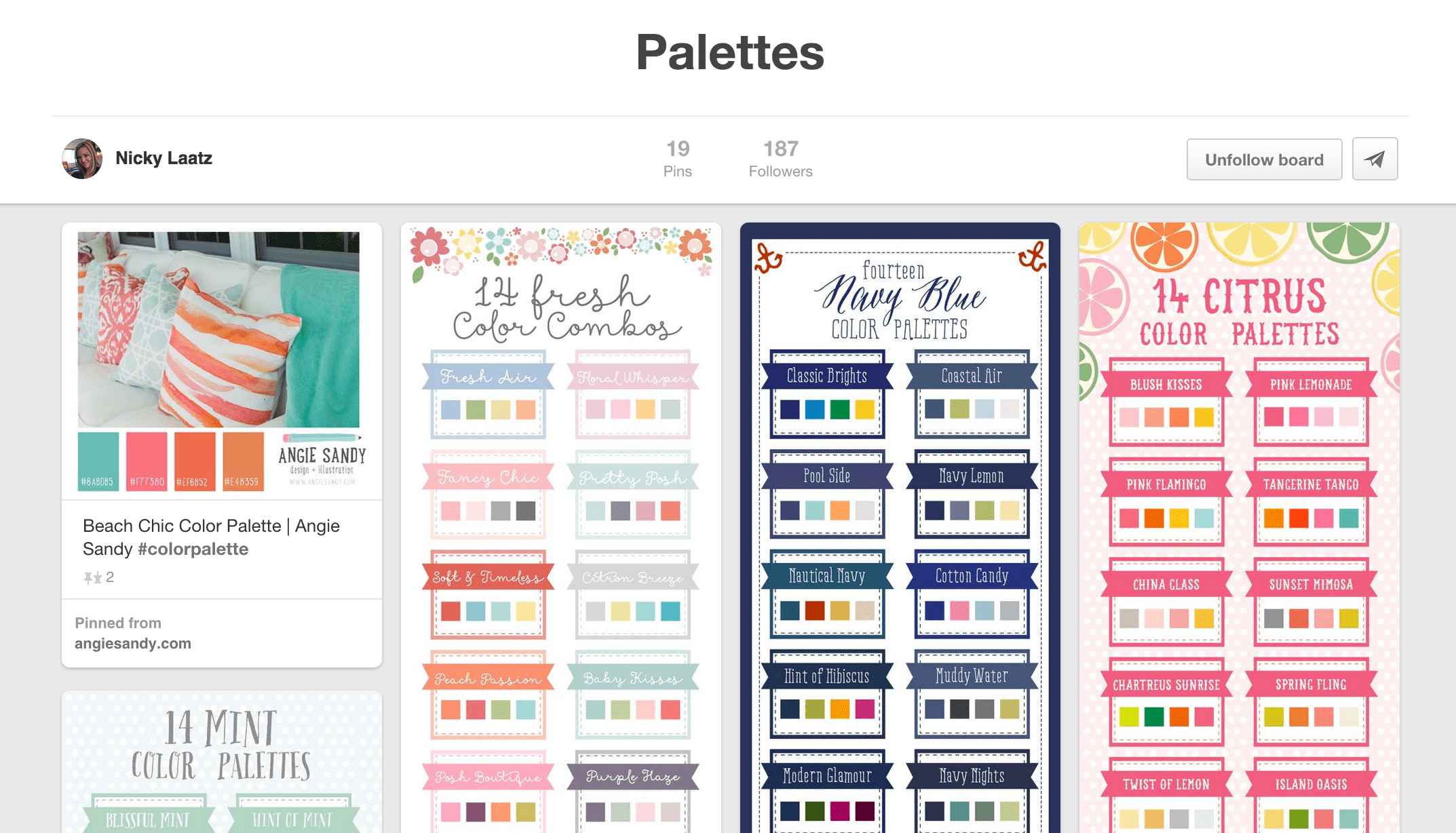
Nicky keeps a Palettes board in her Pinterest profile(opens in a new tab or window), where she stores attractive color schemes for later use. You can see the relationship between the inspiration she gets from pins like “14 Citrus Color Palettes” and the color schemes in products like Vanilla Frosting.
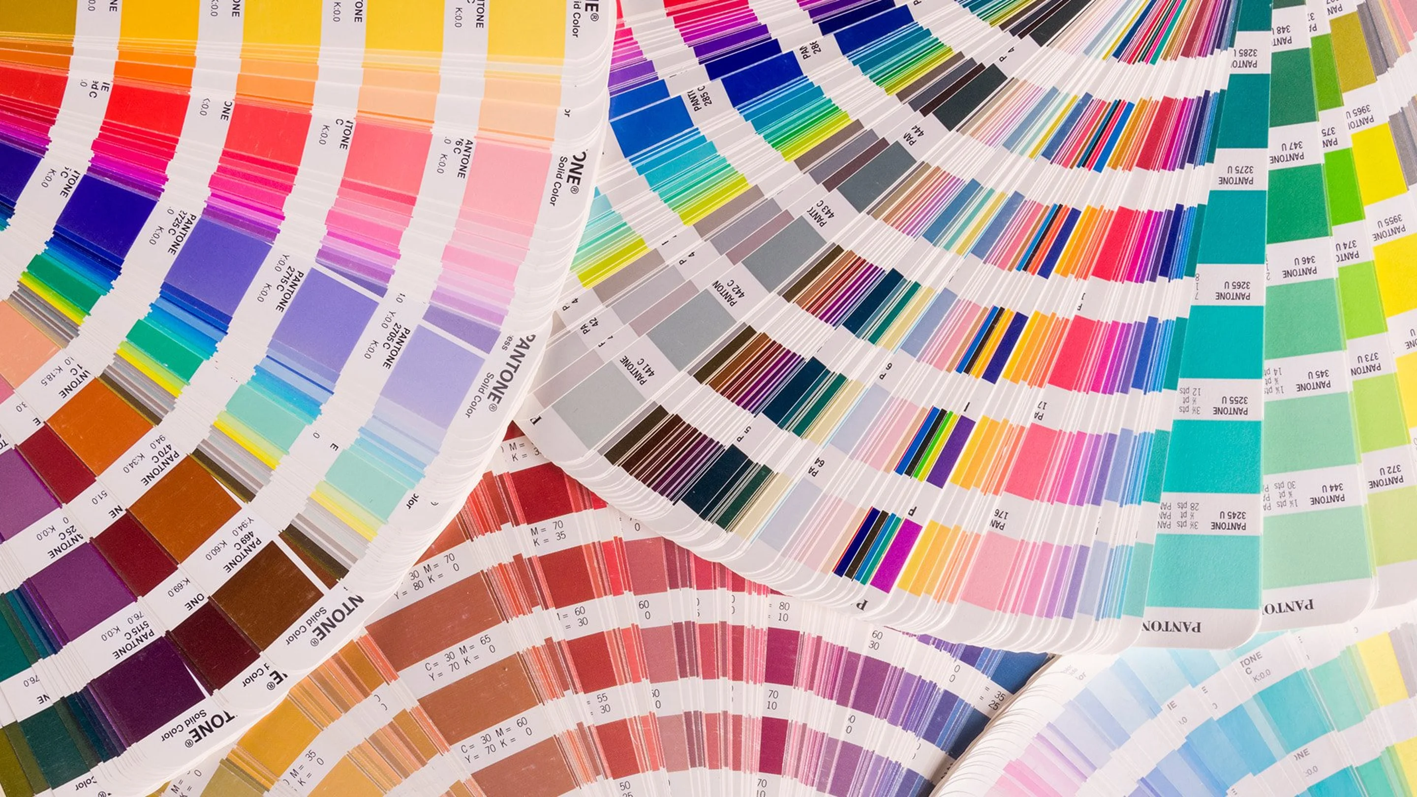
05. Use color swatches
Sometimes when choosing a color combination, a digital color wheel just won’t cut it. It can be incredibly inspiring to step away from the screen and instead look at a physical color swatch, and that’s exactly what Pantone sets provide.
Designer Callie Hegstrom breaks out her trusty Pantone Color Bridge set whenever she wants to select colors the old-fashioned way.She explains that “sometimes it’s nice to have a physical guide that doesn’t just rely on-screen colors. It’s also helpful if a client has a very specific color need, and they want to see physical samples.”

The nice thing about Pantone swatches? Every Pantone color comes with its HEX equivalent. You can even use hexadecimal colors in the Canva color picker for quick and easy palette development.
Pantone swatches and other physical color index sets are also fantastic for any designer who is crafting something for print purposes. Knowing exactly how your color will look when it’s on paper can save you so much time, money and stress when it comes time to head to the printers.
06. Bring in colors from nature
Our eyes are used to admiring natural color schemes. If you take your inspiration from the environment, suggests Gary from the CO-OP(opens in a new tab or window), “the color combinations are endless”. Landscapes, foliage, fruit, all things natural can be amazing, accessible and free sources of color inspiration. Gary designs in South Africa, where he built his online shop and is constantly influenced “by the bright South African sunshine. The colors are warm and striking.”

Textured Watercolors
It’s fairly easy to see where Gary find inspiration from with these watercolor textures(opens in a new tab or window) – from the warmer, sunset-like colors of “Fire Red”, to the cooler, plant-inspired hues in “Forest Green”.
Create the watercolor-textured look with these templates:Cream Orange Watercolor Art Postcard(opens in a new tab or window) and Pastel Color Flower Watercolor Illustration Postcard(opens in a new tab or window)


It can be easy to get stuck searching for inspiration online and in others’ work, but there’s a whole world of inspiration just outside your window, just begging to be tapped into.
07. Stick to three or four colors
Unless you’re going for a deliberate, full-on rainbow look, avoid combining an excessive amount of colors. Rodrigo German, a Chilean graphic designer, recommends using three colors to keep your graphics looking clean, and not too overwhelming. When using more than three, he suggests adding in textures to tone down some of those additional colors.

Marty Spring
In this piece for his Marty font(opens in a new tab or window), Rodrigo sticks to three main colors:pink, black and green. He also plays with texture to achieve the right amount of contrast.
Get the look with this template:Green Pink Vintage Curvy Serif Typefaces Simple Presentation(opens in a new tab or window)

So, if you’re ever creatively stuck with your design, or think there’s just something that isn’t working, look at your palette and ask yourself if you can cut down the number of colors in your palette–ideally down to the magic number:three.
08. Match color to your topic’s mood
Consider the topic that you are trying to portray in your design piece. Is it sports, fashion, beauty, or business? From there, think about a specific mood that you would like to associate with the activity. Is it a cute fashion flyer, or an aggressive sports brochure? Is it feminine, cheerful, serious or elegant?
Salome, the designer behind Graphic Box, suggests coming up with a rough definition of the color theme before you go ahead and work on the details. “For example:‘I need a romantic purple’ or ‘I want a cute pink’.”

Autumn Collection
For her fall graphic kit(opens in a new tab or window), Salome relied on earthy greens, pale oranges, and worn-out reds.
Get the fall look with these templates:Autumn Motivational Poster(opens in a new tab or window) and Autumn Leaves Thanksgiving Poster(opens in a new tab or window)


Have a look around at photographs, designs and any other creative sources that capture similar tones, ideas and emotions as you would like for your design. What similarities are there? What differences?
Another good technique to build your color choice’s strength and effect is to familiarise yourself with color theory. Do a little research, read a few studies, and find out what some common colors can do to people psychologically and subconsciously when used correctly. Remember:colors that are chosen with purpose and reason can often the most effective!
09. Search Pinterest for themed palettes
Pinterest holds an impressive amount of color palettes(opens in a new tab or window) curated by creatives all around the world. Ian Barnard, creator of Vintage Design Co.(opens in a new tab or window), explains his search process below:
“If I was doing a design for a beach themed poster, I would do a simple search under ‘Summer Color Palettes’ and choose one”

This is what a simple search for “Summer Color Palettes” looks like on Pinterest. The best part? You’ll get color inspiration from different design fields:interiors, fashion, graphic and even event design.
10. Follow sites for color lovers
Colourlovers(opens in a new tab or window) is a creative community where people from around the world create and share colors, palettes, and patterns. Join the site and explore millions of user-created color palettes to inspire your ideas.


Written by
Laura Busche

")


