- 50 blog footer design examples
50 blog footer design examples
Blog footers are normally the last element in a website’s structure to get a little design love. They often are a forgotten block, filled with copyright information, disclaimers, and SEO links. This lack of interest, in creating beautiful and appealing footers, is rooted in the misbelief that users are just not that into them. Who scrolls all the way down anyway?
Many websites out there are challenging traditional design approaches and use of blog footers. They’ve been giving footers a facelift, carefully considering their function and aesthetics.
If you are trying to up your footer game, check out our showcase of 50 outstanding footers below. You’ll find great examples of footers with alternative functionality, exceptional design, and hopefully, enough inspiration to get you started on your own footer.
In the article below we explore some best practices to follow in your blog footer design, and showcase 50 of the best examples we've seen online.
What are blog footers used for?
Most blog footers highlight the most important information from a business or brand. Users look to footers primarily when they wish to find important business information, hours, or addresses. It is vital to avoid neglecting footers, designing them just as thoughtfully as you would the rest of a website
Best practices for website footer designs
Aside from the design, there are also a few blog footer best practices to consider.
- Consider legal protection. When it comes to building a website, you want to ensure that you are covered legally. Often website footer incorporates copyright(opens in a new tab or window), privacy policy, and terms of use information.
- Your contact information. One important piece of information to include is how your customers can contact you. More than just a phone number or email, it's also important to direct them to the right source of advice. This can include, customer service, and relevant media contacts, and a relevant address.
- Social media icons. Make it easy for your visitors to meet you on various other online platforms.
- Your call to action. If you're a business that allows your customers to log in, or if you would like to engage with them via email, a CTA is a great idea. This allows users to contact you more conveniently because they don’t need to scroll back up.
01. Use a Minimalist Approach

Tennent-Brown
Tennent-Brown uses a plain white background and crisp black text for its footer. A section of large, black type from a section directly above trickles down into it. It’s balanced, simple, and contemporary.
02. Use a Pattern

Frank Body
Create a pattern with meaningful vector icons to use as a background texture for your footer. Australian company, Frank Body, uses a cute pattern in its footer, featuring icons representative of different aspects of the brand.
03. Go Full Screen

National LGBT Museum
Try going full screen instead of confining your footer to a rectangle at the bottom of a page. The National LGBT Museum transforms its entire section into a patterned, full screen contact form and offers traditional footer elements in a condensed section below.
04. Provide Further Information

Ministry of Type
Your footer’s contents don’t have to be limited to piles of links. The Ministry of Type offers additional information about the website and the designer behind the site. It is a refreshing and engaging alternative to a sea of links.
05. Provide Navigation Links

Noun Project
Be sure to provide navigation links, like the Noun Project. If you’d rather not, provide an alternative that lets users head back to the top of the site easily.
06. Use an Unconventional Footer Shape

Keep Portland Weird
Who says footers have to be rectangular? Keep Portland Weird condenses its footer into a square. It fits its layout and is a great example of how footers can take on different shapes.
07. Categorize Information

Visit Bruges
Visit Bruges categorizes its information into logical buckets. If you have a bit more info, consider bucketing it into easy to access categories.
08. Advertise Special Offers

Cinquante
Keep users engaged by reminding them of special offers currently available at the footer, like Cinquante, who offers free shipping. They might just head back into the website to make a purchase.
09. Use Playful Design Elements

Hive.io
Hive.io uses confetti-like elements in its footer. They are refreshing, simple and add playfulness to the site. The whole footer, instead of containing links, offers users the option to sign up to their newsletter to be kept in the loop.
10. Use a Gradient

Wake.io
Sometimes a simple design solution, like a gradient, is the best way to go. The gradient on Wake.io gives its footer an elegant, effortless touch.
11. Create a Condensed Version

Build With Chrome
Build With Chrome condenses its footer, containing little information, into one line. It frees up space in the body of the website for users to build cool stuff using the site. In this case, it works well with the goal of the entire site.
12. Use a Color Block

Ninjas For Hire
Use a single color and lay your information on the block, like Ninjas For Hire. Also full screen, they’ve created a simple sign up form set over a rich orange to serve as a footer.
13. Use Expressive Typography

Vintage Hope
Vintage Hope uses expressive typography on its site and footer, looping all elements together. They’ve also bucketed information into categories, making it easy to navigate.
14. Add a Map of Your Location

Parliament CoWorking
Instead of an address, provide an interactive map that lets users see not only where you are but what is around you. Parliament CoWorking uses a full-screen map as a footer, dropping a pin with an expressive P on their location.
15. Apply Retro Styling

Dollar Dreadful
If your website allows for it, use retro styling like Dollar Dreadful. They’ve given vintage facelifts to all the other companies they feature in their footer, including Jib Jab.
16. Share Hours in Creative Ways

The Mill
The Mill has locations in several cities and shares the hours of each using a clock instead of regular digits. Pretty cool, huh?
17. Surround a Footer With Design Elements

Cafe Frida
Cafe Frida integrates its footer to the rest of the site by surrounding it with beautiful, floral elements. All of the elements on the site are lovely, have a look.
18. Provide Useful Information

Chick’s Fry House
Chick’s Fry House uses its footer to summarize(opens in a new tab or window) all the important information anyone looking to snag some nom noms from the restaurant needs in its footer. Contact information, pickup window details, hours, it’s all there.
19. Feature Special Products

Cereal
Cereal reminds its users of cool products they are offering in its footer. Much like advertising, it may draw users back into the website, retaining them for a bit longer.
20. Include a Social Media Gallery

Chickenbot
Instead of offering links that redirect to social, why not include a gallery? Chickenbot feeds its Instagram photos into its footers, making the footer interesting and saving users a few clicks into the gram.
21. Use Doozy Icons

VOTD
Try featuring icons with cool messages in your footer, like VOTD. It is a nice way to end a user’s viewing experience and a suave visual.
22. Offer an Opportunity to Connect

For Better Coffee
Offering users the ability to sign up for a newsletter or service? Include a way to do so in the footer, like For Better Coffee. The bold blue background and coffee illustration serve a pleasant visual while giving users the opportunity to stay connected.
23. Include an Easy Way to Return to the Top

Blue Ribbon Chicken
Ever scrolled all the way down only to find you must scroll all the way back up? Avoid frustrated users by providing a quick way to get back to the header. Blue Ribbon Chicken provides an icon on its right-hand side that will let users fly back up top in no time.
24. Keep Shopping Carts Visible

Limonadela
If you are building an ecommerce site, consider keeping the shopping cart visible, like Limonadela, in the footer. It saves users a trip back to the top, where shopping carts normally live.
25. Use Fun Visuals

Jarritos
Jarritos uses a luchador skeleton to spice up its footer. It’s in line with its branding elements and adds a bit of fun to the end of a scroll.
26. Use the Footer as Navigation

Absolute London
Absolute London turns its footer into its navigation bar. Granted, the layout lends itself for it. If you are designing a website that might benefit from a similar layout, consider giving it a shot.
27. Use Photography

Gnosh
Gnosh integrates top view photography into its footer and pairs it with expressive type. The rest of the site has a pretty cool style, check it out.
28. Create a Stark Footer

Epicurrence
Epicurrence’s footer is beautifully stark, containing just its lovely mark and a line of text. Less is more.
29. Use Bold Colors

Mambo Mambo
Make a statement with big type and bold colors like Mambo Mambo. If your site has an established color palette, try a bright variation of one of the existing colors.
30. Integrate the Footer to the Website

Beliyf
Beliyf is a very special website all around. Its footer is integrated to the rest of the site, as it is part of the roots of a tree that grows throughout it. Check it out, it’s pretty awesome.
31. Include a Contact Form

Letters Inc.
Make sure users can reach you should they need to. If nothing else needs to be said, transform your entire footer into a contact form, like Letters Inc.
32. Use Typeface Combinations

Cirq
Instead of setting all your links in just one of your typefaces, try using the same combinations you’ve used throughout the site. Footers don’t have to be typographical bores.
33. Include Affiliations

The Hugo
Designing a website for an entity that has affiliations, partners, or any other type of meaningful relationship? If they don’t have a designated section in the body of the website, include them in the footer. Users expect to find them living in footers.
34. Display Different Locations

Siberia.io
Siberia.io has different locations around the world. They let visitors know in their footer, detailing contact information for each.
35. Include a Condensed Menu

Leader Bag Co.
Not including navigation links in your footer? Consider providing a condensed menu. This way, users won’t have to scroll anywhere should they want to navigate to another part of the site.
36. Include a Warm Closing

Watching the World Cup
Watching the World Cup encloses a thank you note in its footer. You don’t have to give extensive thanks like these guys but can thank users for stopping by or include any other warm messages that may be memorable.
37. Use Textures

Mood Furniture
Give using related textures a shot, like Mood Furniture does. If nothing else, it will add visual interest to an otherwise bland footer.
38. Use Fun Animations

Andrevv
Andrevv concludes a fun animation at his footer. Check it out on the site, it’s pretty neat.
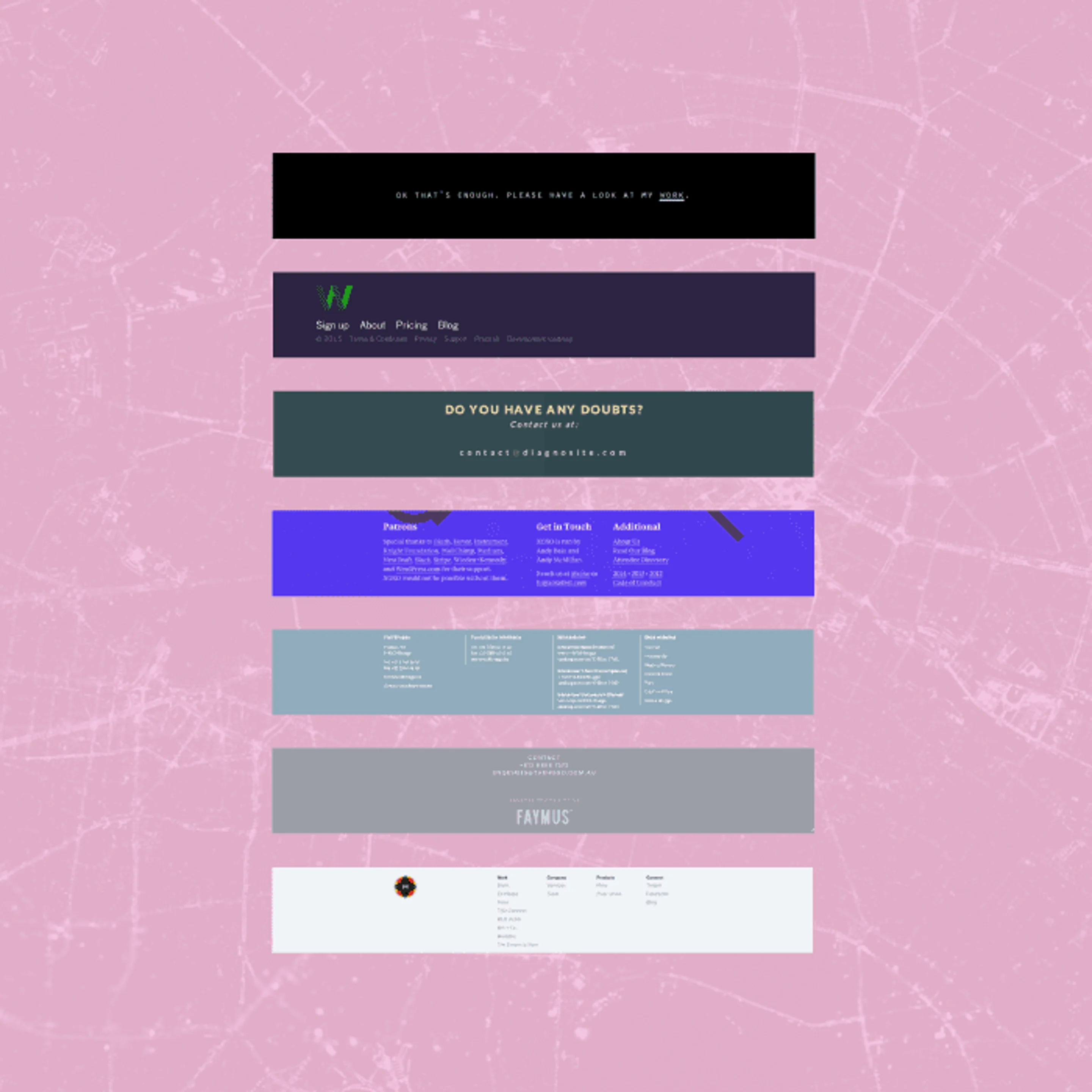
39. Offer Further Information

Diagnosite
Diagnosite offers further information for unsatisfied users who have gotten down to the bottom of the website. This can be a great way to retain and re-engage users.
40. Use a Simple Palette

Metalab
Limit the colors you use or create a muted palette, like Metalab. They’ve set their footer in a single color, with lists of links and their mark. Simple and to the point.
41. Use Calls to Action

Dartarrows
Interested in urging viewers to do a particular thing? Consider using buttons in your footer, like Dartarrows, that clearly provide paths for users to take.
42. Use Quirky Visual Effects

Cultivated Wit
Not for every site but playing with visual effects is always fun. Cultivated Wit provides information on its fun Fridays and styles it to give the illusion that someone has had a bit too much fun.
43. Overlay elements

XOXO
XOXO overlays its design elements, adding visual interest to its footer. It is also refreshing to see larger type being used in a footer. No need to set type so small. It makes users feel glued to Command + +.
44. Use a Simple Grid

Social Design House
Set information on your footer using a simple grid, like Social Design House. A simple two column grid is enough to add a little spice to their footer.
45. Share Information About the Site’s Birthplace

Brand New School
Where was your site created? Brand New School proudly displays the American flag in its footer, sharing information about where the site was born and creating a cool design element.
46. Include Meaningful Imagery

The Integrated Podiatry Clinic
Use imagery that speaks about your content. The Integrated Podiatry Clinic went for an obvious but meaningful choice when they selected an image of feet to sit at their footer.
47. Display Social Media Links

Warp Films
Social is king nowadays. Remind your users to connect with you by displaying social media links in your footer. Warp Films’ entire footer is centered around building a following.
48. Include Important Copyright Information

Team Week
Have copyright info or terms and conditions you cannot leave out? These normally live in footers. Make sure to include them in your design, like Team Week. They don’t have to be huge, just present.
49. Use Fun Vector Illustrations

Take It App
Create a fun vector illustration to serve as a footer. It does not have to be complex or detailed, just interesting and related to your content.
50. Layer Fun Visual Elements

BaoBab
BaoBab layers design elements in its footer, creating an interesting look. They are a vegetarian restaurant and their food looks as good as their site!
Your Turn…
Next time you feel inclined to create a generic footer, take another look at our list to remind you that footer design doesn’t have to be dull. Look for a bit more inspiration online and get started on a memorable footer for all your web design projects!

Written by
Maria Jose

")


