- 50 funny ads to inspire you
50 funny ads to inspire you
When it comes to advertising, a brand can attempt to connect with audiences through a variety of creative strategies, some of which include stirring emotions, offering an aspirational model, or presenting a slice of reality. However, it’s often the humorous ads – the clever, laugh out loud, rolling on-the-floor(opens in a new tab or window) ads – that will not only connect with audiences, but also get them talking, sharing, and thinking positively about a brand.
Creative, clever, and funny ads provoke a feel-good feeling. It makes audiences feel good about a brand because the brains behind the brand have purposefully attempted to – and hopefully succeeded – in understanding and challenging its audience in order to get grins and chuckles. And who doesn’t like to be understood, challenged, or made to laugh?
“Designing funny,” says comedian Heather Bradley, “is about influencing people to react in a specific way.” The concept is the all-important factor here, which is supported by and expressed through imagery, words, media, and ad placement.
Of course, the humor has to hit the mark for advertising to deliver an element of entertainment; but when it does it makes for memorable and persuasive ads that also have the potential to go viral. Here are ten lessons on how to design with humor. Let the hilarity ensue. Tickle your audience’s funny bone with funny advertising ideas that are memorable and persuasive below.
Why funny ads are effective
Funny ads are effective because they capture the audience's attention. According to neuroscience experts, as humans, our attention is attracted to anything that previous experience tells us is potentially good or bad. Loud noises and images of gore attract our attention because we're taught to fear them, and good associations can be felt by things that make us laugh.
Scroll on for funny ad and creative ad inspiration.
01. Tailor Your Humor to Your Audience
Humor is subjective. Not everyone gets the same jokes. The sense of humor needs to be appropriate for the brand and the target audience. It may be, as Bradley lists, raunchy, sarcastic, highbrow, goofball, geek wit, wholesome, morbid, absurd, or whimsical.
Let’s begin lowbrow with a little toilet humor, so to speak. This ad for Ambi Pur plays on classic perfume ads because the product has an attractive fragrant smell.

Ambi Pur
The ingredients in La Dispensa Soup’s(opens in a new tab or window) range all have evil, twisted characters behind them. The front of the packet shows a beat up ingredient while the back reveals how it happened. In this case, it was carrot versus eggbeater.

La Dispensa Soup
Axe(opens in a new tab or window) is known for clever multimedia advertisements and here they tap into the clever crowd that code those ads. With a bit of geek wit, it uses code-speak to make an inside joke that is really not an inside joke.

Axe
This Kit Kat ad(opens in a new tab or window) uses dark humor for dark chocolate and tells its audience to “enjoy the dark.”

Kit Kat
Pubfinder(opens in a new tab or window) speaks to Guinness lovers with this ad, turning two freshly poured pints of stout into binoculars.

Pubfinder
02. Play With Faces and Bodies
Advertiser’s manipulation of faces and bodies can be very amusing either because of the facial expressions that can be created or because the protagonist may be unaware of how the manipulation appears to others. However, while it’s laugh-worthy, it is not about laughing at people – it’s about laughing with people, because the best thing about humor is sharing it.
A nose is recreated on the side of these Starbuck coffee cups(opens in a new tab or window) and a mouth with glistening white teeth (sponsored by Extra) on the bottom. This isn’t only clever and humorous but it adds value to the cup and will be used a few times over to share the joke. #selfie

Starbucks
This bag is sure to get some quizzical looks and good old belly laughs out on the street. Advertising topical solution for nail biting(opens in a new tab or window), a person on the bag appears to munch the fingernails of the person holding it.

Stop n Grow
Exaggeration is a good way to get some chortles when it comes to faces and bodies and this billboard(opens in a new tab or window) has been angled to make the overweight man seem to tip it off balance.

Silberman’s Fitness Center
Tear-off ads are excellent for local advertising as they can be placed in strategic locations and help members of the target market easily obtain and record contact details. These tear-off ads for a children’s hairdresser(opens in a new tab or window) and very clever – as the tabs are torn the children’s fringe is cut.

Cuttie Cut
This campaign for Bench Fix(opens in a new tab or window) hairstyling demonstrates the superior hold of its products by transforming the model’s hair into a gecko that’s just not going to let go.

Bench Fix
03. Make a Statement
Any kind of statement! It may be an overstatement or understatement. It might be stating the obvious, admitting mediocrity or even a little self-deprecation. These kinds of statements can be clever ways to inform audiences, to share the joke or admit some home truths.
Amsterdam’s Hans Brinker Budget Hotel boasts that it is apparently the worst hotel in the world; in fact it can’t even earn one star from the tourist board. In these posters Hans Brinker proudly owns its mediocrity.

Hans Brinker Budget Hotel
Still rocking a mullet? It may be time to upgrade, unless it’s insightful foresight. This advertising concept reminds readers to upgrade Windows 10(opens in a new tab or window) for fear of being out of date.

Windows 10
If cookies could talk, this might be what they’d say. This ad creates a story for Amori cookies(opens in a new tab or window) that plays on the idea of ‘content’ and being more than surface appearances.

Amori
Using hyperbole, this ad for Play-Doh(opens in a new tab or window) details all the potential things that imaginative children can create form Play-Doh, including ‘A bird? … No! A plane? … No! … A flying man who see through underwear.’

Play-Doh
Manhattan Mini Storage(opens in a new tab or window) is known for ads that use bold audacious statements and speak directly to New Yorkers and their often-cramped living conditions. Always good for a giggle when you’re riding the subway.

Manhattan Mini Storage
04. Be Punny
Puns and clichés can often elicit cheap laughs but when used cleverly can also challenge the audience. Double meanings can be presented by matching imagery with words but adding a creatively skillful or ingenious twist.
This is a double-whammy by Ikea(opens in a new tab or window) making a pun of a cliché. A ‘one night stand’ can be two things – a very good tinder date and a piece of furniture that goes next to the bed. The words make you think of the first; the picture makes you realise it’s the second. Swipe right for this ad.

Ikea
This ad for Chase bank(opens in a new tab or window) lines up a row of shot glasses to illustrate how ‘little things add up’ expressing that while the amount of alcohol may be small the effect may be large. Well, the same goes with bank fees – little charges add up.

Chase
Poo-poo-poo-poodle… visual puns are cleverly used to evoke the sound of stuttering for Kekemelodi Stuttering Therapy Classes(opens in a new tab or window).

Kekemelodi Stuttering Therapy Classes
Toronto’s Livegreen organization(opens in a new tab or window) issued this ad campaign to combat littering. It rearranges well-known brand names on street litter to spell out disapproving and shaming names for litterers.

Livegreen
Light beer? Good idea. This ad uses a visual pun to align light beer with a light bulb moment. Light beer is the smart choice in this case.

Light beer
05. Show Some Cheek
Admittedly innuendo and profanity is not everyone’s cup of tea but as long as you know your brand and audience it’s a great way to make a hilarious and memorable ad. Just make sure to be appropriate, research your audience’s limits and consider any censorship issues.
There’s a lot of innuendo at play in this series of ads for Comedy Central(opens in a new tab or window). It takes a little imagination and thought to see what’s going on here but once you’ve got it the laughs are good. And like the tagline says, “in the right place, anything can be funny.” If this kind of humor is up your alley, so to speak, be sure to check out the rest of the series(opens in a new tab or window).

Comedy Central
Modestly covered naturist characters are on the front of these Zest Pasta Sauce(opens in a new tab or window) jars to express that the claim that the product is ‘free from artificial anything.’ It tells you to look behind… (‘behind,’ nudge nudge wink wink)… to see the character holding a sigh with the complete list of ingredients and proof there is nothing to hide.

Zest Pasta Sauce
Pucker up Margaret Thatcher, Che Guevera is coming for the kiss. Thatcher and Guevara are bosom buddies in this campaign for Hope Super Push Up bras(opens in a new tab or window). It brings political opponents cheek to cheek with the tagline “right and left together.”

Hope Super Push Up Bra
Apparently 10 per cent of Europeans were conceived on Ikea beds. Ikea(opens in a new tab or window) used that titbit of knowledge for this print campaign that inserts pictures of different Ikea beds in between generations of ancestors on a family tree, resembling a genogram(opens in a new tab or window). You’ll also find a washing machine, a kitchen sink and kitchen table in there because why keep things in the bedroom!

Ikea
A student project to repackage condoms saw the creation of this “Happy Go Lucky(opens in a new tab or window)” brand that pays homage to Lucky cigarettes and the Mad Men TV show. The name says it all.

Happy Go Lucky
06. Be dimensional
Playing with two and three dimensions can mean adding, well, dimension to your humor and creative ideas. Particularly in terms of packaging or brand-related objects, texture, flexibility and shape can be incorporated for clever and hilarious advertising.
Simon Laliberte(opens in a new tab or window) cleverly designed this cool(opens in a new tab or window) Poilu packaging to play on the word poilu (French slang for hairy) making the brushes appear like a man’s moustache and goatee.

Poilu
Yoga will get you bending and stretching, as this straw advertising the Yoga Center(opens in a new tab or window) demonstrates. Flexing the straw moves the body into back bends, downward dogs and sun salutes.

Yoga Center
Thelma’s cookies are straight out of the oven! The packaging(opens in a new tab or window) for this cookie delivery business has been designed to look like an old fashioned stove-top-oven and the cookies laid out on baking sheets. Now, how to add some heat?

Thelma’s
It’s breakfast in bed at this bed & breakfast with ads by German agency Publicis(opens in a new tab or window). The series recreates various breakfast toppings with the mattress serving as toast.

B&B Hotel
Christian Åslund shot a series for Jim Rickey(opens in a new tab or window) sneakers called ‘Honkey Kong.’ He shot from above with a tele-lens to create flat looking images of the model navigating the streets as if in a classic 2D video game.

Jim Rickey
07. Play with perception
Optical illusions and special effects are great ways to get giggles and thought-provoking looks. Incorporate forms of architecture or other design into advertising – be it print, packaging or signage – by considering how they are used and seen by others.
This clever advertising depicts how one can quickly go from having a full set of chops to just a couple of pegs. Appropriately promoting dental implant insurance(opens in a new tab or window) it turns each bowling alley into a mouth with the bowling pins representing the toothed and toothless.

Dental Implant Insurance
Ring-binder holding paper together or steps into a swimming pool? A few little doodles (now, now, we’re out of the cheeky section) make you think twice in this ad for Kielo Travel(opens in a new tab or window). The concept is astoundingly simple and outstandingly effective.

Kielo Travel
This one may make your stomach squirm but it’s one to remember (and an important reminder, while we’re here). You’re right no one does want to see this but your doctor should. Colon cancer(opens in a new tab or window) is a deadly cancer and regular check ups are important.

Colon Cancer Awareness
In one door and out the other… While it’s not quite that simple, this ad clearly shows the ultimate goal of Weightwatchers(opens in a new tab or window).

Weightwatchers
This clever bus stop ad(opens in a new tab or window) promotes hip hop music in Brazil. Not sure at first what the fuzzy black circle is? You do as soon as someone sits down.

Real Hip Hop
08. Oppose and juxtapose
Creating humor is often about creating tension, which is also what contrasts, oppositions, juxtapositions and comparisons are based on. Whether comparing people, mashing-up animals, or uniting enemies, consider whether they should be surprising or familiar, absurd or understandable.
Farmer’s are usually held up as very hard workers. Well, not this farmer. This packaging for The Lazy Farmer(opens in a new tab or window) dried foods works with the concept that the farmer has little ambition so his foods age and dry up. Each package features a farmer taking a snooze on the ingredient.

The Lazy Farmer
These toy soldiers are doing the opposite of what we expect. Instead of having weapons in their hands, these soldiers are assuming various yoga positions to promote a Brazilian yoga center(opens in a new tab or window).

Espaco Clara Luz
First come loves, then comes marriage, then comes baby in a baby carriage… unless you have Durex(opens in a new tab or window). By juxtaposing a baby carriage and the logo, with price tags on each, Durex makes a very clear statement about the expense that can be saved in being careful.

Durex
This clever ad for Men’s Health(opens in a new tab or window) magazine shows a before-and-after comparison. Look at it one way and the model is overweight; flip it around and he’s muscled.

Men’s Health
So, which one are you? This series of ads for Zomatos(opens in a new tab or window) compares and contrasts lots of different types of people in the world, encouraging people to find familiarity with the descriptions that best represent them. #letsgodutch

Zomatos
09. Humanize animals and objects
To animate inanimate objects or give human qualities to animals imagine consider how that object or animal might feel in and bring that feeling to life. Give it emotion, movement, behavior or verbal abilities.
It’s the classic good guys versus bad guys in this ad for topical acne medication(opens in a new tab or window). Both the acne and the cream and given faces with facial expressions that show exactly who’s going to win.

Topical Acne
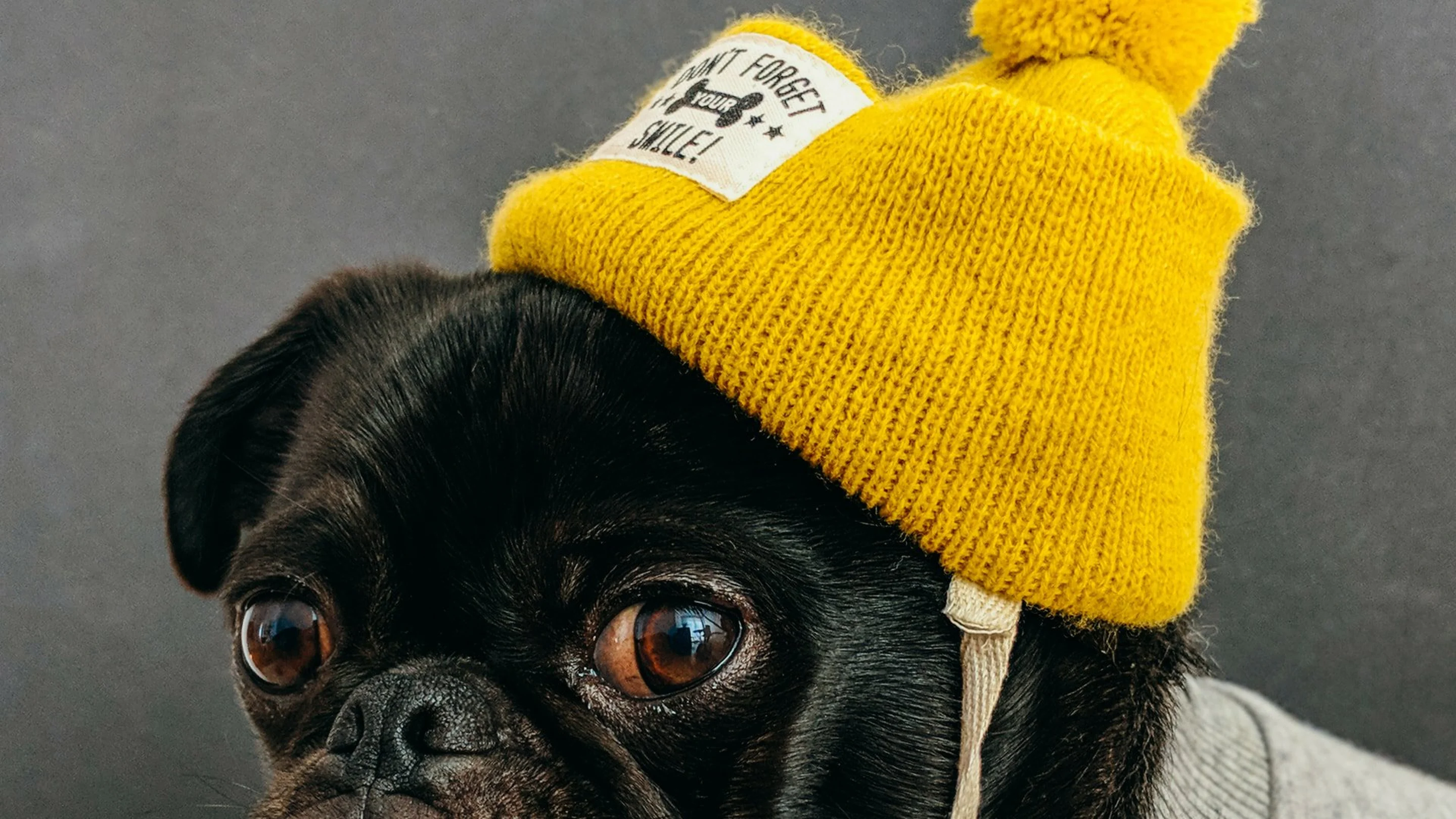
These ads for Dog Spa Course(opens in a new tab or window) sure hit the cute button as they give the pups baby- and child-like qualities. With ear-to-ear grins, the dogs look like they couldn’t be happier.

Dog Spa Course
Speaking of dogs, these canines have been given adult characteristics patiently queuing to use the toilet at the Purina Bark in the Park festival(opens in a new tab or window).

Purina Bark in the Park
This series of ads for Max shoes’ ‘You Are What You Wear’ campaign creates shocked, awed and smiling faces from a variety of shoes and sandals with fingernails for eyes and arm for a neck.

Max Shoes
This chicken is leggin’ it right out of the store. Advertising Artizone(opens in a new tab or window)’s home delivery service, this ad series brings food to life by injecting it with a sense of energy and movement.

Artizone
10. Running jokes
And once you’ve found hit the hilarity on the head why not keep the gag going and create a series of similar advertisements or a progression or timeline. However, be aware that the best thing about a running joke is it knows when to stop running.
If these two meet it could spell (or perhaps smell) disaster. Clearex(opens in a new tab or window)’s clever series of ads set up different situations in which a collision would mean explosion. Better to use the cream and avoid potential catastrophe.

Clearex
Ô Fiô Bier Bar(opens in a new tab or window) encourages people to get offline and meet people in the read world, because as the progression reveals, you really don’t know who you could be meeting online. #swipeleft

O Fio Bier Bar
Some situations are more stressful to handle than others. Bayer’s ads(opens in a new tab or window) set up a series of situations in which sometimes Aspirina is enough, and sometimes you need something stronger.

Bayer
Students at the College for Creative Studies collaborated with Team Detroit to create this conceptual series of ad for the art school that parody classic lines from anti-drug PSAs.

College for Creative Studies
This series of 55 LEGO ads celebrates ’55 years of bricks’ and challenges viewers to graphic riddles. Names of bands, songs, movies and other cultural highlights are hidden in the images using lego blocks and simple line drawings. How many can you get(opens in a new tab or window)?

Lego
Tip: You can also try matching your audience's humor by using memes(opens in a new tab or window) or creating meme videos(opens in a new tab or window)- they may be unconventional but they are just as funny and engaging.
YOUR TURN
Get your audience thinking, laughing, sharing, and feeling good with humorous ads. They’ll thank you for it – and hopefully by spending money on your brand.
And you can help your hilarious ad have an even greater impact by making sure you take advantage of key design principles in print advertising. Learn the basics with Canva Design School's free Print Advertising course(opens in a new tab or window).

Written by
Rebecca Gross

")


