- Hand lettering design: 40 stunning examples to inspire you—and tips from a designer
Hand lettering design: 40 stunning examples to inspire you—and tips from a designer
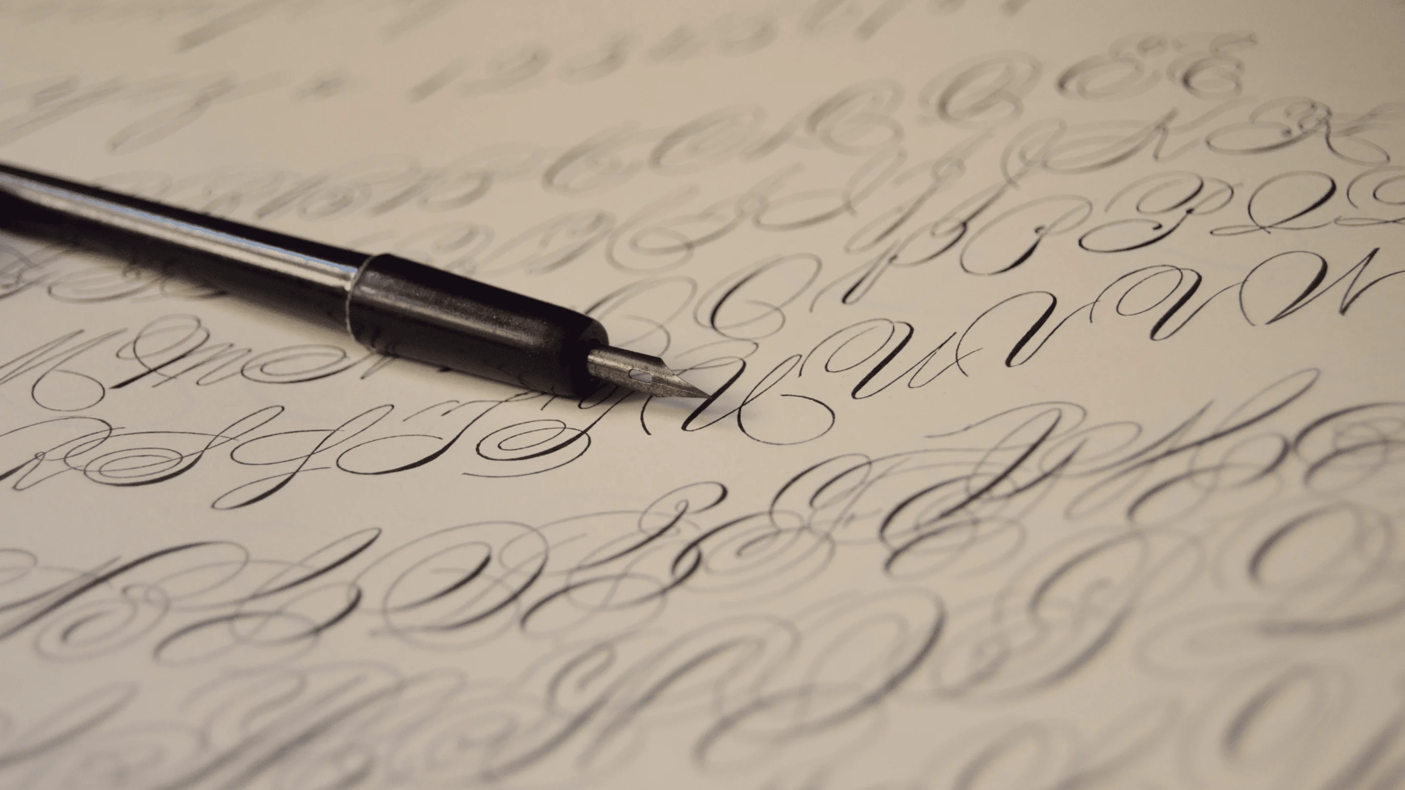
Hand-lettering can often be confused with typography and calligraphy, and understandably so.
The differences between the three are slight, yet important. Calligraphy is writing with a single pass to create written art, hand-lettering is a composition created with drawn letters, and typography uses prefabricated and designed letters.
Essentially, hand-lettering is the illustration of letters that come together to create a single, unified piece. If you were to take each letter out separately to create an alphabet, it would be quite the mishmash.
Use hand-lettering to add flair to your postcards(opens in a new tab or window), invitations(opens in a new tab or window), and other design printables or digital works you wish to customize and hand out. To better understand hand-lettering, let’s take a look at 40 beautiful examples paired with expert tips.
01. Incorporate illustrations

Design by Tobias Saul via Behance.
This hand-lettered piece includes an illustration of a skull and arrows as the center focal point. The skull is incorporated really nicely, and the curves of the lettering mimics the curves of the skull. The inclusion of the words ‘through hell’ in the skull adds in a nice contrast and breaks up the composition.
Customize this template in Canva:

02. Make everything unified

Design by Tobias Saul via Behance.
Elaborate and intricate wisps connect the scripty letters to one another in this piece. This acts to unify everything into a singular, unified composition. The heavier weight of the letters allows the phrase to stand out and not be too overwhelmed by the curls, yet it isn’t so heavy that they feel disconnected.
Customize this template in Canva:

03. Break the norm

Design by Tobias Saul via Behance.
This piece is unique in a number of ways. The background is a bobbing bottle of moonshine in a body of water, and the text surrounds it entirely. Instead of shrinking the text so it could stretch the entire span of any negative space, the designer stacked it where necessary. It adds an extra element of detail and fun, but is still easy to read.
04. Utilize Hand-Lettering in Logos

Behance / Bluerock Design Co.
This logo incorporates stunning hand-lettering. It curves nicely around the illustration, and the letters themselves have true character. The intricate lettering pairs nicely with the simple accent typeface, and is just detailed enough to complement the detailed illustration.
Customize this template in Canva:

05. Hand-Letter Multiple Elements

Behance / Tobias Hall
This invitation poster takes hand-lettering over the top. It looks incredibly vintage and old-timey, and that’s not only because of the color palette, but because each element has been drawn by hand. If you look closely, each letterform differs slightly from the next, and that gives this piece a wonderfully traditional and handcrafted feel.
06. Take Risks

Behance / Alex Palazzi
This piece is a unique approach to hand-lettering. Actual bubble gum was used to create this image, and was carefully stretched and pulled to create the perfect look. Getting hands-on with this project really put it over the top, and it stands out against more traditional attempts.
Customize this template in Canva:

07. Create A Scene

Behance / Steve Simpson
This hand-lettered phrase sits comfortably inside an illustration of a heart. The illustration is portrayed quite literally, as you can see different characteristics of Dublin written and drawn in different areas of the heart. Setting up the composition this way makes it feel unified and actually serve a purpose. It’s not purely for decor.
Customize this template in Canva:

08. Add In Dimension

Behance / Rob Clarke
At first glance, this hand-lettering can look a little flat. It’s beautiful, sure, with all of the thick curves and waves of the letters. But what sets it apart is the incredibly subtle dimension tucked into some of the letters. Where each letter overlaps, or a stroke of color overlaps, there is a slight shadow. This makes the letters pop and look more three-dimensional, versus strictly 2-d had the shadows not been included.
09. Be Informational

Behance / Steve Simpson
Hand-lettering can merge with infographics in a fairly seamless way, as it does in this poster. Infographics(opens in a new tab or window) are simply a way of illustrating information, and that is done using hand-lettering in this example. Different cities and elements are depicted, and it the hand-lettering adds a unique character that may be felt in the Islands.
Customize this template in Canva:

10. Incorporate Other Elements

ANNA SUN via Behance.
This example is unique, because it isn’t all simply illustrated type. Images of flowers and other plants are incorporated and layered over the letters. This merges the elements together and adds in depth. The contrast between the white of the lettering and the red and green of the vegetation is fresh, and the softness of the letters works well with the femininity of the flowers.
11. Keep It Simple

Olga Zakharova via Faveteart
This hand-lettered creation is very simple, but very beautiful. It isn’t overwhelmed with color, and there is just the right amount of ornamentation. The texture within the letters is subtle, yet greatly needed. It provides a break from the stark contrast of what would have been solid black on white.
12. Stretch Your Creative Muscles

Behance / Julien Roudaut
This piece is a ton of fun. Not only are there a number of illustrations to look at, but each element has been hand created. The style definitely relays a sense of summer, and the way the poster is presented gives off a carefree, chill vibe.
13. Have A Purpose Behind Your Design

Behance / Amy Henry Imdieke
The intricately detailed letters in this phrase are beautiful and transfixing. So much care went into each and every one – even the incredibly thin ones, and it is truly mind boggling. What makes it even more mind boggling, though, is that this piece was created with purpose. The detailing in the letters is actually hops and barley used in brewing beer, and it makes perfect sense due to the quote.
14. Utilize Photography

Behance / Abbey Sy
The bright pop of the pink donut against the yellow plate gives this piece a fun personality. What sets it over the top is the carefully crafted lettering around it. Each group of letters is styled differently, and only contributes to the fun in this poster. If the lettering were more understated, it would be lost against the bright photo.
Customize this template in Canva:

15. Have A Sense Of Humor

Behance / John Larigakis
The quote on this piece is humorous, but so is the imagery. You don’t typically see a graphically interpreted piece of sushi in advertising, so it’s a nice thing to see. The lettering appears to be very simple and personal, which makes the message feel like it was written just for you – even if you don’t want to hear it.
Customize this template in Canva:

16. Be Elaborate

Behance / SEAN FREEMAN • THERE IS
This music poster is very detailed and elaborate. The text itself is intricate, deliberate, and classic, while the pairing of the flower photography is fresh, elegant, and luxurious. The placement of the text feels nearly perfect, almost as if the flowers had the letters breathing from them (notice the leaf-like details in the letters?).
17. Use Your Hands

Behance / Allison Supron
A quote was taken entirely literally in this piece. It would have been too easy to simply write out ‘my sister loves cheese’ in a style reminiscent of cheese, so opting to hand carve it out really sets it over the top. Overall, it’s pretty simple, but the overlap and interworking of the letters in the word ‘loves’ gives some much needed character.
18. Be Ornate

Behance / Martin Schmetzer
Shiny gold detailing pushes this hand-lettered poster into another realm. The gold accents lend well to the incredibly detailed styling of the word ‘shortcuts’ and really helps to make the text stand out. The different ways the letters are drawn creates a mishmash between the old west and the Roaring 20s.
19. Create Overlap

Behance / Martin Schmetzer
The overlap between the letters in the word ‘go’ is lovely in this piece. It brings forward the idea of being united and working together, and that notion is solidified with the warm, cheery Fall colors and pumpkins – giving off vibes of Thanksgiving and family get togethers.
20. Use Different Lettering Styles

Behance / Jenna Bresnahan
Behance / Jenna Bresnahan
Matching up different lettering styles is a great way to get differentiation in your pieces. This posterized quote uses two different styles – one that is more simple and realistically written and one that is more scripted and elaborately written. The two styles balance each other and don’t take anything away, but still allows for the main message to be read loud and clear.
21. Visualize Energy

Behance / Linzie Hunter
This poster matched up different lettering styles similar to the previous example, but it also added in some extra energy. Accent marks and a subtle color shift behind and around ‘dare’ makes the word pop off the page and be something you want to look at. If you have something you want to draw attention to in your hand-lettering, consider the elements you put around it – like energetic dash marks.
22. Play With Sizing

Behance / Linzie Hunter
Not all of your text has to be the same size, and you can see a good example of that in this piece. Some of the words, most notably ‘road’ and ‘long’ are much larger than others, and that’s because they’re the most important. Make important words larger, or for a reverse, more unique effect – make them much smaller. The key is to make the most important elements stand out amongst the rest.
23. Create Texture

Behance / Julia Henze
There is texture all over this piece of hand-lettering. It is more subtle in the actual lettering – found most prominently in ‘moon’ and less so in the shadowing of ‘the’ – and is incredibly apparent in the moon. The texture in the illustration and in the letters helps to bring the two together, where it could otherwise be disjointed.
24. Take A Classic Approach

Dribbble / Zane Kaiser
This piece looks very classic, and that’s because of it’s hand created properties. Each letter is handwritten, so each has its own special character. The character of the letters paired with the character of the illustration makes something truly spectacular.
25. Use Decorative Accents

Behance / Mateusz Witczak
This hand-lettered example uses a lot of decorative accents. Swirls, shadows, and banners can be found throughout, yet they don’t detract from anything. Each accent works with the letters it’s connected to, and in the end becomes an extension of each letter to fill up space in a beautiful way.
26. Step Away From The Trackpad

Behance / wawaw srynn
Hand-lettering on a computer can be difficult. Sometimes, it’s much easier to actually draw something out, or in this case, paint. Get loose with your hand-lettering and your results will feel much more natural, just like the simple lettering in this piece.
27. Letter On Interesting Surfaces

Behance / Raksa Yin
Sometimes choosing to letter on paper over and over again can get boring and repetitive. Try out a new surface, like the skateboard in this example. The unique shape of the skateboard gives a fresh working space, and a lot can be done in the background to decorate.
28. Stretch and Squash

Behance / Jenna Bresnahan
This piece shows that you don’t have to give every letter 100% of its integrity. Squash it or stretch it however you need to make it fit in a nice way, just like the ‘a’s and ‘t’s in this example.
29. Use Familiar Imagery

Behance / Orestes Mora
Most people are familiar with the bright and shiny Vegas strip signs we see either in person or in movies. Using an illustration of that sign to house hand-lettering acts as a great back drop. The particular phrase shown here works exceptionally well, because most of us can’t help but feel good in Vegas.
30. Stick To Your Roots

Behance / Sean McCabe
A lot of the time, hand-lettering just comes out better when you actually sketch it out. You can see in this example the roughness and imperfections you’d typically get rid of once you moved into the computer, but those imperfections give this piece personality and life.
31. Use Multiple Mediums

Corey Stewart via Behance.
You can use multiple mediums like pens, markers, paints, and pencils to achieve different effects and textures in your lettering. This example has a painterly feel, yet is still refined in most areas, suggesting that a pen was used to create fine details while a wash of ink was the initial step.
32. Have A Pop Of Color

Corey Stewart via Behance.
If there’s one way to make your hand-lettering stand out, it’s making it a bright color. In this example, bright red is paired against a grey backdrop. The ‘miss’ really stands out, and you can feel the emotion behind it. It also doesn’t go unnoticed that Ohio’s colors are scarlet and grey.
33. Make Your Letters 3-D

Behance / Christopher Vinca
These letters really stand out due to their dimensional effect. They feel much more real than if they’d just been drawn flat, and the reality of their appearance works perfectly with the meaning of the quote.
34. Have Fun With It

Behance / Linzie Hunter
This piece is a lot of fun. Everything from the colors to the illustrations, to the unique set up and the lettering gives off a ton of personality. The lettering is used as an accent to the illustration, and is informative and map-like.
35. Be Precise

Behance / Livy Long
The extreme precision in this piece is definitely noticeable. Each line is carefully lined up without missing a beat. Everything feels right in place and is very easy to read. Take your time and be deliberate in your hand lettering when it’s called for.
36. Give Meaning

Behance / Megan Hodgson
The lettering in this piece is somewhat in the background, and not quite the first thing you see – but it works. The letters are intertwining to create the roots of the tree and to give it a foundation. They are representative of growth, and pair perfectly with not only the imagery, but the overall message.
37. Make It Personalized

Behance / James Vanderhoven
This piece is incredibly fun and energetic. Imagine receiving something like this for your graduation and knowing someone took the time to create it just for you? The tight, curviness of the letters makes it incredibly bubble-like, and it really does give off a sense of celebration.
38. Stick To A Simple Color Palette

Behance / Jessica Rooney Deane
An extensive color palette isn’t always the solution when you’re hand-lettering. In this example, only three colors are used, yet they’re used in a way that makes it seem more colorful and bright than it really is. Experiment with limited color palettes(opens in a new tab or window) and you’ll be surprised just how creative you can get.
39. Place Your Lettering In An Environment

Behance / Risa Rodil
This piece has a lot going on – and it’s great. Each word is nestled into its own space and really feels at home. Every element works together and helps create a cohesive scene.
40. Bring In Natural Elements

Amber Phillips
Accents of leaves decorate this hand-lettered piece, and add in a nice element of nature. The leaves grow from different parts of the letters, so everything feels connected and deliberate. Had the leaves not been connected with the letters, it wouldn’t have had quite the same effect and would have seemed disjointed.
Without a doubt, hand-lettering is its own form of art, and it is incredibly beautiful. It takes practice, skill, and patience. It is clear to see that in each and every one of these examples, the artist behind them is very devoted to their craft.

Written by
Caitlin Jordan


