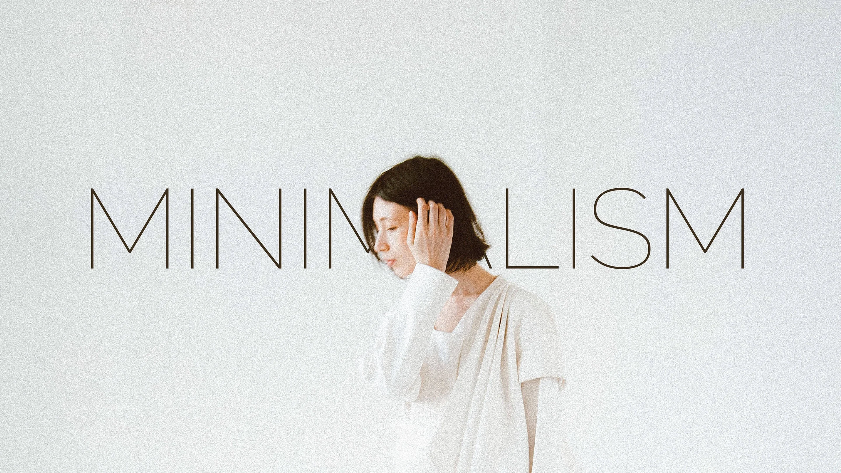
- Minimalist design: 25 beautiful examples and practical tips
Minimalist design: 25 beautiful examples and practical tips
You’ve probably heard the term ‘minimalism’ thrown about here and there, particularly in the past few years, but what exactly is it and how can we get the most out of it?
Minimalism can be described as the stripping away of all unnecessary elements and focusing on what needs to be there. In this sense, minimalism encourages purpose.
While minimalism often appears simple on the outside, a lot of thought, practice and time goes into the production and development of a minimalistic piece. So, here are some ways you can get the most out of minimalism.
01. Get Consistent

A minimal brand mark can be incredibly useful when it comes to creating a brand identity. Take this bar branding by Simon McWhinnie(opens in a new tab or window) for example. By keeping the logo(opens in a new tab or window) super simple and the colour palette very minimal, it has become flexible enough to be used throughout the rest of the branding seamlessly, creating a consistent and very memorable brand.

02. Explore Hidden Relationships

Embracing minimalism in no way means that your design has to be any less creative. In fact, when you’re not bogged down in complex visuals, you often get a chance to explore and play with clever relationships hidden within your design. Have a look at the branding done by Interbrand(opens in a new tab or window) for Opera Australia, a minimalist design has allowed them to discover a clever relationship with the words ‘OPERA’, ‘OPERA AUSTRALIA’ and ‘OZ OPERA’.

03. Play With Spatial Relationships

Minimalism can allow you to consider the spatial relationship of your design in a way you might not have before. Consider how your design interacts with other elements to create a wider design, just as these business cards(opens in a new tab or window) designed by Trevor Finnegan(opens in a new tab or window) do when lined up.

04. Be Clever

Minimalism isn’t about the complete lack of illustrative elements, but rather the careful choice of when and where to use them. By working an illustrative element that directly relates to the brand name into a logo, similar to the way Frame Creative(opens in a new tab or window) have done with this branding, you can create a very visual, and yet very minimal design.

05. Embrace Efficiency

Minimalism is often about stripping away all the unnecessary things and focusing on the communication. Have a look at the way this business card from Jake Frey displays his contact information neatly and efficiently, no crazy visuals needed.

06. Get On The Grid

As you probably already know, grids are very handy (some may say crucial) to a lot of design, and this is especially true for minimalism. As you may not have that many elements within your design, it’s likely a good time to really play up the use of your grid system. Check out this editorial design from Jessica Giboin(opens in a new tab or window) that uses grids to create a strong sense of alignment with the body copy, headings and graphic elements, generating a clean, simple and effective design.

07. Let’s Get Functional

Minimalism can be just brilliant for functionality. A clean, clear and uncluttered design can make navigation and legibility a walk in the park, just as it is with this contents page design from James Kape(opens in a new tab or window). The minimal design and the clear typographical hierarchy makes the navigation of this contents page quick, easy and functional.
08. Find Your Balance

The relationship between visual elements such as photographs and typographical elements is important to get just right. A good design often ensures that no one element vastly overpowers the other with no good reason. In this publication example from Mother Design(opens in a new tab or window), the more simple photographs have been paired with large, attention-grabbing pull quotes, while the more textured and complicated images have been paired with a small piece of body copy creating a balanced harmony between each page.
09. Break Some Rules

As previously mentioned, minimalism gives you a specific window to experiment with your design in a way you may not have been able to otherwise, and sometimes this means bending the rules a little. Take this logotype from Ruby Wight(opens in a new tab or window) for example, presenting half of a logotype upside down seems like a bit of a crazy decision to make, one that in any other case would ruin the legibility. But, thanks to the extreme simplicity and minimal nature of the branding, this crazy decision actually works really well as a visual element.
10. Make Your Type Visual

Type is an important weapon to not forget about, particularly when it comes to minimalism. It can act as a visual element, especially when it has been tweaked to fit the situation, just as it has been in this opening spread from Italian Vogue(opens in a new tab or window). Adjusting the type to look like rippling water creates a strong visual effect without the use of any imagery, leaving the final design simple and clear.
11. White Space Is Alright Space

White space, also known as ‘negative space’, can sometimes be looked at as just empty or blank space, but this is not entirely accurate! When used well, white space can help balance out your design, declutter it and help it breathe. Take a look at this publication example from Studioahamed, where the idea of white space has been leant into and embraced, resulting in a classy and minimal design.
12. Explore Your Options

What’s more minimal than an all-white colour palette? Design doesn’t have to end on the screen, taking it further when it comes to printing can give it a certain unique flair that sets apart your design from the rest. Considering letterpress or embossing effects at your printer can really complement and add depth to a minimal design, as seen in this example from Adam Buente.(opens in a new tab or window)
13. Texture

When exploring minimalism, it’s easy to assume that in order to be minimal you need to exclusively use flat colours, but this is definitely not the case. Introducing a little bit of texture into your design can give it that added depth and effectiveness without foregoing your minimalist aspirations. Texture works particularly well when it’s balanced out with clean, flat colours just like those seen on this website/branding example by Watts Design(opens in a new tab or window) that uses texture to balance out the simple photography and brand mark to create a very effective design.
14. Think Outside The Box

Quite literally. A minimal design can allow you to be a bit more playful with your elements’ positioning and composition, as seen in this publication example from Gregmadeit(opens in a new tab or window). The positioning of the type off the edge of the page creates a unique and eye-catching effect without damaging the legibility of the text.
15. Be Direct

When there are less elements fighting to be seen, you are able to be a lot more direct with your message and overall communication. This is especially useful when it comes to web design, as we all tend to skim pages, a direct and plain message of intent, as seen on Nine Sixty’s website(opens in a new tab or window), helps give the reader an idea of who they are straight away.
16. Scale It Up

Within minimalism, you tend you have a stronger say on exactly where your audience’s eye goes first, and one way you can achieve this is with scale. Have a look at the elements in this editorial spread from Saturdays Magazine(opens in a new tab or window), the eye immediately goes to the largest element: the pull quote on the right page, then the photograph, then the copy. A simple design, when purposely scaled, helps you dictate the exact path your audience will take over your publication.
17. Not Everything Is Black And White

Many people believe that monochromatic colour palettes are the be all and end all of minimalism, but this isn’t quite true. Colour can be used to create an eye-catching design without foregoing minimalism, as long as the palette is kept relatively small (1-3 colours is best). Check out this example from Moruba(opens in a new tab or window), where the bright yellow paired with the strong white and black logo work together to make a really successful and striking (yet still quite minimalistic) design that is sure to stand out.
18. Be A Bit Flexible

A minimalistic design can really help enhance the flexibility of your design, especially in terms of application. For example, this branding by Büro Ufho(opens in a new tab or window) consists of a simple serif brand mark and two blocks of flat color. This particular branding has a high degree of flexibility in terms of its color palette; the color of the diagonal blocks are able to change quite easily without losing any of the brand’s integrity, all thanks to a simple, yet unique minimalist design.
19. Get Symbolic

Minimalism is a great chance for you to explore the depth of symbolism with your design. Try and think around an object, about the things associated with the subject, about what the subject stands for. For example, have a look at this design by Jennifer Carrow(opens in a new tab or window) for the jacket of the non-fiction book “Against Happiness”. By fashioning the type into the symbol of a sad face makes for a clever and memorable design.
20. Iconography

Icons are useful little items that most of us use every day, from app icons to the toolbar icons on your computer. Icons can be used very effectively in the world of minimalism, as well. They can enhance accessibility, reduce the amount of text or type you have on a page and help guide users around your design visually. Have a look at how this website theme by Spab Rice(opens in a new tab or window) integrates icons throughout the page to help navigation and explain their intent.
21. Think Typographically

Less is definitely better, particularly when it comes to minimalistic typography. Using 1-3 fonts is your best chance at maintaining a minimal and functional design, just as has been done in this example by Kalpakian(opens in a new tab or window). The minimal use of type and the sparing use of fonts creates easy legibility.
22. Small Adjustments, Big Pay-Off

The beauty of minimalism is the fact that small changes can have big results. Take this logotype for The Pines for example. A simple, sans-serif typeface adjusted with just two strokes creates a small but smart visual that doesn’t tamper with the alignment or minimalism of the logotype.
23. Focus

Don’t forget why you started your design: the content. Minimalism works extremely well when it comes to showcasing content as the simplicity of the design allows for the attention to immediately go to the content rather than the business of the page. Have a look at this minimal webpage design by Darrin Higgins(opens in a new tab or window) that simply allows for the content to be the main focus.
24. Contrast

High contrast designs help put your content and visual elements in the foreground and make for an easily consumed design. In this example, a webpage by Mads Burcharth(opens in a new tab or window), the black background of the page contrasts sharply with the vibrant colour of the content images to create a simple but engaging design.
25. Design For The Future

Minimalism can be a vital component to your design as it has the potential to be timeless. The fewer elements your design includes, the less chance they are to go out of style or lose their trendiness. A common and perfect example of this is Google(opens in a new tab or window). Take a look at the screenshots below of the Google homepage 10 years ago and today. Despite small changes, the white space, the focus on the content and the ultimate minimalism of the website has kept the design relatively timeless.
Overall, minimalism isn’t necessarily an aesthetic objective or an exact style you can recreate, but rather, it’s a way of thinking about your design.
Typographically, try to limit your use of fonts to create a more cohesive, and less confusing design. Put an emphasis on your use of hierarchy and align your type to a grid of some sort for maximum legibility.
In terms of colour, embrace monochromatic schemes by all means, but don’t feel limited to them. An occasional addition of colour here and there can really help to highlight certain points of your design and draw focus to particular elements.
In general, try to consider what can be removed, whether that is a colour from your palette, or an image from your composition. Consider what can be condensed, what can replaced by something more concise. Simply, reduce it as much as you can until all that remains is what is necessary.

Written by
Mary Stribley

")


