- Spring design: 30 tips & examples to inspire your spring-themed social media graphics
Spring design: 30 tips & examples to inspire your spring-themed social media graphics
It’s time for a spring cleaning… on your social media profiles, that is.
Sprucing up your profile and posts to feature seasonal imagery or special offers can help engage your audience and draw extra attention to your business or organization.
Whether it’s a fresh new Facebook cover or an Instagram post to advertise a spring sale, a themed approach can give your profile a fun, seasonal facelift.
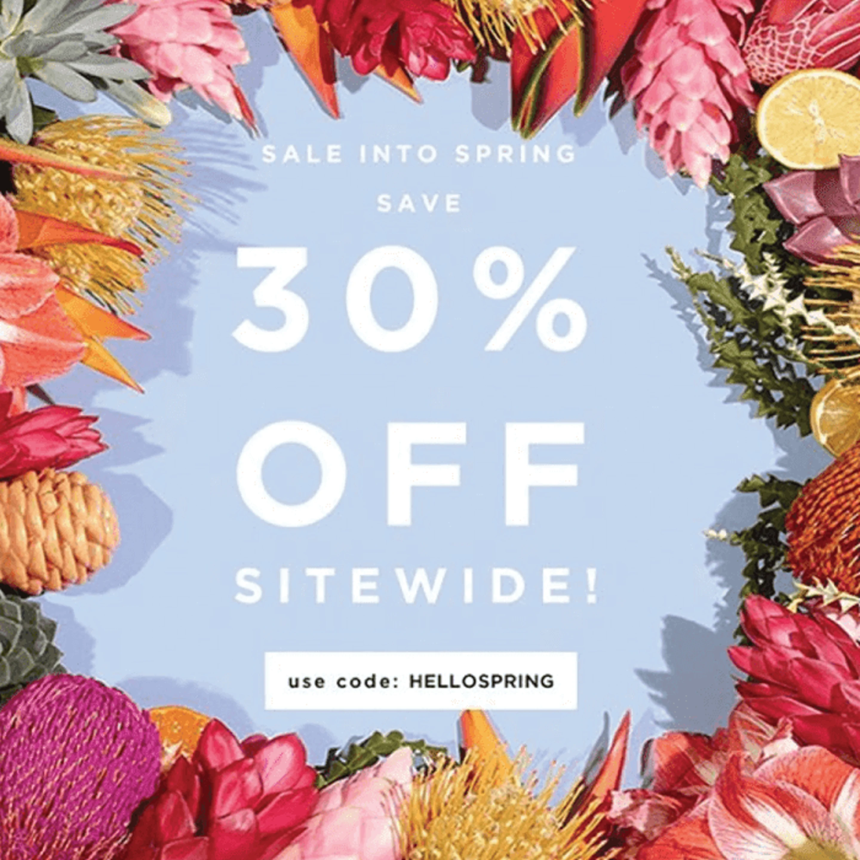
Let’s look at some examples and design takeaways:
01. Personalize With Handwriting

Cocorrina
Everybody likes finding a personal, handwritten letter in the mailbox.Corina Nika(opens in a new tab or window) duplicated that feeling with a simple graphic for her Etsy jewelry shop, which she posted on Pinterest(opens in a new tab or window) and her website(opens in a new tab or window).
The design is simple, featuring flowing handwriting with a pastel pink frame for a springtime association. An incentive is always good for business, and this example also includes a coupon code.
02. Layer Up

Mrs. Lilien
Layering graphic elements — for example, the typography, photography, and blocks of color seen here — can be a visually engaging way to compose a social media graphic.
Mrs. Lilien, the brand of fashion & design blogger and graphic designer Kelley Lilien(opens in a new tab or window), used the technique to display her fashion picks for Spring 2016 in a whimsical, colorful way that brings to mind tropical spring break vacations. The graphic did double duty for a blog post and a Pinterest pin(opens in a new tab or window).
03. Stand Out With Illustrations

Flint Handmade
Illustrations — whether digitally produced or handmade — can stand out on social media channels saturated with photography. Flint Handmade(opens in a new tab or window) re-worked the same illustration (likely from the event’s poster) to create matching Facebook cover(opens in a new tab or window) and post(opens in a new tab or window) images to advertise its annual spring craft fair.
04. Try a Text Effect

Loeffler Randall
The peek-a-boo effect on this Loeffler Randall(opens in a new tab or window) spring sale graphic (posted on Facebook(opens in a new tab or window)) lets the watercolor textures show through, emphasizing the discount being offered. Fresh colors that bring to mind new spring growth help reinforce the seasonal aspect of the sale.
This particular technique works well when you have eye-catching colors, textures, or patterns in the background.
05. Include a Hashtag

Terrain
Help your audience share with their friends by creating a spring-specific hashtag to promote an event, sale or special offer, product, or something else. Terrain(opens in a new tab or window), a home and garden store, created an Instagram graphic(opens in a new tab or window) to facilitate a gift card giveaway.
06. Keep It Real

Terrain
A couple more examples from Terrain, this time from their Facebook page(opens in a new tab or window), show how using real objects — like the typography hand-painted on physical surfaces and live plants shown here — can give your posts depth and make them seem tangible.
These two posts use traditional springtime imagery (a tulip bulb and daffodils) in a fresh and unexpected way.

Terrain
07. Use High-Quality Photography

Alastair Beaton
Alastair Beaton(opens in a new tab or window)’s multipurpose designs for outdoor apparel brand North Face were created for use across multiple social media and advertising channels.
They feature realistic scenes of people wearing the brand’s new spring and summer clothing collection. The key here is the high-quality, natural-looking photography that transports viewers to sunny locales perfect for adventuring during the warmer weather and longer days of spring.
08. Make Your Graphic Interactive

Julianne Gross

Julianne Gross
Julianne Gross(opens in a new tab or window), art director at Front Flip, created a contest for the company’s Facebook page to promote their app for finding deals and discounts from retailers.
They encouraged participation by making the process fast and immediate: users scan QR codes(opens in a new tab or window) on the contest’s Facebook tab for daily opportunities to win gift cards for local retailers. Cheerful graphics in bright colors give the designs a fun, seasonal look.
09. Break It Down

Style Me Pretty
If you’re creating social media graphics with the intent of encouraging viewers to do something, break down the steps or instructions clearly and simply to make it easy to get involved. Style Me Pretty(opens in a new tab or window) has done that for its Pinterest(opens in a new tab or window) contest, aided by cute, similarly interspersed illustrations in spring-like colors.
10. Create More Than One Design

Katie Calcado
Katie Calcado(opens in a new tab or window)’s designs for a spring event at her university include two different Facebook cover options. Rotating designs can keep an event or other promotion fresh in your audience’s feeds and provide room for communicating extra information.
11. Match Your Colors

Cake Boss Baking
This Facebook image for a giveaway from Cake Boss Baking(opens in a new tab or window) (the brand behind the reality TV show Cake Boss) uses an easy trick to create a cohesive design: matching the font colors to the imagery.
As a nice touch, the post makes sure to connect with fans by using part of a familiar phrase (“Bada bing, bada boom!”) used by the show’s host, the Cake Boss himself. That the phrase happens to rhyme with “spring” helps make the design more memorable.
12. Collage a Variety of Spring Designs Into One

Mari-Liza Monteiro
Collages — whether used as a background or a featured element (like above)— can add visual interest to your designs.
Mari-Liza Monteiro(opens in a new tab or window)’s fusion of different complementary patterns for this social media marketing graphic creates a playful, eclectic look, while the floral patterns and vibrant colors support the seasonal promotion.
13. Mix Font Types

Tori Spelling
This Facebook image for a giveaway by Tori Spelling(opens in a new tab or window) CupcakeMAG mixes a clean sans-serif font with a brush-style script for an eye-catching focal point. When done right, combining fonts(opens in a new tab or window) can be a great way to spice up a simple design.
14. Consider Context

Paul Slaven

Paul Slaven
Paul Slaven’s promotional designs for Hallmark’s line of baby clothing include graphics for use on Facebook and X (formerly Twitter). The whimsical illustrations, soft colors, and playful fonts match both the season as well as the baby-focused theme.
In other words, the design choices are context- and audience-appropriate — important considerations for an effective social media campaign.
15. Do Something Different

Tabitha Hatch
Instead of going with typical springtime imagery and themes, Swingline’s Facebook collateral (designed by Tabitha Hatch(opens in a new tab or window)) for its sweepstakes held in late spring looks ahead to the summer barbecue season, featuring graphics and colors to suit.
16. Go Retro

Charlotte Gibling
A distinct visual style can make an otherwise unexciting subject more interesting, and a retro aesthetic is always a popular choice. Charlotte Gibling(opens in a new tab or window) took that tack in creating social media images for a grocery store’s spring cleaning event.
For these Facebook cover and timeline images, the color choices (1950s-inspired, but also spring-appropriate) and fonts do the most to establish a nostalgic mood.
17. Add Some Embellishments

My Paper Shop
Want to add some personality to product photos or other imagery? Add some embellishments, like My Paper Shop(opens in a new tab or window) has done for their contest on Pinterest(opens in a new tab or window). Hand-drawn frames in vibrant colors that match the photography give the image a casual, crafty feel.
18. Create a Visual Pathway

Sankhalina Nath
Essential to a successful layout is arranging your design elements in such a way that viewers can easily navigate the design and focus on the most important information.
Sankhalina Nath(opens in a new tab or window)’s social media graphics for online fashion brand Eat Shop Love’s spring collection do this effectively with diagonal movement: Notice how the headline in the top left corner guides your gaze through the photography down to the call to action in the bottom right corner.
19. Make Visual Connections

Display Dynamics
When your social media graphic is communicating on a visual level, it helps make your message clearer and your design more memorable.
For instance, take a look at Arvin Rapadas(opens in a new tab or window)’ Tumblr graphic(opens in a new tab or window) for a spring sweepstakes: the title and imagery visually support each other, as a spring bouquet pops up through letters that spell out “Pop-Up Into Spring.”
20. Play up Patterns and Solid Blocks of Color

Amber Harmon

Amber Harmon
Amber Harmon(opens in a new tab or window)’s promotional social media graphics for a handbag manufacturer’s Facebook campaign(opens in a new tab or window) capitalize on patterns, shapes, and playful spring colors.
They also address users directly to encourage engagement. Friendly questions and suggestions like “Are you ready?” and “Which print is your favorite? Give your fave a thumbs up!” build anticipation for new products and invite feedback.
21. Be Bold

Darren Cooper
With dramatic typography and saturated colors, Darren Cooper(opens in a new tab or window)’s design for an Easter event is eye-catching, with a non-traditional style that helps set it apart from the pastels and bunnies common to many Easter- and spring-themed promotional materials.
The design’s bold, easy-to-read layout is a smart move to help it get seen on social media channels. This piece was cropped from the event poster, so the consistent imagery will create familiarity across multiple advertising methods.
22. Contrast With Color Temperature

ShopSosie
It can be easy to fall into conventional or overused color choices when designing for a particular time of year. One way to mix things up a bit while still referencing season-appropriate themes is to contrast color temperatures.
For example, Sosie’s Instagram graphic contrasts warm pinks and oranges with a cool grayish blue for a striking advertisement.
23. Keep It Simple

Lowe’s
Lowe’s(opens in a new tab or window), a home improvement store, demonstrates how simple graphics can get the job done with this Facebook cover image that introduces suggestions for DIY spring projects. Transparency effects applied to the illustration’s dominant color — a fresh spring green — help give the illustration visual interest.
24. Divide and Conquer

Lowe’s
Dividing your social media graphic into sections with a grid or any other organizing principle can offer creative layout options and give you space to showcase extra imagery. Another selection from Lowe’s shows a simple, three-image grid with text overlaid on top of the largest photo.
25. Use Leading Lines

Lemon Sanuk Kim
Leading lines don’t have to be visible or even linear. Anything that visually leads viewers toward a focal point can serve the same purpose.This Facebook cover by Lemon Sanuk Kim(opens in a new tab or window) frames and points toward the design’s text to instantly direct viewers’ focus.
26. Strike a Mood

Serengetee
Here’s another example of a simple but effective social media graphic, courtesy of Serengetee(opens in a new tab or window). Both the photo and the typography work together to create a casual, relaxed mood that suits the theme of the giveaway. The brand did some cross-platform promotion by posting its Instagram contest image on X (Twitter)(opens in a new tab or window).
27. Use a Background Shape

Magnolia Market
You have a photo that you want to place text over, but either the image is too busy for the text to be easily readable, or font color you want to use won’t show up well. The solution? Use a background shape behind the text.
Here, Magnolia Market(opens in a new tab or window)’s spring sale ad on Instagram(opens in a new tab or window) features a slightly transparent box behind the text that blends in nicely with the image. This technique can work with both solid and transparent shapes.
28. Appeal to the Senses

Fit Foodie Finds
Our brains like visual information(opens in a new tab or window). Studies suggest that we process it faster and remember it better than other types of content.
And since social media is largely a visual medium, your graphics had better immediately make a good impression if you want your brand to be memorable to users. One way get ahead of the game is to appeal to other senses.
Yes, for a non-video post you’re only technically able to work with visual qualities, but your design can suggest other characteristics — for instance, tactile ones (soft, hard, smooth, rough) through the use of texture.
Food imagery is an especially good candidate.
The textures, colors, and (imagined) smells and tastes of food have a lot of advertising power. Fit Foodie Finds(opens in a new tab or window) clearly demonstrates this with a spring-colored graphic (featured on their blog and re-posted on Pinterest(opens in a new tab or window)) full of imagery that appeals to all the senses.
29. Slip in Some Branding

Nordstrom
Nordstorm(opens in a new tab or window)’s spring-themed Facebook graphic(opens in a new tab or window) is promoting the fact that a portion of gift card sales go to support non-profits. But the image also provides a convenient opportunity to slip in the brand’s logo so viewers know, at first glance, who the image is from.
Including logos, brand colors, or other elements as part of your designs for social media will help create recognizability for your business or brand.
30. Pick an Accent Color

Clarion USA
Using an accent color can help emphasize certain parts of your design and also give it a sense of unity. Here, the sunshiny yellow on Clarion(opens in a new tab or window)’s pin seems fitting for a spring getaway, but also ties in with the yellow umbrella in the background image.
Over to You
Now you’re all ready to spruce up your social media profiles for spring, and have hopefully collected some inspiring ideas to try out.
Need more social media inspiration? Check out some other Design School resources like Creating Calls to Action for Social Media That Actually Convert.(opens in a new tab or window)

Written by
Janie Kliever

")


