- 25 perfect wedding color combinations
25 perfect wedding color combinations
Your wedding colors should capture and evoke the mood you want for your nuptials.
But that’s not all you have to consider: What tone you want in your wedding photo album? What design and fonts to use in your save-the-date card(opens in a new tab or window)? What color would look good on your bridesmaids? Most importantly, the colors you choose must tie in with your wedding narrative. Although weddings are a predominantly white affair, it’s the accompanying colors that give shape to your theme and sets the mood(opens in a new tab or window) for your event.
The most challenging thing about picking colors, though, is the harmonizing part. Just like you and your partner-to-be, your colors must be a match made in heaven.
To help you out, we’ve gathered 25 color palettes taken from some of the most inspiring wedding invitations(opens in a new tab or window) online. We’ve also included the HEX color codes below each image. To apply the colors, simply copy and paste the codes into the color menu of your Canva editor.
01. Pastel Peach

Julia Song Ink
Julie Song Ink(opens in a new tab or window) is a master of creating watercolored wonders for brands, magazines, and of course, weddings. This soft peach and pear creation evokes the dream-like quality of garden nuptials and intimate gatherings. Check out more of Julie Song Ink’s beautiful watercolors (and their palettes!) in her Instagram account(opens in a new tab or window).

02. Rustic Steel

The Elli Team
This rustic themed invite rendered in a combination of contemporary and vintage tones captures the Old South charm without looking dated. By intersecting a modern, steely tone with earthy browns, and offsetting the two with warm and creamy hues, you get a wedding invite perfect for Gone With the Wind-inspired celebrations.

03. Bounty Fresh

Ana Andreeva
Classic complementary combinations like tones of orange and green are guaranteed to work. For this pair to work on a traditional wedding invite though, it needs to Paired with creamy tones of rose and ivory, this design by Ana Andreeva(opens in a new tab or window) is a refreshing palette of delicate springtime hues.

04. Baby Blooms

Kateryna Savchenko
Perky tones of pink and blue can brighten up any design. Apply it to traditional wedding design elements like florals, but be careful not to swamp the design with too much bright colors. Offset the vibrancy of your blues and pinks with lighter tones or just white, like in the above design by Kateryna Savchenko(opens in a new tab or window).

05. Red Wine

María Hdez
This sleek, contemporary wedding invitation(opens in a new tab or window) by Spanish designer María Hdez makes good use of deep red as the main color by pairing it with analogous tones and using accents in deep green.
The otherwise stark contrasts are balanced by using the main color sparingly when used with light pastel hues.

06. Farm Fresh

Morgan Ramberg
If you’re holding your wedding on a beautiful spring day, match the design perfectly with the season by using the right greens and pinks. Although this palette — based on the featured design(opens in a new tab or window) by illustrator Morgan Ramberg — seems to have a wide range of colors used, it’s actually just variations of complementary colors green and red. This makes the whole design seem detailed without looking cluttered.

07. Summer Solstice

Breanna Rose of Rowan Made
Yellow, deep green, and light taupe come together in this summer harmony of Breanna Rose(opens in a new tab or window) in this Rowan Made design.

08. Playful Blossoms

Lera Efremova
This quirky design works in part because of the equally quirky but compatible color combination. Youthful designs work best with cotton candy colors, as exemplified in this wedding invitation.

09. Green Feline

Janis Andzans
Green cats might not have been a fantastic idea until this wedding invitation of green-toned felines. Unconventional color applications, when done the right way, can modernize what could’ve been a trivial design.

10. Royal Treatment

Jason Wright
Even if you’re not printing with gold foil, you can capture effect with the right tone of gold. Pair it with a contrasting color to emphasize the tone.

11. Precious Metals

André Britz
This silver and gold palette is a classic combination for anyone planning a traditional wedding.

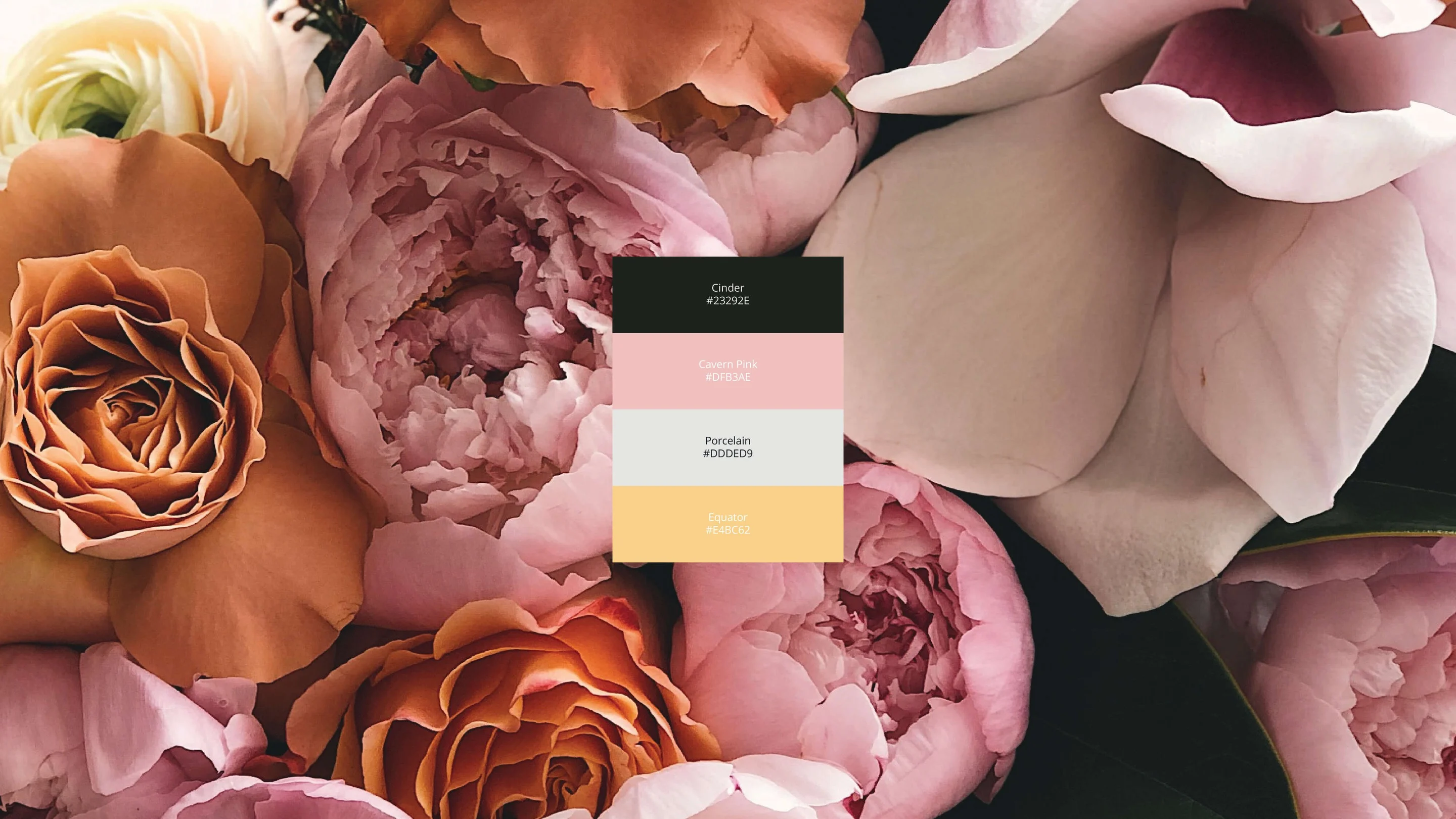
12. Modern Crystal

The Shift Creative
The contemporary design abstracts agate and pulls it off with stark contrasts created by cavern pink and cinder.

13. Wine and Rose

Anna K
Weddings would hardly be complete without flowers and a good bottle of wine. This design takes its cue from two of the most indispensable wedding staples by borrowing their color.

14. Peach Vanilla

FØLSOM Creative Studio
Peach tones are one of the most popular color choices for weddings — this wedding invitation kit(opens in a new tab or window) gives it an upscale twist by pairing it with a black pearl tone.

15. Summer Bouquet

Tiffany Jen
Summer tones of orange, yellow, and green make for an upbeat wedding color combo(opens in a new tab or window). This design pairs it with a lot of white to soften the otherwise too-bright palette.

16. Bubblegum Ice Cream

Xato and Nidia Donado
Sweet bubblegum colors make this wedding invite distinctly feminine. All taken together, the calligraphy, watercolor roses, and pastel tones play off each other very nicely.

17. Morning Spring

Daniel Olivier-Argyle and Ellie Savige
The shady pink, teal, and orange tones in this invite are used mainly to accentuate this wedding invite. Overusing it would have overwhelmed everything else in the design because of their heavy look.

18. Olive and Gold

Lilly and Louise
If not for the playful use of a handwritten font, this gold and olive combination might have come out a bit old fashioned.

19. Pastel Dream

Coral and pastel blue are masterfully blended in this beautiful design. The metallic bronze used for the text stand out beautifully due to the light rendering of the main colors.

20. Charcoal Rose

Vistaprint
These pink and red roses look great against the charcoal-colored background because of the highlights were not too overpowering. If too bright, the flowers would have cluttered the design; if too dark they would’ve drowned.
")
Related: Canva also has programs for wedding templates(opens in a new tab or window) for any wedding theme.
21. Laurel of Greens

Minted
The handmade look of this wedding invitation is perfectly complemented by the particular tones of green applied.

22. Vintage Garden

Rachel Marvin Creative
The washed-out tones gives this floral design a vintage twist. And because of the lightness, it doesn’t overpower the text even if it’s featured in large doses.

23. Old Rose

Rachel Marvin Creative
Here’s another vintage look that works well. The grayscale tone of this wedding invite is accentuated with just the right amount of pink.

24. Midnight Indigo

Jolly Edition
The beautiful illustration is made only more beautiful by the excellent application of color. If you’re looking for something different, this color manages to make dark colors playful.

25. Madison Blue

Little Bridge Design
Gold tones and dark blue somehow give a feeling of royalty to anything they’re applied on. This color combination is perfect for traditional weddings.

Over to you
There you have it, 25 color palettes based on some of the most beautiful wedding invites from around the web.
If you liked this article, you should try our other color inspiration posts: 100 Brilliant Color Combinations and How to Apply Them to Your Designs(opens in a new tab or window) and Build Your Brand: 20 Unique and Memorable Color Palettes to Inspire You(opens in a new tab or window). You may also try exploring a plethora of uniquely designed wedding invitation templates.
Happy designing!

Written by
Staff Writers

")


