- The biggest color trends in 2023
The biggest color trends in 2023
In 2020, we craved comfort and stability in the face of uncertainty. Now, as we enter this hopeful new frontier, we’re also seeking joy and adventure (even if it’s still just from the comfort of our own home!) This will be reflected in the top color trends of 2023.
Joining a palette of earthy, grounding hues, we’re going to see fresh new takes on primary colors like green, blue and orange. From cerulean blue and ash green to burnt coral, it’s all about embracing the unexpected. Here are the biggest color trends and top color combinations for 2023, as predicted by leading color experts and paint companies.
The importance of color

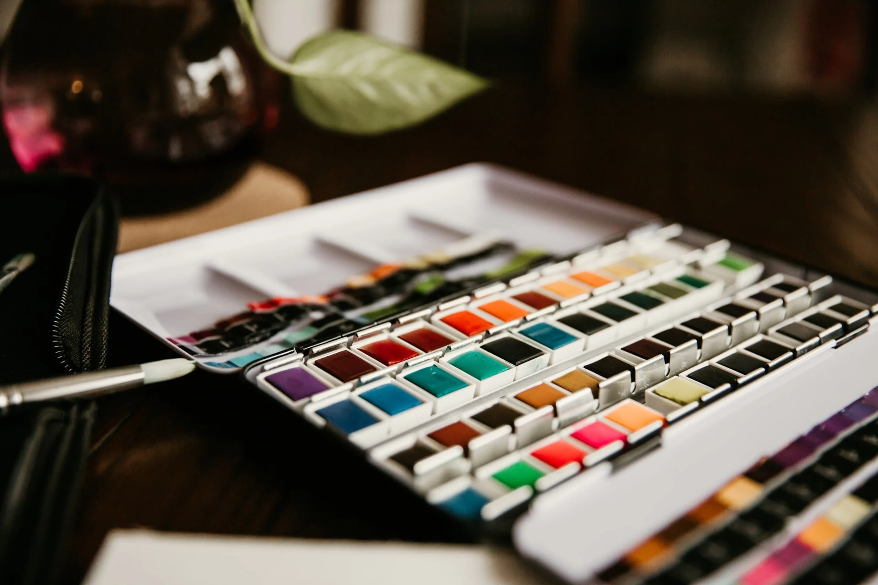
Key Notez via Pexels
Colors are incredibly compelling. They significantly impact our emotions and how we behave. In certain contexts, their effect is universal, but our perception of color is largely subjective. How we respond to certain hues is dependent on a number of factors, including gender, age and culture.
The purpose of color

Scott Webb via Unsplash
Colors inform how the viewer should start to feel. So from a branding perspective, they should represent the purpose and personality of a product or brand. For example, the color blue is perceived as reliable and trustworthy, making it a popular choice for corporate businesses. Green often points to wholesomeness and nature, so it’s often adopted by wellness brands. And red symbolizes prosperity and power in certain cultures. So what we learn here, is when used strategically, color can effectively position a brand in the minds of its customers.
The emotional impact of colors can also be used to a brand’s advantage. Red and orange shades make us feel hungry, which is why they abound in the food industry. Blues and neutral colors have a calming effect, while yellow can be energizing. If you want to make your audience feel a certain way, the right color or color combination can make your intention known.
The top 10 color trends for 2023
The color experts from Pantone, Dulux and Coloro weigh in annually with their predictions for the year ahead. While these trending colors originate in art and interior design, their influence is far-reaching. We’re likely to see these color trends appear not only on fashion catwalks and cafe walls, but also in the graphic design world. From logos(opens in a new tab or window) and product packaging(opens in a new tab or window) to social media content(opens in a new tab or window), these will be bold color choices for forward-thinking brands.
Here are the top 10 biggest color trends set to take 2023 by storm.
1. Summer Song: #A7C2D8

Via The Nordroom
According to the Pantone Trend Institute’s forecast for Spring/Summer 2023, Summer Song is set to take center stage. A crisp, cyan-blue, this shade resembles the clear sky on a summer’s day. With an abundance of time spent inside in 2020, it’s a beautiful celebration of the great outdoors. It also features a slight grayish tinge, which adds a hint of mystery.
From logos(opens in a new tab or window) to banners(opens in a new tab or window) and even corporate materials, this versatile color can be used almost anywhere. It could also be used by brands(opens in a new tab or window) across a wide range of industries, from health to finance. The sky’s the limit with this one!
If you're considering incorporating Summer Song into your home's interior design, explore Canva's house plans(opens in a new tab or window) with free templates and easy-to-use tools.

Want to see what Summer Song can do for your brand? Check out Canva’s Pale Fashion Facebook Cover template(opens in a new tab or window)
2. Crystal Oasis #B3C6BF

Via My Design Agenda
Crystal Oasis is one of Dulux’s top color predictions for 2023.
With a cool and clean aesthetic, it’s reminiscent of a moss-covered forest.
Much like the natural landscape it’s inspired by, Crystal Oasis is calming and vibrant. It’s the perfect choice for brands that like the freshness of mint (one of the trending colors in recent years), but are looking for something a little more sophisticated.

Ready to breathe new life into your design with this nature-inspired color? Canva’s Green Simple Illustrated Leaf Environment Logo i(opens in a new tab or window)s ready to be customized.
3. Crushed Cinnamon #934E31

Via Sampleboard
Cinnamon has long been a mainstay in the design world. In 2023, it’s not going anywhere. But in place of the peachy, pink hue that has been popular, we’ll see a more mature, burnt iteration take the reins.
It’s a chic and stylish shade that still feels warm and convivial. Being a trendy and ‘of the moment’ color, timeless brands may not want to commit to using burnt coral as the foundation of their branding. Instead, it can make an excellent ‘feature’ color for pop-up campaigns, or an accent color in brand collateral.

Take Crushed Cinnamon for a spin with Canva’s Orange and Blue Building Icon Construction Logo template(opens in a new tab or window). It’s versatile enough to be used by a broad range of industries.
4. Starry Night Blue #354171

Via Glowsy
This shade is a close relative of cobalt blue. But, where cobalt is striking and electrifying, Starry Night Blue feels more homely and nostalgic. As Patone themselves put it, it’s “a stirring blue hue that awakens a vision of Paris in the springtime.”
It’s an inviting shade that looks just as at home in branding as a Parisian doorway. If you’re a brand that isn’t afraid to stand out, go all-out with Starry Night Blue in your branding. You can also dip your toe in the water by adding pops of this color to your design.

Ready to dive in with Starry Night? Try Canva’s Blue Roofing Construction Card template(opens in a new tab or window)
5. Spicy Mustard #C2AB69

Via AIA
If you’re after a hue that is both cheerful and comforting, you can’t go past marigold. This Deluxe prediction adds a hint of golden orange to a yellow base. The result is a sweet and nurturing color that feels like warm honey.
Spicy Mustard is the ideal color choice for customer-facing brands that want to emphasize their caring brand personality. Spicy Mustard is also likely to be popular in branding for children’s brands, thanks to its youthful and gender-neutral qualities.

Spicy Mustard looks particularly inviting when paired with earth tones. You can get the look with Canva’s Yellow Self-help e-Book Branding Education Feed Ad template(opens in a new tab or window)
6. Redend Point #B49789

Via Decor Aid
Redend Point has been gaining popularity in the design world in recent years and now it’s official—it’s been named one of Sherwin Williams top color predictions for 2023.
This is “an earth-inspired mid-tone brown/pink, emblematic of Autumn leaves uncharacteristic of a spring palette.” In other words, it’s a rustic shade that works all year round as it’s neither too light nor too dark.
Redend Point looks best when it’s paired with other earthy colors like terracotta, or peachier hues like blush pink. You can even combine it with another trending color for 2023, burnt coral! This creates a dreamy aesthetic that is perfect for bohemian brands.

Feel like redend point is a must-try for your branding? Canva’s Blush Pink Neutral Modern Minimal template(opens in a new tab or window) is the perfect place to start
7. North Sea Green #396C72

Via PPG
Another novel take on emerald and teal, North Sea Green gives a bold blue tinge to this mentholated jewel-toned hue. This creates a cooling and soothing aesthetic that is perfect for wellness brands.
We’re likely to see this color paired with orange, taking the place of the ‘teal and orange’ combination that has been en vogue recently. However, it works just as well when paired with other light, cool shades like light blue—creating a visual effect that’s more tranquil than striking.

Want to play with contrasting colors in your brand design? Check out the Green Orange Vector Graphic Business Design template(opens in a new tab or window) in Canva
8. Transcend #BFAC9A

Via Dezeen
As we brave an uncertain-yet-hopeful future, grounding is something we all need. So, it’s only fitting that Dulux’s color of 2023 is brave ground! It’s an earthy, timeless hue that adds a hint of warmth to a brown base.
Like most neutrals, Transcend is versatile. It looks just as inviting paired with pastels like lilac as it does with other muted hues. It also works well as the main color in branding, paired with neutral accents like black and white.

You don’t need to feel brave to give this trending color a go. We’ve done all the heavy lifting for you with ourBlack and Brown Minimal Edgy Breakfast Invitation template(opens in a new tab or window) in Canva.
9. Raspberry Blush #B83D34

Via Interiors By Color
It’s impossible not to think of a summer day when you see this vibrant color. As Benjamin Moore puts it, “vivifying Raspberry Blush tantalizes”—much like the allure of a sweet gelato on a scorching hot day. This is a bright, fun and vibrant color that isn’t for the faint of heart. However, it also has a touch of femininity and elegance. It’s a great choice for bold beauty and fashion brands who want to make an unforgettable first impression.

Pastel yellows can be used to soften this striking color. Try the Magenta and Orange Margarita Day Facebook Event Cover Photo template in Canva(opens in a new tab or window).
10. Digital Lavender #B0A7CB

Via Glowsy
Purple has had a major comeback in the design in recent years, and it shows no signs of slowing down. Pantone’s 2023 prediction, Digital Lavender, puts jewel-toned hues in the spotlight. It’s similar to mauve, but with more richness and depth.
Digital Lavender straddles the line between regal elegance and floral femininity. This makes it a great fit for brands with a more exclusive or luxury feel. It also works well in graphics for sentimental personal events, such as wedding or baby shower invitations(opens in a new tab or window).

Harness the elegance of Digital Lavender in your own designs with Canva’s Purple Gold Leaf Vine Illustration Wedding Announcement template (opens in a new tab or window)
10 trending color combinations for 2023
In design, even the trendiest colors rarely hold the floor all on their own. It’s all about combining colors with others that compliment or contrast against it to create a visually-pleasing effect. In 2023, we’re set to see grounded, neutral hues being paired with brighter, more striking ones—once again, finding beauty in the unexpected.
Here are 10 color combinations that we’ll see everywhere in 2023.
1. Sage and turmeric

These two don’t only pair well together in cooking. Pops of bright turmeric can be used against calming sage to create a tranquil, nature-inspired palette.

Check out theBrown Outline Strokes Architectural Logo template(opens in a new tab or window) in Canva
2. Brown and red

Via Dulux
Brown and red are two colors we don’t normally see together—but in 2023, that’s changing! Together, they create a cosy effect that feels like a warm hug or relaxing in front of a fireplace.

Channel this rich color combination withCanva’s Red Brown Illustrated Leaves Chocolate Product Label template(opens in a new tab or window)
3. Pastel green and light blue

Via Nordroom
These light, cool colors are calming enough on their own. But when paired together? The results are magical. This analogous duo will be a firm favorite for brands who want to convey a zen vibe.

Get the look with Canva’s Blue and Green Construction logo
4. Teal and red

Via HGTV
Red is back at it again! This time, it’s being paired with laidback teal to add a touch of bold, dramatic flair.

Experiment with this color palette using Canva’s Red and Teal Bright and Playful Fashion Moodboard Photo Collage template(opens in a new tab or window)
5. Olive and terracotta

Via Pinterest
It’s no secret that earthy color palettes are in right now, and it doesn’t get much earthier than olive and terracotta. Despite being on opposite ends of the color wheel,(opens in a new tab or window) they work together in perfect visual harmony.

Take this color combination for a test drive using Canva’s Beige, Brown, and Green Fashion Chic Terracotta Instagram Story Ad(opens in a new tab or window)
6. Mustard and wine

Decoholic
Another food-inspired color combo! Mustard and wine is a complementary color pairing that feels divinely rich and luxurious. It’s likely to be embraced by luxury brands in 2023.

Get ahead of the trend using Canva’s Earthy tones Terracotta Lifestyle Fashion Chic Instagram Story(opens in a new tab or window) template
7. Petrol blue and blush pink

Via Bed Threads
It’s hard to think of a more unexpected color pairing than petrol blue and blush pink. And yet, they just work! The feminine, sweet pink is the yin to petrol blue’s yang. Together, they’re an urban combo that is perfect for contemporary brands.

Try out this trending combination with Canva’s Blue Pink Handwritten Script Leaves Wedding Program template
8. Rust and pink

Via Italian Bark
Both sharing a red base, pink and rust are an analogous color combination. When paired, they create a harmonious, romantic feel that is a perfect fit for bohemian or natural brands.

Canva’s Sale Instagram Post Abstract Watercolor Modern Shapes template(opens in a new tab or window) combines the last two color combinations in a stunning way
9. Mustard and blue

Via Nordroom
Another striking pairing featuring mustard (one of the top trending colors of the past few years) This complementary combination shows how warm and cool colors can pair together beautifully.

See is this color combination cuts the mustard for your brand, using Canva’s Yellow and Blue Gradients Home Lifestyle template(opens in a new tab or window)
10. Blue and grey


Explore this color pairing using Canva’s Grey and Blue Square Photography Logo template(opens in a new tab or window)
Sensible, sleek and stylish—this color combination is perfect for corporate brands who refuse to be boring! It’s versatile too. Whether you pair a light blue and grey or a navy and charcoal, the result is effortless elegance.
By experimenting with these trending colors and combinations in 2023, you can find a palette that works perfectly for you and your brand. Who knows, you might even stumble upon something new and create a trend all of your own!

Written by
Melanie Dimmitt


