- 100 of the best free fonts you should be using
100 of the best free fonts you should be using
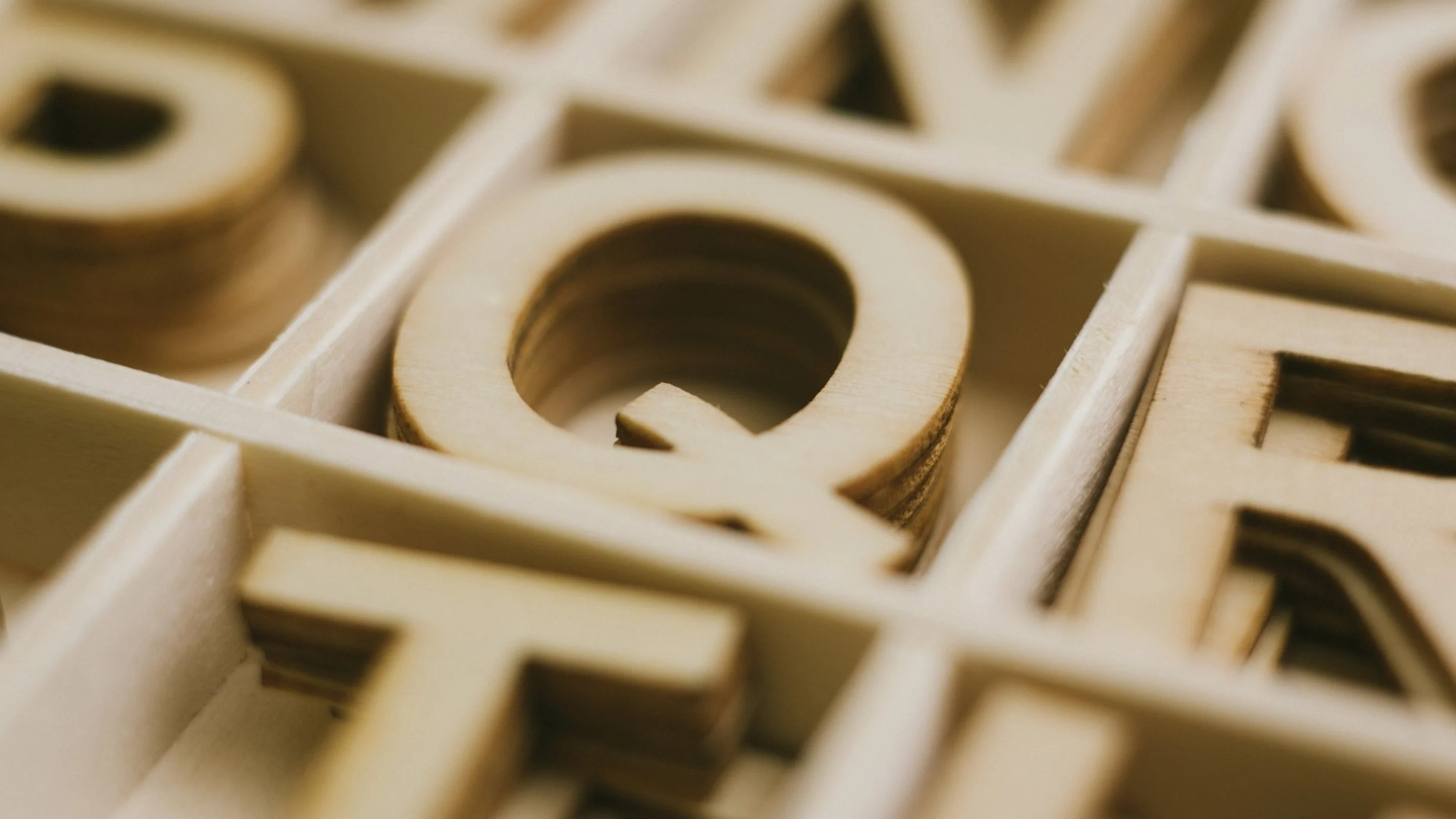
The perfect font is hard to find. Fonts are an important part of any visual communication and can have a huge impact on how people perceive your message. The right font can give personality to a statement, while the wrong one can give a totally different impression to the viewer.
Here at Canva, we know how difficult and time-consuming it can be to search for the perfect fonts every time you need one for a design project. So we’ve done the hard work for you, compiling a showcase of the best typefaces in recent years. You’ll find them organized by category with links to where you can download them for your own use.
It's important to take into consideration the style of font, size, spacing, and color when selecting the perfect font for your project. Check out this article that shows how you can upload custom fonts with Canva Pro, and dive into our tutorial below to learn how to choose the right font for your brand.
Table of Contents
Sans Serif
01. Alegreya Sans by Huerta Tipográfica

Huerta Tipográfia
Features: Humanist design (more organic, calligraphy-inspired, horizontal movement for easy reading); seven weights plus matching italics and small caps.
Great for: Advanced typesetting; books and articles.
Find it at: Huerta Tipográfica(opens in a new tab or window); download the companion serif version at Font Squirrel(opens in a new tab or window).
02. Montserrat by Julieta Ulanovsky

Julieta Ulanovsky
Features: Contemporary yet classic design inspired by early 20th-century signage in the Montserrat neighborhood of Buenos Aires; recently updated with extra weights (but no italics).
Great for: Almost anything; this versatile, clean-lined font is a nice alternative to pricey typefaces like Proxima Nova, Gotham, and Avenir.
Find it at: Font Squirrel
03. Montserrat Alternates by Julieta Ulanovsky

Julieta Ulanovsky
Great for: Adding a custom look or letter variations to text set in Montserrat.
Find it at: FontLibrary
04. Stilu by Genilson Santos

Genilson Santos
Features: Four weights plus italics; includes small caps and ligatures.
Great for: When you need versatility; creating a bold, modern look.
Find it at: Genilson Santos.
05. Webnar Bold by The Northern Block Ltd.

The Northern Block Ltd.
Features: Clean, geometric design created for legibility; performs well both in print and on screen.
Great for: Punchy headlines; has a modern look originally designed for technology contexts.
Find it at: MyFonts(opens in a new tab or window).
06. Muller Thin and Extra Bold by Fontfabric

FontFabric
Features: Wider letter structure for better readability at small sizes.
Great for: Creating a cohesive, polished look with multiple weights of the same font. Its versatility makes it a good option for text-heavy projects (magazine layouts, web pages) and branding.
Find it at: Fontfabric(opens in a new tab or window).
07. Cabrito Semi Light & Medium by Jeremy Dooley

Jeremy Dooley
Features: Semi-serif (combination of sans-serif & serif qualities); rounded corners for a casual, accessible appearance.
Great for: Multipurpose design applications; the hybrid design makes it unique yet versatile; try on websites or product packaging.
Find it at: MyFonts(opens in a new tab or window).
08. Aileron by Tipotype

Tipotype
Features: 16 weights and styles with a clean, simple design similar to Helvetica, but with some unexpected stylistic twists.
Great for: Typesetting text-heavy designs; plenty of weight and style choices make it easy to create a polished, uncomplicated layout.
Find it at: TipoType(opens in a new tab or window).
09. Geomanist Regular by atipo

Atipo
Features: Clean, linear design created for contemporary contexts.
Great for: Both body copy and larger type because it’s readable at small sizes, but its clean lines and geometric shapes also make for engaging headlines.
Find it at: Atipo.
10. HK Grotesk by Hanken

Hanken
Features: inspired by classic grotesque typefaces (sans serifs that have uniform proportions and aren’t based on calligraphy) like Helvetica, Univers, and Gill Sans; two weights: regular and bold
Great for: clean, versatile text that’s easy to read (even at small sizes) and doesn’t draw a lot of attention to itself
Find it at: Hanken
11. Bonn by Villa Studio

Villa Studio
Features: Tall and narrow; includes upper and lowercase letters in three weights
Great for: Logos, headings, posters — the typeface was designed for use at larger sizes and looks especially good in all caps
Find it at: Villa Studio.
12. Work Sans by Wei Huang

Wei Huang
Features: versatile, adaptable design with multiple language support; 10 weights but no italics
Great for: websites and other on-screen usage; optimized for medium-sized text (14–48 px) but also suitable for print
Find it at: GitHub(opens in a new tab or window)
13. Sansita by Pablo Cosgaya and Omnibus-Type

Pablo Cosgaya and Omnibus-Type
Features: A curvy, calligraphy-inspired sans serif with flair; four weights plus italics; can also be used as a display typeface, especially the black weight
Great for: Adding a fresh, fun style to branding and packaging
Find it at: Omnibus Type Foundry.
14. Archivo Narrow by Hector Gatti

Hector Gatti
Features: Slim design with a simple, clean style; regular and bold weights plus italics
Great for: Fitting more text into small spaces
15. Overpass by Red Hat

Red Hat
Features: inspired by the typography on U.S. highway signage; four weights plus italics
Great for: everyday use; multiple weights make it flexible for typesetting both paragraph text and titles
Find it at: Font Squirrel(opens in a new tab or window)
16. Anke Sans by Noe Araujo

Noe Araujo
Features: Simple, geometric design with a bit of quirkiness
Great for: Lending a friendly, youthful look to your design
Find it at: 1001 Fonts(opens in a new tab or window)
17. Rubik by Hubert & Fischer

Hubert & Fischer
Features: Sturdy but soft design with rounded corners; five weights plus italics
Great for: Typography that makes an impact but is more inviting than imposing; branding, packaging, web design
Find it at:Hubert & Fischer
18. Homizio Nova by Álvaro Thomáz

Álvaro Thomáz
Features: Simple design with larger lowercase letters for enhanced readability; two weights plus italics
Great for: Easy-to-read text that doesn’t distract from the content of your design
Find it at: Dafont.(opens in a new tab or window)
19. Genome by Alfredo Marco Pradil

Alfredo Marco Pradil
Features: Clean, lightweight design with proportions that facilitate easy readability on screen
Great for: Web design at larger sizes (its thin letters might be hard to see at smaller point sizes)
Find it at: Font Library(opens in a new tab or window)
20. Noto Sans by Google

Features: highly readable design created for the web with multiple language support; two weights plus italics
Great for: websites and apps
Find it at: Font Squirrel(opens in a new tab or window); download the serif version, Noto Serif, here(opens in a new tab or window) or in the next section
21. Reef by Gatis Vilaks and Evita Vilaka

Gatis Vilaks and Evita Vilaka
Features: Bubbly, rounded style; includes upper and lowercase letters, numbers, and punctuation/symbols
Great for: Design projects with a casual, upbeat tone
Find it at: Wild Type(opens in a new tab or window)
22. Sinkin Sans by K-Type

K-Type
Features: Large, multipurpose type family with nine weights plus italics; created with subtle details to maintain sharp definition and readability on screen
Great for: Websites or online documents
Find it at: K-Type(opens in a new tab or window)
23. League Spartan by The League of Movable Type

The League of Moveable Type
Features: Bold, geometric design in a single, strong weight
Great for: Logos and other stand-alone typography; looks impressive in all caps
24. Encode Sans by Impallari Type

Impallari Type
Features: Versatile, “workhorse” type family that includes nine weights in normal, narrow, wide, compressed, and condensed styles
Great for: Just about anything, but particularly useful for complex typesetting where you need to organize and separate a lot of information
Find it at: Font Squirrel(opens in a new tab or window)
25. Rakesly by Typodermic Fonts Inc.

Typodermic Fonts Inc.
Features: Condensed design influenced by the grotesque-style headlines common to 19th-century typesetting; six weights plus italics
Great for: Headlines, but also text due to its variety of weights; when you’re short on space
Find it at: Fontspring(opens in a new tab or window)
26. Cyntho Pro Regular & Italic by Mint Type

Mint Type
Features: modern, geometric design with real italics; includes stylistic alternates and small caps
Great for: everyday typesetting for styles ranging from corporate to casual
Find it at: Fontspring(opens in a new tab or window); download the matching slab serif version here(opens in a new tab or window)
27. Atzur by Oscar Cobo

Oscar Cobo
Features: Semi-serif design; open letterforms for good readability at small sizes
Great for: Striking a balance between the professionalism of serif type and the modern accessibility of sans serif; designs that require smaller text, like business cards(opens in a new tab or window)
Find it at: Behance(opens in a new tab or window)
28. Alcubierre by Matt Ellis

Matt Ellis
Features: Minimal design style with both upper and lowercase letters
Great for: Larger typography; looks nice in all caps — try it out for headings or subheadings, perhaps on a resume or presentation
Find it at: BeFonts(opens in a new tab or window)
29. Poppins by Indian Type Foundry

Indian Type Foundry
Features: Simple, geometric design in five weights but no italics
Great for: A modern, minimal approach to typography for the web
Find it at: Google Fonts(opens in a new tab or window)
30. Martel Sans by Dan Reynolds & Mathieu Réguer

Dan Reynolds & Mathieu Réguer
Features: Seven easy-to-read weights, no italics
Great for: Typesetting text-heavy documents
Find it at: Google Fonts(opens in a new tab or window)
31. Fjalla by Sorkin Type Co.

Sorkin Type Co.
Features: Clear, strong design that leans toward the display category; optimized for on-screen use
Great for: High-impact type; looks good at display sizes, but can also be used to set short paragraphs at moderate point sizes (be wary of going too small due to the bold, condensed design)
Find it at: Font Squirrel(opens in a new tab or window)
32. Chivo by Omnibus-Type

Omnibus-Type
Features: Grotesque-style typeface with four weights plus italics
Great for: Versatile typesetting in sentence-case or upper case, from body copy to headlines
Find it at: Omnibus-type
33. Hallo Sans by Fredrik Staurland

Fredrik Staurland
Features: A non-traditional design with unique letter shapes
Great for: Adding some unexpected quirkiness to casual projects
Serif
34. Source Serif Pro by Adobe

Adobe
Features: Six weights; a classic style adapted for modern design
Great for: Both print and screen; design contexts where readability is important
Find it at: Font Squirrel(opens in a new tab or window)
35. Choplin Extra Light & Medium by Fontfabric

Fontfabric
Features: A sturdy slab serif design with alternative characters and ligatures
Great for: A distinctive typeface that’s more friendly than formal; try on websites or product packaging
Find it at: Fontfabric(opens in a new tab or window)
36. Garibaldi Medium by Harbor Type

Harbor Type
Features: An elegant serif inspired by classic calligraphy
Great for: When you want to keep your typography conservative, but not bland; would work great for long passages of text in a magazine, book/e-book, or other document
Find it at: MyFonts(opens in a new tab or window)
37. Chonburi by Cadson Demak

Cadson Demak
Features: a bold, stylish serif that leans toward the display category
Great for: large typographic features like headlines and titles
Find it at: DaFont(opens in a new tab or window)
38. Aleo by Fontfabric

Fontfabric
Features: Slab serif design with slightly round edges for a friendly, accessible appearance and good readability; three weights plus italics
Great for: Websites, brochures and other promotional materials
Find it at: Fontfabric(opens in a new tab or window)
39. Medio by TipoType

TipoType
Features: Letters with contrasting thick and thin lines, along with fine serifs, for an elegant, calligraphy-inspired look (similar to Didot, but perhaps more easily readable)
Great for: More traditional or high-end design contexts; would look great on a formal invitation or for branding with a classic style
Find it at: TipoType(opens in a new tab or window)
40. Fenix by TipoType

TipoType
Features: An angular design with strong serifs; proportional letters for easy reading
Great for: Use at both large and small sizes; suitable for long passages of text
Find it at: TipoType(opens in a new tab or window)
41. Brixton Regular by Tom Chalky

Tom Chalky
Features: A distinctive, decorative style with a hand-drawn feel and alternate characters
Great for: When you want a serif that’s not too serious and has some personality
Find it at: Dribbble(opens in a new tab or window)
42. Modum by The Northern Block

The Northern Block
Features: A contemporary serif designed for typesetting long passages of text; includes a selection of alternative lowercase letters, small caps, and ligatures
Great for: Newsletters, magazine layouts, books/e-books
Find it at: The Northern Block(opens in a new tab or window); get matching italic style here(opens in a new tab or window)
43. Didactic by Tyler Finck

Tyler Finck
Features: A sharp-looking design with multiple language support
Great for: Typesetting text at both large and small sizes
Find it at: 100bestweddingfonts
44. Libre Caslon by Rodrigo Fuenzalida & Pablo Impallari

Rodrigo Fuenzalida & Pablo Impallari
Features: A revival of the 1941 version of the classic typeface by William Caslon; two separate display and text versions, both optimized for the web (and each with multiple weights and styles)
Great for: Typesetting complete web pages, from headline to copy, and maintaining readability even at small point sizes
Find it at: Behance(opens in a new tab or window)
45. Luthier by Adrià Gómez

Adrià Gómez
Features: Contemporary design with sharp serifs; includes two weights plus italics
Great for: Text that has good visibility due to the font’s high-contrast design; suitable for both text and headlines; try on documents that lean toward a serious/conservative style
Find it at: Gumorad
46. Inknut Antiqua by Claus Eggers Sørensen

Claus Eggers Sørensen
Features: Inspired the artisanal calligraphy found in historical manuscripts; seven weights but no italics
Great for: Creating a formal, almost chiseled look while maintaining readability; designed for long-form text and performs well on low-resolution screens
Find it at: Fonts Arena
47. Questa Regular by Martin Majoor and Jos Buivenga

Martin Majoor and Jos Buivenga
Features: A versatile typeface family with two serif fonts (for text and display uses) plus a sans-serif version
Great for: Text-heavy projects that would benefit from multiple complementary font styles to help create a clear typographic hierarchy(opens in a new tab or window)
Find it at: The Questa Project
48. Noto Serif by Google

Features: Highly readable design created for the web with multiple language support; two weights plus italics
Great for: Websites and apps
Find it at: Google Fonts(opens in a new tab or window); download the sans-serif version, Noto Sans, here(opens in a new tab or window)
49. Coelacanth by Ben Whitmore

Ben Whitmore
Features: A digital revival of the classic Centaur typeface; six weights but no italics
Great for: Books and other long-form text; maintains readability at small sizes as well as large
50. Gaspar by Carlos Alonso

Carlos Alonso
Features: Contemporary slab serif design; two weights plus italics
Great for: Multipurpose typesetting for print and web
Find it at: FontShmonts
51. Tehuti by T. Christopher White

Christopher White
Features: A delicate, elegant design with two weights plus one italic style; includes alternate characters
Great for: Designs with a traditional/conservative style; long passages of text
Find it at: 1001freefonts
52. Cyntho Slab Pro Regular & Italic by Mint Type

Mint Type

Mint Type
Features: Modern, geometric slab serif design with real italics; includes stylistic alternates and small caps
Great for: Everyday typesetting for styles ranging from corporate to casual
Find it at: Fontspring(opens in a new tab or window); download the matching sans-serif style here(opens in a new tab or window)
53. Unna by Omnibus-Type

Omnibus-Type
Features: Strong stems and delicate serifs for a softer, inviting style; two weights plus italics
Great for: Created for book and editorial design; suitable for both print and web
Find it at: Omnibus-Type
54. Domine by Impallari Type

Impallari Type
Features: Open letters and short serifs for a friendly appearance that’s influenced by classic typefaces but more airy and contemporary; two weights, no italics
Great for: Body copy on the web, which it was designed especially for
Find it at: FontSquirrel(opens in a new tab or window)
55. Rhodium Libre by James Puckett

James Puckett
Features: Slab serif with wide, open letters; designed for on-screen display at small sizes
Great for: Websites and mobile apps
Find it at: Google Fonts(opens in a new tab or window)
56. Anglecia Pro Text Regular & Italic by Mint Type

Mint Type
Features: A combination of classic and contemporary design touches; includes ligatures and small caps
Great for: General typesetting at typical reading sizes; intended for editorial design (with traditional heading, subheading, and body copy text divisions)
Find it at: Fontspring(opens in a new tab or window); you can also download the matching Title(opens in a new tab or window) and Display(opens in a new tab or window) versions
57. Kurale by Eduardo Tunni

Eduardo Tunni
Features: Soft shapes and curled terminals create a graceful, more decorative style
Great for: Body text and headlines; it’s easy to read but has interesting details at larger sizes
Find it at: Google Fonts(opens in a new tab or window)
58. Suranna by Cyreal

Cyreal
Features: Unique letter shapes and attractive details
Great for: News publications (which it was originally developed for), long passages of text
Find it at: Google Fonts(opens in a new tab or window)
59. Cormorant by Catharsis Fonts

Catharsis Fonts
Features: A refined design influenced by the classic Garamond typeface, with sharp serifs and smooth curves; large and versatile type family that includes six styles in five weights
Great for: A classic, elegant look at display sizes, but maintains readability at text sizes; suitable for print and web, optimized for high-resolution printing and display
Find it at: Font Squirrel(opens in a new tab or window)
Script
60. Sant’Elia by Yellow Design Studio

Yellow Design Studio
Features: Regular and rough versions with swashes and stylistic alternates included
Great for: adding some friendly personality to a design; try on postcards, flyers, or social media graphics; the rough version can add a vintage, printed feel
Find it at: Fontfabric(opens in a new tab or window)
61. Niconne by Vernon Adams

Vernon Adams
Features: Based on a 1925 cursive typeface; unconnected letters
Great for: When you need a font that’s on the fancy side, but not too ornate and still readable
Find it at: Font Squirrel(opens in a new tab or window)
62. Mightype by AF Studio

AF Studio
Features: A hand-drawn typeface with plenty of swirls and swashes
Great for: Wedding or party invitations, social media graphics or promotions, or any application where a style that’s a little whimsical would suit
Find it at: DaFontFree
63. Streetwear by Artimasa Studio

Artimasa Studio
Features: A 1960s/70s-inspired style commonly found on sportswear and jerseys; includes alternate characters
Great for: Adding some sporty, retro style to t-shirts or logos
Find it at: Free Design Sources
64. Bellico by Seventh Imperium

Seventh Imperium
Features: a big variety of swashes, alternates, and ligatures plus bonus vector ornaments
Great for: when you need a flowing script that’s not too fancy; typographic art or posters
Find it at: 1001freefonts
65. Badhead by Ianmikraz Studio

Ianmikraz Studio
Features: Stylistic alternates, ligatures, and ornaments for easy customization
Great for: When you want a script that’s more edgy than pretty
Find it at: Ian Mikraz
66. Variane Script by Boy Moch Tomi

Boy Moch Tomi
Features: Fluid, handwriting-inspired script reminiscent of the 1950s
Great for: Adding a fun, retro style to your design; greeting cards, advertising or promotions
Find it at: 1001 Fonts(opens in a new tab or window)
67. Blenda Script by Seniors Studio

Seniors Studio
Features: bold, vintage-inspired design with stylistic alternates
Great for: logos, apparel, posters
Find it at: Mighty Deals(opens in a new tab or window)
68. Courgette by Karolina Lach

Karolina Lach
Features: Brush-style script with unconnected letters; intended for display type, but maintains readability at smaller sizes for short- to medium-length passages of text
Great for: Creating a lively but orderly typography style reminiscent of handwriting
Find it at: Karolina Lach
69. Debby by Artimasa Studio

Artimasa Studio
Features: Handmade construction in a natural-looking brushed style
Great for: Adding an imperfect, personalized quality to your designs; try on posters, invitations, and cards
70. Nickainley Script by Seniors Studio

Seniors Studio
Features: Monoline design that’s simple yet stylish
Great for: Adding a personalized, handwriting-inspired look to logos, labels, cards, and more
Find it at: fontfabric
71. AlGhifari Script by Mikrojihad Inc.

Mikrojihad Inc.
Features: An upright script with sharp, brush-style strokes
Great for: Giving your design an edgy, almost graffiti-like style while maintaining readability
Find it at: Fontspace(opens in a new tab or window)
72. Bukhari by Mikrojihad Inc.

Bukhari by Mikrojihad Inc.
Features: A chunky, monoline design; includes contextual and stylistic alternates
Great for: Logos, labels, t-shirts
Find it at: Fontspace
73. Sophia by Emily Spadoni

Emily Spadoni
Features: A smooth, brushed design that looks inky and hand-drawn
Great for: Replicating a hand-lettered look; adding nice flow and authentic character to digital projects
Find it at: Creative Booster(opens in a new tab or window)
Display / Decorative
74. Norwester by Jamie Wilson

Jamie Wilson
Features: Uppercase and small caps letters; condensed, geometric style
Great for: Logos and other high-impact type; adding a slightly vintage, industrial vibe
Find it at: Jamie Wilson
75. Nexa Rust by Fontfabric

100 free fonts you should be using_Nexa Rust
Features: a family of five free fonts with a handmade, slightly imperfect style
Great for: adding a rustic, textured quality to your design; the most versatile display typefaces of the five will be Sans Black and Slab Black Shadow
Find it at: Fontfabric
76. Merienda One by Eduardo Tunni

Eduardo Tunni
Features: a swirling design with brush-style strokes; regular and bold weights
Great for: a distinctive typographic focal point; try on posters or flyers for an artistic style
Find it at: FontSquirrel
77. Bebas Neue by Fontfabric

Fontfabric
Features: four new weights (thin, light, book, and regular) added to the original big, bold Bebas and Bebas Neue typefaces
Great for: making eye-catching statements; try it for headlines or on posters — anywhere you need a strong typographic focal point
Find it at: Fontfabric(opens in a new tab or window)
78. Monthoers by Swistblnk

Swistblnk
Features: An inky, printed appearance; 15+ special characters with decorative swashes
Great for: Replicating the look of hand-drawn lettering; adding vintage texture to logos or other featured typography
Find it at: swistblnk(opens in a new tab or window)
79. Big John/Slim Joe by Ion Lucin

Ion Lucin
Features: A pair of contrasting, all-caps typefaces: one bold and one light
Great for: High-contrast, graphic type treatments (posters, typographic illustrations, etc.)
Find it at: Behance(opens in a new tab or window)
80. Barbaro by Iván Núñez

Iván Núñez
Features: Crisp, vintage style reminiscent of the late 1800s; an extra “western” version featuring letters with spurs on the sides
Great for: Giving old-fashioned flair to logos, branding, packaging, and more
Find it at: Behance
81. Waterlily by The Hungry JPEG

The Hungry JPEG
Features: a fluid, handmade font complete with numbers and punctuation
Great for: a hand-painted effect; digital art, greeting cards and invitations
Find it at: DaFont
82. Galderglynn Titling by Typodermic Fonts Inc.

Typodermic Fonts Inc.
Features: Inspired by 19th-century metal type; seven weights plus italics
Great for: Prominent headlines and titles, as the name suggests
Find it at: Fontspring(opens in a new tab or window)
83. Bernier by Ryan Pyae

Ryan Pyae
Features: Three style options, including a distressed version
Great for: Trying the modern-vintage style trend; a stamped or printed effect
Find it at: Fontfabric
84. Cast Iron by Jeremy Vessey

Jeremy Vessey
Features: Condensed, all-caps typeface with an angular design
Great for: Logos and branding; creating bold typography with a solid, industrial style
Find it at: JeremyVessey.com(opens in a new tab or window)
85. Melo by Marcelo Melo

Marcelo Melo
Features: Handmade, all-caps typeface with multiple language support
Great for: Adding a casual, personalized feel to your design; creating a crafty, handwritten look
Find it at: Sellfy(opens in a new tab or window)
86. Royals by Paul Reis

Paul Reis
Features: a sturdy, all-caps typeface with a classic-yet-modern design; includes four styles and special characters
Great for: high-impact typography with a slightly vintage flair; try on logos or signage
Find it at: Behance(opens in a new tab or window)
87. Katahdin Round by Tyler Finck

Tyler Finck
Features: Named after the largest mountain in Maine and designed to have a commanding presence; rounded corners add a warmer, less imposing aesthetic
Great for: Typography that needs to attract attention
Find it at: Behance
88. Dita Sweet by Ksenia Semirova

Ksenia Semirova
Features: Inspired by classic fashion illustrations; contrasting curving and linear shapes; includes upper and lowercase letters
Great for: Adding some glamour to your design; try on magazine covers, posters, or fashion/style-related branding
Find it at: BeFonts(opens in a new tab or window)
89. Moderne Sans by Marius Kempken

Marius Kempken
Features: Anspired by typefaces from the 1920s; clean, sharp design with Art Deco flair; includes upper and lowercase letters
Great for: Posters, titles; looks striking in all caps
Find it at:Dafontfree
90. Liberal Hand by Tom Chalky

Tom Chalky
Features: Classic serif style with a hand-drawn twist; all caps in regular and bold
Great for: Adding some rugged character that you can’t get with run-of-the-mill serifs; try with rustic-style logos or branding
91. Freschezza by Marco Oggian

Marco Oggian
Features: A fun and funky design with four styles in all caps that can be layered for a 3D look
Great for: Posters, party invitations, and other casual contexts
Find it at: Hello Font(opens in a new tab or window)
92. Banthers by Swistblnk

Swistblnk
Features: Vintage-modern style; includes upper case letters and special, decorative characters
Great for: Logos, t-shirts, typographic art
Find it at: Behance(opens in a new tab or window)
93. Ranga by TipTopTyp

TipTopTyp
Features: Italic style inspired by old, hand-painted signs in Berlin; regular and bold weights
Great for: Getting that retro, sign painter’s feel in advertisements, web banners, social media graphics, and more
Find it at: Font Squirrel(opens in a new tab or window)
94. Julep by Jeremy Ross

Jeremy Ross
Features: Outline-style design with layerable fill options
Great for: Adding a sophisticated, slightly vintage style to typographic features
Find it at: Sellfy(opens in a new tab or window)
95. Moonshiner by Mattox Shuler

Mattox Shuler
Features: Condensed design inspired by vintage whisky bottle labels; includes regular and oblique styles with alternate characters
Great for: Logos and packaging that emphasize an old-fashioned craftsmanship
Find it at: Dribbble(opens in a new tab or window)
96. BSRU Bansomdej by Wisit Potiwat

Wisit Potiwat
Features: Stylish, sans-serif display typeface influenced by Thai calligraphy; several weights plus oblique styles
Great for: Elegant typographic features, especially at larger sizes where the unique shapes and details are more visible
Find it at: Behance(opens in a new tab or window)
97. Ansley Display by Kady Jesko

Kady Jesko
Features: Retro-style, slab serif design in all caps; four weights plus inline and outline styles
Great for: Adding a sporty, casual vibe to your design
Find it at: Dribbble(opens in a new tab or window)
98. London by Antonio Rodrigues

Antonio Rodrigues
Features: Sophisticated style influenced by the classic Bodoni typeface; includes solid and outline versions
Great for: Projects focused more on the artistry and style of the typography rather than the readability
Find it at: Antonio Rodrigues Jr(opens in a new tab or window); download the sans-serif version, Chelsea, too.
99. Ranger by Eduardo Higareda

Eduardo Higareda
Features: Tall, condensed design in all caps
Great for: Posters, especially those with a space age/tech theme
Find it at: UI Space(opens in a new tab or window)
100. Paperweight by Hello Brio Studio

Hello Brio Studio
Features: A charming, hand-lettered style; includes upper and lowercase letters, as well as numerals and punctuation
Great for: Making your own greeting cards or personalized print projects
Find it at: Hello Brio(opens in a new tab or window)
A quick note on licensing…
To the best of our knowledge, all the fonts here are free to use (most, if not all, commercially) but please make sure to double-check that each typeface is documented and/or licensed(opens in a new tab or window) in a way appropriate for how you plan on using it.
Now, get busy installing and experimenting with some great new fonts. As always, happy designing!

Written by
Janie Kliever


