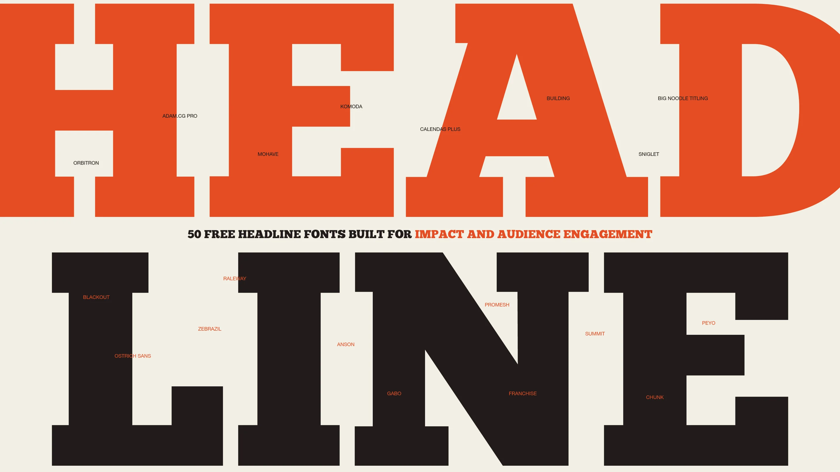
- 50 of the best bold fonts built for impact in any design
50 of the best bold fonts built for impact in any design
Headlines that don’t grab attention really hurt the chances of your work being noticed by anyone. It doesn’t matter how good the design work or content is, if the headline doesn’t draw in the crowd, you’ll always struggle to build an audience.
A big factor that contributes to whether your headlines ‘work’ is whether you’ve chosen a bold font(opens in a new tab or window). Choose the wrong font—one that doesn’t attract a crowd and make an impact—and you’re in trouble. Choose the right font—one that is robust, unique and impactful—and you can consistently create standout headlines that engage the masses.
But finding the best bold font(opens in a new tab or window) is difficult. Where do you look? What do you look for?
In this article, we’ve curated a list of the 50 best bold fonts currently available for download online. The good part? They’re all free to download.
So, without further adieu, let’s have a look at our showcase of the 50 best bold fonts that are sure to make an impact in your next design.
01. Adam.CG Pro

Adam.CG Pro available at Behance.
Adam is a sans serif typeface inspired by Futura, perfectly suited for eye-catching headlines. Its clean appearance and mid-weight makes it a wonderful candidate for being paired with more decorative, elaborate subheading fonts.
Find it on Behance(opens in a new tab or window).
Using the Adam.CG pro on a design like the Black Modern Building Festival Poster(opens in a new tab or window) template gives it a stronger impact.

02. Zebrazil

Zebrazil font via Behance.
Zebrazil is a beautiful, delicate font. The high lines, thin accents, and subtle serifs give it an elegant, yet modern appearance. It truly grabs attention, and is great for more high class, extravagant messages.
Find it on Behance(opens in a new tab or window).
03. Mohave

Mohave font from Absolut Foundry.
Mohave is an all caps typeface, and has a smooth appearance. It has three weights, regular, semibold, and bold – along with italics. The multiple weights give you the flexibility to stick with one font in your designs and create distinction with the different variations of the typeface.
Find it on Absolut Foundry.
04. Anson

Anson font by Mikko Nuutila.
Anson, inspired by the British twin-engine Avro Anson, is a sans serif typeface great for attention grabbing headlines. It is clean, yet has a subtle softness in the roundness of some of the letters, and the cut outs the lowercase letters replicate a subtle serif. This allows Anson to serve as a sans serif font, but with a bit more personality.
Download it from Mikko Nuuttila(opens in a new tab or window).
Get the look by replacing the font in the Trash Segregation Classroom Poster(opens in a new tab or window) template.

05. Komoda

Komoda font via Fontm.
Komoda is a unique, sans serif display font. The narrowness of the typeface adds a lovely height, and really sets it apart from regular sans serif display fonts. Try pairing it with a more squat, bold subhead font and you’ll create something that stands out.
Find it on Fontm(opens in a new tab or window).
Komodo fits the look of the Orange and White Beer Happy Hour Poster(opens in a new tab or window) template. Personalize it to fit your needs.

06. Promesh

Promesh via Behance.
Promesh is a bold, serif, athletic-looking font. The distressed, jersey-inspired mesh texture inside the letters gives it a unique touch, and really drives the athleticism home. It would be great for sports promotions, and it even has a second version free from the mesh, in case the texture gets too overwhelming.
Find it on Behance(opens in a new tab or window).
07. Calendas Plus

Calendas Plus.
Calendas Plus is a beautiful, elegant headline font. It comes with a variety of ligatures, adding in wonderful detailing and a calligraphic flair, but is still legible and not overdone.
Find it on Calendas Plus(opens in a new tab or window).
08. Summit

Summit from Luke Lisi.
Summit is a sans serif typeface with 10 styles and five weights. The options to layer up the different styles gives off a nostalgic feel, yet still manages to be modern. It can be used for subtle headlines, as well as more bold, attention-grabbing ones.
Download it from Luke Lisi(opens in a new tab or window).
09. Building

Building by Leonardo Gubbioni via Behance.
Building is a sans-serif typeface created by Leonardo Gubbioni. It was created in the style of the Art Deco movement and draws from the use of metals in the architecture of the time. It feels strong and bold, and captures attention in a quiet, stoic way.
Find it on Behance(opens in a new tab or window).
The Building font works well as a logo. Check out the Salmon Typographic Restaurant Logo(opens in a new tab or window) template and personalize it.

Related article:60 free fonts for minimalist designs
10. Peyo

Peyo via Behance.
Peyo is a sans serif font that is fun and playful. It is geometric, yet still rounded, which only contributes to the lightheartedness. It’s a bit off-kilter, and that’s what makes it so special and attention-grabbing.
Find it on Behance(opens in a new tab or window).
11. Glamor

Glamor font by Hendrick Rolandez via Behance.
Glamor is a modern, elegant, and chic font family. It truly oozes class, and has a wide variety of options for use, including 24 different fonts from light to bold. These fonts would be perfect for something in the fashion or beauty industry, as they really radiate elegance.
Find the font on Dribbble(opens in a new tab or window).
12. Franchise

Franchise via Webneel.
Franchise is a bold, clean, and easily read font. It grabs attention with its subtle details, and gives off a sense of power and strength—which makes it great for headlines. Its height adds to the power, and the thin, delicate spaces between letters keeps the message compact and all together, where it should be.
Download it from Webneel.
13. Gabo

Gabo font by Dannci via DeviantArt.
Gabo is a thick sans serif font perfect for bold headlines. The subtle tilts and shifts within the letters, particularly the ‘G’, gives this font a unique touch. That paired with the thin slits in the lowercase letters truly makes this font something special.
Find it on DeviantArt(opens in a new tab or window).
Get the look by trying Gabo font on the International Children's Book Day Commercial Poster(opens in a new tab or window) template.

14. League Gothic

League Gothic
League Gothic is a revamp of Alternate Gothic 1, and is a sans serif typeface. It’s slim, yet its' still weighty features help to make it stand out from other similar sans serif fonts. It has expanded, italicized, and condensed variations to help create dimension in your designs.
The League Gothic font makes a great substitute for any similar font. Get the look with the Cream and Purple Creative Presentation(opens in a new tab or window) template.

15. Ostrich Sans

Ostrich Sans is a lovely sans serif typeface with a lot to offer. It has a number of styles and weights including dashed, rounded, ultra-light, normal, bold, black, inline, and heavy – which allows you to use the same typeface in a variety of different ways to draw attention to your headlines.
16. Junction

Junction font
Junction is a humanist sans serif typeface available in light and bold versions. The interesting curve in the lowercase ‘u’ and ‘n’ adds a unique contrast to the overall roundness of the letters, and serves to set it apart from other sans serif typefaces.
17. Blackout

Blackout font
Blackout is an interesting sans serif typeface based on newspaper headlines. The holes you would normally find, such as inside the ‘B’, have been filled in. This gives the font a somewhat unsettling, confrontational feel which really grabs attention and gives off a message.
18. Knewave

Knewave font
Knewave is a fun, bold, and painted typeface. You can even see the brush-like texture in the ends of each letter, which sets this rounded font apart. It is thick and delicious and really gives off a carefree vibe.
Knewave is available on Canva, but you can also find it on The League of Movable Type(opens in a new tab or window).
The Knewave font gives a soft and casual look to the Neon Graffiti Paint Art Typography Book Cover(opens in a new tab or window) template. Check it out.

19. Raleway

Raleway
Raleway is a classic, sans serif typeface most known for the interesting crossing in the ‘w’. It is thin and elegant and makes a real statement with its simplicity.
Raleway is already on Canva, but you can also find it on The League of Movable Type(opens in a new tab or window).
20. Orbitron

Orbitron font
Orbitron is a geometric sans serif typeface. It is futuristic, and was created keeping sci-fi movies in mind – think Eurostile. It is easy to read, yet still interesting to look at, and definitely looks like something of the future.
Related article:60 free calligraphy fonts to bring charm to your designs
21. Chunk

Chunk via The League of Movable Type
Chunk is an ultra-bold slab serif typeface perfect for capturing attention. It is similar to American Western woodcuts and old newspaper headlines, so it has a slightly old school feel. The boldness isn’t too overpowering, and it pairs well with slimmer fonts.
22. Sniglet

Sniglet font via The League of Movable Type.
Sniglet is a rounded typeface. It is soft and playful, yet still attention-grabbing due to its thickness. Its playfulness is perfect for more carefree headlines that shouldn’t be taken quite so seriously.
This font is already available in Canva, and you can also find it on The League of Movable Type(opens in a new tab or window).
Sniglet is a playful font that works well with fun designs like the Colorful Taco Birthday Card(opens in a new tab or window) template.

23. Big Noodle Titling

Big Noodle Titling via DaFont.
Big Noodle Titling is a sans serif, all caps font that captures attention. It is relatively simple, but the interesting points at the bases of the letters give it a sharp, unique look. It is also available in italics, which allows you to provide emphasis in your headlines.
Find it on DaFont(opens in a new tab or window).
24. Megalopolis Extra

Megalopolis Extra via Font Squirrel.
Megalopolis Extra is a bold, thick typeface. The interesting curvatures in the letters, look to the lowercase ‘l’ and ‘j’, gives a unique personality to the typeface and helps break up any rigidity. It’s structured without being too harsh, yet soft without being too round.
Find it on Fontsquirrel(opens in a new tab or window).
25. Academic M54

Academic M54 font via Fontspace.
Academic M54 is a bold, serif font. It is reminiscent of sports t-shirts and logos, and makes an athletic statement. The small cutouts in some of the letters (‘c’ and ‘s’ for example) help to break up the boldness and let the font breathe without being too open.
Find it on Fontspace(opens in a new tab or window).
26. Matiz

Matiz via Font Squirrel.
Matiz is a sans serif font with an interesting twist. It has a subtle edge texture that makes it look somewhat hand done, but still structured. The texture allows for a nice break to the normal, blocky sans serif headline typeface, and adds some grit.
Find it on Fontsquirrel(opens in a new tab or window).
27. Coolvetica

Coolvetica font via DaFont.
Coolvetica is a sans serif typeface inspired by the modification of Helvetica that was so prevalent in the 1970s. It is simple and easy to read like Helvetica, but not as plain and with more personality due to the interesting curls on some of the letters. It’s just simple enough to work for a headline, but not so simple to be boring.
Find it on DaFont(opens in a new tab or window).
28. Telegrafico

Telegrafico font by ficod via DeviantArt.
Telegrafico is a lovely sans serif typeface. It is easy to read and has elements of visual interest, like the interesting curves of the ‘B’. It works well as a headline, and would pair nicely with something more elaborate as a subhead for balance.
Find it on Deviant Art(opens in a new tab or window).
Try using Coolvetica with the Black and White Minimal Professional Presentation(opens in a new tab or window) template.

29. Speakeasy

Speakeasy via Font Squirrel.
Speakeasy is an Art Deco-inspired sans serif typeface. The sharp points add interesting contrast to the incredibly rounded ‘c’, and the ‘s’ is unmistakably 20s inspired. It’s a font with attitude and will work perfectly to capture an audience.
Find it on Fontsquirrel(opens in a new tab or window).
30. Kilogram

Kilogram via Behance.
Kilogram is a typeface by KalleGraphics based on Nick Curtis’ font Anagram. It is sans serif and has some very interesting details It is sharp, yet still has curve to it, and the idea of replacing the ‘a’ with a triangle gives it a unique and unexpected appearance. There is a ton of variation from letter to letter, but it all works together to create something very visually appealing.
Find it on Behance(opens in a new tab or window).
Related article:50 free stylish fonts to bring a touch of elegance to any design
31. Minstrel Poster WHG

Minstrel poster via Font Squirrel.
Minstrel Poster is a sans serif typeface with unique curvatures to some of the letters. The curvatures are severe, and contrast the rigidity of the other letters. There are a number of aspects of this font that make it unique, from the pointed ‘m’ to the broken up ‘e’, and it really is a showstopper.
Find it on Fontsquirrel(opens in a new tab or window).
32. Age

Age from Font Fabric
Age is a unique, futuristic, sans serif typeface. It is rounded, yet still has some linear structure, which gives it a futuristic feel. The interesting cut off in the letter ‘g’ gives the font an abruptness, and the overall thickness really makes it stand out.
Find it on Font Fabric(opens in a new tab or window).
33. Great Lakes NF

Great Lakes Font via FontSquirrel.
Great Lakes is a bold, captivating typeface. The angular cuts of the letters gives it an edge, and the height adds strength – making it perfect for headlines. It grabs attention without being too loud, and has just enough uniqueness to set it apart.
Find it on Fontsquirrel(opens in a new tab or window).
34. Gipsiero

Gipsiero via 1001 Fonts
Gipsiero is a serif font inspired by old horror movies. It has a bit of a western feel, and the option to have a cracked version only adds to the old, creepy feeling. Its boldness makes it work well for a headline, and it’s interesting origins are sure to grab attention.
Find it on DaFont(opens in a new tab or window).
35. Qhytsdakx

Qhytsdakx via 1001 Fonts
Qhytsdakx is a nice sans serif typeface with a mid-century modern charm. Its clean, even strokes give it an understated presence that makes it perfect for minimalist designs.
Find it on 1001 Fonts.
36. Nevis

Nevis from Ten by Twenty.
Nevis is a strong, sans serif typeface. It is bold and sends a message, but isn’t too confrontational. It works great for headlines because it looks great in all caps and can really make an impression.
Find it on Ten by Twenty(opens in a new tab or window).
Add another level of texture to the Black Red and Blue Modern Horse Show Poster(opens in a new tab or window) template when you use Qhytsdakx with it.

37. Code

Code from FontFabric
Code is a beautiful and simple sans serif font available in light and bold versions. Its simplicity makes it effective as a headline font, and pairing the bold and light versions together can make a very visually interesting design.
Find it on Fontfabric(opens in a new tab or window).
38. Nexa

Nexa via Font Fabric
Nexa is another simple sans serif font available in light and bold, but it a bit more impactful than Code. It has its own unique points, such as the dynamic curve of the ‘g’, and its bold and light versions pair great together along with other typefaces.
Find it on Fontfabric(opens in a new tab or window).
The Nexa font looks good as a logo. Give it a try with the MONO Modern Minimalist Etsy Shop Icon(opens in a new tab or window) template.

39. Langdon

Langdon from XLN via Font Squirrel.
Langdon is a bold, sans serif typeface. It is serious and has a dependable quality, and the shadowing really sets it apart from other sans serif fonts. It is just bold enough to stand out, but not so bold that it can’t work well with other subhead fonts.
Find it on Font Squirrel(opens in a new tab or window).
40. Aleo

Aleo via Behance.
Aleo is a slab serif typeface that has a delicate nature. It has a soft roundness, but still has a strong personality and high readability. It is available in three weights along with italics. It’s clean and concise with just the right amount of personality.
Aleo is available on Canva for all users, but you can also download it from Behance(opens in a new tab or window).
Get the look with the Orange Black and White Soccer Poster(opens in a new tab or window) template.

41. Lovelo

Lovelo via Font Fabric.
Lovelo is a geometric sans serif typeface. It is available in three styles, black and two lined versions. The lined versions are a unique solution to a headline, as they are bold but open and airy. The lined typefaces are a lighter solution to a bold, typical headline font.
Find it on Fontfabric(opens in a new tab or window).
42. Airbag

Airbag font
Airbag is a modern, slab serif typeface. It has a very interesting shadow full of texture, and it really stands out against a colored background. The free version only includes all caps, but that is perfect for a bold, attention capturing headline.
Download it from Simon Stratford(opens in a new tab or window).
43. Intro
")
Intro is a geometric sans serif typeface. It was created based on the principles of simple geometric shapes like triangles, circles, and squares. The interesting tracing of the letters on its interior sets it apart from regular thick, sans serif typefaces, and lets background colors and textures shine through.
Find it on Fontfabric(opens in a new tab or window).
With the layout of the Lavender White Modern Fancy Menu(opens in a new tab or window), the font works also part of the visual element. Try it with the Intro font.

44. Archive

Archive font
Archive is a contemporary sans serif font. While it is geometric in style, it has a nice, subtle roundness and softness to it. It is powerful, yet understated, and would make for a lovely headline.
Find it on Fontfabric(opens in a new tab or window).
45. Muchacho

Muchacho font
Muchacho is a western inspired, serif font. It has very interesting details in the legs of the font, and has a ton of personality. Its boldness and uniqueness makes for an interesting headline font.
Find it on Behance(opens in a new tab or window).
Related article:9 terrific font pairs for you to try
46. Musket

Musket font via Bybu.
Musket is an interesting typeface, somewhere between serif and sans serif. It has a nice weight to it, and interesting curves on the legs of the font. It has just enough personality to stand out amongst other headline fonts, and will work well with both serif and sans serif subheads.
Find it at Bybu.
Try the look of the Writing Class Wattpad Book Cover(opens in a new tab or window) and use Musket with it.

47. Bariol

Bariol font.
Bariol is a lovely, sans serif font. It is soft and feminine, but still has a serious and informative appearance. It makes for an impactful headline, but not something abrupt and overly in your face.
Find it at Bariol(opens in a new tab or window).
48. Mecca

Mecca via Dribbble.
Mecca is an interesting serif font. It has a wonderfully playful sharpness to it, and the geometrical angles gives the typeface a unique grit. It can be used in a number of contexts, but would suit music and event posters especially well.
Find it on Dribbble(opens in a new tab or window).
49. Mission Script

Mission Script via Lost Type.
Mission script is a nice scripted headline font. It is sweet and casual, and has a lovely thickness to it. It’s the perfect headline font for something fun and carefree with an elegant twist.
Find it on Lost Type(opens in a new tab or window).
Add more personality to the Romance eBook Cover(opens in a new tab or window) template by using Mission Script on the titles.

50. Governor

Governor art deco alphabet via Lost Type.
Governor is a sans serif typeface inspired by the apartment signage of Miami Beach during the Art Deco period. It is simple, yet has a fun personality. The thickness of the letters makes it great for a headline, and its simplicity allows it to pair well with a variety of other fonts.
Find it on Lost Type(opens in a new tab or window).
Get the look with the BAKS Clothing Company Logo(opens in a new tab or window) template.

Next Steps
Looking for some extra help to choose a font combination? Canva's got you covered. Try out font combinations generator to help get you started.
Building your brand from scratch? Canva's free logo maker uses AI to generate a designer-made logo for you in seconds.
Inspired to design? Signing up for Canva is free and easy. Design anything, and publish anywhere with ease.

Written by
Caitlin Jordan


