- How to use fonts effectively
How to use fonts effectively
Knowing how to use fonts effectively can be a daunting task. Aside from the many rules graphic designers follow when it comes to choosing fonts(opens in a new tab or window), there's also the task of pairing your fonts together with other complimentary fonts.
Between different fonts choices, weights, and sizes, the possibilities are endless.
When used with purpose, fonts(opens in a new tab or window) can make your designs stand out, convey your message clearly and get your text to jump off the page. Beginners, try these five tips to enhance your designs. Remember, mastering text is a crucial factor for visual success.
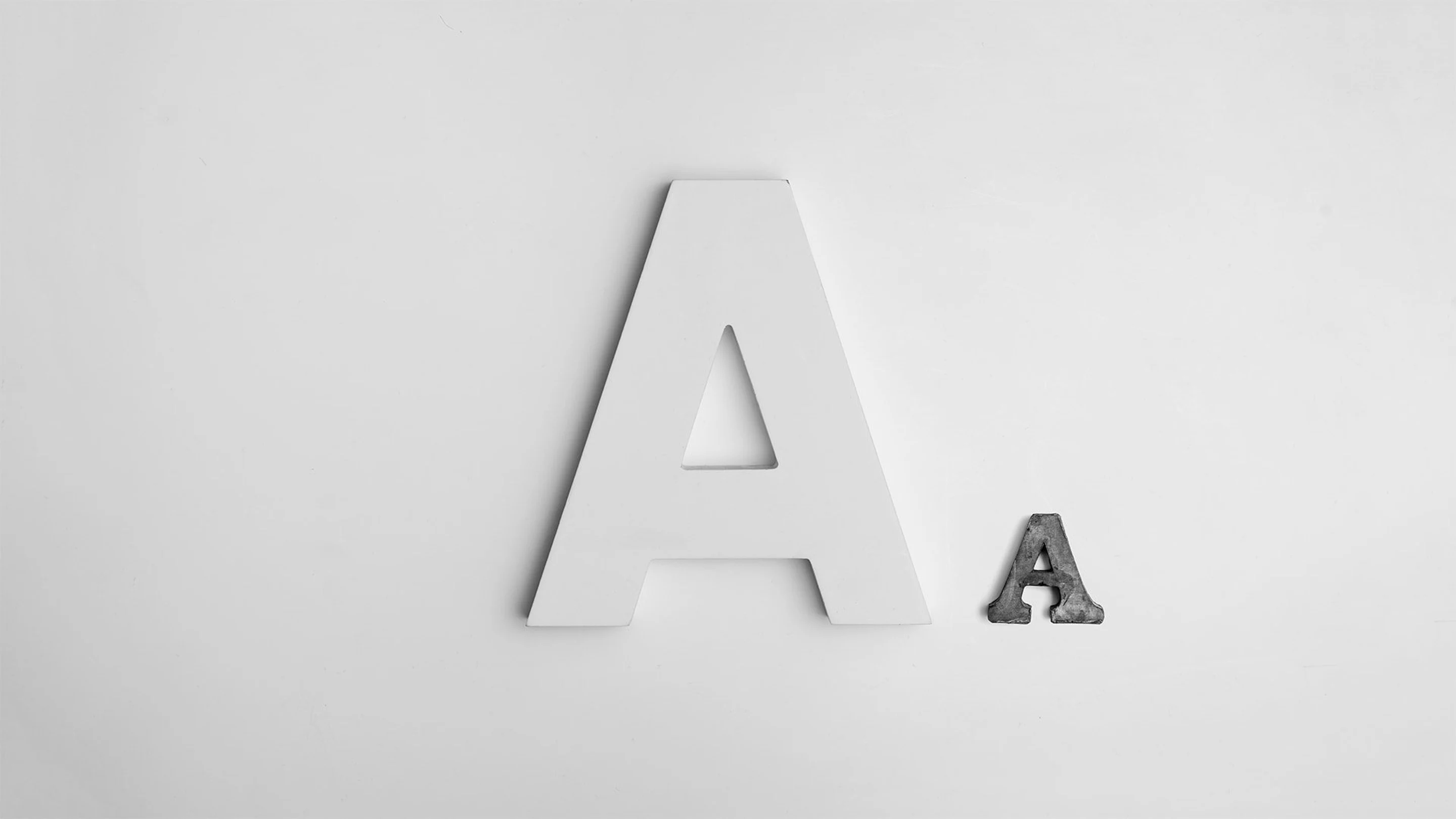
If you’re new to the world of fonts, grab your notebook and jot down this basic terminology lingo!

01. Use fonts to create a hierarchy

Typographic hierarchy(opens in a new tab or window) refers to the order that the text is read. The eye is naturally drawn to large or dominant elements, so choose the largest font size for your title, followed by your subtitle, then your body text.
Remember, some fonts look better in short sentences and some fonts work better for paragraphs and each font has a different width, height, thickness, style, and size.
Get the look with these templates:Band Flyer(opens in a new tab or window) and Colorful Blocks Spring Promotional Poster(opens in a new tab or window)


02. Use contrasting fonts

Choosing fonts with high contrasting fonts(opens in a new tab or window) is a great rule-of-thumb for striking titles and adding subtitles photos or videos(opens in a new tab or window).</p>
The fonts used in the above example contrast each other by featuring different styles—upper case and lower case lines of text. The font Anton has been used for the headline ‘weekender’, and Julians Sans One for the subtitle.

Here, contrast has been created by using different font weights—the font Raleway Heavy has been used for the title, and Raleway Regular for the subtitle.
The contrast is also emphasized by making the size of the two fonts very different. In many cases, the more contrasted the fonts are, the more they will complement each other!
Get the look with these templates:Red-tinted Cherry Blossoms Poster(opens in a new tab or window) and Church Sermon Pastor Flyer(opens in a new tab or window)


03. Create readability

First up, don’t confuse your serif, sans serif, and script.
Font readability is especially important for longer sections of text. Try to avoid using elaborate (script) fonts or upper case text, as these options can strain the eye. Save these for titles or headings.
The graphic above uses serif and sans serif(opens in a new tab or window) fonts, which are generally a better option. The design also features a very high contrast in the colors. The background is very dark, and the text is white. This is another great way to increase readability with font.

Serif:A letter or character with an extra stroke, line or flourish at the ends
Sans serif:A letter or character without the extra flourish at the ends (sans means ‘without’)
Script:A letter with fluid stroke like cursive writing
Second up, know where and when to use them:
- Always choose an easy-to-read font for body text. Generally, sans-serif is easier to read on a screen while a serif (particularly a Roman typeface) is easier to read in print.
Get the look with these templates:Cream Illustrated Flowers Summer Quote Instagram Post(opens in a new tab or window) and Quote on Defining Goal X (Twitter) Post(opens in a new tab or window)


04. Play with size and spacing
Play with the size of letters and the spaces in between for alignment and to create blocks of text.

In this image, size and spacing have been adjusted so the text forms a rectangle shape and creates a geometric block of text.
05. Know when to use all-caps
Titles with all capital letters can really make your message stand out. They look elegant for short blurbs, titles and subtitles but a paragraph in all-caps can be difficult to read.

Note that script and more elaborate fonts shouldn’t be used as all-caps, so use sentence case and lowercase letters when using those fonts.
Get the look with these templates:Orange Microphone Talent Show Flyer and Pink(opens in a new tab or window) and Black Grunge Creative Wattpad Book Cover(opens in a new tab or window)


06. Be creative

The phrase above has been aligned to form a rectangle shape, creating a geometric block of text.
In order to make different words fit the shape, the font size of each line of text has been altered. In addition, the letter spacing of the second line has been increased. This is a creative, simple way to increase the impact of your message.
07. Use fonts that suit your style

Effective fonts should always enhance the message you are trying to convey. The title above uses a cursive font:Yellowtail. This suits the fun, casual content of the graphic, which depicts waffles as a weekend treat, and gives it a sense of personality.
In order to balance this elaborate style, Raleway (which is a sans serif) has been used to complement, or balance, the word ‘waffles.’
Here are four more fonts that have a personality:

Be elegant and sophisticated with a script or italicized font or an old style or calligraphic font.
Examples include:Parisienne (pictured), Euphoria, Allura, Great Vibes.

Have fun with a font with lively, recognizable or slightly retro characters.
Examples include:Lobster (pictured), Cody Star, Londrina Sketch, Sniglet.

Be cool with an on-trend or timeless geometric sans-serif font.
Examples include:Anton (pictured), Helvetica,Archivo Narrow, Racing Sans One.

Chill out with relaxed serif or italicized font, or a font with has a sense of being hand drawn.
Examples include:Yellowtail (pictured), Sacramento, Pacifico, Satisfy.
Get the look with these templates:Yellow and Black Vintage Beauty Logo(opens in a new tab or window) and White and Pink Strikeout Cosmetics Beauty Logo(opens in a new tab or window)
")
")
08. Know your audience

Different fonts will appeal to different audiences so always think about who the design is for. For example, Economica might be too serious for a children’s birthday party but Crafty Girls is too young for an office memo(opens in a new tab or window). Remember that fonts can set the tone for design.

Get the look with these templates:White and Brown Minimalist Farmer's Market Poster(opens in a new tab or window) and Green Border Variety of Fruits Raffle Flyer(opens in a new tab or window)


09. Use ascenders and descenders as playful accents
Ascenders are the rising stems of lower case letters (such as b, d and h) and descenders are the downward tails of lower case letters (such as g, p, and q). The create gaps and spaces you can have fun with such as filling these spaces with subtitles or small lines of text can enhance the way your design is presented.

Experiment with typography to elevate your designs
When it comes to using fonts, there are certain rules to keep in mind, such as legibility. However, rules are meant to be broken! Once you have a solid understanding of font fundamentals, it's time to get creative and have some fun. Experiment with different combinations, styles and sizes to see what works best for your project. Play around and take risks. You may just discover a new favorite font style that sets your work a part from the competition.

Written by
Anna Guerrero