
How to design unbreakable brand templates
10m
Learn how to design unbreakable brand templates in Canva. Build flexible, easy-to-edit designs that work for teams, scale across formats, and stay on-brand.
How to design unbreakable brand templates
10m
Learn how to design unbreakable brand templates in Canva. Build flexible, easy-to-edit designs that work for teams, scale across formats, and stay on-brand.
What you’ll learn
- What makes a template “unbreakable”
- Why templates often fail in real-world use
- How to design for flexibility and scale
- How to make templates easier for others to use
- How to test and prepare templates before publishing

What makes a template unbreakable?
The best templates aren’t designed just for the content you see now — they’re designed for what comes next. That means: An unbreakable template accounts for all of that from the start.
Try it yourself: Open up this Activity and follow along as you learn!
Why templates often fail
Most templates break for the same reasons: A good template should be able to help anyone – especially non-designers – to design confidently and on-brand. The goal isn’t just to design something that looks right, but to design something that keeps working, no matter the context or content.
Let the system do the work
When formatting is applied manually, especially in “hacky” or slightly tricky ways that the average user wouldn’t know how to do, things tend to break as soon as someone else edits the content. Small changes — like longer text or updated graphics — can quickly undo the original design. Using a simple system of built-in formatting and effects helps lock those decisions in, so they hold as the template is reused. In Canva, these settings are designed to carry through edits, so your formatting stays consistent without needing to be reapplied.
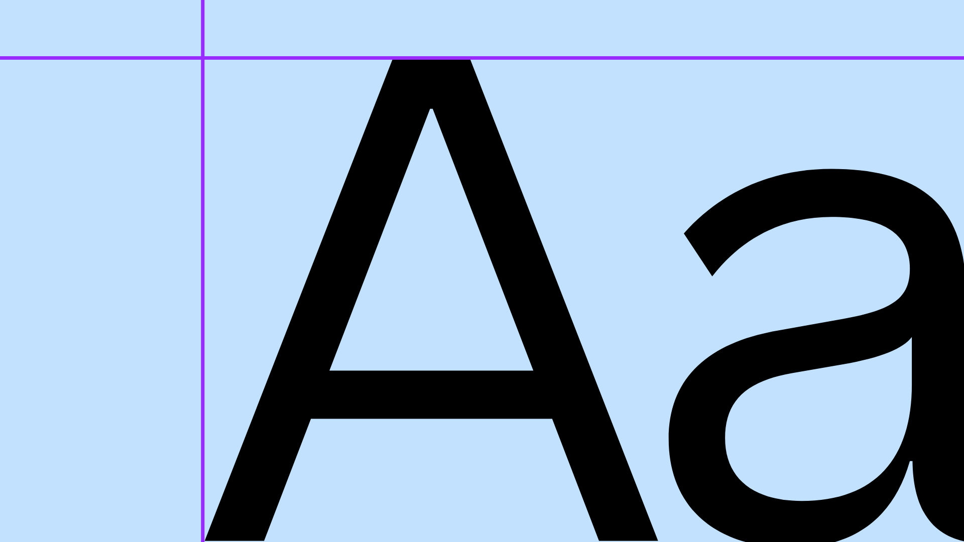
Avoid manually styling text (like typing in all caps or duplicating text for effects). Instead:Use text formatting tools
Using a built-in shadow effect ensures it updates automatically when text changes.
When line spacing is too tight, text can feel cramped and harder to read. When it’s too loose, lines can feel disconnected and harder to scan. These challenges arise particularly as content changes or scales across different formats.Adjust line spacing
Small adjustments here improve readability and consistency.
When effects are created manually (like duplicating text for a shadow), they don’t update when the content changes.Use text effects properly
This keeps styling connected to the text, rather than relying on separate elements.
Design for scale
Templates should work with content you can’t predict. Names get longer, titles wrap, and layouts start shifting. If your design only works with the original content, it won’t hold up.
When text boxes are sized to fit the original content, they can quickly break as soon as someone edits the text. Longer names, titles, or labels won’t have enough room, and the layout starts to shift or overlap. Extending your text boxes gives the design room to adapt, so it holds up as content changes. Or: This creates room for longer content.Extend text boxes
Test your text boxes with different lengths of copy to make sure the layout holds.
Even with larger text boxes, layouts can still break if elements don’t move together. Text might expand in one direction while everything else stays fixed, causing overlap or uneven spacing. Anchoring controls how text grows, and grouping keeps related elements moving together — so the layout adjusts as a whole instead of falling apart.Anchor and group text
Grouping ensures elements move together when content changes.
Make customization obvious
A template should guide the person using it. They shouldn’t have to guess:
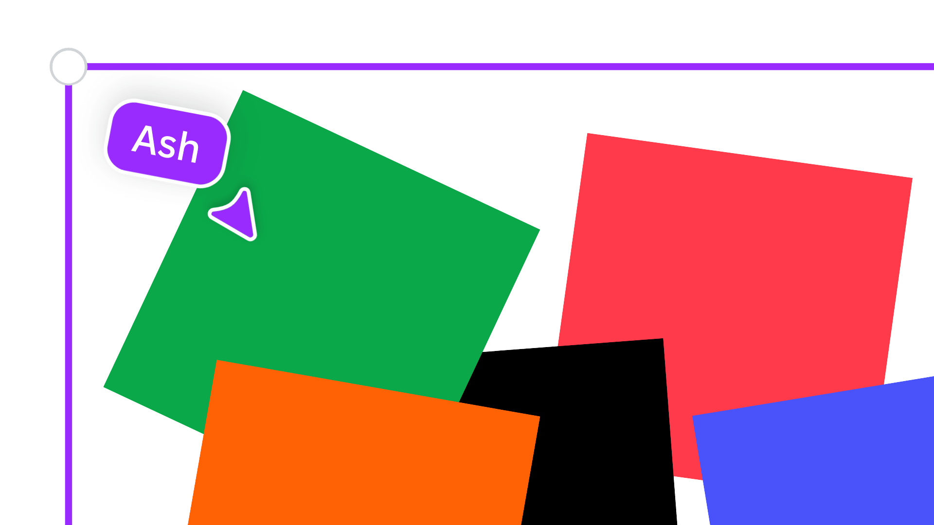
If editable content sits behind other elements, it becomes harder to find and update. Organising your layers makes key content easier to access.Prioritise layer order
This makes key elements easy to access.
If everything is editable, layouts can shift too easily. Locking key elements — and unlocking what should be edited — helps keep your design stable.Lock and unlock elements
This prevents accidental changes while keeping editing simple.
When placeholder text is unclear, people don’t know what to change or what to add. Clear labels guide users and make templates easier to use. Replace generic placeholders like: With:Provide context with placeholder text
This helps users understand exactly what to add.
Design for where it lives
Templates don’t exist in isolation — they’re used in specific contexts. That affects how they should be designed.
Text that looks fine on your screen may not work in its final format. Checking legibility helps ensure your design is readable in context.Check legibility
What looks fine on screen may not work in context.
Think your template might be printed? Designs can look correct on screen but still fail in print. Setting up bleed ensures your layout prints cleanly without unwanted edges. This prevents unwanted edges when printed.Set up for print
Try it yourself
The best way to understand this is to test it. Use the Learn & Play activity to: Each exercise shows how small changes make a template more flexible and reliable.
Before sharing your template, take a step back and test it. Ask: Running through a checklist helps catch issues early and ensures your template performs as expected.
One last thing
Templates aren’t finished when they look good. They’re finished when they still work after someone else edits them. Once you start designing with that in mind, your templates become easier to use, easier to scale, and much more reliable.
Keen to learn more about brand design? Check out our video on Optimizing Brand Prescence next!