Pick a font that matches your brand's personality
5m
Beginner
Every brand has a personality — bold, refined, playful, precise. Pick the one that sounds like yours, and discover the Monotype fonts in Canva built to say it.
Pick a font that matches your brand's personality
5m
Beginner
Every brand has a personality — bold, refined, playful, precise. Pick the one that sounds like yours, and discover the Monotype fonts in Canva built to say it.
What you’ll learn
- What different font styles communicate
- How to identify your own brand's personality
- Which Monotype fonts in Canva fit that personality

Think about your brand or business. If you had to describe it in two words, could you do it? That answer matters more than you might realize, because whichever two words you land on, a font can send that same message before anyone reads a single sentence about your business.
Fonts speak before words do
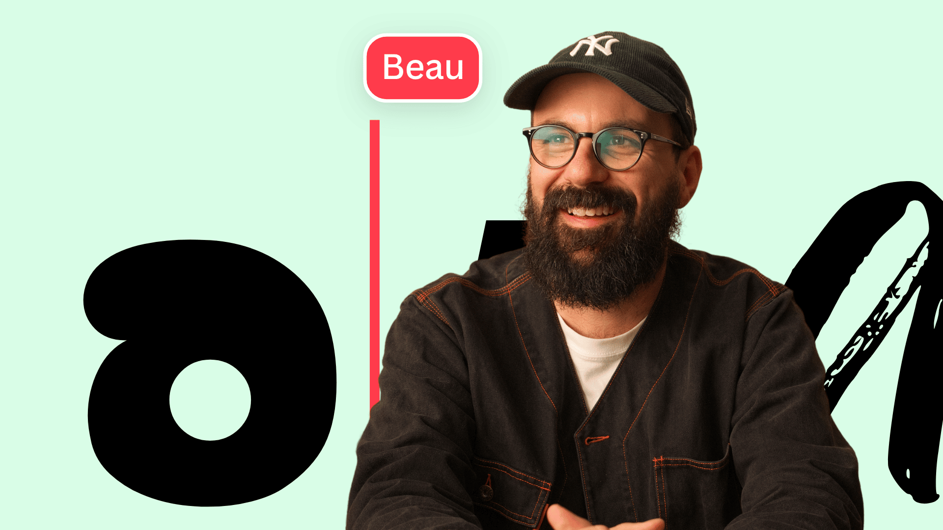
As you probably know, a brand is more than a logo or a product. It's the reputation, the perception, the feeling people get when they think about your business. Brand identity is how that feeling becomes visible — through color, imagery, sound, and, often more than anything else, fonts. Because of this, typography and branding are inseparable. The right typeface shapes how people feel about a business, often without them realizing it's happening. Sometimes a font is the only thing doing that work — so it better be doing it well. Watch this video to learn more.
This all starts with knowing your brand's personality. Once that's clear, the right font gets a lot easier to find. Look at the list below and pick whichever one feels closest to your brand right now.
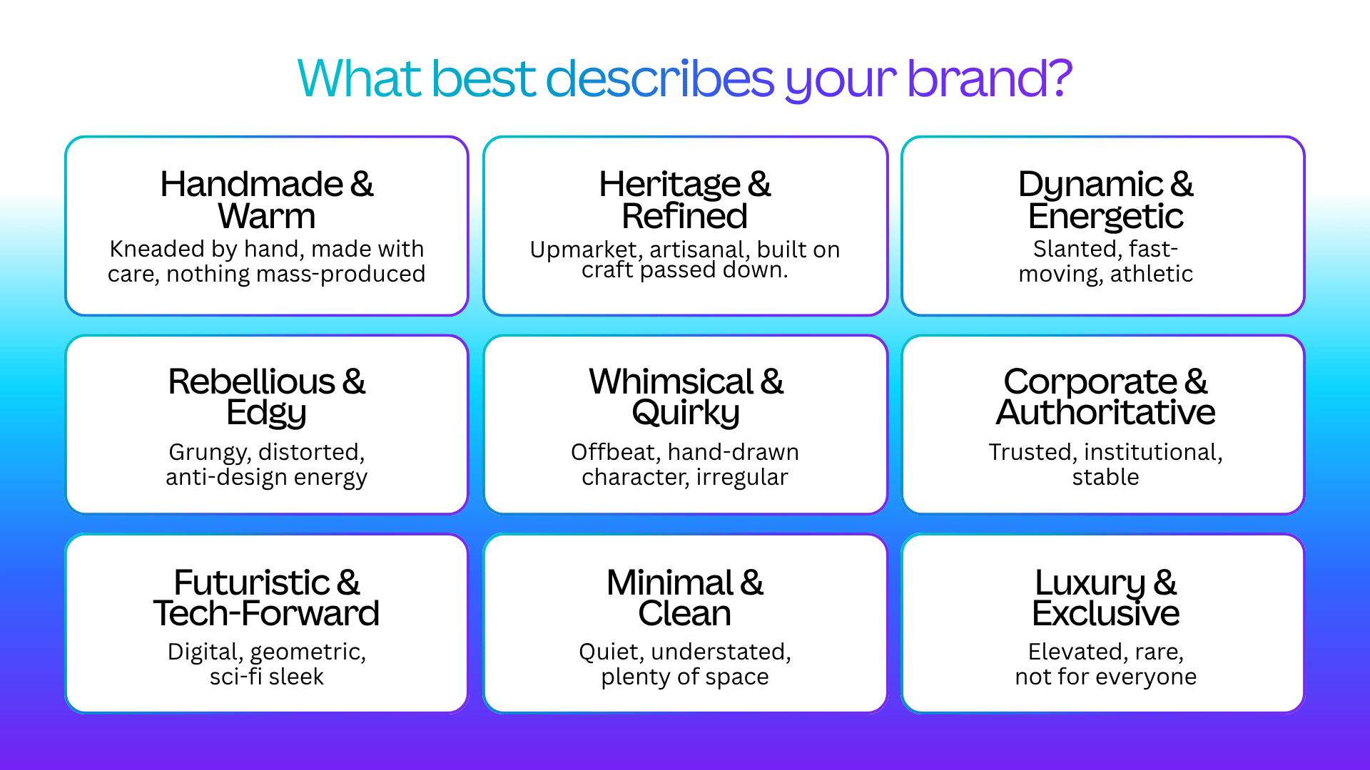
Scroll down to find Monotype fonts in Canva that are built for exactly the personality your brand needs.
Is your brand 'Handmade and Warm?'
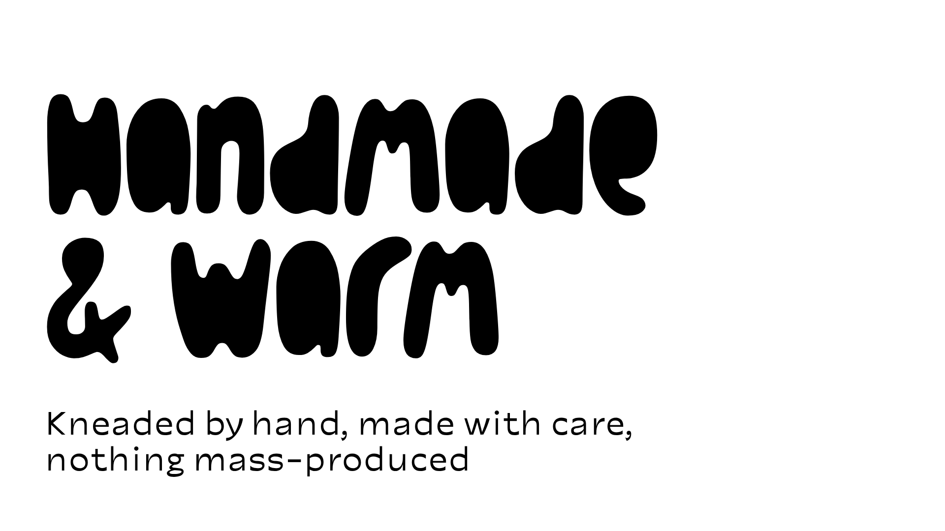
About this combination This brand didn’t come off a production line. Every curve looks like it was made by an actual hand, on an actual day — a little uneven, a little imperfect, and better for it. Who is this good for? Bakeries, ceramicists, small-batch makers, anyone whose story is the product. What fonts should I reach for? Monotype’s “Spilled Ink” combined with “Portland” would work well.
Or is it 'Heritage and Refined?'
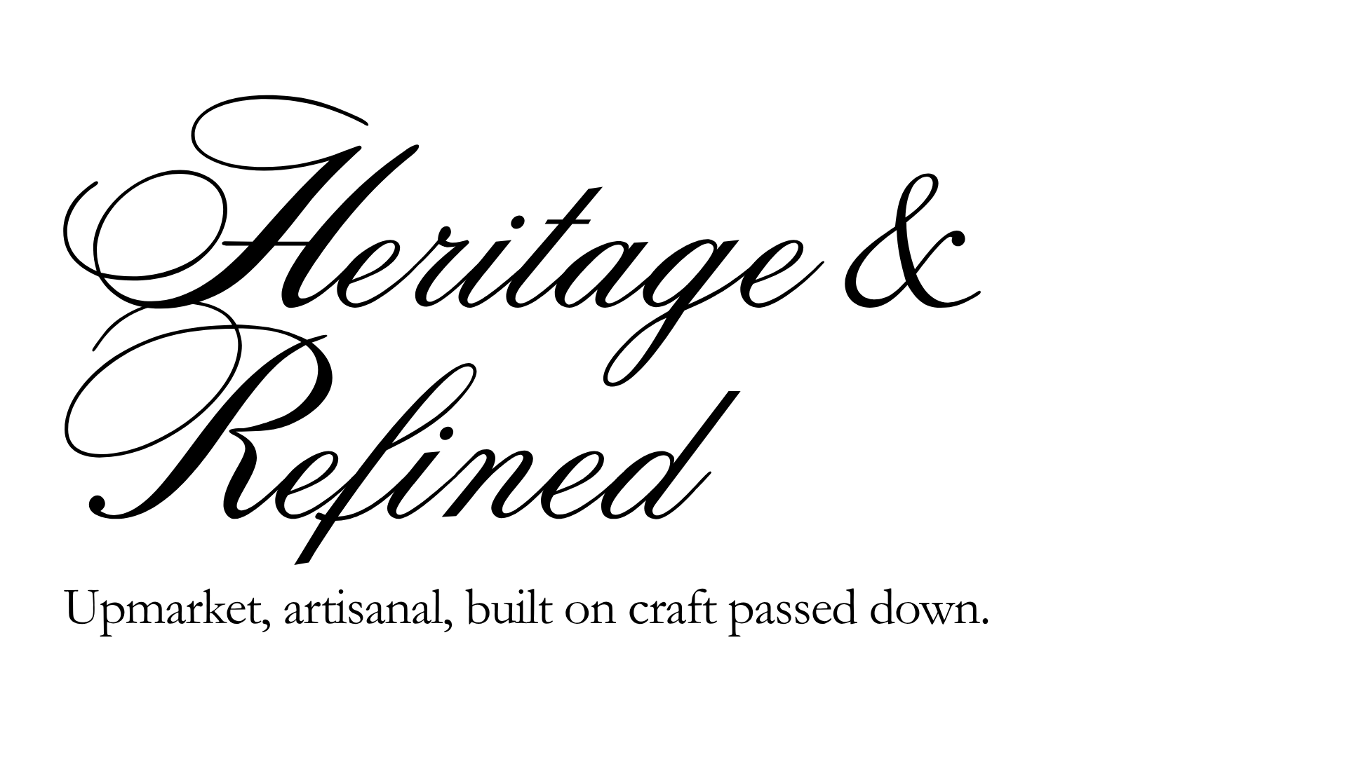
About this combination This brand’s been doing this a long time, and it shows. The letterforms carry weight and history — the kind of confidence that only comes from years, not trends. Who is this good for? Family businesses, tailors, breweries, anything trading on time and trust. What fonts should I reach for? Monotype’s “Citadel Script” combined with “Garamond.”
What about 'Dynamic and Energetic?'
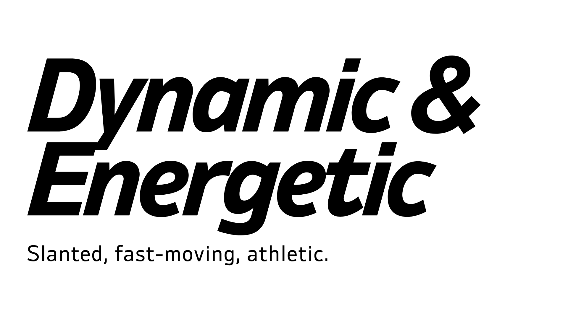
About this combination This brand is moving at velocity – boldly and aggressively leaning into the work. Sharp corners coupled with no- nonsense letter shapes convey a confident assuredness. Who is this good for? Sporting teams and sporting goods, cutting-edge technologists, anyone who wants to tell a visual story of strength and velocity. What fonts should I reach for? Monotype’s “Ambiguity Bold Italic” combined with “Ambiguity Regular.”
Maybe your brand is 'Rebellious and Edgy?'
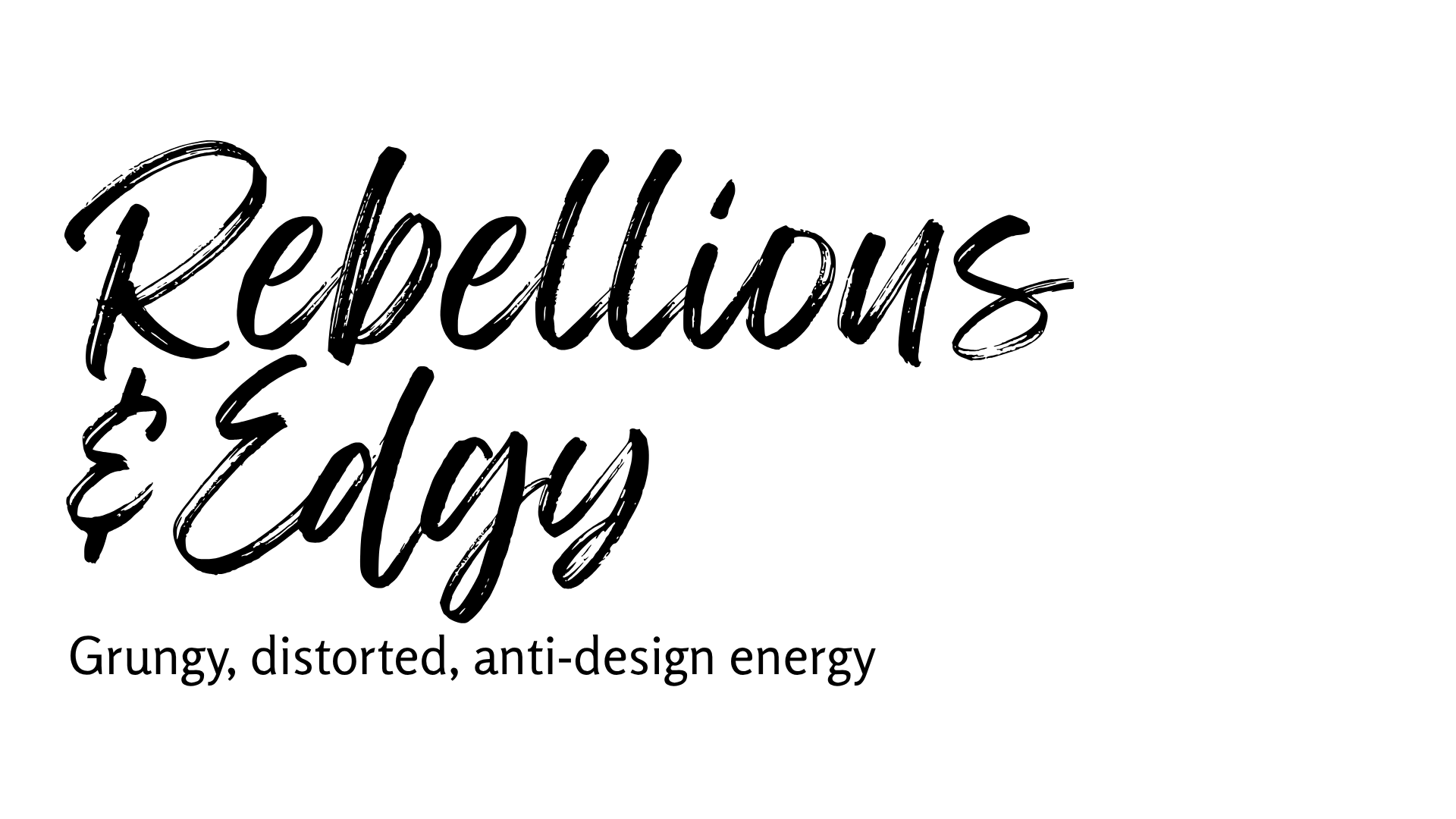
About this combination This brand doesn't ask permission. The letterforms look a little broken on purpose — proof that following the rules was never the point. Who is this good for? Streetwear, music, youth culture, anything underground by design. What fonts should I reach for? Monotype's “Feeling Passionate” combined with “Rosario.”
Or more 'Corporate and Authoritative?'
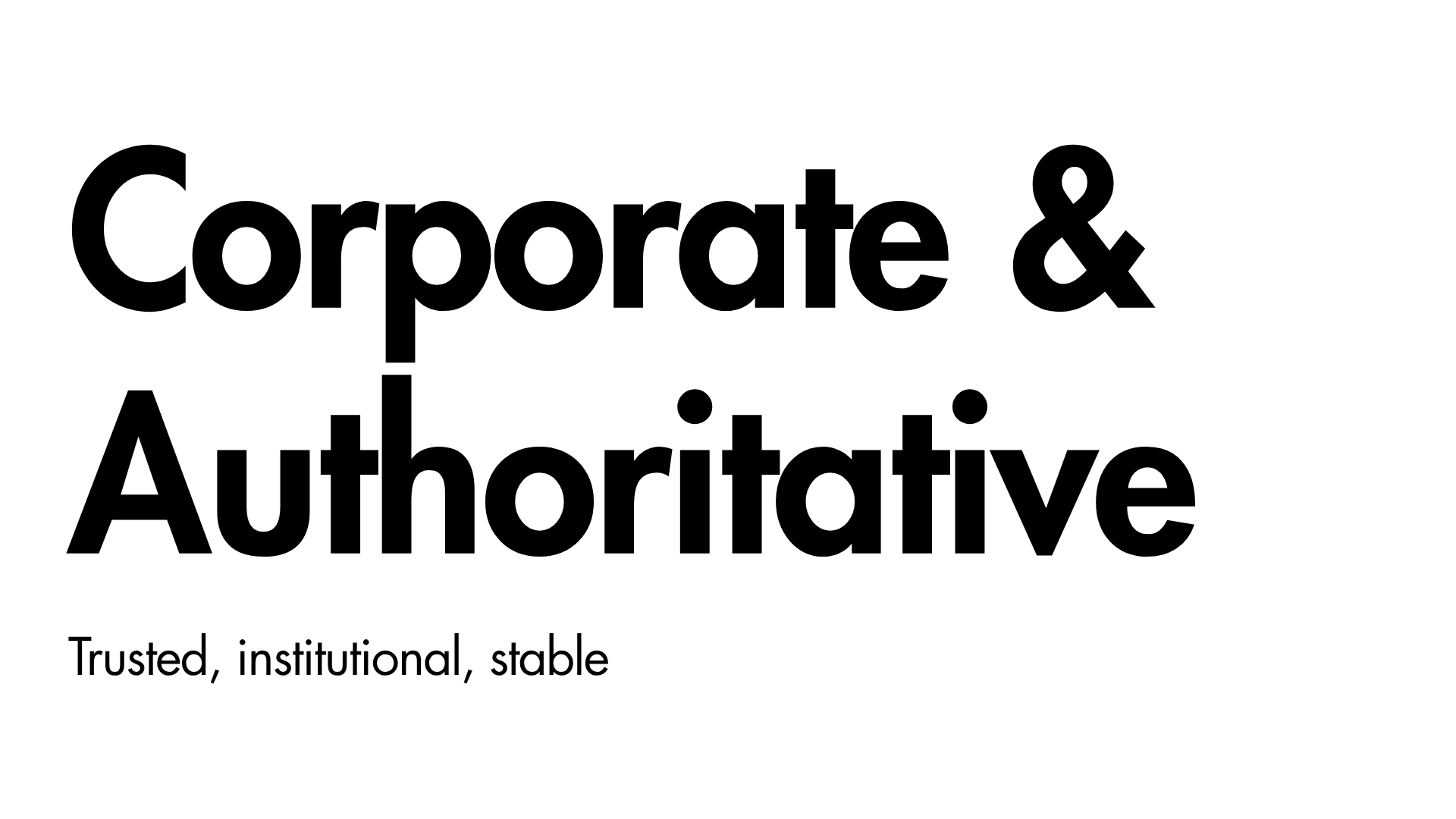
About this combination This brand wants to be believed before it’s even read. Even letterforms and generous spacing do the work — the visual equivalent of a firm handshake. Who is this good for? Banks, law firms, government services, enterprise software. What fonts should I reach for? Monotype's “Futura Bold” combined with “Futura Regular.”
'Whimsical and Quirky?'
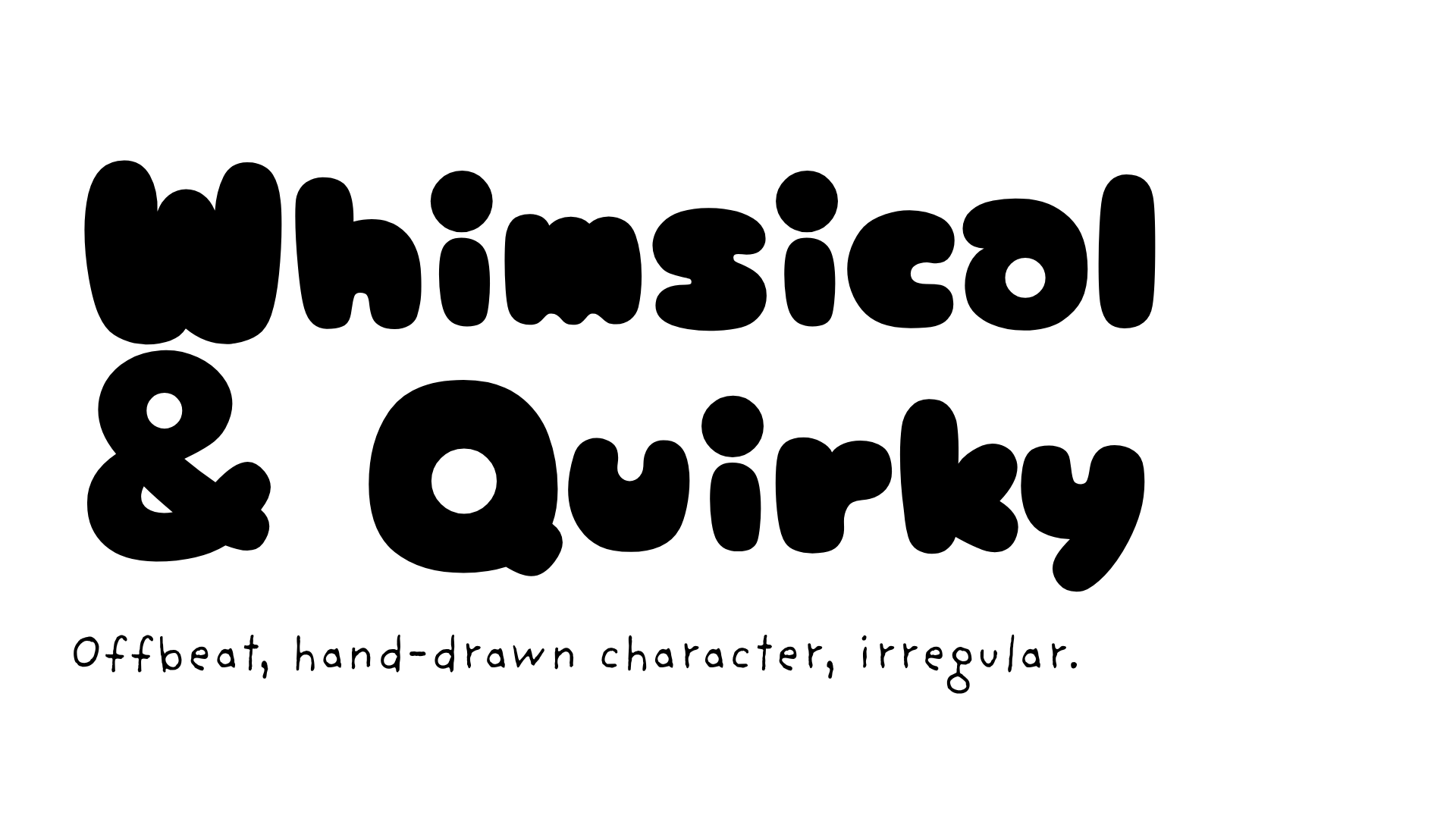
About this combination This brand doesn’t take itself too seriously, and wants everyone to know it. The letters wobble and bounce — an open invitation to have a little fun. Who is this good for? Kids’ brands, novelty products, playful startups. What fonts should I reach for? Monotype’s “Ame Chan Pop Maru” combined with “FF Providence Sans.”
'Futuristic and Tech-Forward?'
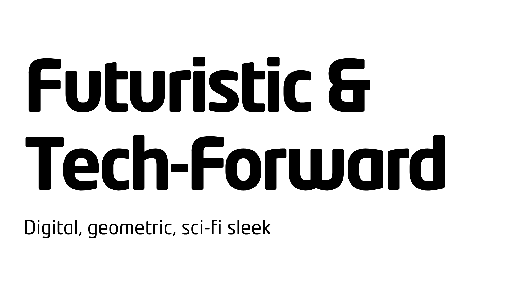
About this combination This brand is building something that doesn’t exist yet. Clean geometry and tight spacing make it feel designed on a screen, for a screen. Who is this good for? Tech startups, apps, anything selling what's next. What fonts should I reach for? Monotype’s “Neo Tech Bold” combined with “Neo Tech Regular.”
'Minimal and Clean?'
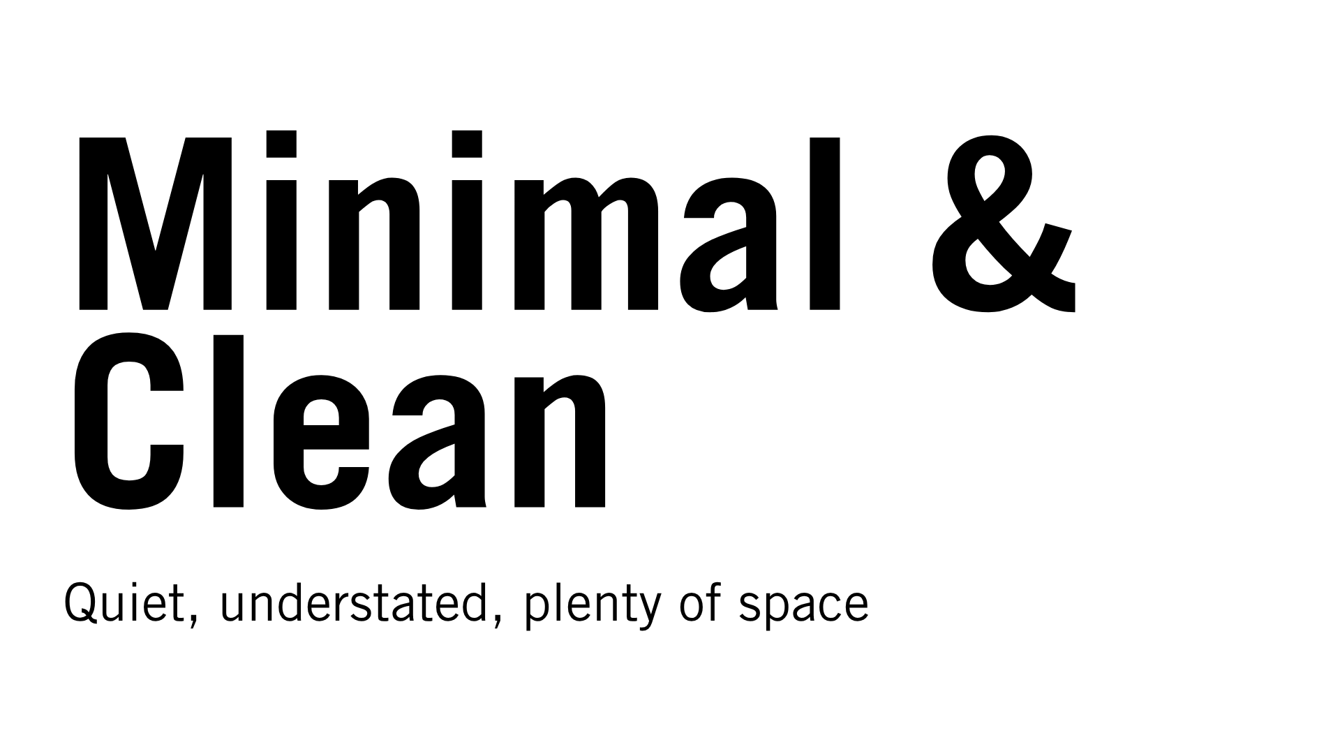
About this combination This brand doesn’t need to shout to be heard. Every letterform is stripped back to only what's necessary — confidence, not decoration. Who is this good for? Architecture, design studios, premium products that speak for themselves. What fonts should I reach for? Monotype’s “Trade Gothic Bold” combined with “Trade Gothic Light.”
'Luxury and Exclusive?'
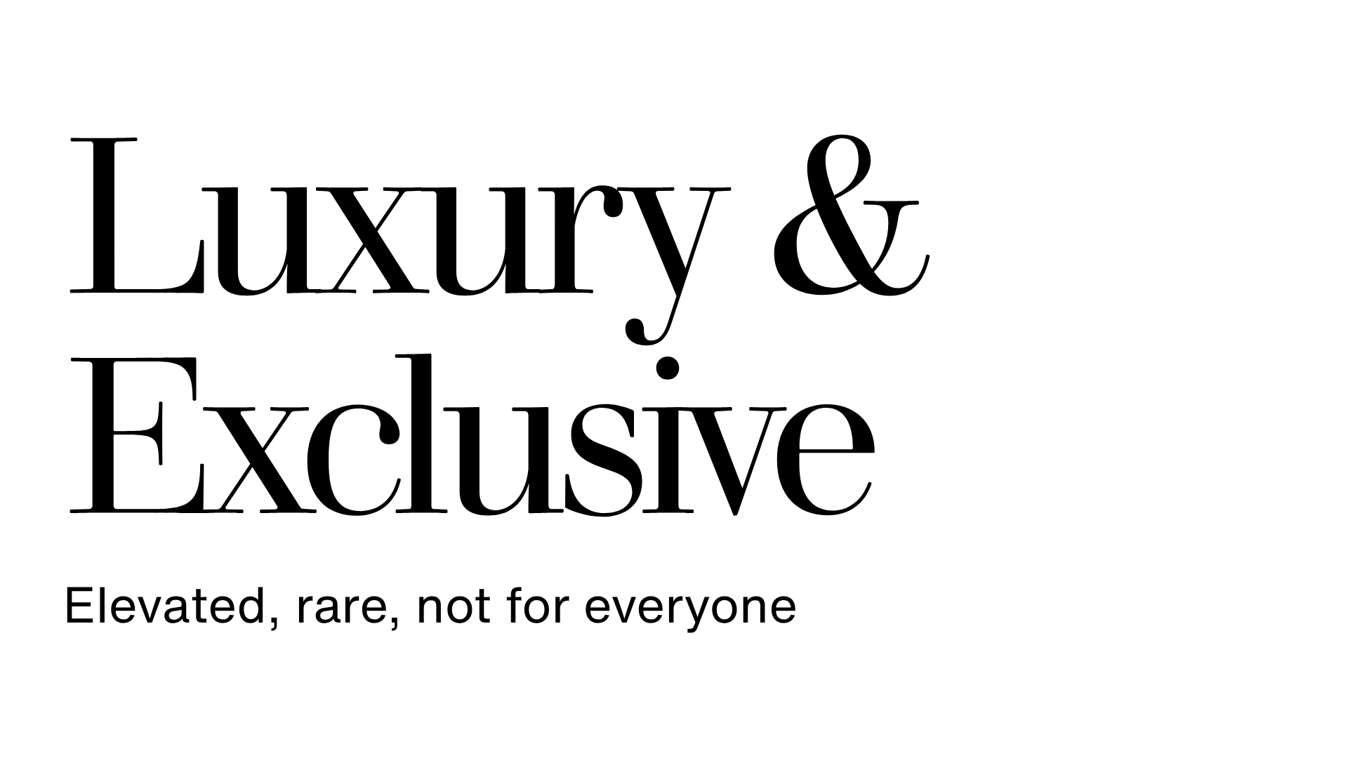
About this combination This brand isn’t trying to reach everyone, just the right people. Thin, elegant strokes signal something considered and hard to come by. Who is this good for? High-end fashion, jewellery, exclusive experiences. What fonts should I reach for? Monotype’s “Walbaum Light” combined with “Helvetica Now.”
This just nine of a near infinite number of potential combinations. Explore Monotype's font library in Canva and find the perfect one for your brand.
About Monotype
Great design starts with great type. Monotype brings together iconic typefaces, technology, and scalable design systems to help the world’s leading brands and creatives bring ideas to life. Monotype offers more than 350,000 fonts from over 5,000 talented designers and foundries around the world, helping brands and creatives discover, use, and manage type beautifully and seamlessly.
On this page
1
Fonts speak before words do
2
Is your brand 'Handmade and Warm?'
3
Or is it 'Heritage and Refined?'
4
What about 'Dynamic and Energetic?'
5
Maybe your brand is 'Rebellious and Edgy?'
6
Or more 'Corporate and Authoritative?'
7
'Whimsical and Quirky?'
8
'Futuristic and Tech-Forward?'
9
'Minimal and Clean?'
10
'Luxury and Exclusive?'
11
About Monotype