- Comparison Charts

Comparison charts
Create a comparison chart online
Make complex decisions easy by organizing your data in a comparison table. Our online comparison chart maker lets you create digestible comparison charts to present the different packages you offer, rate anything, or help your customers choose from a range of products. Start with a template, and use the suite of collaboration tools from Canva Whiteboards to design a comparison chart with your team.
Infinite space made for unlimited ideas
Professionally designed templates to fast-track your workflow
Share and ideate with anyone, anytime, on any device
Run a workshop with whiteboard elements, sticky notes, and a timer
Embed your comparison chart in Docs, presentations, and more easily
Easy online whiteboard tools and data visualization
How to make a comparison chart

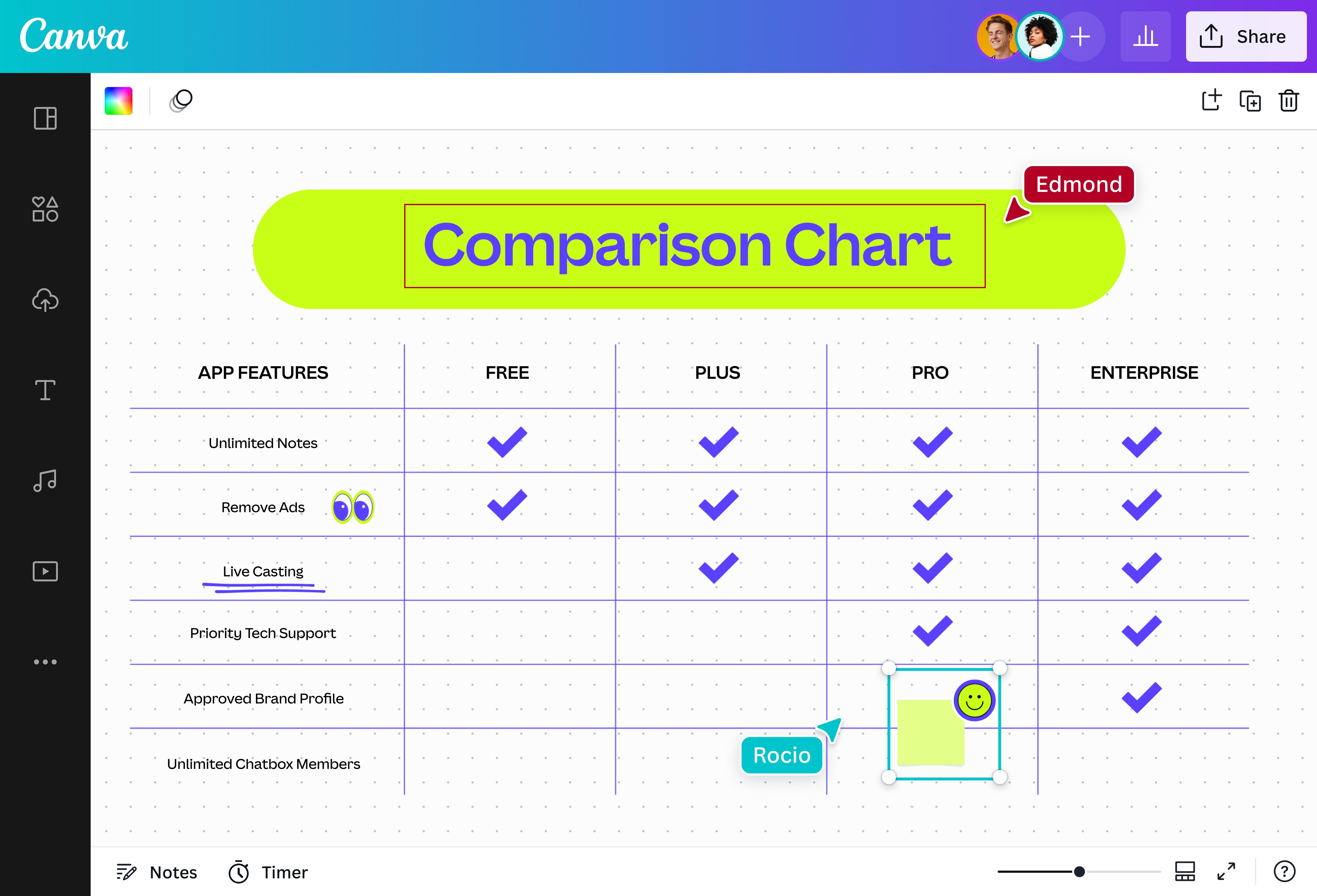
What is a comparison chart?
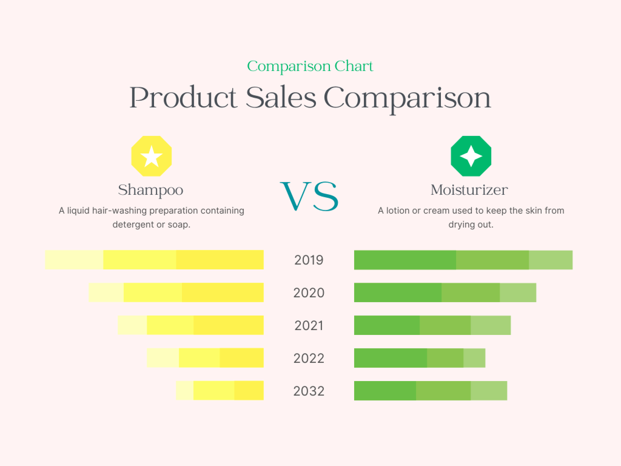
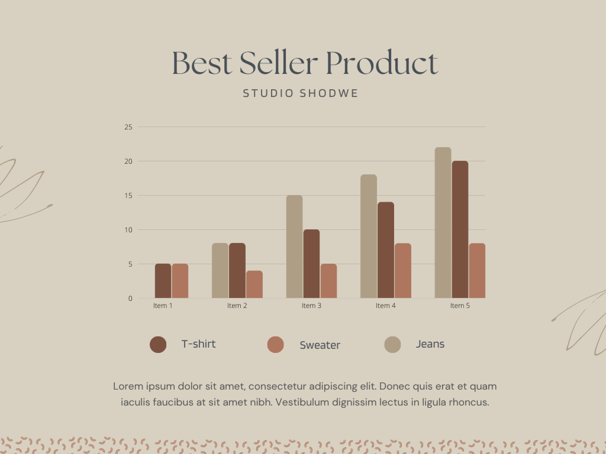
Comparison charts represent the features of one or more options that can be compared to each other. They can be used to depict differences, analyze the progress of data groups, and highlight advantages and disadvantages. Comparison charts are versatile, and ultimately, they provide qualitative and quantitative analysis to help you make data-driven decisions.
Why use comparison charts?

Comparison charts present information in a digestible format, so you can draw quicker and easier comparisons than with plain text alone.
Are you buying a new phone but stuck between two different models? Do you want to weigh the pros and cons of owning a home? No worries. Whether you’re making a simple choice or a complex decision with major consequences, a comparison table can help you gain valuable insight to arrive at a conclusion that will benefit you the most.
Simplify your analysis

Create a comparison chart to make information easier to interpret. On Canva Whiteboards, you can quickly compare similarities and differences, and recognize patterns or trends using all types of comparison charts — from comparison bar graphs to pie charts. Find the perfect comparison chart design from our library and compare and contrast options to simplify your decision-making process.
Customize with the right elements

Spruce up your comparison table with free design elements to make it visually appealing and engaging. Access our entire library content and add stickers, whiteboard graphics, and icons. Change fonts and colors to match your preferences. With our drag-and-drop editor and data visualization features, you can create a comparison chart that’s both fun and functional.
Draw comparisons without limits

Easily visualize the pros and cons between two or more options on an infinite canvas. List down all the features available for comparison, enlarge your chart, and even add shapes to keep improving your comparison table. With our online whiteboard’s unlimited space, you never have to worry about running out of room for your comparing needs.
Make it a team effort

Canva Whiteboards make it easy and fun to create a comparison chart with your team. Simply share the link to your design for real-time collaboration. Tag teammates in comments, add sticky notes, and react with stickers. You can also use our built-in timer for brainstorming sessions. And since your comparison chart is online, access it whenever inspiration strikes — on any device, wherever you are.
Start inspired with a comparison chart template


Assem A
Frequently Asked Questions
- Comparison charts act as a visual aid to compare the features of two or more data sets. They provide qualitative and quantitative information in a format that’s easy to digest, so you can make well-informed decisions. Comparison charts are used in different fields to help discover data’s benefits and drawbacks, spot patterns, recognize changes in trends, and highlight vital differences, making them an essential tool in business and even scientific fields.
- Comparison charts are a data visualization tool with different variations to better compare and contrast multiple options. Some of these variations include:
- Comparison bar chart
- Line chart
- Pie chart
- Dot diagram
- Matrix chart
- Venn diagram
- A good comparison chart should contain vital information in a clear and digestible format. It should also be engaging and visually appealing to your audience. You may benefit from a comparison chart maker that lets you build ideas on an infinite canvas and elevate your chart with different design elements. Canva Whiteboards offer all this and more. Access free editable templates and online whiteboard features, and share the design link with your team to workshop your comparison chart before presenting it directly from the editor.