- Radar Chart

Free radar or spider charts online
Radar chart maker features
Spot valuable patterns, relationships, and trends between multiple variables in data sets with Canva’s free radar chart creator. Visualize your data in high-quality spider charts with just a few clicks and use them for any report, presentation, or video. Choose from our free and customizable templates, plug in your numbers seamlessly, and explore your data more with our rich media library and collaboration tools and features.
More than 20 professional types of graphs to choose from
Professionally designed templates to fast-track your workflow
Data visualization made easy – no complicated software to learn
Publish, share or download your high-resolution graph
Embed your radar chart in presentations, reports, and more with no fuss
Easy drag-and-drop tools, made with the non-designer in mind
How to make a radar chart

What is a radar chart?
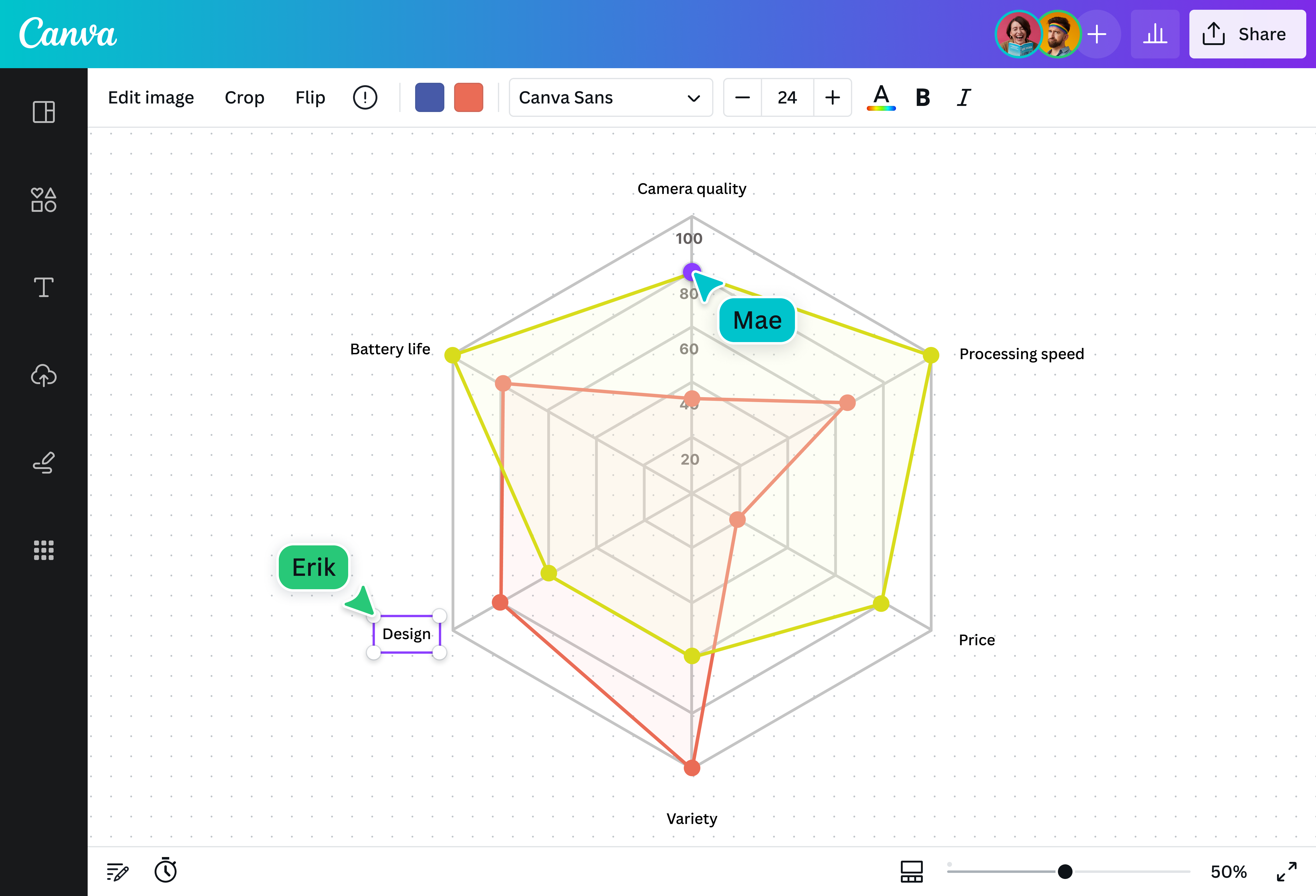
A radar chart is a type of graph, usually quantitative, that simultaneously compares three or more variables against a baseline metric or common denominator. This baseline is shown as the anchor of the graph, around which the variables are plotted at equal intervals, depicted as spokes or straight lines sprouting from the center point. The resulting graph resembles a spider web(opens in a new tab or window), which is why the radar chart is also commonly called a “spider chart”.
Why use radar charts?

Radar charts are powerful data visualization tools. They’re great for analyzing multiple variables at once to see how they compare against each other and if there are any outliers.
They can be used in scientific or academic research to compare and contrast data sets; in marketing and business to visualize a product’s characteristics or qualities; or in classes to depict relationships and patterns.
Components of a radar chart

Center

Radial axes

Labels

Scale

Data points

Lines and patterns
Easily visualize data and insights on your radar

With Canva, creating professional graph designs is no rocket science. Thanks to our premade radar chart templates and a wide array of nifty, powerful editing tools, you can have high-quality data visualization within minutes. All that’s left is to plug in your own data, and Canva will do all the design heavy lifting for you.
Put things into perspective

Make your data tell a compelling story. Create your radar chart with Canva’s easy-to-use customization options and vast elements library. Use color to differentiate your variables. Add icons, vectors, and graphics to distinguish your legends. With design, back your data with context and strengthen its visual narrative.
Spot patterns and trends at a glance

By connecting the data points on a spider chart, the emerging shapes make it easy to see the average trend among the variables. Vary the line weights, colors, and markers to make each data value and variable distinct from one another. Canva’s radar charts are interactive, so you can hover over specific points, highlight specific chart areas while you’re reading or presenting.
Boost data-driven decision-making

Save yourself and your team and stakeholders hundreds of hours of poring through documents and spreadsheets. With a well-made spider web chart, you can have all your important data at a glance and make smarter, data-driven decisions much faster. Share your design to collaborate together, apply changes simultaneously, and leave comments and analysis easily.
Radar chart templates


Assem A
Frequently Asked Questions
In a nutshell, radar or spider charts can be used in anything that compares multiple datasets, particularly for data analytics such as
- Sports analysis showcasing athletes’ or teams’ strengths and weaknesses
- Business reports detailing the qualities of products or services
- Scientific papers documenting experiment results or variable characteristics, and more.
Create a radar graph or spider plot to compare several variables and data sets at once with Canva’s free radar chart maker online.
Unlike pie charts, bar graphs, and other popular 2D graphs, spider charts allow for multivariable comparisons. Essentially, you can get more insights out of the same data sets using a radar chart than you would with other graphs.
For instance, if you want to compare the year-on-year performance of the sales and marketing teams, you’ll need two separate bar graphs. On a spider chart, however, you can plot multiple team performances on the same graph. This not only lets you compare each team more accurately, but you also save space with just one graph instead of multiple.
There are two ways to read the data on a radar chart: based on individual variables or based on the collective picture. To start, understand the factors shown in the graph: the baseline value, the categories in each axis, and the scales of measurement.
The closer the data is plotted to the center, the lower its value. By connecting these plot points, you can see the individual values of each variable, as well as any emerging trends from the group, like the general average value or any outliers that are higher or lower in the scale.