- 40 examples of classic branding next to the modern version
40 examples of classic branding next to the modern version
From minor tweaks to major redesigns, these companies have changed with the times to stay at the top of the branding game.
Evolution helps brands stay fresh and relevant. By looking at the logo(opens in a new tab or window), packaging, product and advertising design of a brand – comparing their early branding iterations with the latest version – we get a clear picture of what has changed and what has stayed the same over a period of time. This can help us understand how a brands values and target market have remained consistent or evolved over time. It gives us an historical snapshot of what was fashionable and popular during a particular period of time and it reveals major trends and developments in branding.
Here are 40 examples of classic and modern branding that will serve as a great source of design inspiration and demonstrate what has stood the test of time.
01. Pepsi 1898 vs 2015

Pepsi-Cola founder Caleb Bradham scribbled the first company logo in script. Pepsi progressively simplified the logo to take a more minimalist approach while still retaining some of the script-like curves of the original logo.
02. Lipton Tea 1900 vs 2012

In stark contrast to the current ‘less is more’ advertising mantra, ‘more is more’ proved to be the trend in the early 1900s. While these Lipton Tea ads are visually very different, both rely on some boasting. The classic ad is chaotic providing as much information as possible about tea that is the “finest the world can produce.” Whereas, the modern ad is designed to evoke a sense of calm and relaxation – because “Lipton Tea can do that.”
03. Goodyear 1901 vs 2015

The Goodyear logo has walked its way right through the last century and still survived. Only minor alterations have been made to the font, colour and Wingfoot design of the classic logo to the modern version (designed in 1970 and still going strong). Goodyear has been onto a good thing since way back in the early 1900s.
04. Cadbury Dairy Milk Chocolate 1905 vs 2015

Cadbury Dairy Milk Chocolate is one of the most famous chocolate brands and its purple and gold colour palette has been consistent since its launch in 1905. Cadbury originally had more decorative packaging to seduce new customers; however, today Cadbury appeals to customers with the goodness of chocolate and imagery that represents the company’s well0known tagline “a glass and a half.”
05. BMW 1917 vs 2015

The defining elements of the BMW logo have remained unchanged for nearly a century reflecting the historic prestige of the luxury car brand. What is interesting here is that unlike many modern logos that have become progressively flatter, BMW has added depth to the logo with a light source shining on the ‘B.’
06. Weet-bix 1920 vs 2015

Lipton Tea, Cadbury and Weet-bix demonstrate the trend for food brands to include a picture of the food product in the packaging, which began with the rise of advertising photography in the 1920s. Prior to that, packaging and advertising relied on illustration and decorative typography to appeal to customers.
07. Warner Bros. 1923 vs 2015

The Warner Bros. logo has never strayed far from its 1923 conception. The first logo featured a photo of the studio in the iconic shield in a decade that films really found their place in popular culture. Over time, Warner Bros. reflected changes in the movie experience – such as colour and 3D effects – in the logo.
08. Vogue 1929 vs 2015

Vogue seeks to put the finest on its magazine covers whether its fashion, illustration, a supermodel or actress of the moment. In the 1920s, Art Deco fashion illustrations displayed expensive garments, a cosmopolitan flavour, and a bespoke masthead. Today, magazine covers vary little from one another. However, no matter what, Vogue magazine’s branding reflects fashion who or what was trending at a particular month, year, or decade.
09. Pabst Blue Ribbon 1930 vs 2015

PBR has become the hipster choice of drink in recent years, effectively reviving the brand after decades of slumping sales. Both the classic and modern bottles take their design from the 1880s when the beer won multiple competitions and Pabst took to tying a blue silk ribbon around the neck of the bottle, even changing the beer’s name to Pabst Blue Ribbon. WWI shortages meant no rations for silk so Pabst incorporated a blue ribbon into the label and its still there today.
10. Shell Oil Company 1930 vs 2015

The Shell logo is one of the most recognised symbols in the world and it evolved since the 1930s in line with trends in graphic design. Gradually modified from a more realistic iteration, the current Shell logo is distinctive with simple lines and bold colours. This progressive simplification worked to improve recognition and memorability as well as aid better facsimile transmission in the 1950s.
11. Audi 1932 vs 2015

Like BMW, Audi’s logo has evolved from a flat design to one with depth. However, the iconic overlapping rings have remained part of the logo as they represent the company’s history: each ring represents the four companies of the Auto-Union consortium of 1932 – DKW, Horch, Wanderer, and Audi.
12. London Underground 1933 vs 2015

The London Underground logo is as much a logo for the Underground as it is for the city of London. The roundel first appeared in 1908 and has proved to be a memorable, identifiable shape that serves as an easy-to-read station marker. The logo has been streamlined and the colours tweaked and it holds a place as one of the most effective, highly emulated and reproduced logos of all time.
13. Monopoly 1935 vs 2015

Hello cat, goodbye iron! Monopoly continues to evolve to stay relevant nd one of the most recent changes was the addition of the cat token. Otherwise, the monopoly box has changed drastically over the decades while the logo and its placement have changed little.
14. Volkswagen 1939 vs 2015

Volkswagen is bucking the same design trend as BMW and Audi with its move from a flat design to one with depth – and coincidentally, they are all German brands. The core of the logo has remained the same since 1939 with the V set atop the W. However, the radiating striated lines disappeared shortly after WWII due to their similarity to the Swastika and association with the Nazi regime.
15. NFL 1940 vs 2015

When you’re on to a good thing why change? That’s obviously the attitude of the NFL that has been working this logo since 1940. Red, white and blue is patriotic as are the stars. The stripes disappeared in the 1960s making the logo easier to reproduce and transmit electronically.
16. 3-M 1942 vs 2015

The modern 3M logo originated in 1978 and despite prolific changes that traversed numerous iterations and multiple fonts it is very similar to the logo designed in 1942. Both are very bold defined by typography and colour.
17. Juicy Fruit 1946 vs 2015

In 1946 Wrigley radically redesigned its Juicy Fruit packaging to this classic version that stuck around until 1987. Wrigley introduced bright yellow and added two red chevrons at either end of ‘Juicy Fruit.’ In the modern version, the font has been animated to reflect the brand values of ‘fun’ and ‘sweet.’
18. Vespa 1949 vs 2015

Enrico Piaggio designed the Vespa in 1947 as a contemporary and affordable way for Italians to get around. With only minor modifications, the Vespa logo has remained as stylish as the Vespa itself and is a clear symbol of the brand values of fashion, youth and adventure.
19. Dunkin’ Donuts 1950 vs 2015

Everything about the Dunkin’ Donuts logo has changed since its 1950 incarnation when it was the name on a single coffee shop. As Dunkin’ Donuts grew to be a worldwide success, the brand introduced the modern logo in 1980 and added the coffee cup in 2002.
20. Quaker 1956 vs 2015

Born in 1877, the Quaker man has been deservedly spruced up lately with a thinner face, shorter hair and fewer wrinkles. Overall, he has moved with the times to become increasingly svelter and lighter in line with Quaker’s brand values, while ‘Est 1877’ has been added as a mark of tradition.
21. Crest 1956 vs 2015

Renowned industrial designer Donald Deskey designed the Crest toothpaste logo and packaging in 1956. Much has changed about the packaging but a number of elements remain consistent: the ‘C’ is in red, the ‘e’ has a sparkle, and an arrow points the way at the end of the box.
22. Burger King 1957 vs 2015

The Burger King logo has transformed from a complex and literal interpretation of the brand name – a king sitting atop a burger – to a more dimensional and animated logo that sandwiches the name ‘Burger King’ between the two halves of a burger bun.
23. Ray-Ban 1957 vs 2014

Ray-ban has been in fashion since the 1950s and has achieved this by understanding its consumers well enough to push branding boundaries without distancing its audience. Ray-ban has always added the cool-factor to design – from a close up, stylised face with a fashion-forward red lip in the 1950s to a crowd of youg partiers celebrating good times in 2014.
24. Volkswagen Beetle 1959 vs 2015

The Volkswagen Beetle is famous for keeping its branding simple in both ideas and visuals. VW introduced Americans to the car in a 1959 campaign that told consumers to “think small” – a distinct contrast to the ever-larger cars American manufacturers were producing. According to Bernhard Rieger, VW presented the Bug as “an amusing, lovable, and curious automobile” and this still holds true in the modern ads that also have a sense of nostalgia for the hippie symbol.
25. McDonalds 1960 vs 2015

It’s hard to go past those golden arches when talking about classic branding and as these images from 1960 and 2015 reveal the golden arches have been a part of McDonalds branding since the early days. In fact so much so that the golden arches were an architectural feature of the first McDonalds establishment in 1952.
26. WWF 1961 vs 2015

Who can resist the WWF logo? Founding chairman Sir Peter Scott created the panda in 1968 and it is very similar to the modern version designed in 2000. However, like many modern logos, the level of detail has been reduced and the overall form simplified.
27. Target 1962 vs 2015

The Target logo is, well, on target. From a small retail store to a global brand, the bullseye symbol has remained Target’s logo although shedding some of its rings.
28. Max Factor 1962 vs 2012

Max Factor’s 1962 and 2012 ad campaigns use the same peachy colour palette and open lipsticked-mouth. And while the 1962 ad reflects the style of 1960s advertising it wouldn’t go amiss in a modern mag.
29. Heinz 1962 vs 2007

Speaking of colour palettes, it’s hard to go past red when you’re promoting ketchup. But beyond red, both of these ads speak to the freshness of Heinz tomatoes. The 1962 ad does this through copy, “… made from fresh sun-ripened tomatoes,” while the 2007 ad uses imagery with the simple addition of green tomato leaves coming out of the bottle.
30. United Airlines 1964 vs 2013

Travel ads are designed to transport viewers, both metaphorically and physically, to another place and both these United Airlines ads do this. They also reveal the historical trends in graphic design for travel advertising: the emphasis on illustration in the 1950s/1960s versus the use of photography in recent decades.
31. Olympics 1968 vs 2016

Every four years a major city gets to reinterpret the Olympics logo. The Olympic rings and colours can’t be modified but the rest is up to creative license as designers appropriate the logo to reflect a time and place.
32. American Airlines 1968 vs 2015

In 2013 American Airlines revamped the classic 1968 logo. They reconfigured the eagle wings to appear like an airplane tail; added a gradient to the red, white, and blue; and employed a font that doesn’t stray from Helvetica. Overall the logo is modern and streamlined as the revamped airline intends to be.
33. Nike 1971 vs 1995

The Nike logo has had the tick of approval since 1971. It is so well recognised that the brand name needn’t accompany the iconic ‘swoosh’ for us to know this is Nike. This is the pinnacle of logo design and branding at its most genius.
34. Apple 1976 vs 2015

It’s hard to believe the first Apple logo now that we are so familiar with the streamlined minimalism of everything that Apple does and represents. The modern logo sets the tone for the company – beautiful design, simple functionality – and demonstrates the trend towards sleek design.
35. MTV 1980 vs 2015

The MTV logo has changed little with its general shape and proportions remaining unaltered. The most revolutionary element of the MTV logo is that there are no corporate colours enabling designers to get creative with colour and pattern and create fresh and vibrant logos that use the same template.
36. Lego 1981 vs 2007

Lego created an ad campaign in the 1980s that emphasised both boys and girls playing with Lego because “it’s imagination that counts.” Interestingly, Lego sets have become increasingly gendered while ads, such as this from 2007, have become increasingly un-gendered. Yet it is still imagination that counts as Lego advises readers that Lego is “what you make of it.”
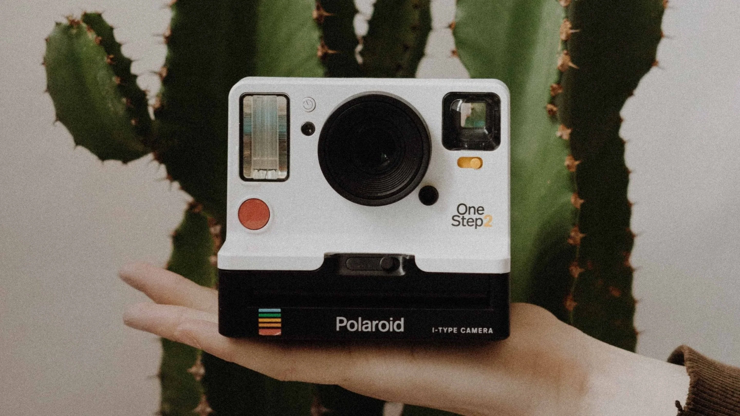
37. Polaroid 1982 vs 2015

It’s all about “retro-chic” with this Polaroid camera. Hitting on the popularity of nostalgia, Polaroid has designed a camera reminiscent of the Instagram logo with the colours of the classic 1982 camera.
38. SodaStream 1980s vs 2014

Well we know what was fashionable in the 1980s and 2014 from these SodaStream ads. Perms, mullets, and pastels were the order of the day in 1980s while a sleek black dress set the tone in 2014.
39. M&Ms 1987 vs 2013

The M&M anthropomorphic characters have always loved the spotlight! M&M advertising has developed the personality of each character to engage consumers and stand out from competitors. Get in the bowl!
40. Google 1998 vs 2015

The Google logo sums up many stylistic trends including flattening and minimising the design for clarity. This keeps Google at the top of the design game, ensures their relevance, and reflects the brand value of innovation.
What can we learn from comparing classic and modern branding?
There is inspiration to be found and lessons to be learnt by comparing classic and modern versions of branding. Look to the past for what was trending in fashion, style, taste, and design and reinvent it, where appropriate, for the present. Get a better understanding of culture by reviewing a particular historical period. And learn from those brands that have stood the test of time. If you’re on to a good thing, don’t mess with it because your brand will accrue inherent value that can prove to be priceless.

Written by
Rebecca Gross


