- Everything you need to know about fonts
Everything you need to know about fonts
Before we get out of bed, we're bombarded with typefaces through emails, news articles and social media. Despite being such a common part of our lives, the importance of typography often goes unnoticed. And it's this very subtlety that makes it so essential to your marketing.
The main goal of typography is to present text in a way that enhances the reading experience.
To create cohesive typography, it's necessary to understand the terminology, techniques and common mistakes.
This comprehensive guide aims to shed light on these important aspects.
Table of Contents
What is typography?

Typography refers to the design or selection of letter forms that are organized into words and sentences. These blocks of type are then arranged for print on a page or displayed on a screen. It's a fundamental aspect of graphic design, playing a crucial role in the way we perceive and interpret written information.
The anatomy of typography

Font vs. Typeface

A font represents a set of text characters, displayed or printable, which share a consistent style, referred to as a typeface. Nowadays, 'font' and 'typeface' are often used synonymously, though they have distinct historical meanings. A typeface is the visual design you observe, while a font is the means by which that design is implemented or utilized. Even though this differentiation has lost some relevance with the advent of desktop publishing, understanding the historical disparity between the two terms remains important.
Size
A font can be used in various sizes to establish a visual hierarchy, which helps make the text easier to read. Think of a newspaper: it uses a large font for the headline to draw attention, a smaller font for the subheader to summarize key points, and an even smaller font for the main body text to explain the story in greater detail. To achieve this balance, you can apply a design principle known as the golden ratio.
Weight

The weight of a font refers to the thickness or thinness of its characters. Thin, narrow fonts can provide an appealing contrast to thicker, bolder headings and body text, but they also have their limitations. Specifically, when used for smaller body text, these slender fonts may appear too faint, making them challenging to read.
Ascender

An ascender is the vertical stem of a font, which extends above the mean line. In other words, the taller part of a lowercase letter or the upper portion of an uppercase letter. Smaller, introduction or supportive text are usually best on this landing space.
Descender

The descender is the part of a letter that dips below the line we write on, or the font's baseline. Subheadings or less important text fits well in this space, a simple tagline or embellishment.

Serif
A serif typeface has small decorative edges at the ends of the letters. They have a traditional, sophisticated look. Serif typefaces are suited to long body copy as they are easy to read.
Sans Serif
A sans serif is a geometric typeface with no decorative details, additional strokes or spurs at the end of letters. They have a modern, minimalist look and are great for titles.
Script
A script font mimics the stroke of a paintbrush, often linking letters together. Applying a script can add an edge to your design. Script typefaces create a dynamic pairing when combined with a sans serif.
Slab Serif
A slab serif is a typeface that is identified by its thick, bold serifs.
Baseline

The baseline is the line on which most letters sit and below which descenders extend. If you want to add text corresponding to the line above, the baseline is a good space for this.
Tracking (or letter-spacing)
Tracking is adjusting the space between letters throughout an entire word. Designers often elongate shorter words and fill empty space by increasing letter spacing, creating flush lines between headings and subheadings.

Kerning
Kerning is similar to tracking as it determines the space between two letters or characters. However, tracking adjusts space equally through a whole word, kerning only adjusts the distance between two letters. Adjusting space between the letters enhances the visual flow of words. Words can be indecipherable when letters are set too close together and awkward when too far apart.
Leading

Leading refers to how text is spaced vertically in lines and affects the readability of text. For example, the space between the bottom of the upper line and top of the lower line should be in proportion to the size of the font. Too much or too little space can make it difficult to read and descenders can overlap ascenders.
Line Height
Line height is the distance between two rows of text from the baseline of the upper row to the baseline of the lower row.
Alignment
Alignment is the arrangement or adjustment of components to make them sit together.
Glyphs
Glyphs are the characters and symbols in a typeface, such as an ampersand or asterisk.
What is font hierarchy?

Typographic hierarchy is the principle that guides the reading sequence of text. Our eyes instinctively gravitate towards elements that are larger or more prominent, so it's advisable to use the largest font size for your most crucial message—typically the title—followed by the subtitle and then the body text.
What is font psychology?

Font psychology investigates the influence different fonts have on our thoughts, emotions and behaviors. People often have distinct, and sometimes very particular, associations and emotional responses to diverse font types.
Reading small, closely spaced text can be straining, while text with a legible font and size make reading a fun experience. Similarly, a poster with vibrant colors and creative typography can transform your perception of a product, service or brand.
The font psychology behind major font categories
Serif


Serif fonts are considered timeless classics. These fonts are extensively used in books, newspapers and magazines.
When you incorporate a serif font into your designs, it can evoke the following associations and emotional reactions:
- Trustworthiness
- Respect
- Authority
- Formality
Serif fonts are particularly suitable for brands and sectors that lean towards tradition, such as:
- Financial institutions
- Legal practices
- Insurance firms
- Consultancies

San Serif


If your goal is for your brand to seem more youthful, sans serif fonts can come across as friendlier compared to their more formal serif counterparts.
When you use a sans serif font in your designs, it can evoke the following associations and emotional reactions:
- Uncomplicated
- Contemporary
- Trustworthy
- Refined
- Technology-oriented
- Pioneering
Sans serif fonts are an excellent choice for brands seeking to portray their designs as inventive, bold and sophisticated, such as:
- Technology firms
- Fashion labels
- Start-ups

Script


As they mimic handwriting, script fonts offer a personal touch. Depending on the font, they can evoke a playful and whimsical feel or a vintage vibe.
When you use a script font in your designs, it can evoke the following associations and emotional reactions:
- Elegance
- Sophistication
- Extravagance
- Creativity
- Happiness
- Tradition
- Personal connection
- Whimsy
Script fonts can be an excellent option for various brands and industries aiming for a sophisticated, whimsical and/or personal touch, such as:
- Food and beverage companies
- Fashion labels
- Brands focused on children

How to choose the perfect font for your brand

To help demystify the font-choosing process, there are four things to consider when choosing your shortlist.
- Be unique and memorable
- Be legible
- Readable on every platform
- Communicate your personality
Let's explore 40 of the top franchise fonts on record. This list makes an excellent starting point for building your font library and each font is free to use within Canva.

What to look for in a typeface
Legibility pertains to how easily individual letters can be recognized and differentiated.
Text typefaces prioritize legibility for easy reading while display or decorative fonts focus on attracting attention.

Some of the characteristics of legible fonts include:
Transparent Appearance: Typefaces are deemed transparent when they subtly blend into their environment without drawing excessive attention. They possess standard letter forms, an unobtrusive style and refrain from being overly ornate.

Generous X-Heights: This refers to the height of the lowercase letters. A generous x-height, relative to the uppercase letters, boosts legibility.

Large Counters: This pertains to the enclosed or semi-enclosed white areas within letters such as a, b, c, e and o. Letters become more readable when these spaces, known as counters, are larger and more open.

Low-Contrast Design: Subtle design elements such as consistent strokes and understated serifs can enhance readability. Overly dramatic letter forms, such as significant variations in strokes on each letter, or exceptionally long or slender serifs can all detract from legibility.
Format text for clarity and sufficient space
When dealing with text-heavy designs or documents, prioritizing readability is crucial.
Readability is determined by your choices in type usage, arrangement and formatting which influence how easily your text can be read.

To create an inviting design, consider these tips:
- Ensure ample white space between and around design elements
- Apply uniform spacing and alignment to text
- Establish a clear hierarchy within your design
What is kerning and why does it matter?

Kerning is the process of adjusting the space between two characters, like letters, numbers or punctuation, to eliminate awkward gaps or to alleviate crowding.
Certain letter shapes, particularly those with strong slants or extended features can present kerning challenges, and words set in all capitals may require additional focus.
Here are some characters to watch out for:
- Slanted letters: A, K, V, W, Y
- Letters with arms or cross strokes: F, L, T
- Letter combinations: W or V + A (in any order), T or F + a lowercase vowel
Check your line length
Line length, or measure, impacts the readability of text. Extremely short or long lines can hinder the reader's ability to scan the text effectively.
A common guideline suggests maintaining an average length of 45-75 characters per line (including spaces and punctuation), although the perfect length may vary based on the characteristics of your typeface.

What is the purpose of leading?
Leading refers to the vertical space between lines of text. It's a common feature in word processing programs. The goal is to achieve a balance, too tight or too loose spacing can hinder readability. The optimal leading settings will depend on the font's style, point size and case (uppercase or lowercase).
Text set in smaller point sizes or with longer line lengths requires more liberal leading to enhance readability. Most word processing and design programs have a default setting for leading, which is often too narrow. It's recommended to adjust the leading to be 120 to 150% larger than your text's point size.

Winning font combinations

Selecting great font combinations is crucial for exceptional design.
Using too many different typefaces in a design can create a cluttered and chaotic appearance. It's recommended to stick to a maximum of three different fonts.
A safe starting point for combining fonts is to pair a basic sans serif font with a serif font, as they usually compliment each other. You could also choose a single typeface or type family which offers various weights and styles, ensuring a cohesive look.
While it can be tempting to overuse bolding, italics or capital letters for emphasis, it's best to exercise restraint. You won't need more than one style to effectively convey your message.
There's an art to applying headings, subheadings and body copy that aligns with your content type, brand message and tone.
Try these font combinations. They’re ideal for creating logos, presentations, infographics, invitations, postcards and just about any other design project you have in mind.


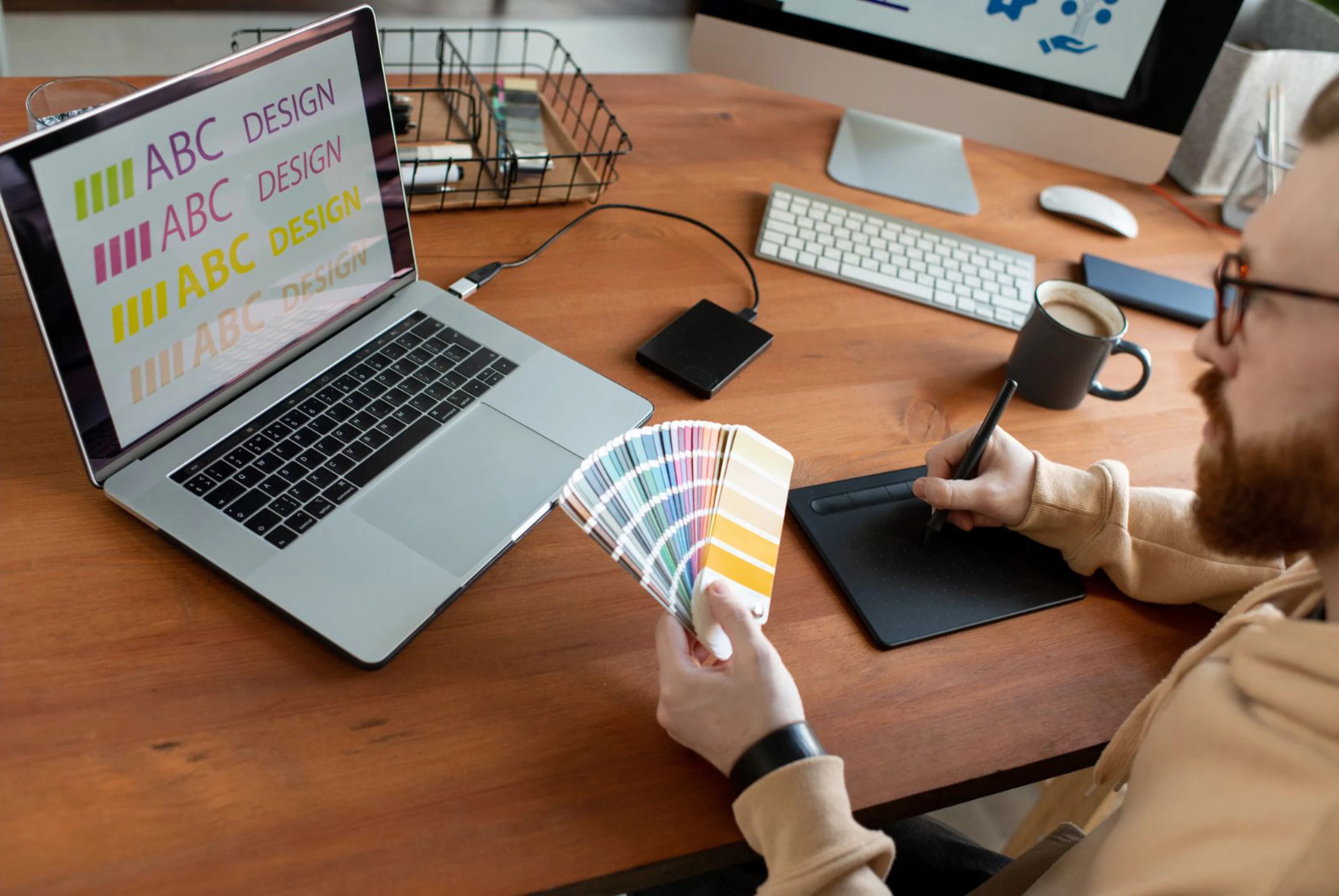
How to choose the perfect color palette for your brand

Color is an impactful tool in visual communication, significantly influencing feelings and perceptions. Color interpretations vary, as cultural and societal associations greatly influence the meanings associated with colors.
Let's examine the interpretations of fundamental colors in Western culture.
Red
The color red, depending on its context, can convey very different messages. Its association with fire can symbolize warmth or danger. Because of its connection to blood, red is often seen as a vibrant color, linked to emotion and occasionally, aggression.
In design and branding, the color red is often used to evoke feelings of confidence. It symbolizes strength and significance, and stands out due to its high visibility.

Orange
Orange blends the warmth of red with yellow's joviality, resulting in a shade that conveys action and a positive outlook.
Orange doesn’t take itself too seriously. In design and branding, it often creates a creative, youthful vibe and casual style.

Yellow
Representing the hue of the sun, yellow conveys joy and the rejuvenation of spring. In specific situations, it can also serve as a sign of caution or alert.
In design and branding, vivid or pure yellow effectively captures attention, akin to red, but it typically offers a more positive feeling.

Green
This hue is synonymous with nature, vegetation and development. Consequently, it frequently denotes healthiness, freshness or an "organic" attribute. Especially in its darker variants, green can symbolize wealth and steadiness.
In design and branding, hues inspired by nature such as green and brown are frequently selected by businesses aiming to project a "green" image (connoting natural, wholesome, sustainable, eco-friendly and organic).

Blue
As the color of the ocean and the sky, blue often conveys qualities of serenity and purity. Unlike warmer, more vibrant colors, blue is perceived as soothing.
In design and branding, blue is widely used and one of the most versatile colors. It’s generally used to communicate trustworthiness, security and stability. Dark or navy blue is a particularly popular choice for corporate contexts since it’s perceived as professional and understated.

Purple/Violet
The color purple is traditionally linked with regality, grandeur or dignity. It can also carry mystical or religious implications.
In design and branding, darker hues of purple continue to represent luxury and royalty, while lighter, more vibrant shades can be perceived as feminine or appealing to children.

Black
Similar to red, black carries numerous meanings which can sometimes be contradictory. It can signify power, sophistication, luxury and exclusivity. Conversely, it can denote death or mystery. In the context of clothing, black typically conveys formality, as seen in "black tie" events, or expresses grief or sadness, being the traditional color worn to funerals.
Black is commonly utilized as a neutral color, although it can still convey the aforementioned meanings depending on its context. Numerous designs are strictly black and white, whether this is a conscious decision or a cost-saving measure on color printing. Colors always appear more vibrant and pronounced when contrasted against black.

White
Being the color of light and snow, white is associated with purity and innocence, making it a traditional choice for brides. However, it can also be perceived as harsh or sterile.
In design and branding, white symbolizes a sense of simplicity or a clean, contemporary attribute. Designers pursuing a minimalist look often make extensive use of white.

Popular fonts for small business owners and franchises

Whether for a marketing brochure, a business report or a logo, your chosen font plays a significant role in ensuring your business looks professional, polished and on brand.
Discover Canva’s top fonts for small business owners and franchises.
Popular san serif fonts

Sans serif fonts bring a modern touch to designs. Here we discuss Canva’s top choices for sans serif fonts. Among the highlighted fonts are Helvetica Now and Proxima Nova, which are popular choices for logos and branding.
The best handwritten fonts for a personal touch

Handwritten fonts offer the distinct charm of real handwriting while providing the convenience and time-saving benefits of typing. The best part is, you don't have to spend anything to get them. We suggest these free handwritten fonts that you can incorporate into your designs to give them a unique, personal feel.
Stay current with futuristic fonts

Contemporary design, with its emphasis on pushing boundaries and sparking imagination, leads to futuristic typefaces which break the mold. Here we discuss free futuristic fonts you can use to make your designs shine. These futuristic fonts can add a modern and innovative approach to personal and commercial projects.

Fonts communicate more than just words, they convey mood, tone and give personality to the text. They can guide a reader's eye and enhance readability. A well-chosen font can impact how a message is received and can transform the course of a brand’s relatability.
To continue learning about the topic of fonts, learn how to leverage Canva to create text effects and animations here. Enhance your social content by adding text to images and bring your illustrations to life.

