- A comprehensive guide to understanding design principles
A comprehensive guide to understanding design principles

The landscape of visual design has evolved dramatically due to the volume of digital design tools, making design more accessible than ever and raising collective consumer expectations.
Design's primary role is to concisely present ideas to an audience.
Whether you're a beginner or a seasoned designer, it's crucial to understand how your audience interprets your design and how it influences their thinking.
Grasping the interpretation of designs is a fundamental skill for visual communicators. Without understanding the key factors that shape these perceptions, we can't effectively sway audiences with our designs.
In this comprehensive guide, we'll delve into how audiences interpret visuals in graphic design and provide tips on crafting compelling designs for paying clients and social media audiences.
Table of Contents
How to design using the golden ratio

The Golden Ratio is a mathematical principle demonstrating a sense of harmony and proportion.(opens in a new tab or window) Simply put, if you have a line divided into two equal parts, the longer section divided by the shorter section will equal approximately 1.618.

Don't let the numbers intimidate you. In the world of design, the Golden Ratio is less about complex calculations and more about creating aesthetic balance and pleasing proportions. It's a guiding principle to ensure your designs are harmonious.

This ratio has been revered for thousands of years, from ancient architecture to modern art, because our brains naturally find well-balanced designs attractive.
Consider the Golden Ratio a useful guideline for determining the dimensions of your design layouts.
How to establish a visual hierarchy in design

The concept of visual hierarchy refers to the way in which humans naturally perceive and process information(opens in a new tab or window) presented on a page. By prioritizing certain elements through a system of organization, it becomes easier for viewers to understand and interpret the content.
In both web and print design, the placement of logos plays a crucial role in brand recognition and navigation. Typically, in web design, logos are positioned in the top left corner of the page, while in print they are often at the bottom of the page with a call to action.

Both approaches are based on the principle of visual flow, which allows designers to control the viewers' focus and guide them towards specific elements.

Designers can establish a clear focal point and minimize distractions by considering where the viewer's eyes will first land on their design, identifying secondary points of interest, and determining the ultimate endpoint for the viewer's attention. Prioritizing these three details can also help determine the placement of other design elements.

By understanding and implementing visual flow principles, designers can create effective and engaging designs that capture the viewers' attention and communicate their intended message.
Enhance or decrease visibility with correct sizing

To enhance or reduce the visibility of design elements, size plays an important role(opens in a new tab or window).
Increasing the size and scale of a design element can draw more attention to it, while reducing the size of less important elements can place them lower in the visual hierarchy.
It's crucial to maintain balance and moderation in sizing to avoid overloading or sacrificing the usefulness of the design.
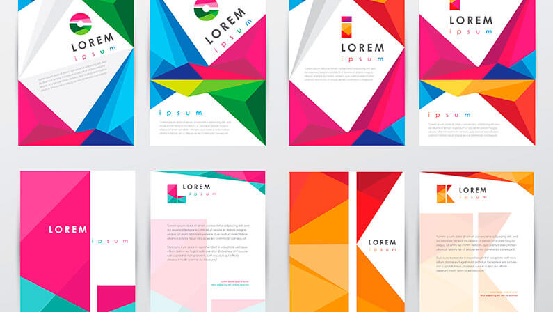
How to choose a visual focal point in your designs
A design can become overwhelming if the focal point is too large, or if secondary information appears too small.
To emphasize a focal point, designers must give it visual weight through techniques such as size, shape, color, texture, and position.
These layouts show a successful balance of size, shape, color and layout structure:


The role of color and contrast in design

A strategic use of bright colors like green or orange can be effective in drawing attention. However, overusing a multitude of colors when designing can counteract the intended impact of a color by failing to establish a clear visual hierarchy.
It’s important to use color sparingly(opens in a new tab or window).
There are various creative approaches to utilizing color and contrast(opens in a new tab or window) in design to guide the viewer's focus, as listed below.
Color Temperature

When it comes to color, they can be classified as cool (blue and green), warm (red, orange and yellow), or neutral (black, white, gray and sometimes brown or beige).
Combining colors(opens in a new tab or window) with different temperatures, especially those with strong contrast, can draw significant visual attention.
Value
The degree of lightness or darkness in a color is referred to as its value. Similar to temperature, contrasting colors with different values can create a striking impact, while colors with similar values often have similar visual weight.
Saturation

When a color is at its most vivid and intense, it is considered 100% saturated. On the other hand, as a color approaches gray, it becomes more desaturated. Incorporating bright or muted colors, either individually or in combination, can be a deliberate way to establish areas of high or low contrast within a design.
The meaning behind your color choices
Understanding the psychological impact of colors(opens in a new tab or window) is crucial in creating effective designs, ones which evoke your desired emotions in the audience.
Warm colors

Red, yellow and orange are known to radiate warmth through their brightness and association with the sun and fire. These colors usually communicate feelings of enthusiasm, passion and optimism.
Cool colors

Green, blue and purple are frequently found in nature and have a soothing impact. These colors are known for their calming effect.
Neutral colors

Brown, beige, gray, black and white can be paired with both warm or cool tones to create a sophisticated look. These colors are sometimes referred to as earth tones due to their association with nature.
Challenge your creativity with gradients

Incorporating depth in your designs(opens in a new tab or window) can be achieved in numerous ways. One of the most impactful ways is by incorporating gradients into your background.
Gradients are created when two or more tints or shades are positioned next to each other.(opens in a new tab or window) This color progression mimics how an object would react to light in reality, creating the illusion of being three-dimensional.
This effect can be achieved by overlaying tints on the original color, adding shades below the original color, or by incorporating both around the original color. The more tints and shades you include, the smoother the gradient appears.
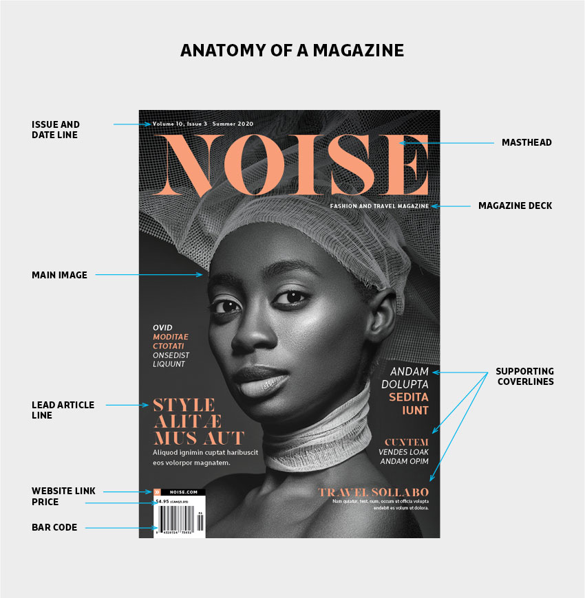
The importance of having a typography hierarchy
Typographic hierarchy is an essential part of planning your design.
To understand the importance of typographic hierarchy(opens in a new tab or window), one can analyze a newspaper or magazine article. Each article consists three levels of typography(opens in a new tab or window). These levels work together to create a visually balanced and cohesive layout which organizes the content and guides the reader through the article.
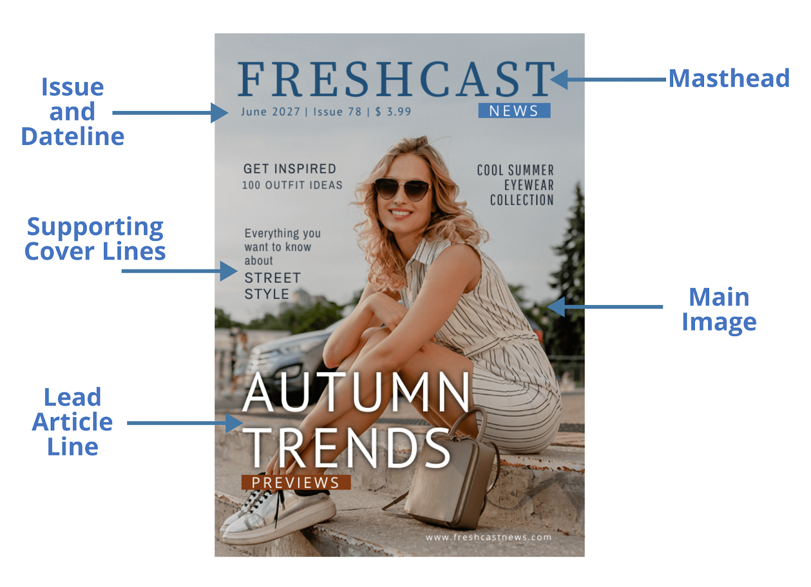
Level-one typography includes the headline, which should be the largest and most prominent typeface on the page.The purpose of level one fonts are to capture the reader's attention and provide a brief summary of what the article is about.

Level-two typography helps organize the design into sections or groups of related information. It includes elements such as headers, body copy and pull quotes. These elements should be slightly smaller than the level-one typeface, but still stand out clearly. They should guide the reader's eyes across the page and help them navigate the material.

Level-three typography is generally used for the complete message, purpose or details of the design. It can be long or short—a whole article, a short note or a brief description.
To make level-three typography highly legible in a text-heavy layout, one should consider font size and spacing. The font size should be big enough to read, but not so large that it takes up too much space.
The role of typeface categories and styles in enhancing your designs

Fonts can be categorized as sans-serif, serif, script or decorative,(opens in a new tab or window) and their styles can vary from bold to italic. While typographic hierarchy helps organize your design and improve navigation, the style of your fonts play a vital role in setting the mood and emphasizing key elements of your design.

Graphic designers advise limiting the use of fonts to a maximum of two in a single design. This is because incorporating too many fonts can lead to a disorganized and cluttered look. It's important to opt for fonts that not only enhance the aesthetic appeal of your design, but also harmonize well with each other.
Maintaining simplicity is key,(opens in a new tab or window) especially when it comes to font selection. If you opt for a more intricate typeface, it's recommended to pair it with a more straightforward one to achieve a balanced look.

Font pairing is an art form. Classic combinations like pairing a sans serif font with a serif font can create a strong visual impact.
To help kickstart your design process, consider these classic font pairings(opens in a new tab or window).
Impactful designs utilize white space
Spacing, particularly the use of white or blank space, is a critical yet often overlooked design principle. When used strategically, white space enhances a design's clarity(opens in a new tab or window) by balancing intricate sections with areas that allow the design to breathe.
White space gives the viewer's eyes a resting place, directing their path through the design and separating your layout into sections.

Failing to incorporate negative space in a layout can lead to confusion. Designs crammed with text and images can be overwhelming, making them difficult for viewers to navigate. To avoid this, don't feel compelled to fill every space with content.
Consider scaling down your graphic elements. By reducing the size of your imagery, typography or graphics, you can create white space around your vital focal points.
Conversely, reducing space to bring related items closer together is also an important aspect of effective spacing.
The rules of composition
Most designs benefit from an overall structure or organizing principle.

One technique is the Rule of Thirds,(opens in a new tab or window) where designs are divided into three rows and columns. The intersecting points of these lines should be the focus area of your design.

Whereas, the Rule of Odds typically includes threes. This principle suggests an odd number of elements, like a focal point with two or four additional items. This tends to be more captivating than an even number of elements.

Another technique, Implied Movement, can also effectively guide viewers towards critical information. This technique uses leading lines,(opens in a new tab or window) which may be actual lines, repeated patterns or interactions of positive and negative space, to create a directional movement. Common formats include horizontals, verticals, s-curves and z-shapes, with the latter being popular for website layouts due to left-to-right reading patterns.
Read on to learn more about creating motion in your designs(opens in a new tab or window) here.
Transform your creative toolkit with grids

The use of grids in design is invaluable. Grids provide a framework to improve a design's structure(opens in a new tab or window) and overall aesthetic. They serve as a guide to arrange visual elements for better comprehension.
For instance, a grid-based design can ensure consistency across different pages or sections of a design. This is particularly beneficial in multi-page documents, where consistent alignment of elements aids in creating a cohesive look.

Different grid systems can be used across various mediums. For instance, a 12-column grid is often used in web design due to its flexibility. This format can easily be divided into halves, thirds or quarters, allowing a broad range of layout options. In contrast, a manuscript grid, consisting of a single large block of text, is commonly used in book design.

Margins and gutters are key components of grid-based design.
Margins, the space around the design elements, help avoid a cluttered appearance by providing breathing space. Gutters, the spaces between columns(opens in a new tab or window), ensure that elements are evenly spaced and separate from each other, maintaining the grid's functionality.
Lastly, while horizontal and vertical grids are more common, diagonal grids can offer a unique perspective. They can create dynamic layouts with a sense of movement,(opens in a new tab or window) which can be effective in designs intended to be eye-catching, such as posters or advertisements.
Experiment with symmetry and asymmetry

In the realm of graphic design, symmetry and asymmetry play critical roles in creating impactful visual narratives.


Symmetrical visuals, characterized by identical or similar elements mirrored around a central axis,(opens in a new tab or window) generate a sense of order, simplicity and formality. They resonate with our inherent desire for harmony and balance. The aesthetic appeal of symmetrical designs lies in their ability to distill complexity into an easily digestible format.

On the other hand, asymmetrical designs, which feature an unbalanced or uneven arrangement of different elements, can be equally compelling. Despite their lack of balance, asymmetrical visuals introduce variety and unpredictability, and offer a dynamic playground for the viewer. They have the unique ability to highlight specific elements, drawing attention where it's needed most, and thereby creating a more active composition.

This jazz poster serves as a prime example of the effective use of symmetrical elements. Here, the designer created a unified image using two distinct elements. Although these elements differ in color, their symmetrical arrangement fosters a sense of unity.
The key to powerful graphic design lies in striking the right balance between symmetry and asymmetry. While symmetry provides stability and order, asymmetry breaks the monotony, adding intrigue and depth. By carefully balancing these principles, designers can craft compelling visuals that captivate audiences, effectively communicate the intended message and leave a lasting impression.
Create depth in your designs with transparency
Transparency in graphic design can create emphasis and enhance visual interest. It refers to the degree to which an element allows light to pass through it.
Lowering the opacity of an element allows underlying layers to show through, creating an overlay effect which can mix colors, reveal content or create a sense of depth and dimension.

Mixing transparent and opaque elements introduces contrast as well, which can emphasize important components in a design.
There are numerous ways to incorporate varying levels of transparency(opens in a new tab or window). For instance, you could use semi-transparent overlays to soften colors or images, or to create a 'frosted glass' effect. You could also layer multiple transparent elements to create new colors and textures, or to suggest movement and change.

Many logo designs often showcase varying levels of transparency to create overlapping shapes and colors, resulting in a logo that is visually unique.
To make working with transparency easier, try utilizing the Background Remover(opens in a new tab or window) tool in your Canva Editor.
Make three-dimensional designs by adding texture

Incorporating texture into your designs(opens in a new tab or window) adds a level of dimensionality.
By adjusting the opacity and transparency of a textured background, you can completely transform a 2D graphic into a three-dimensional piece of art.


Or, alternatively, you can add texture through typographical art. Typography itself, with its vast range of sizes, shapes,(opens in a new tab or window) colors and textures, can add variety and emphasize minimalist designs. With carefully chosen typography, you can deliver a robust statement without resorting to overly intricate compositions.
Establish a work environment that encourages creativity

In the design industry, efficient workflows and processes can boost productivity.
Templates like design briefs or launch plans(opens in a new tab or window) can standardize the design process, saving time and reducing errors in your projects.
Pre-production documents ensure necessary information is collected upfront and everyone on your team understands expectations and deliverables.
When developing these templates, ensure they’re flexible enough to accommodate revisions, yet detailed enough to provide clear guidance.

For instance, a design brief(opens in a new tab or window) could include sections for project objectives, target audience, deliverables, timeline and budget. Whereas, a launch plan might outline the steps for final design approval, production, distribution and post-launch evaluation(opens in a new tab or window).
Progress tracking is equally important and a collaborative roadmap can be a powerful tool for this. It provides a visual representation of what needs to be done, who is responsible for each task and when tasks are due.
Canva Business(opens in a new tab or window) allows your team to make real-time updates on collaborative documents, brainstorm in one place using Whiteboards(opens in a new tab or window)and gives you a secure place to keep yourself organized.
Whether you're just starting out or you've had your design business for years, Canva’s YouTube channel offers valuable insights and techniques to help refine your design approach and elevate your creative projects. Discover how to apply these design principles to your work here(opens in a new tab or window).

Written by
Susan Villemaire