- Funnel Chart
Free online funnel charts
Funnel chart maker features
Track the progression of your data at each stage of a process and spot where bottlenecks occur with Canva’s funnel chart creator. Start with a ready-made template you can customize with your team and add an interactive funnel diagram into your design. Input numbers manually or export from a file and make your data story more visually impactful using our drag-and-drop editor, intuitive design tools, and extensive media library.
More than 20 professional types of graphs to choose from
Professionally designed templates to fast-track your workflow
Data visualization made easy – no complicated software to learn
Publish, share or download your high-resolution doughnut charts
Embed your funnel chart in presentations, reports, and more with no fuss
Easy drag-and-drop tools, made with the non-designer in mind
How to create a funnel chart

What is a funnel chart?
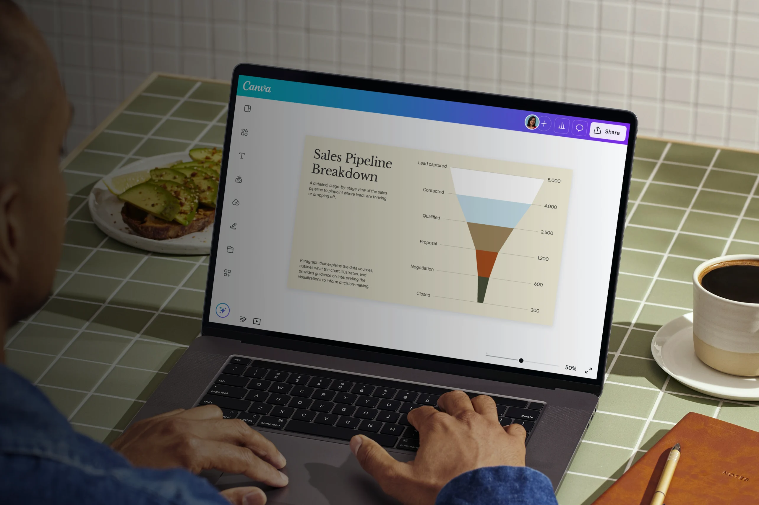
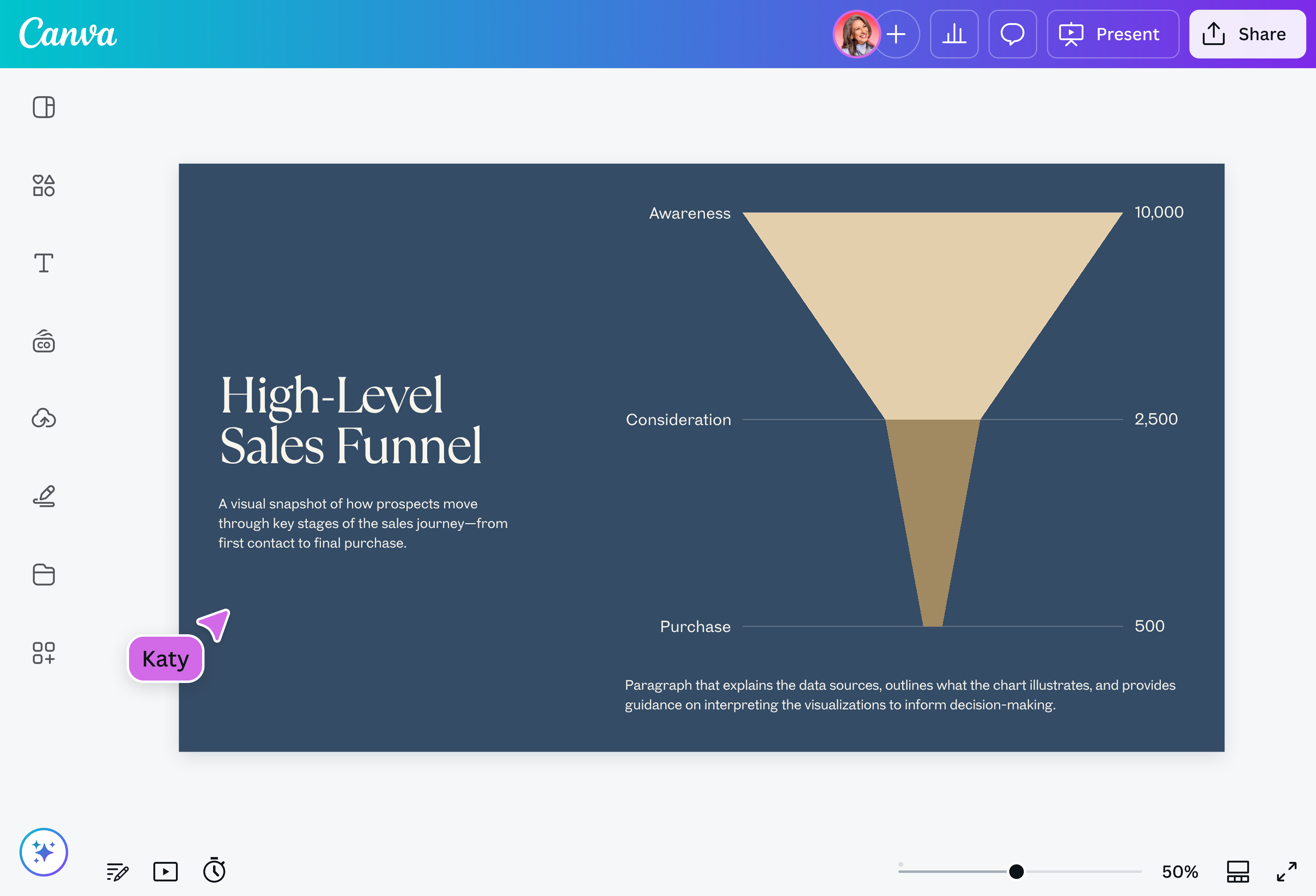
A funnel chart is a data visualization tool for demonstrating how data points move through subsequent stages of a business process. It derived its name from its shape, with the widest section at the top and the narrowest at the bottom. Each funnel segment reflects the data value at that particular stage, decreasing in length as data progresses from the initial to the final stage.
Why use funnel charts?

Funnel charts are great for visualizing business or sales processes with multiple stages, such as customer journeys, recruitment, order fulfillments, and even event planning. As the value of data gradually reduces in subsequent stages, so does the length of the funnel segment, making it easy for you to spot where drop-offs occur and identify bottlenecks.
By using funnel charts, you can gain data insights into your processes to improve business strategies and make informed decisions.
Components of a funnel chart

Process stages

Funnel segments

Data values
Quick and easy-to-use funnel chart maker

Create a funnel chart online, fast and easy. Build the perfect addition to your sales reports and presentations, but without the hassle of creating one from scratch. Instantly add a funnel chart to any Canva design by dragging and dropping the pre-made funnel chart from the Charts menu. Just like that, you already have a funnel flow chart ready to customize.
Customize your funnel chart in a snap

Editing a funnel segment’s data value? Adding a stage you missed? Don’t manually change the length of your bars or rearrange their layering anymore. Just type your data into our funnel chart creator, select your preferred label, value, and segment options, and even customize the font and colors — these are automatically applied to your chart, no hard work needed.
Workshop your funnel chart with your team

Make sure your funnel graphic is in good shape from top to bottom before presenting to stakeholders. Invite teammates to your design so they can leave feedback and edit with you in real-time. Need an overhaul of your entire sales process, or reconsider the approach to your report? Share ideas through comments, where you can leave sticker reactions and assign specific tasks to team members.

Assem A
Frequently Asked Questions
A bar graph visually represents the data of multiple categories, each with a corresponding bar that extends along an X-axis or Y-axis of values (they can either be plotted vertically or horizontally). A pie chart, on the other hand, is a circular graphic divided into “slices”, as in a pie. Each slice shows the proportional value of a category or variable to a quantitative whole.
While a funnel chart may sometimes use bars, it’s different from a bar graph in that it represents how values transform in each stage of a process; a bar graph helps with comparing each category according to their values. Similarly, a pie chart is also used to make comparisons between these categories according to their proportional values.
A funnel chart is best for when you want to see how data trickles down through the different levels of a process. It’s often used in business, with possible applications including a sales funnel chart or a marketing funnel diagram. Here the chart can be used as a means to understand how much of the audience impressions from your ads or landing pages, for example, eventually turn into conversions or sales.
A funnel diagram can provide important insights on the current state of your processes, helping you spot areas where flow can be improved, so that you can then think of ways on how to.
As with any graph or chart, a funnel flow chart must accurately represent data — specifically, how it diminishes through the funnel process. Apart from double-checking your numbers to make sure they are correct, it’s good practice to make sure their presentation is also correct.
Proper formatting is key to a clear funnel chart. Using a simplistic triangle-shaped chart runs the risk of showing a steady trickle of data, when there might actually be drastic fluctuations from one stage to the next. For this it’s better to use a bar funnel, or an actual funnel-shaped chart.
Avoid confusion by also making sure your labels and data values are properly aligned to their corresponding stages, and use spacing that’s easy on the eyes. You can even make each of them distinct by color-coding them.