- Histograms
Histogram Maker
Supported upload file types: XLSX, CSV, TSV
Let the numbers tell the story with Canva’s free histogram maker. Create visually appealing histograms using beautiful templates and translate a huge data set into a concise, insight-rich graph.
Histogram maker features
No more plain and boring histograms. Canva’s free online histogram maker helps you create a histogram that’s as insightful as it is beautiful. Although you’re working with a big data set, data visualization is quick and easy. Just choose a histogram template and customize it to your project in a few minutes.
More than 20 professional types of graphs to choose from
Professionally designed templates to fast-track your workflow
Data visualization made easy – no complicated software to learn
Publish, share or download your high-resolution graph
Embed your histogram in presentations, reports, and more with no fuss
Easy drag-and-drop tools, made with the non-designer in mind
How to make a histogram

What is a Histogram?
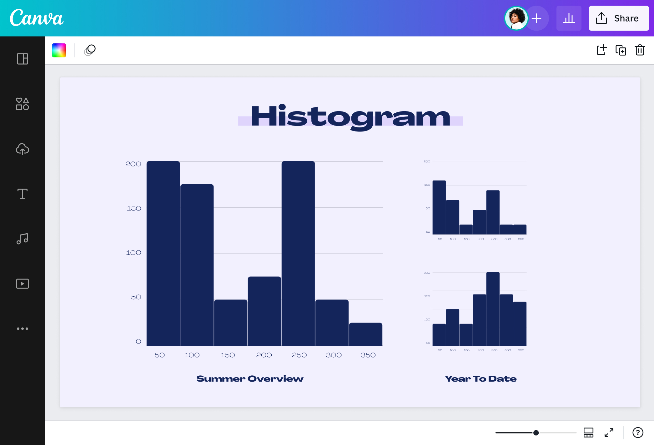
A histogram is a special kind of bar graph or chart that demonstrates how often something occurs. It shows the frequency distribution of a continuous data set. A histogram also groups data into ranges known as bins. Each bin is represented by a vertical bar, and the height of the bar shows how often the variable appears.
See astonishing insights within seconds

Histograms involve a big data set, but Canva’s online histogram maker makes data visualization super quick and easy. Simply copy and paste your data set from your sheet, and you’ll uncover the frequency distribution and outliers in seconds. No need to start from scratch, either. You have beautiful, 100% editable histogram templates at your disposal. From demographic data to survey responses to behavioral patterns, every data set will come to life with our histogram generator.
Glam up your histogram

Who says histograms should be plain? Create Canva magic using our powerful histogram creator. Color-code each bin; use your brand colors or follow the theme of your project. Play with font styles and add descriptions in clear, readable text. Add illustrations or icons that complement your numerical data. You can also use your own photos. Upload your images, drag and drop them to the histogram template, and use our built-in photo editor(opens in a new tab or window) to spruce them up. With endless customization options, each histogram you make will be a visual delight for any worksheet, lesson plan, or math presentation.
Bring the whole team in

The team that designs together succeeds together. Share the project with your teammates and make a stunning histogram together. Thanks to the online histogram maker’s collaborative function, you can generate insights as a group and get richer interpretations. Discuss the implications of a right-skewed histogram or examine the possible explanations behind a left-skewed distribution. Leave comments about the outliers, polish the descriptions, or turn your canvas into an online whiteboard(opens in a new tab or window) for brainstorming and planning, complete with sticky notes and graphic elements. You’ll surely meet your research goals faster!
Share your histogram instantly

How far can your histogram go? As far as you want it to! You can download your histogram as a PDF or image file and share it online. Add it to your class project or business proposal(opens in a new tab or window) for a client. Your histogram will look good in your pitch deck at work or as a social media card for your research group. Put it in a report, review, or research paper. Embed it to your site, print it as an infographic poster, or add it to your visual Canva Docs(opens in a new tab or window).
Common histogram shapes

Normal distribution

Right-skewed

Left-skewed

Bimodal distribution

Uniform distribution

Random distribution
Histogram templates


Kelsey J
Frequently Asked Questions
- People use a histogram graph to summarize continuous data. A histogram divides the data into specific ranges of values known as bins and shows the number of data points within each bin. People also use histograms to find out the median of a data set, spot outliers, and identify the minimum and maximum data points.
- A bin is a way of sorting data when making a histogram. Each bin is an interval or a range of values, and the entire data set will be sorted into bins. For example, if you’re making a histogram for the age groups in a population data, your bins could be 0-4 years, 5-9 years, 10-14 years, and so on. The larger the data set, the more bins you’ll use. When you use our online histogram maker, each bin has a corresponding vertical bar.
- Histograms look a lot like bar graphs, but they’re not always used for the same purpose. People use a histogram to see the frequency distribution of a numerical data set. In contrast, people use bar graphs to count non-numerical categories. If you need to use a histogram, the easiest way to build one is through a histogram maker.
- To interpret a histogram chart, take note of the height of the bars. The bin with the highest bar is the bin with the highest frequency. In addition, the histogram shape provides insight into the data. For example, a right or left-skewed histogram means, at a glance, that the mode is different from the median. Meanwhile, a uniform distribution may mean that the histogram needs more bins. Outliers also represent unusual cases that the researcher must take note of.
- The median is the value at the exact middle of the data set. A simple way to find the median is to sort all the values of the data set from lowest to highest. Identify the value at the very center of the list—that’s the median. If you have an even number of data points, take the mean (average) of the two data points in the middle. That will be the median of the histogram data set.