- Area Charts
Free online area chart maker
Area chart maker features
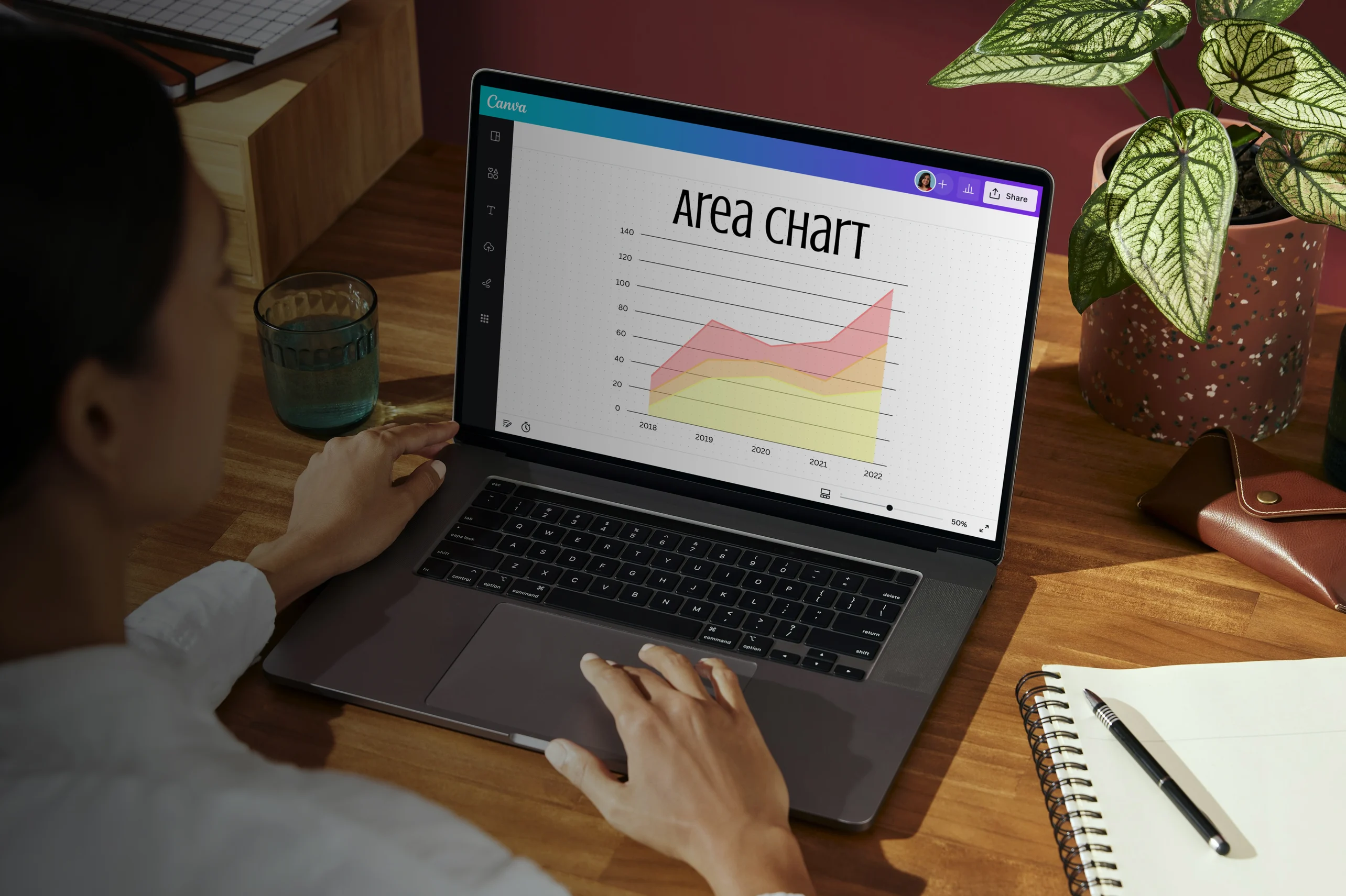
Whether you want to chart your net profits over time or the popularity of various ice cream flavors in your shop since opening, nothing beats an area chart for showing time-series relationships. Start with free templates or build different area chart types in our easy-to-use area chart maker. Input your data or upload an existing CSV file. Then, customize your area chart with colors and graphics to reflect your data visualization and storytelling.
More than 20 professional types of graphs to choose from
Professionally designed templates to fast-track your workflow
Data visualization made easy – no complicated software to learn
Publish, share or download your high-resolution area chart
Embed your area chart in presentations, reports and more with no fuss
Easy drag-and-drop tools, made with the non-designer in mind
How to make an area chart

What is an area chart?
An area chart or graph is a data visualization type that shows how values change over time. By combining the plotted data points of a line chart and the spatial utilization of a bar graph, area charts can present trends and shifts in data more effectively. In an area chart, the space between the foundational x-axis and the lines is filled with color to convey the scale of distribution and magnitude of data values in time.
Why use area charts?

Most people are visual learners(opens in a new tab or window), meaning they process and retain information better when seeing it. Area charts visually represent the peaks and valleys of one's data — making it easier to interpret than mere numbers.
But what are area charts used for? Area charts help differentiate the values between groups. They’re also useful for comparing subgroups’ contributions and total performance over time.
Represent groundbreaking numbers and trends

Easily design a custom area chart with Canva and add it to any presentation, infographic, report, or document seamlessly. Just input your dataset by manually entering your values into a table or uploading a CSV or Google Sheet straight into the Canva editor. Don’t know where to start? Browse professionally designed area chart examples in our templates gallery.
Cover more areas for insights

Find the right chart to represent your insights. Unstacked charts show how data between two groups overlap, while stacked area graphs can showcase both cumulative and individual values of groups. To compare relative sizes, try a proportional area chart, which presents data in squares. To present both negative and positive values, use a streamgraph — a stream-shaped chart that’s displaced around a central axis.
Designed for winning data storytelling

Customize your area chart with as much clarity and visual context as possible to give your audience more sound insights. Whether for your company presentation or report, pick new colors and fonts or make your area chart consistent with your brand look. Make any area chart design stand out by adding visual elements in our library like photos, illustrations, graphics, and custom animation.
Built with teamwork

Make collaborating with colleagues or friends easy and fun in Canva. Invite your team to edit your area chart designs or review your data sets by sharing a design link. Allow them to leave comments with their insights and analysis, apply changes, and react with stickers and notes from the library. Get things done together in real-time from any device, whenever, wherever.
Area charts templates


Assem A
Frequently Asked Questions
This chart is the most common type of area chart. Each segment is stacked on top of another with data groupings distinctly separated by lines and colors. With an unstacked or overlapping area chart, you’re typically comparing two similar groups and seeing where the data overlaps.
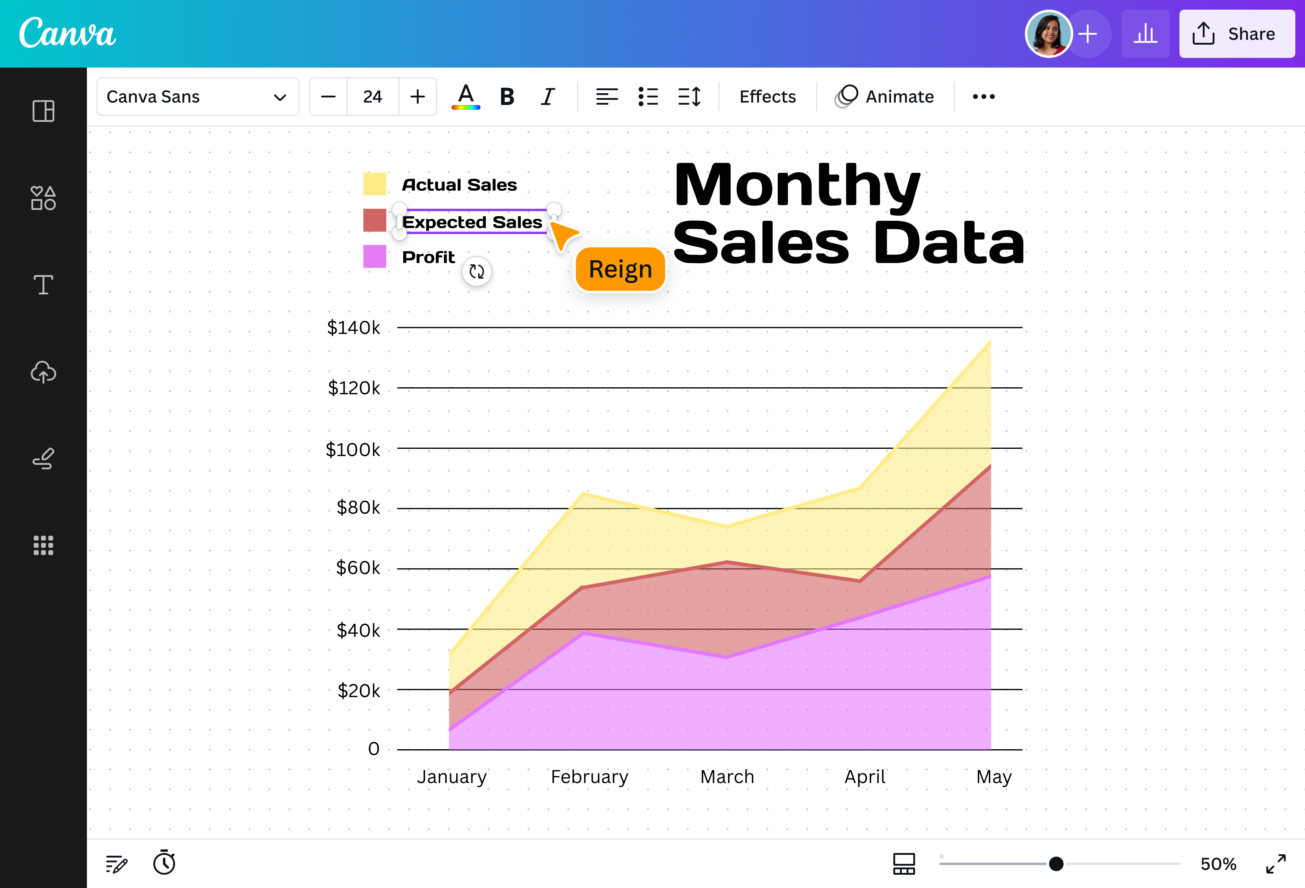
Stacked area charts are useful for making part-to-whole comparisons among segments and assessing their overall performance or contributions over time.
Stacked area chart analysis looks at which segments (separated by color or shading) increase or decrease in size throughout the horizontal axis.
For example, you can use a stacked area chart to represent the yearly sales of your brand’s cellphone models over the course of 15 years. Each filled area will be a different color, representing the upward and downward trend in sales through the years. It is likely that earlier and less popular models will show smaller area sizes than models with more longevity.
- Stacked area charts are best used when you have datasets comprising several different components. They’re great for showing both the individual values of groups and their cumulative contributions.
- A proportional area chart comprises squares or circles representing the relative sizes of each data set. This area chart type helps viewers interpret the size differences among data sets without using scales.
- A streamgraph is a chart that’s displaced around a central axis. It appears like a stream or organic shape, with curves rather than sharp lines. This is a good option for showcasing data with both negative and positive values.
Area charts are made up of the following components:
- Y-axis: Also known as the vertical axis. This is where you plot your data values.
- X-axis: Also known as the horizontal axis. This represents a second variable, usually time.
- Data series: A group of values represented by horizontal lines connecting the data points.
- Filled area: This is the area between the x-axis and the horizontal data series lines that you fill with color or shading.
- Legend: A guide explaining the meaning behind the colors used in each filled area.
- You can add or edit your data and update your area chart to reflect new results by choosing the “Data” button on the toolbar. Enter your values and labels into the table that pops up or copy and paste from a pre-existing data table. Need to edit a specific data range? Just click on that particular bar or bin and it will highlight the relevant cell on the table so you can easily identify and edit it.
- Every design needs balance. Ensuring that your designs are well aligned or well-distributed means that it won’t look cluttered or crowded. Begin by selecting the elements or text you want to align by clicking on it, then click the group button on the toolbar. Once all elements are grouped, click on the arrange button and select whether to align: left, right, center, top, middle, or bottom. To set how you want the elements spaced evenly, click on the Horizontal or Vertical button.
- Create an area chart design that is instantly recognizable by uploading your logo, using your brand color palette and consistent fonts. To upload your logo, click on the Uploads tab, select the Uploads folder, and click on the green Upload your own images button. Select any PNG, JPEG or SVG file you wish to upload from your computer. Uploaded images are automatically saved inside your Uploads folder, ready to be used in other designs.