- Bar Graphs
Free bar graph maker
Supported upload file types: XLSX, CSV, TSV
Present time-based changes in your data with a custom bar graph. Use Canva’s bar chart maker and its interactive bar chart race to compare variables and identify patterns quickly.
Bar graph maker features
Understand the differences between two or more data sets using Canva’s bar chart maker. Choose any design template and add a static bar chart or an animated bar chart race you can interact with from our elements library. Input your data or upload a CSV file and customize your design project with our collaborative editing tools for more compelling data storytelling.
More than 20 professional types of graphs to choose from
Professionally designed templates to fast-track your workflow
Data visualization made easy – no complicated software to learn
Publish, share or download your high-resolution graph
Embed your bar graph in presentations, reports, and more with no fuss
Easy drag-and-drop tools, made with the non-designer in mind
How to make a bar graph

What is a bar graph?
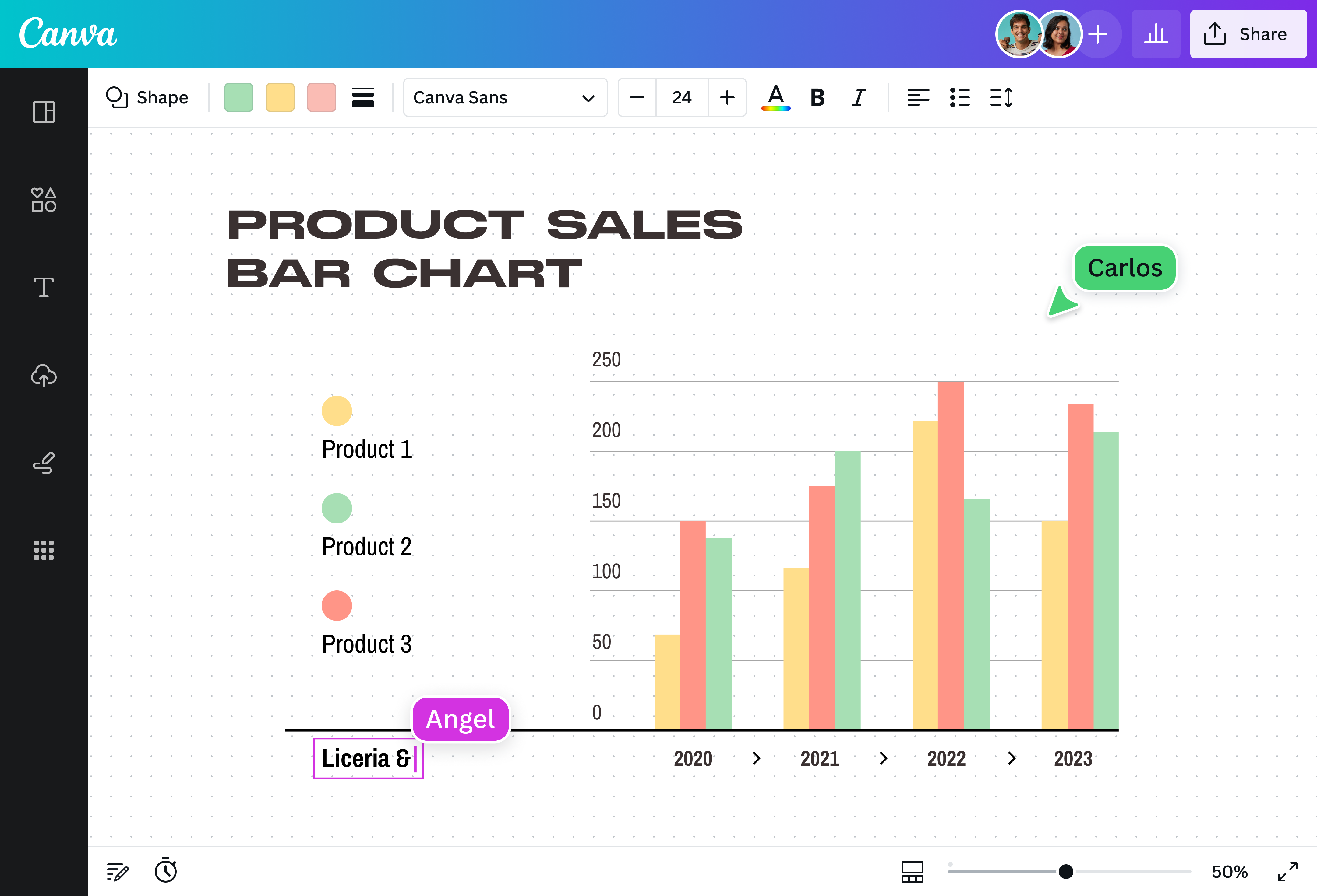
A bar graph, also known as a bar chart, is a data visualization tool that compares data across different categories or groups. It uses bars to present numeric values for levels of data categories, which can extend horizontally or vertically. These bars are plotted on two axes, with one axis representing the categories and the other axis representing the numerical values.
Why use bar graphs?

With a bar chart, the longer or higher the bar, the greater the value of the categorical data. This makes it ideal for comparing various data sets or illustrating changes in data over time. Whether you’re comparing sales for different products, presenting survey results, or displaying cost fluctuations over time, a bar chart can provide data insights in a concise and digestible visual format.
Compare various data sets at a glance

Conveying complex information is easier with a bar chart you can create on Canva. Choose from our premade templates to turn large data sets into a stunning visualization that’s easy to understand. Browse our elements library to find a unique color palette to highlight different groups and pick the perfect font for the labels to create an effective and memorable bar chart.
Make your data more dynamic

Breathe life into your data with an animated bar chart that’s sure to engage your audience. No coding skills needed — just grab a bar chart race that you can interact with from our elements library. Whether comparing election results or the population of dog and cat lovers over the years, a bar chart race can visualize time-based changes in data while elevating your data storytelling.
Identify patterns and trends together

Collaborate with your team to create a striking bar chart or an impactful bar chart race. Simply share a design link to give them access. Run brainstorming sessions to study trends in your data, leave comments and sticky notes, and watch them make real-time edits on an infinite canvas. Plus, your bar chart is stored in the cloud, so you can revisit and edit it whenever you want.
Get data insights from better data storytelling

Let your data storytelling reach all corners of the world. With Canva, it’s easy to download your bar chart or bar chart race in a high-quality file format or share it via email or social media. You can even embed it on websites or in presentations and reports. Go beyond borders and present meaningful data insights that will help and enrich your community.
Bar graph templates


Assem A
Frequently Asked Questions
- A bar chart is used to compare data across different categories. Each bar represents a category. Taller or longer bars represent larger values; shorter bars represent smaller values.
Bar charts come in different types, each with its own unique structure and purpose. These include:
- Stacked bar chart: Also known as composite bar graphs, stacked bar charts divide a single column into different parts. These parts are labeled and represented by different colors within the same bar.
- Row chart: As the name suggests, a row chart visualizes data using bars that run horizontally. The length of each bar is proportional to the data category it represents.
- Stacked row chart: Similar to a stacked bar chart, a stacked row chart splits each bar into multiple parts to compare total values across categories.
- A bar chart race is an animated form of data visualization that shows changes in data over time. The bars in a bar chart race can extend and retract depending on the value it represents at a specific moment. This makes it ideal for identifying and understanding patterns and trends throughout a period of time.
- To create a bar chart race, you must first identify the data you want to visualize. Make sure to include a time element, so you can see the changes in your data over time. Then, choose from different software tools, programming languages, and online websites available to create a bar chart race. Our bar chart maker lets you create one easily with collaborative design tools.
- Creating a bar chart is super easy. We removed any confusion between the x-axis and the y-axis and laid everything in a template, so you can see how everything fits together from the start. Our bar charts can be interactive also so you can add your data in a few clicks. Input each variable manually or upload an existing CSV file or Google Sheet to complete your data storytelling.
- Yes! Signing up for Canva is completely free, and it's free to use. Most of Canva's pre-designed templates and images are free as well. Access more templates, features, and design elements when you get Canva Pro at an extremely affordable price.
- A histogram represents quantitative data, while bar charts visualize categorical data. Additionally, histograms display continuous data with bars beside each other. Meanwhile, bar charts tend to leave a space between bars to indicate different categories.