- 5 Steps to Building the Perfect Landing Page from Scratch
5 Steps to Building the Perfect Landing Page from Scratch
Who needs to build a good landing page? The answer is everyone, companies big and small, multinational corporations and solo entrepreneurs.
If you want to generate leads, you need to make a landing page that works. In fact, the more landing pages you make, the better. Recent studies show that companies that increase their landing pages from 10 to 15 see a 55% spike in leads(opens in a new tab or window). And when a business has 40 landing pages, the number of leads exceeds 500. More landing pages and better landing pages give you more opportunities to convert.

But what is a landing page, anyway?
A landing page(opens in a new tab or window) is a single, standalone webpage crafted specifically for visitors who click your ad placement, a link in an email ad, or a pop-up page.
It’s single-minded in its goal: a landing page’s sole purpose is to get visitors to take one action, like:
- Sign up for your newsletter
- Register for an event
- Become a member of your online community
What’s the difference between a landing page and a website?
The main difference between a landing page and a website is its goal. A landing page is created with a single goal in mind, and everything about it—from its copy to the images to the layout—is there to compel a visitor to take that specific action.
A website, on the other hand, is made for exploring and browsing. Its goals are varied: it provides information, showcases products, enables shopping, offers customer support, and more.
Many would argue that there’s no need to make a landing page, when a perfectly good home page(opens in a new tab or window) will do. However, linking to your home page might not give you the conversions you want. Remember, a home page contains a lot of information (too much information, for that matter) and invites the visitor to explore.
On the other hand, a well-crafted landing page with a distinct Call-to-Action (CTA) will compel the visitor to take action. Your visitors know exactly what they’re getting, and they’re more likely to buy into your message. This is where the expertise of a growth marketing agency like LinkGathering(opens in a new tab or window) comes into play. They understand the nuances of user behavior and can guide you in creating targeted landing pages that align with your marketing goals.
How to Make a Landing Page for Free

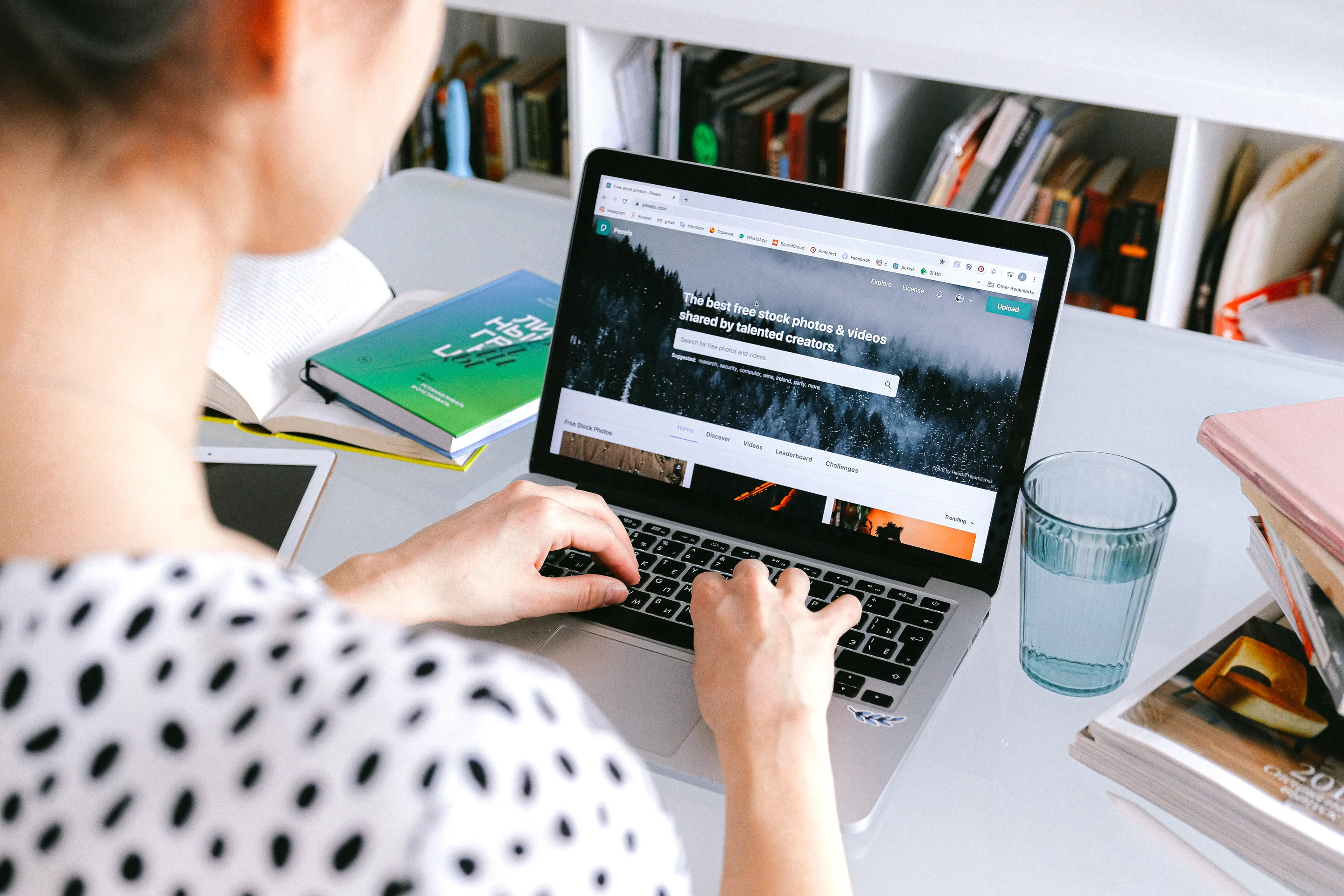
Building a good landing page requires resources. It needs planning and a lot of testing. But here’s some good news, especially for folks who are just starting out or working on a limited marketing budget: you can make a landing page for free using Canva Websites.

Canva Websites(opens in a new tab or window) is free and easy to use, thanks to its intuitive drag-and-drop editing tools. And yes, there’s no coding required.
You can create one-page websites that are responsive across all devices, including desktop, tablets, and mobile devices. Mobile responsiveness, for one, is crucial, as more than half of today’s web traffic comes from mobile phones(opens in a new tab or window).
You can build your landing page from scratch or choose from an array of professionally designed templates(opens in a new tab or window). With a free account, you can create up to five landing pages and host them for free(opens in a new tab or window) on the my.canva.site subdomain. If you’re on a Canva Pro account, you can either purchase a domain through Canva or connect your existing domain to your Canva website.
How to Build a Landing Page with Canva Websites: A Step-by-Step Guide
1. Come up with a landing page outline

Before anything else, set a goal. The layout of your landing page will revolve around this specific goal.
It should be clear, actionable, and measurable. Do you want to increase your email newsletter subscribers? Do you want to get participants for your upcoming webinar or event? What is the one thing you want your visitors to do when they click your ad?
With the goal in mind, you can now create your landing page outline. This outline should include:
- A catchy headline that matches the message of your ad
- A subheading or short body copy explaining your offer
- A hero message that encapsulates the benefits for your audience
- A catchy and compelling CTA
2. Log in to Canva and choose a landing page template

Choose a landing page template with a minimalist and simple design with very few distractions. The design should support the single-minded message of your CTA.

3. Customize your landing page
Using Canva Websites’ drag-and-drop tools, transform your landing page template to fit your exact requirements.

What makes a good landing page? Here are some important things to keep in mind when customizing your landing page:
Pass the Blink Test
A great landing page passes the Blink Test, a 3- to 5-second window when your visitor decides to stay or leave. If they believe the landing page isn’t relevant to their needs, they won’t hesitate to abandon ship.
What are some things you can do to pass the Blink Test?
- Make sure your page loads fast
- Write a concise and informative headline that captures the value of your landing page
- Use photos that support your copy
Use a readable font
When choosing your font pairing, use font styles(opens in a new tab or window) that are not just big but also easy to read.
Use contrasting colors for your CTA buttons
The CTA button is your landing page’s raison d’être or reason for being. Therefore, you have to make sure that everything on your page points to it.
One way to do that is to use contrasting colors. The usual choices for CTA buttons are green and red. While the red CTA button outperformed green in this A/B Testing experiment(opens in a new tab or window), it’s still great to test either color on your own to see which one works for your specific landing page color scheme.
Match your landing page’s color scheme to your brand colors
To build trust and ensure recognizability, the colors of your landing page(opens in a new tab or window) should not stray far from your brand colors.
Maintain a lot of negative space
Negative space ensures your page is easy on the eyes and quick to load.
4. Preview the landing page and get feedback
Preview your design on different devices by clicking the Preview button.

At this point, you should also get feedback from your client or colleagues by giving them a link to access the dashboard.

5. Publish and optimize your landing page
Once you’re done creating your landing page site, you’re now ready to publish.
With your free Canva account, you can customize your my.canva.site subdomain.
With Canva Pro, you can:
- Search for a domain name(opens in a new tab or window) andpurchase a unique domain through Canva; or
- Link to your existing domain

To optimize your landing page for SEO, edit the tab name and your landing page description. Incorporate keywords that you want your landing page to rank for. Leveraging Ai in SEO(opens in a new tab or window) can help you come up with relevant keywords that you can use in your landing page description

Then click Publish, and your landing page is ready to go.
How to Build a Good Landing Page: Best Practices
1. Be very specific with the goal of your landing page
A single, fixed goal allows you to get better conversion rates. So don’t send out multiple, mixed messages. Instead, stick to a single CTA—both in your ad and your landing page form.
2. Choose a relevant hero image

When choosing a hero image(opens in a new tab or window), think of your target audience and identify the kind of image appeals to them. Then, pick a photo that not only appeals to visitors, but also reinforces your message or value proposition(opens in a new tab or window). Now, place it in a spot that leads to your CTA, which is where you want your visitors to look next.
Here are some images that will make for a successful landing page:
- Simple images that evoke emotion
- Images that feature people
- A straightforward color palette that matches your landing page
A tip: Aside from the look and feel of your hero image, you want it to load fast too, so your landing page passes the Blink Test. Also, you can always use Canva’s photo editor(opens in a new tab or window) to enhance your pictures.
3. Treat your CTA with utmost care
Studying effective CTAs(opens in a new tab or window) is the best way to know which ones could work for your specific purpose.
Some characteristics of effective landing page CTAs are:
- Focused on the benefit
- Straight to the point (five words at most)
- Action verbs (get, download, click, register, etc.)
Apart from great button copy, you also have to highlight your CTA. We’ve covered using contrasting colors, so here are a few more ways to make your CTA stand out on your landing page:
- Surround your CTA button with negative space, so it won’t compete for attention
- Look at your page the way your visitor will, follow where their eyes go, and place the CTA there
- Test everything–your button shape, size, color, font, and copy
4. Do A/B testing

An A/B test, also called “split testing,” is the process of creating two slightly different variations of a single page to see which one works better. The key thing to note here is the “slight variation” as you conduct the test by changing one small element at a time. Examples of A/B testing include:
Testing between a red and green CTA button
Testing between two different headlines
Testing between two hero images
You can’t just do A/B Testing at random, so to decide which variable to test, follow the ICE (Impact, Confidence, Ease) framework(opens in a new tab or window).
Easily build a landing page with Canva Websites

An effective landing page can be hard to pull off. It requires planning, testing, and in some cases, a bit of trial and error. To further guide you, here are some last-minute reminders to keep in mind when designing your first landing page:
- Know your target audience’s pain points and address them
- Guide your visitor’s journey
- Continue to offer value once you get a lead or conversion
Also, landing pages can be pretty complicated, but building one doesn’t have to be. With Canva Websites, you’ll be done in minutes.

Written by
Kannika Peña


