- Treemap

Free online treemap generator
Treemap maker features
Have tons of data points but a limited amount of space? Create an interactive, hierarchical map to visualize relationships, similarities, and irregularities with Canva’s free treemap generator. Pick any design template and add a custom treemap chart you can interact with. Input data or upload existing data files, organize groupings by color, and watch those patterns and relationships sprout to life.
More than 20 professional types of graphs to choose from
Professionally designed templates to fast-track your workflow
Data visualization made easy – no complicated software to learn
Publish, share or download your high-resolution graph
Embed your treemap in presentations, reports, and more with no fuss
Easy drag-and-drop tools, made with the non-designer in mind
How to create a treemap

What is a treemap chart?
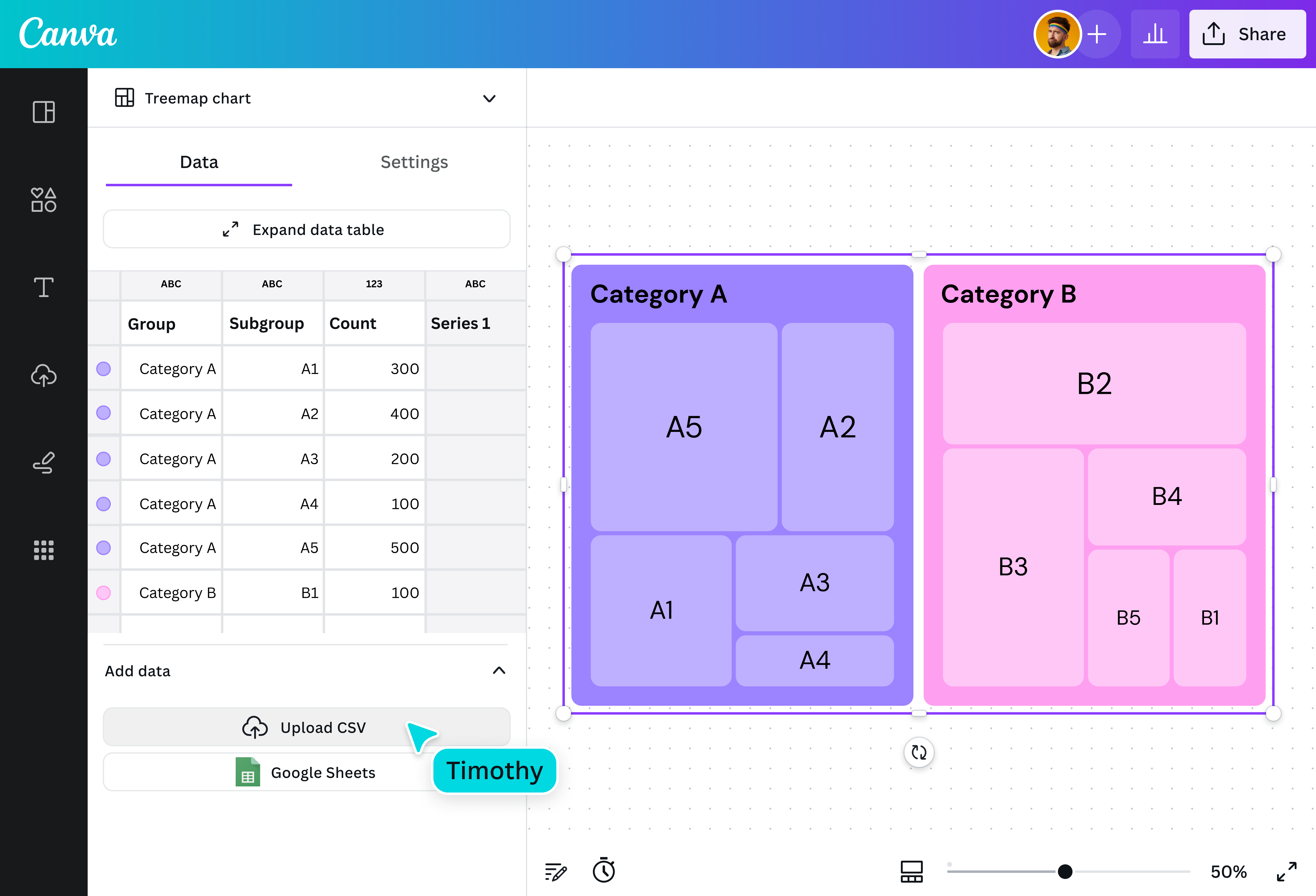
A treemap is a data visualization that represents hierarchical data and helps you see part-to-whole relationships at a glance. Despite its name, a treemap doesn’t look like a tree. Instead, it’s made up of nested rectangles arranged according to size. The size of each rectangle is proportional to its data value, which lets you immediately identify relationships and patterns across categories.
Why use treemaps?

The treemap chart was created by a University of Maryland computer science professor, Ben Shneiderman, who was searching for a way to organize a massive computer file directory without taking too much screen space. This ability to visualize complex hierarchies in a relatively small area is one of the most significant advantages treemaps have over similar visualization tools like pie charts.
Components of a treemap chart

Large rectangles

Smaller rectangles

Size of rectangles

Color palette

Legend
Interact with your data easily

Anyone can make a treemap with Canva’s straightforward generator, regardless of your coding or design experience. Easy to set up and edit, you only need your data and a bit of time to input names and values. Already have a CSV or Excel file or perhaps a Google Sheet on hand? Just upload your file and watch your data blossom into a treemap.
A treemap tailored to you

Easily refine your treemap to best represent your data. Choose how many levels of hierarchy to show at a time, then customize the colors and fonts of your visualization. Turn run-of-the-mill data into a memorable presentation with pre-made, customizable visual elements, such as charts and graphs, text, graphics, photos, illustrations, and animation, and make your design truly your own.
Branch out to data storytelling

Communicating complex data can be tricky, especially when you have a large amount. Treemaps make it easy to present thousands of hierarchical data points, all without taking up too much space. Create an interactive treemap that makes comparing data neat and intuitive. With Canva’s treemap maker, you can zoom in and out to get the complete picture or examine the finer details.
Seamless collaboration

Invite teammates to jump in and collaborate with you. Just share a design link to give them access to apply changes and leave comments on your treemap design. Run a workshop on treemap best practices or present your data to remote colleagues. Then, gather insights together in brainstorming sessions on an infinite canvas, sticky notes and stickers, and a nifty timer.

Assem A
Frequently Asked Questions
- Treemaps are used to visualize large amounts of hierarchical data in a compact space. They’re best for analyzing and comparing quantitative values and the relationships between parts and whole.
To read a treemap, look for the biggest rectangular boxes first. These represent the larger categories. The smaller, nested rectangles represent subcategories within each larger node. Color variations also help to differentiate certain values.
In many cases, treemaps are interactive, meaning you can click individual rectangles or hover over each one to reveal details. This is especially helpful when there’s an abundance of data that renders multiple small boxes that can’t accommodate labels.
The biggest advantage of using a treemap is its compact nature. Treemaps were designed to represent a large amount of data in a small area. They’re also best used for presenting non-specific data at a glance.
However, treemaps do have their limitations. For one, they don’t immediately present specific values. To see each data point, you’ll have to zoom into a specific box. Presenting a lot of data in one treemap also makes it rather difficult to read, especially when nodes are broken down into tiny boxes. This can be overwhelming for some viewers.
When creating a treemap, keep the following tips in mind:
- Include only a few categories and subcategories: Too many will create visual clutter, making it harder for viewers to understand your message.
- Pick vibrant and contrasting colors: You want each category clearly defined, so choose colors that stand out. However, try to pick complementary colors to maintain a visually appealing chart.
- Create a legend: If you’re using color to represent a certain value, indicate this in a legend. You can also add labels for larger categories to create more precise distinctions.
- Leave smaller boxes blank: Don’t try to fit text into tiny boxes. This adds to the clutter. Instead, use an interactive treemap maker like Canva’s that lets you zoom in and out of each node and leaf and provides the value of each rectangle when highlighted.