- 25 graphic design tips for non-designers and beginners
25 graphic design tips for non-designers and beginners
Working in a large organisation with over 100+ employees? Learn how to communicate visually, boost productivity, and stay on brand, at scale. Get in touch(opens in a new tab or window).
Get your graphic design game-face on with these inspiring tips.
Whether you’re creating videos for social media(opens in a new tab or window) or designing invitations(opens in a new tab or window) for an upcoming event, the application of graphic design(opens in a new tab or window) is vast and versatile. From font pairing(opens in a new tab or window) and scale(opens in a new tab or window), to alignment and white space, the facets of the design world are complex. Let these 26 epic design tips help you through the pits and the peaks of the creative process.
Click on the ‘remix this design’ link throughout the post to create your own designs.
01. Limit your typefaces

When selecting a typeface or font for headings, subtitles and body text, use easy to read fonts for simple and effective graphic design. The eye finds it hard to scan multiple typefaces, so stick to a simple collection of fonts. This design uses variants from the Aileron font family, a geometric sans serif typeface that has a simple and modern aesthetic.
02. Don’t be scared of scale

Apply scale to type, shapes or compositional features that need proportionate emphasis. Use appropriate colors to enhance this technique while making sure suitable typefaces that look good when increased in size. Here, Raleway for the word ‘Scale’ is strong and bold with clear forms.
03. Respect the space of other elements

Use letter spacing to fill dead space, aligning text, or condense words that take up too much space. However, be careful not to reduce letter spacing so much it can’t be read, or increase it so much the letters become detached from one another. Here, the decreased letter spacing on the word ‘Respect’ gives a condensed effect, as a visual representation of space, or lack thereof.
04. Use a small color scheme

Choose a color scheme that has 1-3 primary colors and an additional 1-3 secondary colors that contrast and complement each other. Use different tones of the same colorfor consistency by adjusting brightness for contrast. Finer typefaces will need stronger distinction against a colored background. Here, bright aqua is offset against forest green background for clarity and readability.
05. Create Clean, crisp and clear imagery

Pump up contrast by adjusting the brightness of the background image so that it offsets the text color, making the design clear and easy to read. This is a great way to apply white or black text over an image(opens in a new tab or window) to create a strong ‘cut-out’ effect.
06. Use fonts to help inform the mood of your design

Choose a typeface that sings the song of your content. Typefaces with rounded edges are usually a friendlier note, Quicksand is used here); hard-edged geometric fonts (sans serifs) are solid and strong; while serifs convey an elegant and sophisticated look.
07. Create order with alignment

Apply a line or an embellishment for design balance and composition. Here, a line to the left of the text mimics the margin line and anchors the block of text.
08. Keep your designs simple

Keep it simple, but don’t forget your basics. Make sure every element has a reason to be in the design and keep the number of fonts, colors, shapes and frames to a minimum. Use contrasting tonal color combinations to text is sharp and easy to read. Applying a solid frame to contain your copy will enhance the compositional structure of a design.
09. Use the same design elements on every page

The easiest way to ensure aesthetic unity across a document or presentation is by duplicating pages then editing text and replacing images.
10. Be original

Push your creative abilities and graphic design skills(opens in a new tab or window) to achieve original graphics. Be inventive and experimental and choose and combine different typefaces and filters(opens in a new tab or window). Avoid trends and create designs that correspond with your own unique style, leaving a personal stamp on your work.
11. Use hierarchy to order your content

The most visually dominant feature in a design should be the most important part of the message. Apply color or scale to a graphic to see how it changes the hierarchy of elements and what grabs attention first.
12. Play with symmetry

Use horizontal and vertical lines to correspond with other design elements. For balance and proportion, ensure the thickness of the elements match the weight of the fonts.
13. Relax your eyes every now and then

Recharge your creative batteries by taking a break. Relaxation boosts energy and productivity so take a walk, grab a bite to eat, sit in the park to refresh the brain and revitalize the vision.
14. Keep your font in the same family

Create visual uniformity by applying one typeface or font familyto text. Use a typeface or font family that has a selection of variants, such as italic, bold, condensed, to keep options open. This image combines Libre Baskerville Bold, Light and Italic.
15. Use white space

Create a fluid design by surrounding words with white space to let elements breathe. The application of space around text boxes, images and other graphic elements makes a design easier to read. It’s also more likely to attract attention than a cluttered composition.
16. Research before you start designing

Have all the details needed before you begin to write or create. Study, read, research, and resource. Whether you're gathering materials or information, thorough research is crucial for a successful outcome. Interested in finding the right tool for your graphic design projects? Dive into our guide on top laptops for graphic design(opens in a new tab or window), designed to enhance your creativity and efficiency.
17. Create a mood board

Use a grid for a simple and easy mood board(opens in a new tab or window) to contain a collection of images(opens in a new tab or window), cliparts(opens in a new tab or window), color swatches(opens in a new tab or window), and other visual pieces. This practice will help you to find a common color palette or theme that can then be applied to a project.
18. Imitate and create

Use your Canva social stream or inspiration websites to find designs you love. Replicate the type treatment, the photo filters or the general layout in your own content.
19. Be conscious of global events

Keep your mind fresh with current events to inspire and influence both your work and the way you work. Follow relevant news pages on social networks get vital and relevant information and keep general knowledge up to date.
20. Think outside the box

The most creative people think outside the box. Don’t use the typical icons and symbols(opens in a new tab or window) you see everywhere to represent your topic. Research, sketch(opens in a new tab or window), and print(opens in a new tab or window) to find new and original icons to visually communicate with your audience.
21. Contrast is key

Contrast is one of the most imperative parts of the design for mood, legibility and to make it stand out. Use a contrasting color palette background, fonts, and graphics. Use photo filters to enhance the positive/negative space in an image and apply black or white to copy to create optimum contrast against a background image. A good rule of thumb is if you have a light colored background then you should use a dark font (and vice versa).
22. Brighten up your graphics

Create drama and impact with attention-grabbing graphics. Ensure your colors don’t bleed together by choosing hues that contrast against one another.
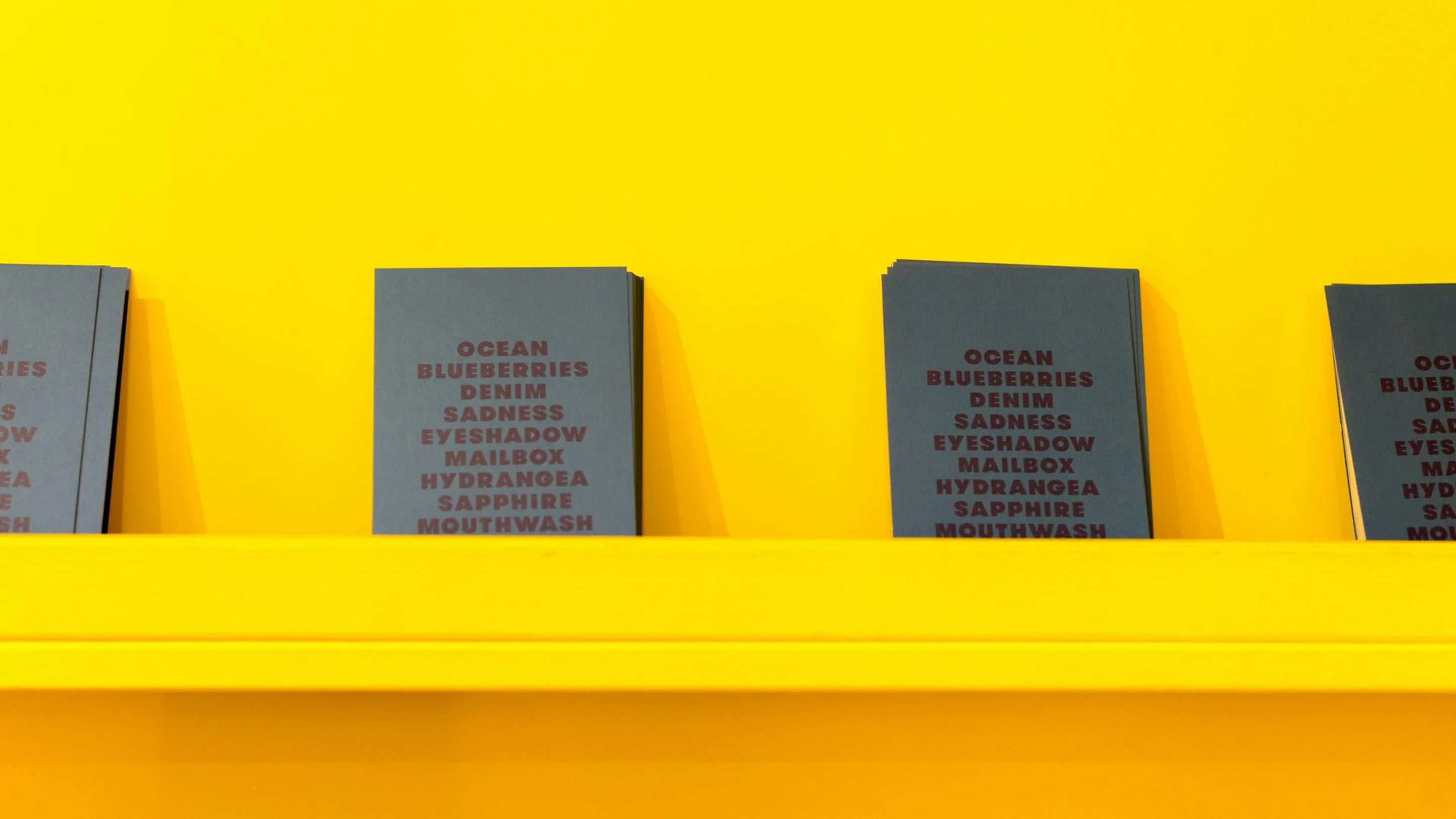
23. Keep a notebook

Whether on the train, at work or about to fall asleep, inspiration can come at any time so it’s important to be prepared. Keep a notebook to draw or scribble down notes and ideas and refer back to them when it comes time to create.
24. Trial & error

Everyone makes mistakes and sometimes they are the most important part of the learning experience. Design is all about trial and error so push your designs to the limit because the creative process is often never complete. Don’t like what you see? The ‘undo’ button is always a great friend.
25. No naked images

We’re not talking image content here, we’re talking layout. Aligning images with grids or frames(opens in a new tab or window) makes a design look more professional.
26. Finesse. But not too much.

Make sure elements are correctly aligned, text is legible, contrast is enough, and space gives design features room to breathe.
YOUR TURN
Remember: be creative, break the rules and push your design skills by coming up with new and innovative ideas. At the end of the day, graphic design is about exploration and experimentation.

Written by
Poppie Pack


