- The ultimate guide to logo design
The ultimate guide to logo design
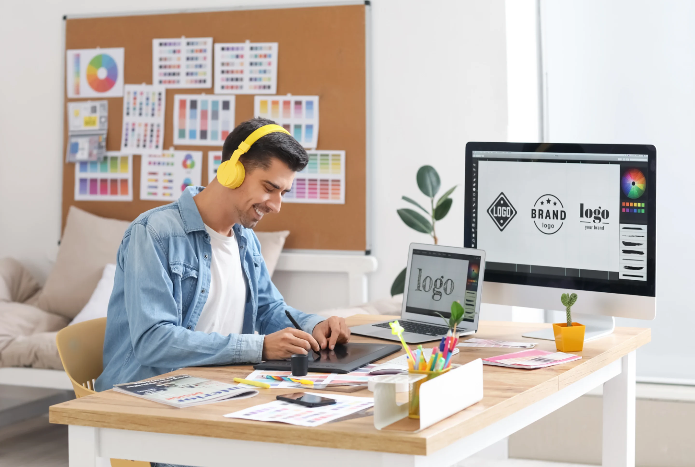
Logo design is a pivotal component in the construction of a brand's identity. It serves as the visual cornerstone of a brand, embodying the company's mission, values, and unique selling propositions.
The power of a well-designed logo lies not just in its aesthetic appeal, but also in its ability to communicate.
Logos speak volumes about a brand even before a single word is read, or a product is experienced. They can encapsulate a brand's personality, ethos, and market position, all in one succinct visual.
One of the essential aspects of a logo, which often goes unnoticed, is its role in establishing brand credibility. Consistent usage of a logo across all marketing channels creates a cohesive image, enhancing its recognizability. This consistent visual fosters trust, and reliability in the minds of consumers, which is crucial for credibility.
If you’re just getting started with logo design, we have resources for beginners, case studies to help educate and inspire, and expert tips to help improve your branding(opens in a new tab or window).
Table of Contents
Establish a Point of Difference
For a company to stand out in the realm of logo design, they have to possess a unique Point of Difference (POD)(opens in a new tab or window).
A POD isn’t just about creating visually appealing designs, it's about embodying the distinctive qualities that set your brand apart from the competition, and allow you to attract clients who share your core values.
The questions you should ask yourself before you begin the design process(opens in a new tab or window) include:
- What does my brand excel at?
- Why would a customer prefer me over another brand?
- What is the most flattering feedback I’ve received from a customer?
- Who are my main competitors and how do they market themselves?
Understand your target audience
It’s important to delve deep into understanding who you are and who you want to reach with your product before committing to a design, considering factors like the gender, age, location, and income of your target audience.
You should take into account how you plan to market your business,(opens in a new tab or window) whether it be through social channels, email newsletters, a brick-and-mortar franchise, or traditional media outlets. Understanding the platforms your audience uses most, and how you will be using these platforms to sell your products, will help you create a logo that is versatile and effective across all mediums.
Inspiration for logo design isn't confined to research alone, and can be found in everyday experiences such as music, movies, quotes, and graphics. It’s beneficial to explore your team’s personal and professional digital footprint, including websites and social media, to gain insights into your core values and visual identity.
Five essential areas to consider when creating a memorable logo
- Brand Identity: Your logo should accurately reflect your brand's personality and values.
- Audience: Consider who your target audience is and what kind of design would appeal to them.
- Scalability: Your logo should look good in all sizes, from business cards to billboards.
- Simplicity: Keep the design simple for easy recognition. Avoid using more than three letters.
- Uniqueness: Make sure your monogram logo stands out from your competitors.
Core attributes of a great logo
1. Choose easily legible typography
If you're not designing a logo based solely on imagery, your design will inevitably contain text. The choice of font for this text plays a significant role(opens in a new tab or window) in your logo's overall impact.
The options are endless(opens in a new tab or window) and range from serif fonts, which exude a sense of tradition (like Times New Roman used in the New York Times logo), to sans-serif fonts, which offer a modern, clean look (like Helvetica used in the American Airlines logo). You might also consider graphic fonts for an avant-garde approach.
While aesthetics are important, readability should never be compromised when designing. Even the most visually appealing logo will fail to make its mark if the text is illegible.
Using a web-friendly font is crucial to present a professional and polished logo. It ensures effective communication of your brand's message.


2. Understand color psychology
Selecting the right color palette for your logo design is not merely about personal preferences. Colors are powerful. They evoke specific emotions and reactions from your audience, making it essential to choose thoughtfully.
Understanding color psychology can guide you in selecting colors that stimulate your desired response. For instance, green often signifies nature and tranquillity, while bright colors like yellow and orange are cheerful, and appeal to a younger demographic. The colors you select will define your brand identity, so ensure they communicate the correct message.
A successful logo should be timeless, displaying well in both monochrome and color, and in varying sizes. This adaptability ensures its effectiveness across different platforms, as demonstrated by the classic Nike 'Swoosh.'
When determining your color palette(opens in a new tab or window), consider either an analogous or complementary color scheme.
An analogous color scheme involves using two closely related colors on the color wheel, like yellow and green, or pink and purple. This pairing creates a harmonious effect, ideal for brands aiming for a calming and grounded logo.
On the other hand, a complementary color scheme uses two colors which sit opposite each other on the color wheel, like red and green, or orange and blue, resulting in a high-contrast look.
No matter what you opt for, it's crucial to ensure your marketing materials harmonize with your chosen color palette.
The meaning behind popular color choices
- Red symbolizes warmth, love, and boldness.


- Pink represents love, care, and nurturing.


- Orange is associated with fun and cheerfulness.


- Yellow signifies happiness, optimism, and positivity.


- Green represents reliability, natural elements, tranquillity, and is often linked to environmental brands.


- Blue communicates professionalism and calm, reminiscent of skies and oceans.


- Purple is used for luxury brands, emanating a sense of mystery, intellect, and wisdom.


- Grey conveys seriousness, maturity, security, and authority.


- Brown is connected with reliability and being grounded.


- Black is elegant, impactful, strong, and lends a modern look.


- White signifies cleanliness, purity, and simplicity.


3. Use iconic symbols and icons to increase brand recognition
Creating contrast in your logo design isn't solely reliant on color. You can also utilize shapes, lines, and iconography to create unique vectors(opens in a new tab or window) and patterns, or even craft a 3D logo.

Circles, as seen in the Pepsi logo, suggest a sense of community and unity.

Squares and rectangles, like those in the Microsoft Windows logo, imply stability while triangles symbolize power.
Lines also play an important role. Straight lines denote strength and efficiency, while curved lines convey comfort and approachability.
Icons and symbols in logos can be extremely impactful, often communicating a brand's essence without the need for words.


Renowned logos, such as the golden arches of McDonald's or the Starbucks mermaid, are prime examples of how effective iconography can set a brand apart from its competitors, and concisely facilitate intricate ideas. These iconic symbols not only distinguish the brand, but embed themselves into the consumer's memory, enhancing brand recognition.
The different logo types and their significance
Emblem logos
Emblem logos often incorporate seals, crests, or badges, and each carry their own historical context. Ensuring these elements align with the brand's identity and values is key to a brand’s success.
Several successful brands have effectively used emblem logos. Warner Bros, Harley Davidson, and Starbucks have all incorporated seals or badges in their logos, lending them a distinctive look.
Emblem logos, due to their intricate details, can face limitations on social media and may not scale down well on platforms like Instagram, where logos appear in smaller sizes. This could affect the logo's readability and impact.
To combat this issue, consider simplifying the design, or creating a variation of the logo that retains the brand's identity, but is more adaptable to smaller scales.
Mascot logo

Mascots, which are essentially personified characters or symbols, can effectively communicate the values and personality traits of a brand. They serve as a visual representation of the brand, making it more relatable and memorable to consumers.
Mascots can be animals, people, objects, or even made-up creatures(opens in a new tab or window) which embody the brand's ethos. Successful examples include the Michelin Man for Michelin, Tony the Tiger for Kellogg's Frosted Flakes, and Ronald McDonald for McDonald's. These mascots have become iconic symbols, strengthening brand recognition and fostering loyalty among customers.
When effectively used, mascots can:
- Increase Brand Recognition: A unique and well-designed mascot can make a brand instantly recognizable.
- Humanize the Brand: Mascots can give a brand a friendly face, making it more approachable and relatable to consumers.
- Strengthen Customer Loyalty: Mascots can evoke emotions and create personal connections with consumers, leading to increased customer loyalty.
Monogram logos

Monogram logos often consist of one to three letters (usually a company's initials), and are used by many well-known brands, such as Louis Vuitton (LV), Chanel (CC), and General Electric (GE).
They’re simple, versatile, and easily recognizable. They can be used across various platforms and mediums without losing their impact. These logos can help establish a strong brand identity, conveying the essence of your business concisely.
The media industry also utilizes monogram logos to create a strong visual presence. In fashion, brands like Gucci (GG) and Yves Saint Laurent (YSL) use monograms to evoke a sense of luxury. In technology, Hewlett Packard (HP) uses its monogram logo to present a clean, modern image.
Wordmark logos

Unlike monogram logos, which typically incorporate a company's initials, wordmark logos consist of the full name of the business. This type of logo is effective in creating brand recognition and conveying the brand's personality through typography.
The length of a brand's name can significantly impact whether a company uses a wordmark logo. Shorter names work best, as they are easier to read and more memorable. For longer brand names, a monogram or a combination mark could be a better fit.
For social media channels where space is limited, some brands create an alternative, more compact logo. For instance, McDonald's uses its iconic 'Golden Arches' as a standalone logo on social media, while the full wordmark logo is used elsewhere. Google, Coca-Cola, and Visa are also great examples of brands that have successfully used wordmark logos.
Abstract logos

Abstract mark logos use abstract geometric forms to represent a business, and can be incredibly memorable. Brands like Pepsi, with its circular, tri-colored logo, and Adidas, with its iconic three stripes, have successfully utilized abstract mark logos. They stand out due to their simplicity and the power of the symbolism they carry.
The abstract mark could be designed to convey aspects of your brand identity, such as innovation, creativity, or dynamism. However, the risks lie in the logo's potential lack of clear relevance to your business, making it harder for customers to associate it with your brand.
Pictorial marks

Pictorial marks or logo symbols are iconographic images that are easily recognizable and represent the brand's identity. They're often simple, bold, and abstract graphics used to convey a brand's values and tell its story at a glance.
Brands like Apple, with its iconic bitten apple and X (formally Twitter) with its blue bird, have utilized pictorial marks effectively.
However, there are challenges in using this type of logo. The primary one is the difficulty of making a simple image encapsulate everything your brand stands for. It requires a deep understanding of your brand, creativity, and often, the passage of time for the symbol to become associated with your brand in the minds of consumers.
Combination marks

Combination mark logos are one of the most effective tools for building brand recognition(opens in a new tab or window). This type of logo combines a wordmark (the brand's name), and a pictorial mark or symbol. They work in tandem to provide both a clear indication of the brand's name and a visual representation of the brand's identity.
Examples of successful brands(opens in a new tab or window) using combination marks include, Burger King with its bun-enclosed name and burger pictorial, and Lacoste, with its brand name and the iconic crocodile.
One of the primary advantages of a combination mark is its versatility, making it an excellent choice for future-proofing a business's growth. As your brand evolves, you have the flexibility to use the wordmark, the pictorial mark, or both together depending on the situation and platform. This is particularly useful in situations like social media channels where space is limited.
Creating an effective combination mark involves ensuring the symbol and wordmark complement each other, and together represent your brand's identity. The design should be unique and memorable, and the elements should be balanced so that one doesn't overshadow the other.
Key design principles to enhance the flow of your logo design
Understanding the nuances of design principles(opens in a new tab or window) is needed to become an effective visual communicator. Without a firm grasp of the essential elements that influence consumer perceptions, our ability to engage and influence audiences through our designs and branding materials, like our logo, can be compromised.
The following design principles will provide you with a competitive advantage.
Balance
Balance in logo design is about ensuring harmony and equilibrium. A balanced logo looks well-structured and doesn't lean too heavily to one side or the other, preventing chaos and facilitating easy absorption of information.
Key elements like alignment, spacing and symmetry contribute to a balanced logo, making even complex compositions appear well-arranged and not overwhelming.
Here are some examples of well-balanced logos:


Repetition
Repetition in logo design can guide the viewer's eye across the design, ensuring easy retention of information. However, to prevent monotony, patterns with slight variations should be incorporated, too. This could mean using the same text in different colors or employing icons and shapes with minor differences.
A few successful examples can be found below:


Contrast
Contrast creates a 'wow' factor in logo design by juxtaposing two opposing elements to make them stand out. While contrasting color schemes are common, contrast can also be achieved with shapes and lines, or through a symmetrical design of varied elements.


Dominance
Dominance refers to making one visual element more prominent than others, turning it into the focal point of your logo. Despite seeming counter to balance, dominance can effectively draw the viewer's eye to a specific area, adding an element of surprise to a design.


Hierarchy
Visual hierarchy in logo design involves structuring elements to guide the viewer's eye through the design, helping them process the logo's information logically. Elements like framing, typography, and colors, along with other design principles, contribute to a strong visual hierarchy.


White Space
Also known as negative or blank space, white space is crucial for achieving balance(opens in a new tab or window) in a logo. It provides breathing room for your graphic elements(opens in a new tab or window) and prevents your design from appearing chaotic or overcrowded.


Alignment
Proper alignment and spacing are essential for a professional-looking logo. Ensuring all letters, word spacing, visual elements, and margins are even and centered contributes to a harmonious design.


Simplicity
Great designers often focus on what they can remove rather than what they can add to their logos. A clean and simple design reduces competition for the viewer's attention, allowing the included visual elements to stand out.
Flat design exemplifies simplicity in logo design,(opens in a new tab or window) offering a streamlined and minimalist approach(opens in a new tab or window) that effectively communicates brand identity.


Symmetry
Symmetry plays an important role in creating visually pleasing designs(opens in a new tab or window). Symmetrically balanced designs can be achieved by having equal space around your text, or including a mirrored graphic in your logo.


Crafting a legacy: The journey of HRC’s successful logo design
The Human Rights Campaign (HRC), the largest LGBTQ advocacy group in the United States, has harnessed the power of design and branding to share its message of equality across the globe.

Central to these efforts is the HRC's iconic logo,(opens in a new tab or window) a symbol widely recognized within the lesbian, gay, bisexual, transgender, and queer community.
Introduced in 1995, the logo, a yellow equals sign set against a blue square, has become a potent symbol for the fight for equality. The simplicity and clarity of the design have contributed to its widespread recognition and adoption.
In an innovative move, the HRC has created variations of its brand icon and empowered supporters to create their own versions. This strategy has allowed the organization to broaden its reach, and engage with a wider audience, fostering a sense of ownership and involvement among its supporters.
A key moment illustrating the power of this approach occurred when the HRC's Marketing Director decided to change the nonprofit's Facebook profile picture to a red variation of the logo. This change was made to demonstrate solidarity with the LGBTQ+ community during the U.S. Supreme Court hearings on same-sex marriage.
The red logo rapidly gained traction, triggering a massive wave of social media engagement. It quickly went viral, with millions of Facebook users changing their profile pictures to the red logo in a show of support.
Through its effective use of branding, the HRC is now a symbol of a worldwide movement towards equality and inclusion, demonstrating the power of design in shaping social discourse.

Spending time and resources on effective logo design is not an optional luxury, but a strategic investment. It is an integral part of business branding that yields significant benefits, from strengthening brand identity and increasing visibility, to fostering customer loyalty and driving business success.
Logos are ubiquitous, reaching audiences far and wide, silently communicating and reinforcing the brand message at every glance. Whether straightforward or complex, a well-designed logo has the power to resonate with consumers and set a company apart from its competition.
If you’re ready to create a professional logo quickly and easily, try Canva’s AI Logo Generator(opens in a new tab or window) to jumpstart your design process with unique and creative ideas. Learn more about designing your own logo on our YouTube channel here(opens in a new tab or window). Additionally, you can see how your logos will look like in real life using logo mockups(opens in a new tab or window).

Written by
Susan Villemaire


