- Create Keynote Presentation
Keynote presentation maker

Easy drag-and-drop editor
1M+ professionally-designed templates
Generate content and media with AI
Invite others and design together
Elevate your keynote speech with a sizzling presentation made with Canva. Using our keynote presentation software, upgrade your slides into a design that’s sure to captivate audiences. Confidently take to the stage and give a talk worthy of that standing ovation!

Create a show-stopping keynote presentation
Whether you’re giving a talk about a product launch, a profound academic discovery, or an inspiring story, make sure to have a smashing keynote presentation before you give your next big speech.
Don’t settle for a boring design — create awe-inspiring slides(opens in a new tab or window) with Canva! Our keynote presentation software has tools and AI features to make your design unforgettable. Pump up your infographics. Add a striking, high-quality photo. Play around with elements, fonts, and colors. Prepare an inspiring keynote presentation, all without the fuss.
How to make a keynote presentation


Meet Magic Studio™: All the power of Canva’s AI
Magic Studio™ brings together the best AI-powered tools for you and your team to help you design with more ease, speed, and creativity.


Punch up your keynote with high-quality visuals
Nothing makes a point like a compelling talk delivered alongside stunning visuals. Find one that fits the tone and mood of your speech with Canva, which has a variety of stunning, free keynote presentation templates — great for any style, layout, or industry. Customize them further with graphics, images, and even videos from our selection of free and premium elements library.
Streamline with magic AI features
Make presentation creation easier with AI tools available in our keynote presentation software. Need instant slides? Upload your media to Canva and have Magic Design™(opens in a new tab or window) generate up to eight (8) templates you can choose from. If you’re looking to improve the wording of a certain idea, Magic Write™(opens in a new tab or window) can generate copy drafts for inspiration. Stuck on what to present? Use the topic generator(opens in a new tab or window) to brainstorm ideas. And with the AI video generator(opens in a new tab or window), you can add just exactly the clip you’re looking for to make your visuals more dynamic.
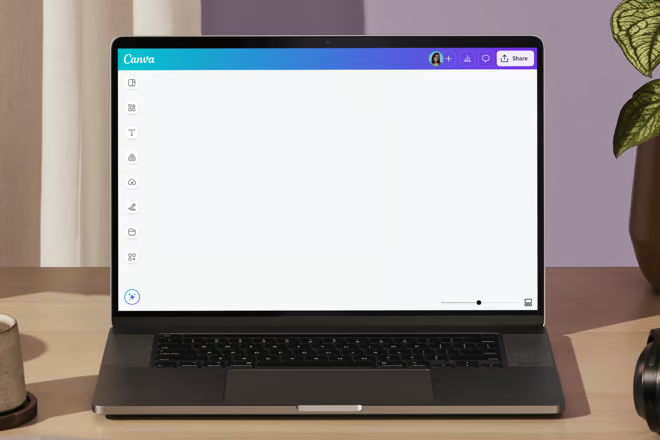
Collaborate to fine-tune ideas
Captivating concepts are the product of many minds working together. With Canva, collaboration is made easy. Simply click the “Share” button, then check the box to allow others to edit your keynote presentation. Anyone with the link can contribute, and all of your changes will be saved to the cloud, making it accessible anywhere. How’s that for a smart idea?
Present your keynote with ease
Once your keynote presentation is ready, you can present right away from Canva. Do it even more effortlessly with Presenter View, so you don’t miss out on important talking points. Delivering your keynote asynchronously? Canva’s screen recording feature allows you to record your face, your screen, and your voice over your slides – packaging it to a video ready for audience viewing, anywhere, anytime.
FAQ

@navneet4


