- Your ultimate guide to background design
Your ultimate guide to background design
There's no denying that background design is important. The background design you choose can dramatically change your design and make your graphics feel complete. Colors can be used as overlays to enhance brand awareness(opens in a new tab or window) amongst your audience, while images don’t need to just sit alongside your graphic elements — they make for excellent backgrounds when placed correctly.
Backgrounds are the backbone of great design. Here’s why:
- Backgrounds are the foundation of a successful composition.
- Background textures(opens in a new tab or window) and colors(opens in a new tab or window)create depth and contrast, allowing graphics to stand out and get noticed.
- Well-composed background images(opens in a new tab or window) can help create space for you to overlay text.
- Backgrounds can give design more context, providing supporting visual elements.
Since starting with an empty page can be confronting, this article will help you discover a range of free background design templates(opens in a new tab or window). You can customize each one, change colors of an image(opens in a new tab or window) and text to make it your own. Plus, we’ll share some techniques to take your backgrounds to a whole new level.
Table of contents

Click here for free stock photos you can use as a background
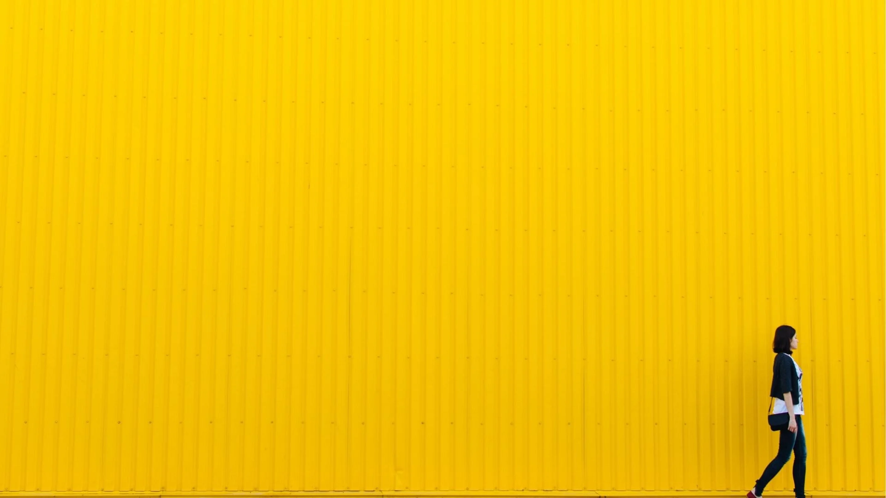
Solid color background designs
Using a flat color background is an incredibly effective way to create simple designs. The most important element to remember when applying this technique is the mood you want to create.
A stronger tonal duo of a very light and a very dark color, or perhaps complementary colors from opposite sides of the color wheel(opens in a new tab or window) will create impact. While a lighter combination will exude a softer, more calming effect.

Edit this design to add your own color combination:

Using lighter shades for your background doesn’t mean you have to compromise the legibility of your type. Retain the wistful aesthetic of light color combinations by using soft pastel backgrounds(opens in a new tab or window) with stronger tones like dark grey for your text to increase the contrast.
TIP:Using two tones of the same color helps to separate content without abruptly dividing the page.
Solid high-contrast background designs
Using a tonal separation for your color combinations(opens in a new tab or window) creates an impact for your message. By using colors that offset against one another, your designs will stand out and get noticed. This technique is great for creating web-based content like banners or social media graphics.

Using a dark background with contrasting bright or neon helps the lighter objects, like text, stand out. Alternatively, you can use bright colors(opens in a new tab or window) to form a modern and contemporary style.
TIP:Limit your color palette. Try to use no more than two colors for optimum effect or overlay alternate tones to create visual harmony.
Texture background designs
The key to texture(opens in a new tab or window) is ensuring there are limited colors and simple composition. You don’t want to divert the attention from the overall design, so your texture should be substantially small, behaving as a background and not hogging attention as the foreground. Either use pre-created textures(opens in a new tab or window) or make your own using small shapes and patterns.

Textures can create the illusion of paper or a high-quality stock. It’s a particularly nice technique to use if you are creating web content (like an email invitation(opens in a new tab or window) or social media(opens in a new tab or window)) that would benefit from a more tangible effect, providing a tactile and personalized touch.
The intention of a texture is to form a three-dimensional aspect that lifts the space between your background and your text(opens in a new tab or window) – boosting the type from the page to help your message sing.
TIP:If you are applying an eroded or natural texture, you can take this style a little further by using a handwritten or brush style typeface.
Gradient background designs
A gradient is excellent to use on digital or print-based projects. The beauty of a gradient is that you can combine almost any color(opens in a new tab or window) — whether neutral or bold, a gradient is always a sophisticated choice.
Gradients(opens in a new tab or window) are a more subtle approach than solid or block color. Whether you apply a radial or linear gradient, you will see a different effect on your designs. The direction will have a direct impact on your audience’s focus point.

The significance of a milestone has been visually voiced in the graphic above with the use of a gradient. The clean effect of one color over a gradient background will capture the attention of your audience and give your design space to breathe.
Image background designs
The best way to give your design context is to paint a picture. By including animage in your background(opens in a new tab or window), you’ll grab the attention of your audience quickly and immediately relate your message visually. When overlaying images(opens in a new tab or window) and elements, keep the detail of your image in mind.

Images with pockets of clear space (negative space) can be used to place type. Remember that all design is deliberate and you don’t want your elements floating on the page, so align it to the edge if possible. Crop where necessary until you have the best position for your text.
TIP:Note how the bridge and type in this design are anchored to each corner to enhance the composition of the overall image. It’s a great way to avoid ‘floating’ elements.
Transparent background designs
As with many things in graphic design, sometimes the simplest technique is the answer. Increasing the transparency of your background will decrease the noise (detail), making the elements in the foreground easier to read. The biggest mistake people make when using transparency is over-application.

Adjust your transparency to benefit your text, not to the point that your background image becomes thin. This will only result in a lackluster and weak looking design.
TIP:Take your designs one step further by applying a montage(opens in a new tab or window) effect. Layer the same image you have used in the background, and increase the transparency.
Pattern background designs
Patterns are great fun to apply to your background. But much like with many techniques, you have to be careful with your placement. Ensure that the pattern doesn’t detract or drown the content of your design.

A pattern is a way to contain type. A geometric pattern(opens in a new tab or window) will create strong lines, making it easy to overlay text.
TIP:Patterns can get cluttered, so be sure to place your type in a clear space.
Illustrated background designs
The illustration(opens in a new tab or window) makes for an interactive experience for your reader. The other advantage is that it can be tailored to the content of your design. Great for a younger audience, the illustrative design is playful and less ambiguous than other background design techniques.
However, illustration can impede on your design and drown your content. To avoid this, the rule of thirds is a good guideline when placing icons and elements. It is vital that hierarchy and balance are considered.
The type in the design below is divided vertically into three, with type appearing in the first third. This allows the message to be communicated clearly, even though more of the space has been taken by the illustration.

TIP:Don’t let type get in the way of a good illustration. Keeping them apart ensures legibility.
White background designs
Never undermine the simplicity of white space(opens in a new tab or window). If your design feels like there are too many elements or it is getting a bit busy, simplify it.
Images and elements are often added for the sake of filling surface area. Think of a white background as a tool for enhancing your senses and allowing you to focus on significant elements within your design.
As well as being a particular trend at the moment, minimal design means you need to put more effort into the other features on the page.

Tip:Give white backgrounds the space it needs, especially surrounding the type.
Technique 1:Using shapes and block text
The more detailed the image, the less elaborate your overlaying elements should be. If you have a lot going on in the background as well as your foreground, your visual hierarchy will suffer. In turn, this will make it hard to communicate with your audience.

A way to avoid drowning your text is to use shapes or blobs(opens in a new tab or window). Placing shapes or blocks behind your type will ensure it is easy to read. This is the favored technique of those not quite confident enough to apply text directly onto the image.
Technique 2:Creating a blurred background
When using an image as a background, often the detail within the image makes it hard to overlay text. There are two common techniques you can apply to work around this:adding an overlay or applying ‘blur’ to your filters(opens in a new tab or window). Both should be applied according to your image.

A blur is still a very effective technique to offset your type from your background. The key to blur is preserving some texture or detail after application, therefore select an image with interesting shapes and form (like the landscape in the image above). After applying blur(opens in a new tab or window), you might want to play with the cropping of your image(opens in a new tab or window) so that text overlays(opens in a new tab or window) more solid areas of your background for optimum contrast.
Technique 3:Applying a color overlay
Another way you can reduce the noise of a background image is to add an overlay. An overlay can be applied in various ways — you can apply a simple black or white overlay with transparency to help your text sit off the page and create some contrast.
Or you can apply a color overlay, which is an excellent option to incorporate brand colors. If you're working on a black background, consider starting with a clean slate — use Canva's black background remover to strip away any existing background before applying your overlay. When choosing your image make sure there is enough tonal nuance to give the background more strength, especially if you're considering using an AI background generator.

Remember to look at the composition of your background image to find the best area for cropping(opens in a new tab or window). Make sure your text overlays the image in the right places (in this case, layering over the images makes the type even more impactful) with lighter text over darker areas and vice versa for easy reading.
Technique 4:Allowing for text space
The composition is one of the often overlooked and most fundamental elements of design. The way all the elements in your design are placed will affect the way your reader digests it. Therefore you can use your background image as a tool to take advantage of this space.

Copy space is the blank or negative space found in an image. The image is a great example of using copy space. The objects around the headline space bring focus to the text and enhance readability.
Technique 5:Using a grid
Use a grid(opens in a new tab or window) to form a well-composed layout that you can divide into sections to separate content. This is a highly visual application and gives you the opportunity to celebrate imagery.
Using colors from the images and filling blank cells with flat swatches of color is a clever way to create tonal harmony. Place contrasting text over the colored cells or use the intersecting lines as an interesting way to form a unique composition.

For this layout, a muted solid color has been chosen for the background to avoid too much clutter. For visual harmony, weigh up the balance between image and text, ensuring you don’t drown one with the other.
Summary
Now that you know the basics of background design, why not test out your skills in the Canva editor with this interactive Learn and Play activity? Check out these designer-made background designs(opens in a new tab or window) to get you started.


Written by
Sarah Marshall