- Data Flow Diagrams

Data flow diagrams
Data flow diagram maker features
Plot and analyze how your data moves using Canva’s data flow diagram maker. With our intuitive drag-and-drop tools, collaborative features, and easy sharing, you can make comprehensive data flow diagrams in just a few clicks. You can start with a template and customize it with design elements from our extensive library.
More than 20 professional types of graphs to choose from
Professionally designed templates to fast-track your workflow
Data visualization made easy – no complicated software to learn
Publish, share or download your high-resolution graph
Embed your data flow diagram in presentations, reports, and more with no fuss
Easy drag-and-drop tools, made with the non-designer in mind
How to make a data flow diagram

What is a data flow diagram?
A data flow diagram(opens in a new tab or window) or DFD is a visual map of how data flows in an information system or process. In many projects, an SRS document(opens in a new tab or window) works alongside a DFD to ensure requirements are both clearly defined and visually represented. Trace your data from its source and transformations to its storage and destination. Commonly used in creating new information systems and understanding existing ones, data flow diagramming isn’t only limited to software development. As teams and businesses plot data flow diagrams, processes and structures become more agile and efficient, leading to improved services and fewer costs.
The history of data flow diagram

Software engineers Ed Yourdon and Larry Constantine saw the need to streamline software system development to offer the best and most minimum-cost solutions possible. In their 1975 book, “Structured Design,” they introduced the concept of structured design, an organized and formalized process of deciding which components of a system and their interrelationships will best solve the user’s problem. This includes analyzing the flow of data through a program or system.
The data flow diagram was influenced by the earlier computation models of David Martin and Gerald Estrin to focus on data movement rather than procedure. To create uniform notations for the diagram, Yourdon and other software engineers Tom DeMarco, Chris Gane, and Trish Sarson, helped create standardized data flow diagram symbols and shapes.
Components of a data flow diagram

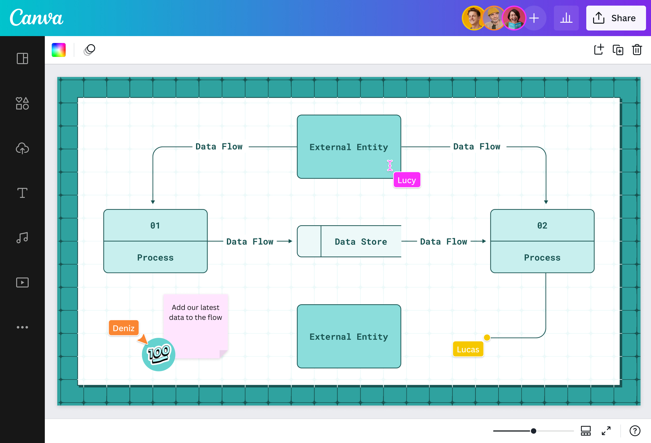
Processes

Data store

Data flow

External entities
Illustrate precise data movements

It doesn’t take a lot of moves to see how your data moves. With Canva’s data flow diagram tool, you can plot new information systems for your upcoming service launch or analyze your existing business processing models in a breeze. No need to learn difficult data flow diagram software! Simply choose a template or start from scratch and let our intuitive editor, drag-and-drop tools, and shortcuts do some magic. Create powerful and efficient systems without the hassle for your new online app or make your store process more efficient.
Direct the flow visually with design elements

Skip that creative block by starting with one of our ready-made data flow diagram templates. Make it your own by adding blocks, connectors, text, and more from our extensive media library. Go minimal if you’re still brainstorming your software with a simple data flow diagram, or go all-out with shapes, lines, and text if you’re plotting a detailed business model in its final stages.
Collaborate and share your work with ease

Invite your team to your data flow diagram online design and work together on your project in real time. Assign a task to a teammate through comments, or use emoji stickers to react to their work. Once you’re done, you can download your data flow diagram in JPG, PNG, or PDF so you can easily share it on your social media platforms or attach it to reports for your clients and stakeholders. Analyze your systems or process and decide your way forward in one editor.
No data cap

Add as many data points as you need. Not even a limited canvas can stop you. You can map with an infinite canvas to illustrate the ins and outs of your data movement and analyze every input and output better. Choose “Expand to a whiteboard” and get the most out of your data flow diagramming with Canva Whiteboards. Get better insights on your customer transaction process or your store’s payment system with a comprehensive yet visually appealing data flow diagram.
Data flow diagram templates


Alex H
Frequently Asked Questions
- A data flow is the movement of data from one part of an information system to another. For example, it can be how a customer’s order details move through your store’s transaction system. You can easily map this out in our data flow diagram creator.
- There are two types of data flow diagrams: logical and physical. A logical DFD outlines the data’s journey from its source and the processes involved to its destination. Meanwhile, a physical DFD maps how that data’s journey will be physically implemented, whether through software algorithms, equipment, physical or digital files, participants, or more.
- You can map out your data flow diagram in different levels depending on how early you are in the stages of system design, how detailed, or your audience.
- A context Diagram or Level 0 is the topmost level or a basic map and general overview of your system perfect for general audiences without technical context. It shows the whole system as consisting of one main, high-level process with a direct relationship to external entities while representing the simplified input and output flow of data through arrows.
- Level 1 elaborates the context diagram by breaking the high-level process into sub-processes.
- Level 2 deep dives into Level 1 DFD by adding specific details like all the blocks and connectors you need to flesh out your diagram.
- Level 3 and lower details more of your Level 2 DFD. However, it’s usually uncommon and could mean an overcomplication of the process that makes communication or analysis difficult.
- You must think about the process you want to map out or analyze. Start with a Level 0 or context diagram using our data flow diagram creator to establish your main high-level process, data flows, source, and destination. Then, you can build up to different levels from there, noting that processes must lead to another, having at least one input and one output. Have at least one data flow in and flow out for data stores. Any stored data should go through a process and cannot move without doing so.
- Data flow diagrams are useful for mapping or analyzing any kind of information system to cut costs and increase efficiency. It’s popular among software developers for the creation of applications or software. Business analysts also use DFDs to study their existing business systems and find problem areas where the data does not flow as efficiently for better customer service. It can also be used by companies, offices, and even schools to outline effective project management methods.
- There are two different sets of shapes and symbols depending on the notation. In the Coad & Yourdon notation, processes are in circles while Gane & Sarson’s are rounded rectangles with a horizontal line along the center. Data stores appear as long rectangles with the right edge erased in both with a slight change with the latter using a vertical line on the left side of the shape. Both notations are the same in representing data flows with an arrowed line and external entities with a rectangle.