- Dot Plot

Free dot plot maker
Dot plot maker features
Whether you’re analyzing your best-selling products or presenting information to your class, a dot plot chart is a useful tool for comparing data based on a single variable. Spot trends and identify patterns in an instant with the help of Canva’s visual suite.
More than 20 professional types of graphs to choose from
Professionally designed templates to fast-track your workflow
Data visualization made easy – no complicated software to learn
Publish, share or download your high-resolution graph
Embed your dot plot in presentations, reports, and more with no fuss
Easy drag-and-drop tools, made with the non-designer in mind
How to make a dot plot

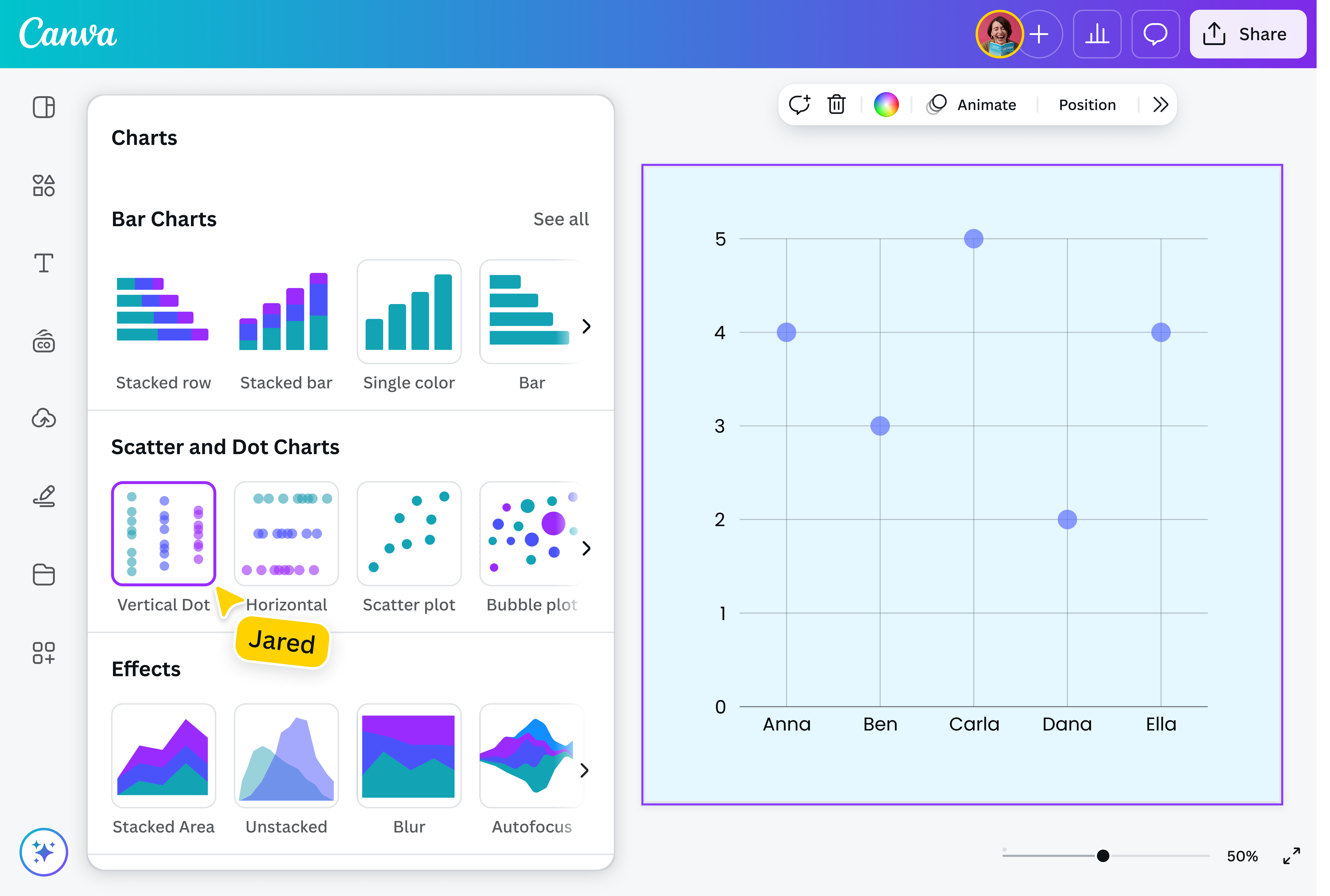
What is a dot plot?
A dot plot consists of data points represented by dots across a graph with an x-axis and y-axis. Visualizing data using a dot plot chart helps identify patterns, groupings, and even outliers while providing an overview of the data’s distribution. It has similarities to histograms(opens in a new tab or window) and bar graphs(opens in a new tab or window) but is best used for small data sets.
Transform data into a striking dot plot

Data visualization has never been easier with Canva’s free dot plot maker. Choose from our library of templates, input or upload your data, and create an engaging and interactive dot plot in just a few clicks — no need to start from scratch. Use it for your client presentation, research paper, financial report, and more.
Stay on-brand

Add your own personal touch to your dot plot. Customize the fonts, marker shapes, and padding of your graph to make sure it matches your vision. Choose from the array of colors we have, or use Brand Kit(opens in a new tab or window) to stay true to your branding. Add shapes, photos, or icons that complement your dot plot.
Canva makes it easy to create a visual that truly makes your data shine.
Connect the dots together

Seamlessly collaborate with your entire team to create impactful dot plots. Just share the link to your design,and they’ll be able to make edits anytime, anywhere. Input data together. Discuss whether you have a uniform distribution dot plot or a standard deviation dot plot. Take note of key takeaways, and see any changes in real-time.
Whether you’re working on a dot plot diagram for market research or to summarize monthly sales, it’s easier to break down data as a team.
Use one platform for everything

We offer more than an easy-to-use dot plot generator. You can upload, plot, and present your data on our platform — no more hassle of using multiple apps!
Input your data directly on your blank dot plot, or import data from Canva Sheets, Excel, and more. Easily make an eye-catching graph, design it however you like, and download it as a high-quality PNG. You can also add your dot plot to another design project, and present it directly from Canva.
Components of a dot plot

Axis configuration

Dots

Frequency/distribution

Assem A
Frequently Asked Questions
Dot plots are helpful in depicting groupings and trends in quantitative data, especially highlighting clusters and gaps. They are typically used to understand the distribution of a single variable, such as how many students received a specific grade or what day of the week sees the most sales.
Dot plots are most useful when comparing small sets of data, such as sample sizes less than 50. If the sample size is bigger, the dots may represent more than the observation you’re analyzing.
Although they all use the components, dot plots can have a wide range of distributions and shapes. This includes:
- Symmetrical dot plot: A symmetric or bell-shaped dot plot shows data that is evenly distributed around a central point, with the left and right sides of the graph being mirror images.
- Skewed dot plot: Here, data is clustered to one side (either the left or right-most) and isn’t evenly distributed.
- Bimodal dot plot: A bimodal distribution has two distinct peaks, indicating that two values are the most common.
- Uniform dot plot: With a uniform shape, data is more or less even across the different categories, with no prominent peaks or dips.
- Because of its simple form, dot plots are quite easy to read and understand. You just need to count how many dots are under a category to get the information you need. You can also zoom out to view larger trends and outliers. For example, if most of the dot plot data points are distributed toward one side with one or a few data points on the other side, this could indicate issues with measurement or special circumstances that account for the differences.
The mean of a dot plot is its central value. To get the dot plot mean, add the number of data points and divide it by the number of values.
For example, if you have a data set that shows an employee worked 5 hours on Monday, 8 hours on Tuesday to Thursday, and 3 hours on Friday, the mean would be 6.4 ((5+8+8+8+3)/5).
In statistics, the median is the middle value in an ordered list of all of the data points. To find the dot plot median, list each data point in ascending order, and count the number of data points. If there’s an odd number of points, take the middle value. If there’s an even number of points, take the average of the two middle values.
For example, let’s say you have information on the ages of your customers—there are 3 people aged 18, 2 people aged 20, 5 people aged 25, and 1 person aged 40. The median of the dot plot would be 25 (18, 18, 18, 20, 20, 25, 25, 25, 25, 25, 40).
- Both line plots and dot plots show you how data is distributed along an axis and are used interchangeably. However, a dot plot is different from a line graph, which shows the progression of a data set over time.